On September 30th, ALLARM was invited by the Allegheny County Conservation District to lead a Data Interpretation Webinar as a part of their “advocate for your watershed” series. Julie Vastine, ALLARM’s Director, and Suzanne Hartley, ALLARM’s Assistant Director, led the webinar with the goal of delving into how to tell a story through data gathered over time.
After volunteers have been trained and have successfully gathered data over a series of months, data interpretation is the key towards turning a series of numbers into a tool for understanding chemical and physical characteristics of a waterway. Looking at pH, conductivity, temperature, etc. may all show interesting trends on their own, but often it is the combination of different trends that tell a wider story about seasonal variation, land use and point or non point source pollution that may be affecting the area of interest. Data interpretation is also an exciting opportunity that brings together the data of different monitoring stations. Through spatial mapping tools like GIS and the data pooled and later graphed from regional databases like the Chesapeake Data Explorer, individuals can look at differences between tributaries and then larger waterways to see where the largest pollution problems are stemming from as one travels downstream.
For the webinar, ALLARM received sample data sets from Montour Run in Allegheny County. Hiba Aoid (‘21) and Olivia Spildooren (‘21) helped by making regional maps used during the webinar. These maps included essential information regarding land cover (forests, developed, agriculture, etc.); extraction sites for coal, oil and gas; as well as geology, which can all contribute to correctly interpreting data. For example, waterways with high amounts of limestone exposure will experience pH buffering that reduces acidity, which may be reflected in higher pH values. One puzzling finding in the data set were elevated chloride levels at a few of the sites during the summer time. Throughout the webinar, participants were able to suggest their ideas regarding the data findings via the chat function. The participants were also able to develop additional questions that could potentially be answered with additional monitoring. These conversations illustrated the importance of a strong study design, enjoyment in exploring the stories in data, and how monitoring is a cyclical process once you answer one question many more can emerge. 
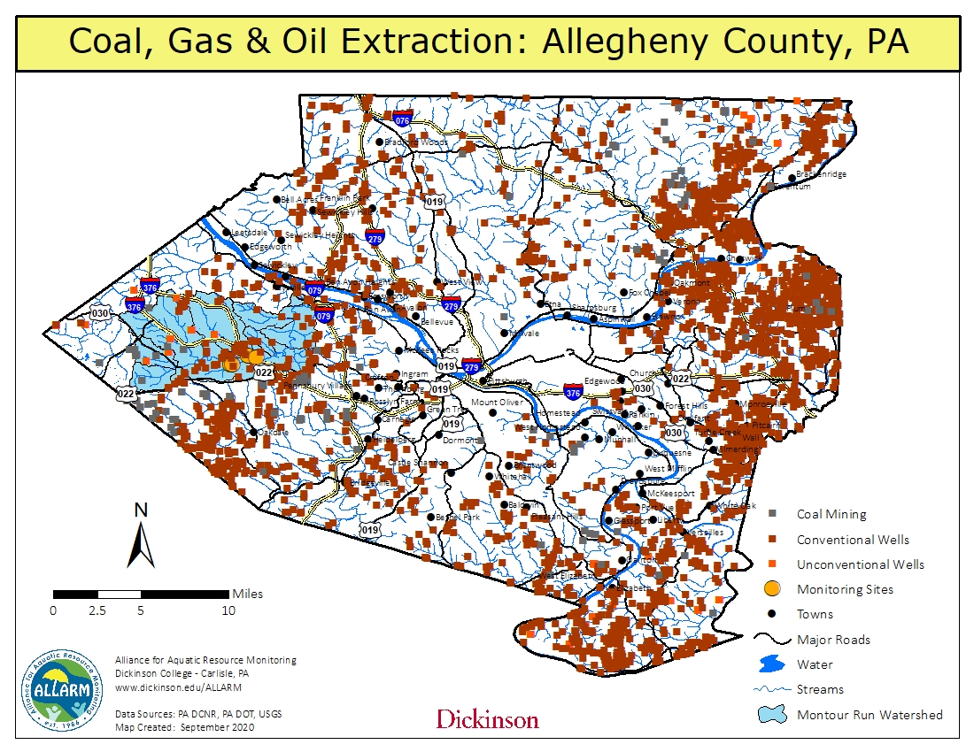
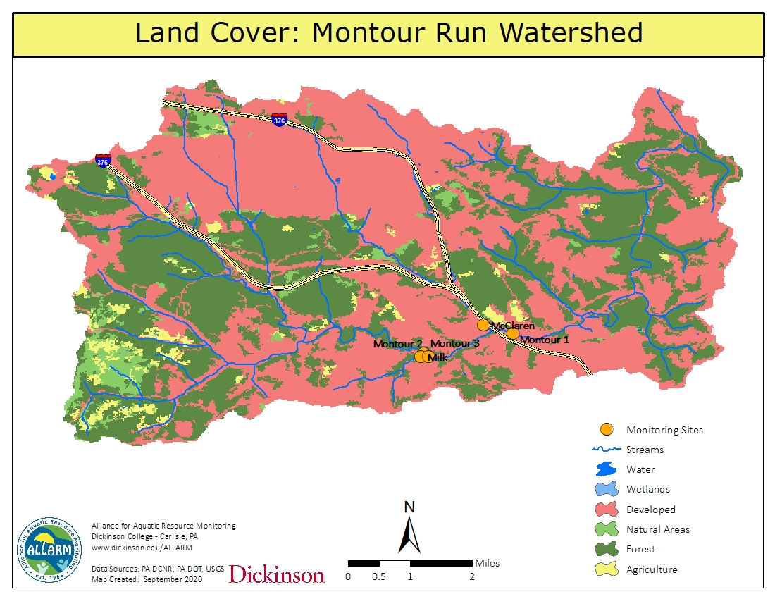
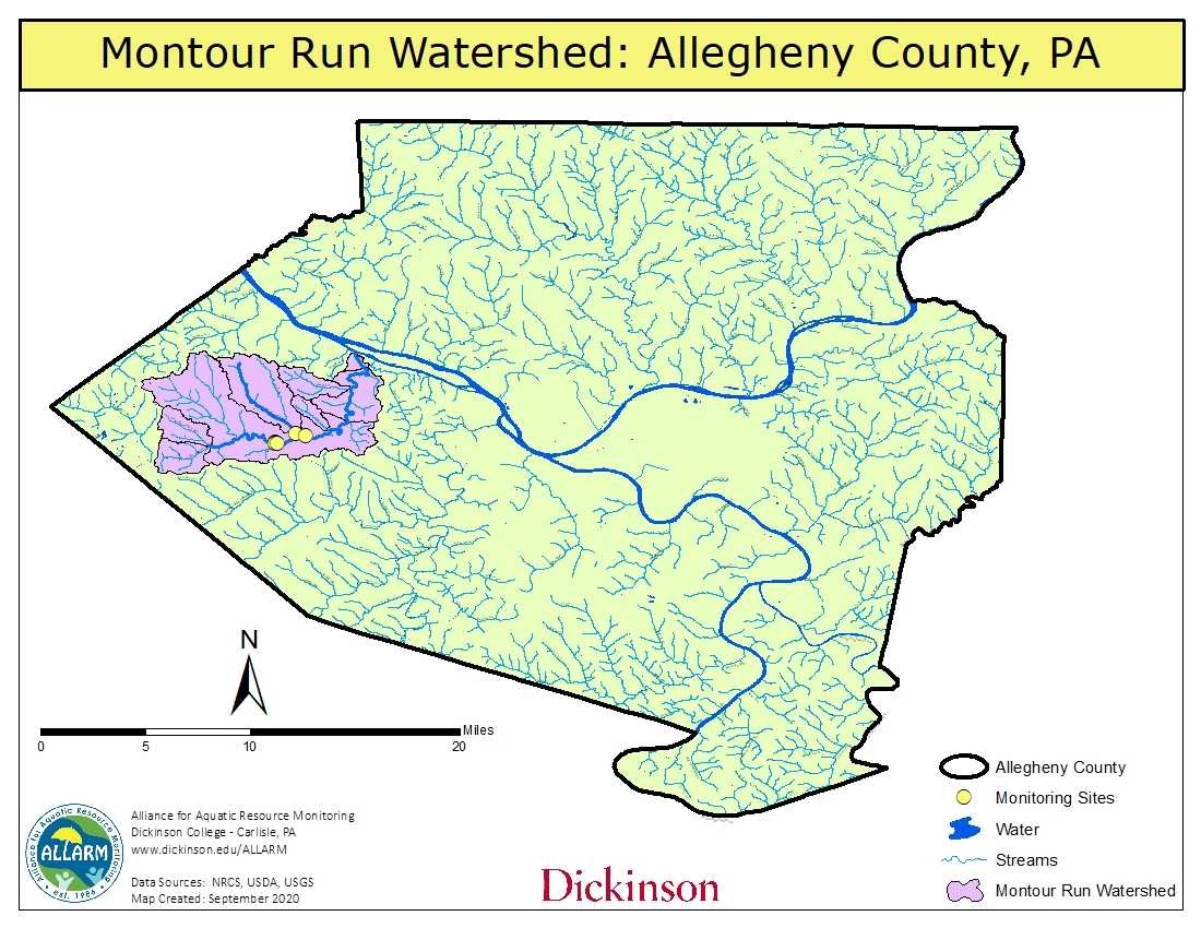
The maps used in the Data Interpretation Webinar