Month: April 2018 (Page 1 of 7)

Marco Polo: Medieval Map


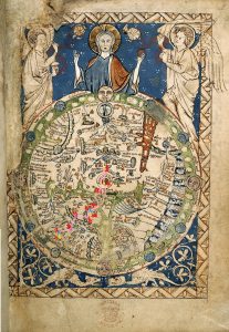
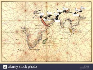
There are many obvious differences between the two maps. One visually striking difference is how much closer the points appear to be in the Medieval Map. I had a difficult time finding a portolan map that could incorporate Marco Polo’s expansive route from the Middle East to Asia. As is noticeable, the points appear to be shorter distances and are more scrunched together. In routing Marco Polo’s points of travel, I often found myself having to redo the placement of Marco Polo’s locations. I finally realized that the Medieval Map was far smaller in comparison to my modern map so my points were going to have to be much closer together than I expected. The hardest points to map were the Middle Eastern locations. The portolan map is missing some Middle Eastern countries making the Middle East much smaller. I was able to find where to place these points but I had to move the points closer together. Additionally, China appears to be much smaller in comparison to India. One reason this is so is that the portolan map’ was originally made for traveling traders, so its sole purpose was to provide detailed routes along the coastlines of these countries. Because of this, the mapping of the inside of these countries was not as much of a priority as the coastline of the Middle Eastern and Asian countries. Upon looking at this map, Marco Polo would have likely used the portolan map as a way to navigate by sea and understand where he was in reference to the traveling ports. The visual descriptions of the land within the Middle East and Asia were not correct representations, so this kind of map would not have aided in his journeys by land. Ultimately, in The Travels of Marco Polo, Marco Polo expressed his knowledge about the traveling ports and his physical location to these ports showing further evidence of how he would have used the portolan map.

The Book of the Wanderings of Felix Fabri: Medieval Travel Map

The hardest part about mapping the section of Fabri’s journey I chose on a medieval map is that his journey, in comparison to the Psalter world map as a whole, only occupies a very small geographic area. Within that limited space, the geographical details included on the Psalter world map only vaguely match up with the descriptions Fabri gives in his account, which are fairly accurate to the modern map and the actual geographies he traveled through.

It was easiest to plot Mestre, Italy and Venice, Italy on the medieval map because Italy is still drawn as a peninsula, albeit very circular and consisting mostly just of Rome. Venice is along the northeast coast of Italy, and Mestre a bit inland from Venice, so their relative locations on the medieval map were the most straightforward.

Plotting the locations in the Alps Mountains was complicated because it’s not made clear which mountain range is which on the Psalter world map, so I just had to make an educated guess based on the location of Greece and the assumption that the Dinaric Alps were included on the map. Within the range that I assumed to be the Alps, there wasn’t much space to plot the multiple stops Fabri made while journeying through them, which is both a function of the scale of the map and of the lower importance placed on that part of the world. Generally, plotting most of the stops I chose from Fabri’s journey was difficult because the Psalter world map’s representation of Europe is condensed. The further north the location, such as those in Germany, the harder it was to plot the town because Europe is not given as much space, as the focus is Jerusalem and the Holy Lands as the center of the world.

The orientation of the Psalter world map complicated my plotting of Fabri’s travels on it because most modern maps are oriented with North on the top, while East is up on the Psalter world map. Given theological views of paradise being in the East, this makes sense, as the Psalter world map is religiously based. The orientation of the Psalter map points to the great importance of religion at the time of its creation, whereas the modern map’s orientation reflects the perceived greater importance of northern hemisphere nations as leaders in politics and economics and the history of countries in the northern hemisphere as colonizers of those in the southern hemisphere.

The Book of Margery Kempe: Modern vs. Medieval Map

Despite the glaring differences between the modern, online-created map being oriented North, and the Medieval hand-drawn Psalter Map being oriented East, the biggest difference between the two that I noticed was a lack of temporal/spatial awareness on the Psalter World Map. Once I plotted the points from the Modern Map onto the Psalter World Map, I realized that it was inaccurate in terms of spatial awareness. For example, on the Psalter Map, the entire peninsula of modern-day Italy is especially cramped and walled off by the Alps. This made me plotting Bologna, Venice, and Rome seem in much closer proximity than when I was plotting them online through ArcGIS. I also thought this was interesting as I thought it might suggest how medieval travelers saw the Alps as a very treacherous natural boundary to cross. On the same note, England was also exceedingly cramped, making my plots for Norwich and Yarmouth seem way too close to the spot where London was already marked on the map. The Psalter World Map is also incredibly small and, while very detailed for its size, this presents two problems when trying somewhat accurately plot modern points: 1) When trying to plot a city on such a small and cramped map, you end up accidentally covering other markers. This was an issue not encountered when working with the online ArcGIS system, because through internet mapping agents, you are able to pinpoint with startling accuracy and make the points as small as needed so that you do not overlap other important information. 2) Since the Psalter World Map only has space for the things it deems most important, it is not very detailed. I could not find Venice, Bologna, Norwich, Yarmouth, Ramleh, or the Church of the Holy Sepulchre as there simply is not room to detail every specific city or site pilgrims may pass through. In this way, navigating with the Psalter Map is very much a guessing game, speaking to the struggle medieval travelers had when trying to navigate from place to place. This was strikingly different from navigating ArcGIS, as all I had to do was enter the city or even a specific building or address, and it would take me to its exact location. There was no need to guess or even think about it as much.

Another large difference I noticed is that just as we can deduce how ruling cultures think about the world through map orientation (modern day maps are oriented North, placing more value on Europe and the United States as they are at the ‘top’ and near the center. Medieval maps are centered towards the ‘East’ where Paradise is meant to be, and Jerusalem is at the center), one can also deduce from medieval maps what traveling members of society cared about most based on how large a certain city or point is. This is exceedingly evident with the Psalter World Map’s placement of Jerusalem. Not only is is placed in the center, as it is in most T-O maps, which signifies it as the heart of the world and a treasured place around which Christ is said to have lived and died, but Jerusalem is HUGE compared to other cities and is circled, like a bulls-eye. The sheer size of how the city is portrayed screams that in the Middle Ages Jerusalem was considered a VERY important place, and details just how central it was to religious pilgrimage. The fact that the city is circled like a bulls-eye makes it appear the Jerusalem is the “end point” despite paradise being far up to the East.

The Book of Margery Kempe: Medieval Map

The template used is that of the World Psalter Map. You can find the original image here. The below image may appear blurry but upon clicking and magnifying, becomes clear. Edits courtesy of 3D Paint software.

Key:

Yellow/Gold= Religious Sites

Blue= Port Cities

Red= Checkpoints

Purple= Food

  1. Norwich, England
  2. Yarmouth, England
  3. Zierikzee, Netherlands
  4. Constanz, Germany
  5. Bologna, Italy
  6. Venice, Italy
  7. Church of the Holy Sepulchre, Jerusalem
  8. River Jordan, modern-day Israel
  9. Venice, Italy
  10. Rome, Italy

Ibn Fadlan and the Land of Darkness: Medieval Map v. Modern Map

Though the Tabula Rogerianais incredibly accurate for the time period, mapping ibn Fadlan’s journey onto it has significantly altered the visual representation of his journey.  On the modern map, ibn Fadlan’s path takes him much further North that it does East.  His journey takes an abrupt turn at Bukhara where the main direction of travel transition from East to North.  In the medieval map, however, ibn Fadlan’s journey takes him farther East than it does North, completely altering the perspective of the viewer as to which direction was more applicable.  On the medieval map, ibn Fadlan’s travels are more aptly described as his travels East, whereas on the modern map, he mostly traveled North.

As such, in the medieval map, the Caspian Sea, or bahr al hozaras it is labeled on the Tabula Rogeriana, appears to be a significantly more relevant landmark for ibn Fadlan as his journey appears to more closely circumvent the body of water. Ibn Fadlan appears far closer to the Caspian Sea at the Northern most point of his travels, having passed more or less around the circumference of the Caspian Sea.  In the modern map, however, the Caspian Sea has no impact on his actual path and is much further West and South of his journey than it appears in the medieval map.

Finally, the proper South-up orientation of the Tabula Rogerianadepicts ibn Fadlan’s travels as going down around the Caspian Sea instead of up into the treacherous mountains and rivers of what is now called Russia, relatively close to Moscow.   Not only does this shift the visualization of his journey, but the end of the Northern side of the medieval map cuts off the top of that northern Eurasian landmass, about halfway through what is today’s Russia.  Ibn Fadlan’s final destination, Bulghar, is incredibly close to this northern edge of the map, making it appear as though he traveled nearly to the most northern, or bottom, edge of the world.  This greatly contrasts with the modern map, which reveals that he made it just about half way through Russia at the western edge, far from the Barents Sea.  As such, ibn Fadlan’s journey appears to take him to the edge of the known world on the Tabula Rogeriana, while on the modern map, his travels take him significantly north, but well within the confines of the Eurasian landmass.

« Older posts

© 2024 Mapping the Global Middle Ages


Academic Technology services: GIS | Media Center | Language Exchange

Theme by Anders NorenUp ↑