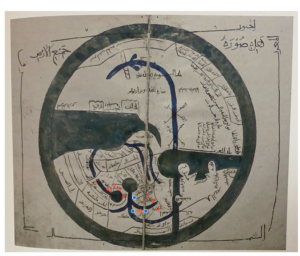
This map is the un-named map of northern and central Europe in the back of the Nuremburg Chronicles. I chose this map because the majority of the first ten places that Felix Fabri travels in his first journey are located within central Europe and the Nuremburg Chronicles was made within ten years of Fabri’s first journey. This map, while a lot closer to modern maps than T maps and most mappemonde that were produced in Europe during the 15th century, is still not a perfect copy of the maps that we use today. One of the most notable aspects of the medieval map that I noticed was how closely all of the cities were placed to each other. While all of the countries and mountain ranges were in the same places in relation to each other that they would be on a modern map, the map was a lot more spread out in the northern Europe region while central Europe was a lot more clustered together. This would have been very important for anyone who would have been planning to make a journey from northern to central Europe using this specific map because it could lead to massive miss calculations when it comes to supplies and directions. While in modern travels, going a mile or two in the wrong direction would not have been that big of a deal, for travelers like Felix Fabri, it could mean the difference between reaching a safe place to rest and replenish and dying of starvation or dehydration. Another aspect of this medieval map that is different from modern maps and could greatly affect any travelers who attempt to use the map is the depiction of the Alps. While the maps layout of the area and relative shape of the mountain range is accurate, its depiction of the mountains as halving wide valleys between them and wide areas of relatively flat terrain where a person could, in theory, traverse easily through is not accurate. This would give a traveler the idea that the Alps could be easily passed through which could easily lead to the traveler getting lost, off course, or severely under supplied leading to their death. This issue is one that Fabri encounters on his journey. He runs into a castle at the top of one of the mountains in the Alps and, thinking that the mountain was too high to climb, goes around it and ends up heading in the wrong direction and very lost. While these are both reasons that this map probably should not be used when planning a journey through Europe, it is one of the more modern 15th century maps that I, personally, have seen.