Entries Tagged as 'Museums'
My favorite painting from the gallery is a portrait of Ben Jonson. A playwright and poet of the Jacobean era, Jonson received some distinction with the works Bartholomew Fair and The Alchemist, both of which I have not read – and for good reason. Unlike his contemporary, Shakespeare, Jonson has completely fallen off the map, having none of the distinction and prestige of his fellow bard. Jonson, as it were, is not “canonical.” In any case, Jonson’s poor rep didn’t prevent me from enjoying his portrait. Indeed, an interesting point about portraiture is that there seems to be a sort of discrepancy between the the artist and the subject. Take for instance the portrait of Shakespeare. Our interest lies with the subject, Shakespeare, and not the artist. Conversely, in Van Gogh’s Portrait of Dr. Gachet we are interested in the fact that the painting’s author is Van Gogh, and less so by the fact that the painted figure was someone called Gachet. And of course other times, the interest is mutual – Da Vinci’s Mona Lisa. Its interesting to note how the discrepancy lessens as you go further through the timelines in the gallery. The Tudor, Stuart, and Jacobean rooms are very much indicative of the British brand of class system and ideology. But as you reached the portraiture of the early 20th century, you find friends drawing each other (i.e. Bloomsbury group).

© National Portrait Gallery, London
The artist who painted Ben Jonson’s portrait is Abraham van Blyenberch, a flemish artist of whom I know little about and care even less. Yet I found it to be one of the most original portraits in the gallery, rivaling that of the ones of Tennyson and Sir John Fieldings. Instead of the traditional rigidness we’ve come to expect from the Renaissance, Blyenberch’s Jonson is refreshingly relaxed. He looks slightly bemused, his head tilted just enough so that it conveys a sense of contentedness and ease. Even so, the portrait still relates to the viewer an august demeanor, probably due to the variations of bronze in the background, hair, and face. When I first looked at the work, I immediately thought of Rembrandt; Jonson’s beady, penetrating eyes echoes that of the psychic dimension of the Dutch master’s self portraits. Although Rembrandt would create his most famous pieces almost a generation later, the style we associate with that region seems to be diminutively intuited by Blyenberch. Through this portrait of Jonson, we are able to look beyond the British stiff upper lip.
Tags: 2010 Sean · Museums

“Eve” by Thomas Brock, 1899
Seeing the Victoria and Albert Museum is a must. And you most definitely should enter the museum via the Tube entrance. Prior to my visit, I naïvely believed the Victoria and Albert Museum would display art from Queen Victoria’s reign to illustrate the period—I found myself mistaken. Upon entering V&A from the underground tunnel, I immediately stepped foot into a series of small, dark rooms off to the right. The rooms modestly displayed furniture and tapestries from Europe dating from the seventeenth to nineteenth century. I then wandered into the main museum hallway above ground and explored the diverse assortment of sculptures extending down a long hallway. Taken aback, I quickly realized the V&A actually displayed a much broader range of art. By the end of my visit, I found that was a huge understatement. The Victoria and Albert Museum is enormous and houses a collection of almost every type of visual art.
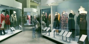
Fashion Exhibit
The museum map became somewhat useless and rather bothersome as I wandered through the labyrinth of art. Branching off of the main sculpture room—which included work from a favorite sculptor of mine, Rodin—were displays of art from China, the Islamic Middle East, Japan, Korea, South Asia, and South-East Asia. Another room I thoroughly enjoyed was a room presenting fashions from Italy, the United States, Japan, England, and France. The clothing dated from the eighteenth century through today. I only explored parts of the first floor and I still had five more levels!
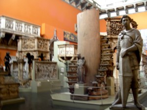
Plaster-casted Sculpture Exhibit (personal photo)
Throughout the remainder of my museum tour, I discovered collections of photography, mini architecture models, prints, drawings, paintings, tapestries, sacred silver and gold, and stained glass. There were also two massive rooms of plaster-casted architecture and sculptures dating from the eighteenth century, when plaster-casting famous works was popular for museum displays. Numerous rooms displayed eclectic exhibits of Medieval and Renaissance European art from the fourth to seventeenth century. When I finally stumbled into a dark hidden room of priceless jewelry dating back from 1500 BC, I was irrevocably astounded. I was lost in the Victoria and Albert museum but when discovering all these sorts of extraordinary pieces of art, who didn’t want to be?

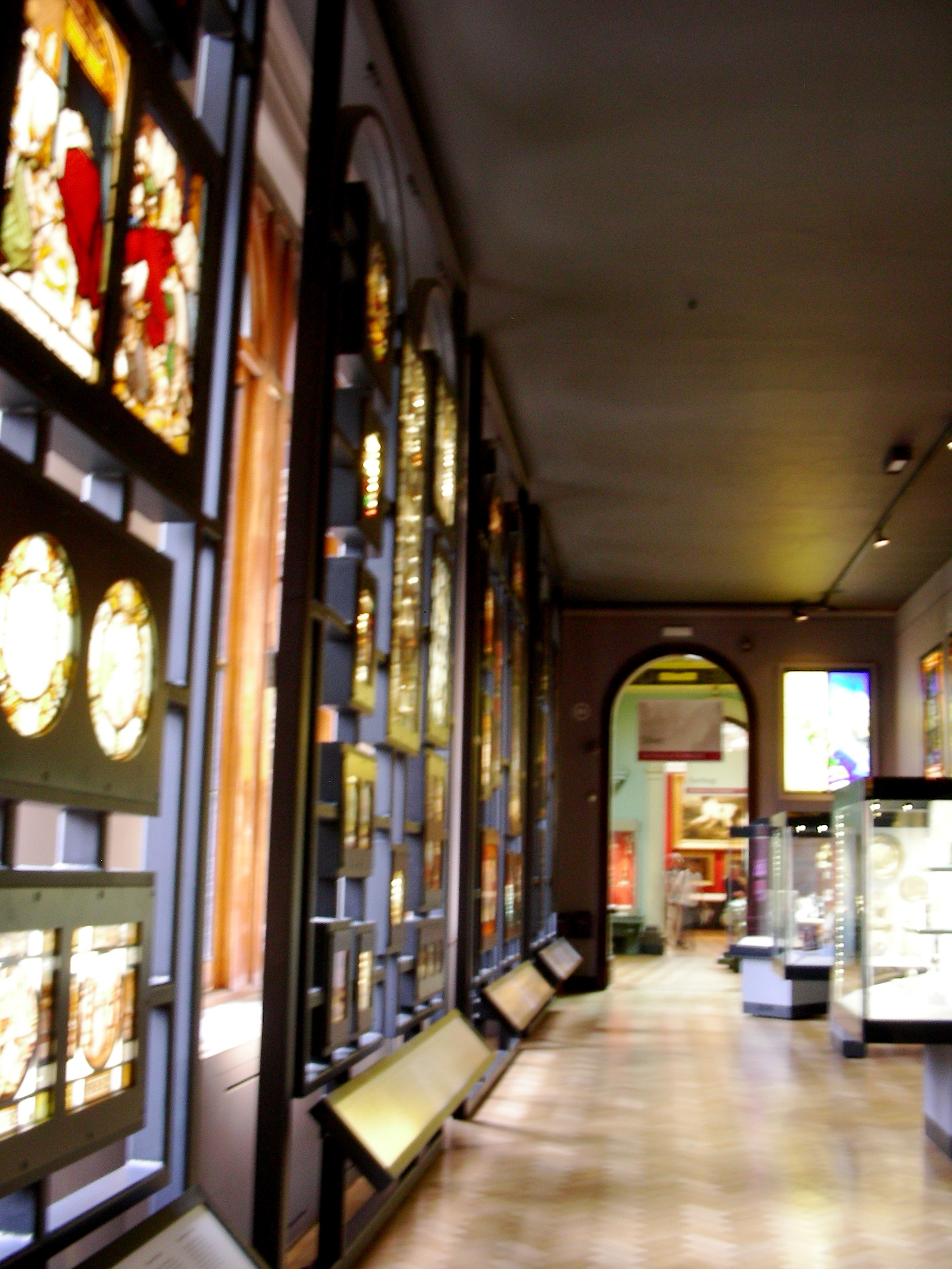
Stained-glass Exhibit (personal photo)
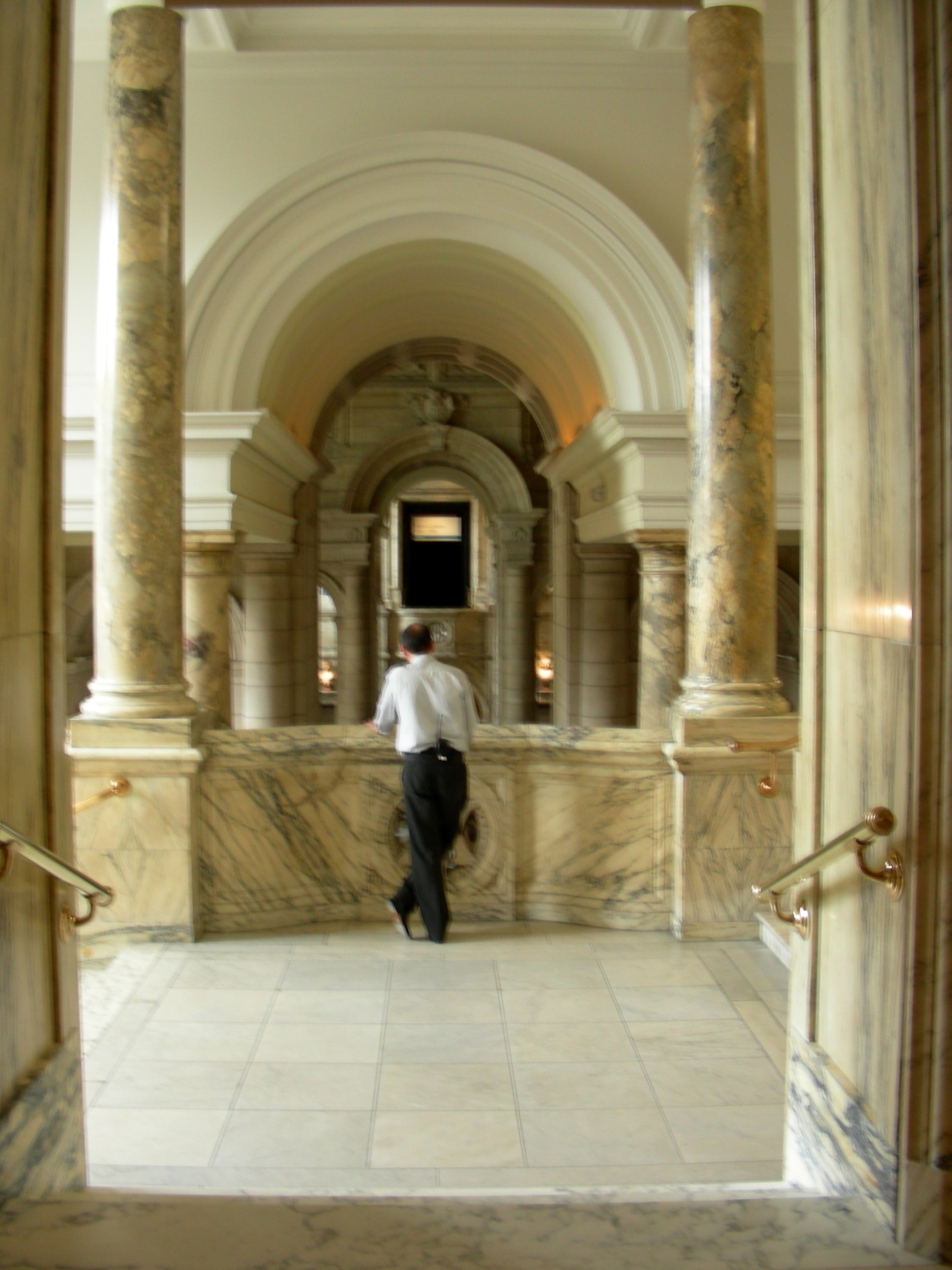
On the whole, the museum’s collection was incredible (if that’s not obvious already). I was completely taken aback by the wide array of art displayed, as well as the priceless items included—countless pieces of silver and jewelry, as well as Leonardo da Vinci’s notebooks and Raphael’s paintings (coming soon). However, the organization of the museum is a contentious topic. The pieces of art come from all over the globe and date back to 1500 BC. Also, obviously, the museum includes almost every type of art. To mitigate this challenge of organizing the art, the museum’s ironically set-up like a maze. The different rooms intertwine and lead you through every floor, and each room is included in the art display. For example, doorways to Renaissance Europe boast beautiful marble columns, tiled floors mimic mosaics on display, monolithic architectural structures make Italian plaster-casted sculptures seem authentic, and aged brick walls and cobblestone floors bring life to the medieval ironwork.

Large-scale Medieval and Renaissance Architecture (personal photo)
From what I could gather, it seems as though the Victoria and Albert Museum is a massive collection of treasures donated by organizations and wealthy individuals. For one, the galleries of donated art pieces ostentatiously display the donor’s name on the wall. Overall, the V&A Museum is a display of wealth—both of England’s monetary wealth and of its wealth of knowledge in the arts. The museum has put on display priceless pieces of art from around the world. The English are subtly, but really quite clearly, boasting. Typical.

One Exhibit’s Entranceway (personal photo)
Tags: 2010 Mary · Museums
September 3rd, 2010 · 2 Comments
Since so many people have already written about the elitist tendencies of the National Portrait Gallery’s collection, I won’t spend any more time on that aspect. What I found interesting was the change in what types of figures were included throughout the years covered in the collection. In the Tudor rooms, only members of the royal family or other important government/magisterial figures were displayed (several of whom seemed to be Elizabeth’s “favorites…”). By the time of the Restoration, more portraits of social or artistic figures were included, and by the time of the Romantics, there were more portraits of philosophers, artists, writers, poets, social activists, etc… than there were of strictly governmental figures. The best explanation that I can come up with for this is the (late) arrival of the Renaissance in Britain during the Tudor reign, which gave rise to popularity for artists, playwrights (cough, Shakespeare, cough), and the like. This movement into non-political realms then continued with the Enlightenment and the growth of both the middle class and leisure time, so people were able to focus more on literature, philosophy, and science.
I really enjoyed the Gallery (except for maybe the twentieth-century room, and the self-portrait done in blood. Weird.), but I feel as though the collection was a very safe one. Almost every portrait seemed to be of someone who has had a positive effect on Britain’s image. There were no portraits (or very few) of political dissidents or very radical thinkers, nor were there any images of people who weren’t perfectly coifed and dressed. This may be due in part to the availability of portraits; I have no idea what sort of resources the museum has been able to draw on. I do think, however, that the collection could acknowledge that Britain’s history involves some ugliness (beyond some of the fashions in the paintings).
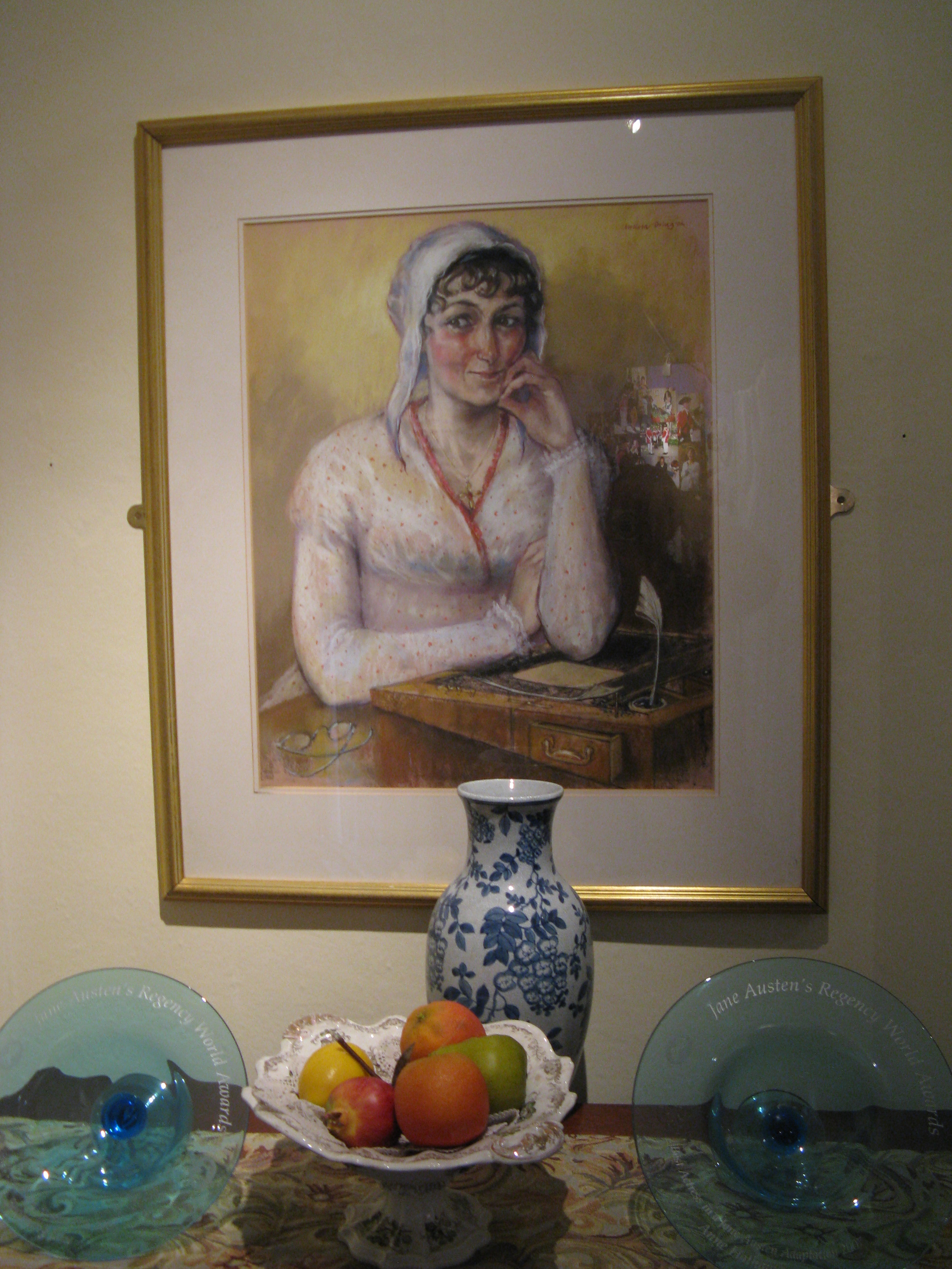
I focused on the portrait of Jane Austen, done by her sister, Cassandra because a) she’s my favorite author and b) it’s a very awkward portrait. I mean, it’s the only known image of Austen that was done from life, and she looks seriously pissed off.  (Image from National Portrait Gallery, http://www.npg.org.uk/collections/search/largerimage.php?sText=Austen&search=ss&OConly=true&firstRun=true&LinkID=mp00179&role=sit&rNo=1)
Austen is turned away from her sister and her arms are crossed, which makes her seem very closed, as if she did not want to sit for her portrait. Since Cassandra never finished the sketch, this may have been the case. Her lips are pursed and her nose seems slightly wrinkled, giving her a definite look of annoyance. Friends and family remarked that hte portrait captured a little bit of Jane, but that Cassandra had more or less missed the boat as far as a real likeness goes. I think that this was probably because drawing was considered a proper and genteel activity for women during the Regency Period, and Cassandra may have just been practicing on her sister.
This portait is especially interesting to me after the time that I spent at the Jane Austen Centre yesterday. In the museum, there was another portrait of Austen, done by a modern artist, Melissa Dring.  Dring took Cassandra’s portrait and descriptions of Austen from the written accounts of people who knew her in order to come up with this new image. I think that her eyes are twinkling a bit too much here, but at least she doesn’t look so ticked off.
Tags: 2010 Holly · Museums
September 3rd, 2010 · 1 Comment
First, who’s not in the National Portrait Gallery? Minorities! Honestly, even without the prompt, it would have been a slow realization that as we walked through room after room of white faces, something was missing. There was one freed slave portrayed in the audience of an abolitionist convention, and that was about it as far as paintings of minorities at the Gallery go.
Second, and more broadly, working class people are not in there. This, to me, is less upsetting as it’s just a natural consequence of the fact that only the upper crust can afford to have portraits commissioned. Hours after visiting the Gallery, though, the lack of minorities still rankles, for one simple reason. If a black or Asian or Latino family came to visit the Gallery, and one of the children asked their parents “Why don’t any of these people look like us?” the parents would have no good answer.
____________________________________________________________________________________________
We were supposed to pick one portrait that we found particularly affecting. As a political science major who has taken British History 244, though, I could not resist going with the dueling portraits of William Ewart Gladstone and Benjamin Disraeli. Gladstone was the pillar of 19th century liberalism, while Disraeli was his counterpart on the right.
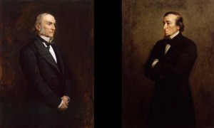
credit: youreader.com
This is exactly how the two portraits (by the same artist, Sir John Everett Millais) appear in the Gallery. In the Victorian era, the two were the titans of Parliament, serving as Prime Minister six times collectively. There is much, much more on their epic personal and political rivalry here:
http://www.bbc.co.uk/history/british/victorians/disraeli_gladstone_01.shtml
A favorite quote of mine on their lack of mutual respect, from Disraeli is “The difference between a misfortune and a calamity is this: If Gladstone fell into the Thames, it would be a misfortune. But if someone dragged him out again, that would be a calamity.”
Their respective portraits contain subtle and not so subtle bits of political imagery. First, Gladstone is facing to his left, while Disraeli is facing his right. The rest of what follows may be a bit of armchair psychology, but I believe it speaks volumes about both men.
– Gladstone has his hands folded, while Disraeli’s arms are folded in an aggressive posture. Disraeli was far more warlike as prime minister.
– Gladstone is looking towards the sky, while Disraeli’s gaze is a bit more earthward. This is in line with both men’s fundamental outlooks on life: Gladstone considered himself a great Christian moralist, while Disraeli preferred to concern himself with more earthly issues, considering Gladstone to be out of touch with the nitty-gritty of the world.
While the placing of these two portraits together obviously has an intended effect, that does not make the effect any less powerful. While standing in front of the two portraits, I felt like I could almost feel the hate flowing between these two great men, a great moment for a politics junkie like me.
Tags: 2010 Dennis · Museums
For a former empire, the British sure do like to only acknowledge the wealthy white people who inhabit this relatively small island. The National Portrait Gallery was wall to wall dignified important white people. For the most part I did not come across images of other ethnicity or socio-economic class. Everywhere I turned I saw another sleepy-eyed English man or woman gazing down on me. While this lack of diversity was a little distressing (where was Gandhi!? He was a great subject of the British Empire!), once I got past this I loved every second of the National Portrait Gallery.
 Image taken from Wikipedia
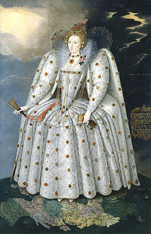
I encountered my favorite painting early on — a magnificent portrait of Elizabeth I (1535-1603) by Marcus Gheeraerts the Younger from 1592. This image of Elizabeth standing atop the world was a beautiful example of Elizabethan portraits. The Latin inscriptions (translated as “she gives and does not expect,” “she can but does not take vengeance,” and “in giving back she increases”) were fantastic examples of typical courtly sucking-up. I enjoyed these phrases in particular because Elizabeth was not known for her patience, humility, or charity. These stock sayings speak more to the traditions of the Early Modern Era than the character traits of this Tudor monarch. The other aspect of this portrait that caught my attention was her dress. This style of gown, a trademark of the later part of Elizabeth’s reign, is frequently referenced in modern culture, for example, the Fairy Queen in the last act of the Merry Wives of Windsor that we saw a few nights ago wore a replica of the gown in this portrait. That this style, which appeared very late in her reign, has become a byword for Elizabethan fashion seized my attention. I had not realized that by the time this portrait was painted, Elizabeth was old and no longer appeared like the young flawless beauty seen in this portrait: instead of porcelain skin she was pock-marked, instead of brilliant red-hair she was going gray. I found this distortion of truth, particularly highlighted by the exhibit itself (this portrait appeared at the end of a series illustrating Elizabeth through her lifetime), fascinating. All in all I thoroughly enjoyed my trip to the past at the National Portrait Gallery.
Tags: 2010 Amy · Museums
The National Portrait Gallery includes prominent figures in UK history, from great thinkers, philosophers and inventors, to sailors, pirates and conquerors. I only was able to view a small portion of the museum, beginning with the Tudors and ending at the Anti-Slavery Convention of 1840. This painting featured a group of 500 legislators gathered in an assembly hall. The scene depicted was Thomas Clarkson addressing the British and Foreign Anti-Slavery Society, with the hope of abolishing slavery worldwide. The only figure standing is Clarkson, with his arm and forefinger held high and a countenance expressing concern, passion and a certain weariness, emotions symbolic of his lifelong struggle to see the end of slavery in the civilized world. To his left, his wife, Mary, and son, Thomas Jr. anxiously witness the culmination of Clarkson’s work.
In the foreground of the portrait sits Henry Beckford, an emancipated slave and delegate from Jamaica. What is of particular interest to me in this portrait, (besides it’s relevance to the movie ‘Amazing Grace,’ which I thought was pretty sick) is the dignity with which Beckford is treated. One delegate is putting his hand on Beckford’s arm and another, William Allen, gazes directly at him, although Clarkson is the one who is speaking. The respect that the other men in the portrait feel for is readily apparant from their expressions and body language. Beckford is surrounded by Europeans but seemingly treated as an equal, with all parties striving toward the same end.
Also, if one checks the link, there are some inexplicably big ass books at the bottom.
http://www.npg.org.uk/collections/search/largerimage.php?mkey=mw00028&search=ss&firstRun=true&sText=thomas+clarkson&LinkID=mp00903&role=sit&rNo=1
(Courtesy of NPG.org, the official website of the National Portrait Gallery)
Tags: 2010 Michael · Museums · Uncategorized
September 3rd, 2010 · 4 Comments
I first have to state that this is a blog about people watching, not art or museums. My trip to the Tate Modern confirmed something I’ve suspected for a long time: I just don’t get modern art. I don’t get the art itself or the the people who do. For the most part (there is some modern art I find appealing), I found that what I saw was trying too hard to say something and in the end, was communicating no message whatsoever to me. Yes, paint splatter looks interesting, but to quote the seven-year-old girl who walked by me, “Daddy, I can do one of these!” One exhibit, a series of pieces by Agnes Martin felt as if the artist looked as if someone had taken a bunch of American Apparel t-shirts, made them very large, and put them on a wall. I just could not get a sense of “euphoria, contentment and memories of past happiness” (for more go here) from a series of stripes.

Taken from the Tate Modern Website
Once I had realized that I was not going to be spending my afternoon sunk into an emotional pit inspired by paint splatter and lumpy statues, I turned to people watching. This activity confirmed what I’ve long suspected: modern art officianados are the same no matter where you are. There seem to be two breeds: those who actually know what they are talking about and those who do not but wish to appear like they do. The first is a fairly respectable bunch. They tend to be middle aged (with some exceptions, of course), upper middle class, educated, and most of all, unpretentious. The other category is much more fun to watch: those who wish to seem cultured. They tend to be young adults adhering to the “hipster trend” (the men are over groomed and the women are disheveled) and have a number of behaviors: there is the intellectual pose (involves leaning slightly back with a hand on one’s chin and staring intensely to the corner of a piece of “art”), and the catch phrase (a hurried “yeah, yeah, yeah” followed by some inane and impossible to understand comment about the power of a poka-dot). This is not an exclusively English symptom — it transcends borders and appears in almost every single modern art museum I’ve ever been to. I’m not quite sure what this says about modern art or humanity in general, but I do find a strange comfort in knowing that across nations people experience the same insecurities and behaviors.
Tags: 2010 Amy · Museums
For the majority of human civilization history has been recorded by and about men. Today we learned that portraits are just another form of history telling. In the patriarchal society that has emerged in Europe in the past few centuries, powerful men have had their likenesses recorded by painters and photographers alike. The artists, who too were white men for the most part, helped to record a history in paintings that has sent the message that in any given era, white men were the only people worthy of remembrance.
Not all of these men illustrated however, were men that were famous or powerful. One portrait that drew my attention, John Ballantyne’s The Artist’s Studio depicts a man, small and off center, carving the lions that would one day sit in London’s Trafalgar Square. It took a little researching but I finally found the picture to be painted of Sir Edwin Henry Landseer, someone whose name I was not familiar with but whose work I had seen dozens of times either on television or on the street. Even in the photo, this man is in the shadow of these monstrous lions, symbols of the aristocracy. It was interesting to finally get another perspective on the monuments all over London. All of these monuments honor great men, but behind all of them were unknown artists commissioned to sculpt or paint for little or no recognition or acclaim.
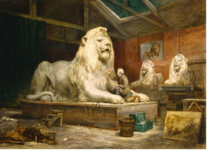
(photo from http://www.nnf10.org.uk/programme/detail/The_Artists_Studio)
Although the gallery was filled mostly with white rich men, it was refreshing to see this one painting of an almost normal guy who, like everyone else, was a subject and servant to an immutable class system.
Tags: 2010 MatthewG · Museums
September 3rd, 2010 · 1 Comment
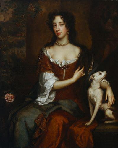
I can agree with Jessica that most paintings in the National Portrait Gallery are of men. I didn’t expect anything else – for most of history, or at least the history that’s been recorded, men have called the shots. But I was most drawn to the portraits of Stuart queens and princesses. For one thing, they looked more real than the Tudor portraits – I can’t imagine a real person looking anything like the portraits of Elizabeth I, for example. But I can imagine Queen Anne. She looks like I could reach out and touch her. The painting of her that I found the most compelling looks like this:
http://www.npg.org.uk/collections/search/portrait/mw08095/Queen-Anne?search=ss&firstRun=true&sText=queen+anne&LinkID=mp00111&role=sit&rNo=6

Queen Anne
I know a lot of this might have to do with fashion, but the Snow-White complexion, the sensual folds and materials of her gown, the emphasis on her… curves… even the placement of her hand all suggested to me a kind of softness, maternity, fertility. I can’t believe a monarch would allow herself to be presented in such vulnerability. She doesn’t look intimidating or powerful. She looks nurturing.
The caption below the portrait tells us that she was the younger sister of Mary, Princess of Orange, and that she experienced eighteen pregnancies without ever raising a child to adulthood. So this means that by the time this portrait was taken, in 1705, Anne had seen her father deposed and replaced by her sister. Her sister and brother-in-law had died. She had buried eighteen children. And then she had become one of the most powerful people in the world. I have to think you can see some of the grief she’s suffered on her face.
The portrait spoke to me because, I think, it made Anne someone real, someone for whom my heart can break. I generally don’t like the Tudor and Stuart era of British history because it seems like so many names and dates and Roman numerals and unnecessary bloodshed over highfalutin theological issues. But the women in this section of the museum brought it alive for me. Look at the resemblance between Mary of Modena, the queen of James II, and Mary of Orange, her daughter:
http://www.npg.org.uk/collections/search/portrait/mw04280/Mary-of-Modena?search=ss&firstRun=true&sText=mary+of+modena&LinkID=mp02997&role=sit&rNo=0

Mary of Modena

Queen Mary II
http://www.npg.org.uk/collections/search/portrait/mw08755/Queen-Mary-II?search=ss&firstRun=true&sText=queen+mary&LinkID=mp02998&role=sit&rNo=0
Different painters, different decades, and they could be twins. I wonder how Mom felt about Mary and her husband replacing James. If it weren’t for the obvious likeness in the portraits, I might never even have asked myself that question. I mean, most moms would be upset if their daughters forgot a birthday. The paintings of men in the gallery, were, for some reason, less evocative for me. I didn’t wonder how James felt about Mary’s role in the Glorious Revolution. Call me sexist, but this was my favorite part of the museum.
Tags: 2010 MaryKate · Museums
September 3rd, 2010 · 2 Comments
Beginning my tour of the National Portrait Gallery in the room of Tudor paintings, I immediately noted the types of people included in the gallery’s selection of portraits: British royalty and aristocrats. As I wove my way in and out of the various rooms and hidden side rooms, I continued to notice a broader representation of the English classes. This included notable figures of military, political, and scientific importance, as well as remarkable social reformers, explorers, poets and writers, painters and sculptors, composers and musicians, and actors. Some scenes of war and exploration–or imperialism, if you prefer to describe it as such–were additionally included in the gallery. I therefore came to the conclusion that clearly, the National Portrait Gallery really wasn’t a proper representation of all English people. There were no people of lower classes–those without distinctive historical achievements.
It wasn’t until the last galleries I explored, the contemporary portraits and portrait finalists, that I noticed another distinctive exclusion: portraits of non-white English people. I unfortunately didn’t keep an exact count of the portraits depicting any English immigrants, but they most certainly were a minority. I found this ironic, as the National Portrait Gallery cannot accurately be called “national” when countless English people are excluded from the paintings–everyday people and immigrants of other ethnic backgrounds.
The National Portrait Gallery does not share this image on its website, so I found it here.
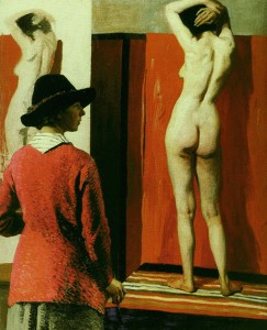
The portrait I chose in the National Portrait Gallery is “Self with Nude,” painted by Dame Laura Knight in 1913. This painting, illustrated above, is of a woman, the artist Laura Knight, painting a portrait of a nude female model. I found it striking as it was displayed in a large alcove, and its provocative nature most definitely caught my eye as it hung amongst other smaller, less distinctive portraits. Dame Laura Knight was an Official War Artist during the Great War (WWI) and recorded the famous Nuremberg Trials after WWII. In regards to this particular portrait though, it represents Knight’s prominence as a talented female painter defending the right for women to paint from a nude life model. The painting was placed in the gallery titled “We are making a New World Britain 1914-1918” where the gallery’s description stated that the Great War was an “end to an era, but it was also a catalyst for changes.”
Tags: 2010 Mary · Museums


