In Acre, Benjamin sees a major port city full of merchants from across the Mediterranean. He notes its strong walls, its thriving markets, and the mix of cultures living there under Crusader control. He estimates about 200 Jews living in the city and names several leaders of the community. He also mentions the ease of travel from Acre to surrounding regions thanks to its centrality in trade and pilgrimage. Acre feels like a crossroads in Benjamin’s account—a place where cultures intersect not only in trade but in governance. Christians rule the city, but Arabs, Jews, and many others circulate through it daily. Benjamin’s emphasis on the port’s international character shows how he imagines the Mediterranean world: porous, mobile, and full of economic possibility. His attention to Jewish leadership here shows that even in a Crusader city—where tensions could easily overshadow everyday life—Jewish communal structures persisted. Acre becomes a kind of reminder that empire and conflict don’t erase local coexistence.
Month: November 2025 (Page 1 of 6)
The Hereford Mappamundi was created after the time that Marco Polo was traveling, but Marco Polo would not have chosen to use it while he was traveling anyway. The Hereford Mappamundi was not created with geography and travel in mind. Its purpose was to be symbolic, and display art and religion in relation to the world as it was understood at the time through a Christian lens. The purpose of a modern map is to be geographically accurate and informed. The modern map would’ve better reflected the distances and landscapes of the places Polo was traveling to.
The Hereford Mappamundi is a T-O map that divides the world into only three continents, Europe, Asia, and Africa. I noticed while I was mapping Armenia and China that they were almost directly next to each other, which is inaccurate to how close they are in reality. The orientation and arrangement of the map distorts the actual distance between the locations. The map is also very obviously Christian oriented. It depicts Jersualem at the center of the map, and the world, and orientates the map with east at the top to represent paradise and heaven. This was one of the biggest differences in mapping on the modern map versus the Hereford Mappamundi. It made it extremely difficult to accurately map the places Polo traveled to on the medieval map. Polo begins his journey in Venice, and to accurately mark where that is, I had to physically take a picture of the modern map and rotate it to the east so I would get a better idea of where everything was located.
The Hereford Mappamundi also uses icons and drawings to represent locations. It has over 500 drawings that have spiritual meanings or depict a curiosity for parts of the world that were unknown. It includes biblical scenes, cities, animals, and depictions of strange people of the world. Some of the drawings were confusing, but others helped me locate the places I was mapping. For example, there is a drawing of an elephant that represents how Indian and Persian solders would use them as fighting platforms, and that story and image helped me find Persia on the map. On the modern map there is a complete arial view of every city in the world. You can see shops, monuments, parks, roads, and topography, which made it significantly easier to map the places Polo traveled to on the map because they were extremely accurate.
Marco Polo is very focused on Christianity throughout his travel narrative. He frequently talks about it, especially when comparing Christianity to other religions he saw. This is where I believe Polo’s travels and the Hereford Mappamundi are the most related. The Hereford Mappamundi is a visual representation of the Christian world as it was understood at the time. Polo would’ve agreed with the way the biblical history was explaining the origins of the world. The drawings that depict monstrous races and the unknown were also depicted by Polo in his travel narrative. He says “…all the men on this island have heads like dogs…” which perfectly matches the dog headed people or Cynocephali featured on the mappamundi (Polo 256). He interprets the people in Asia through a Christian medieval lens, just like the map. Though I do think he would’ve appreciated a map that was more geographically accurate because of his long travels and interest in trade as a merchant. He spends a lot of his travel narrative talking about the time and distance it took to travel to a new place, and a map like the Hereford Mappamundi, would’ve been unhelpful for the practical aspects of his voyages. A modern map would’ve given him a clearer view of the locations he was traveling to.
Marco Polo’s travel narrative gave his predominately Christian audience an interesting perspective of the world and how it related to their view of Christianity. The Hereford Mappamundi would’ve reflected this world view but been inaccurate in regard to the geographical locations and distances between the places Polo traveled to. Its purpose was to create a map that could be considered a work of art and reflect Christianity in regard to the world. A modern map would’ve been useful to Marco Polo’s travels but couldn’t reflect an accurate picture of how a Christian would view the world like he did at the time. The differences between the maps show how the ideas of the world influence the way the physical locations are shown, versus the spiritual meanings.
Map: https://storymap.knightlab.com/edit/?id=marco-polo-travel-map
The Tabula Rogeriana, completed in 1154, was an atlas commissioned by the Norman king Roger III of Sicily by Al-Idrisi, a Muslim geographer. Though it was one of the most detailed and accurate world maps of its time, it is very different from our standard world maps in 2025, almost 900 years later. Having plotted parts of Benjamin of Tudela’s journeys on both the Tabula Rogeriana and a modern map, there are several significant comparisons to be made between the two experiences. It is of course much easier to plot many accurate points on a modern map using modern software; GPS systems do most of the work for us once we enter the name of a town or city. I was able to plot dozens of places that Benjamin of Tudela stopped fairly quickly in Google Maps, as long as the location still existed or I was able to estimate where it is now.
On the Tabula Rogeriana, the cities are marked and labeled, but since it is written in Arabic and the points are quite small, I was not able to mark the locations as precisely as on a modern map and instead had to estimate where to place the icons. In addition, the axis is switched, with South on top according to medieval Muslim theology. Many features of the map are misshapen and features are also missing, which made some places difficult to map. Rome, especially, was hard to figure out, because its shape in the Tabula Rogeriana is very different from our modern visualizations.
One of the reasons that the Tabula Rogeriana is laid out very differently is that it places Mecca at the center of the world, which, like the South-North layout was standard for medieval Muslim maps. All of the medieval maps that we have studied, across various religions and regions, are based on ideology as well as, or more so than, geographical accuracy. This shaped the way that medieval travelers would have perceived the world, as well, when religion was central to life and philosophy across Europe and the Middle East, where Benjamin traveled. Modern maps, in contrast, are utilitarian, based on standardized measurements of distance. Though there are various projections which change the size of the continents in relation to each other, they are not constructed to promote a certain worldview or belief system.
In the 12th century, travel was hard and dangerous, and most normal people did not spend very much time traveling through their lifetimes. Travel itself was an enormous undertaking. Now, travel is easy, fast, and widely accessible. In some ways this is reflected in the difference between the two maps. When broad travel was difficult and rare, limited to walking, riding, or ships, constructing a map that accurately reflected the world was nearly impossible. It took Al-Idrisi more than 15 years to complete the Tabula Rogeriana, and he relied mostly on older writings and accounts of contemporary travelers. Modern technology allows us to map the world perfectly and access information about any place in the world in an instant. I was able to be more comprehensive and precise while reconstructing Benjamin of Tudela’s route in Google Maps, but the Tabula Rogeriana is likely closer to his conception of the world and how he would have mapped his travels.
StoryMap page:
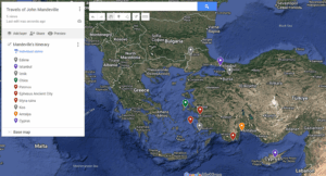
When trying to understand the confusing account of John Mandeville’s fantastic journey, it can be helpful to use a map from the period. The Mappa Mundi found in Hereford cathedral is useful for this purpose, being composed roughly contemporaneously with Mandeville’s The Book of Marvels and Travels. The writer of the Travels never actually visited the places he wrote about, and surely was working from sources similar to the Hereford Mappa Mundi. Putting both documents in conversation with each other, as well as a modern map, reveals several things about the mentality of people in the Middle Ages. The Hereford map distorts distance, heavily favoring the holy land and giving it prime place in the Christian worldview, as opposed to modern maps which aim for accuracy. The map also includes mythic and other classical knowledge, acting as a collection of information on what one can find in certain locations where modern maps tend to emphasize geography.
The Hereford Mappa Mundi, as well as Mandeville’s Travels, are thoroughly influenced by the Christian worldview of their respective makers. One can easily see this in how the Mappa Mundi presents geography and distance. The holy land takes up an absolutely massive amount of space, almost as big as Europe, which far outstrips its actual size in reality. Hereford’s Mappa Mundi does not pretend to give an accurate size, instead emphasizing the region’s importance within the Christian imagination. Supporting this is the Mappa Mundi’s subject matter. The world is covered in stories from the Bible, such as Noah’s Ark resting on Mount Ararat, the path Moses took the Israelites, and the centerpiece of Jesus’ Crucifixion on Mount Calvary. No wonder then that the Levant, the location of most of the Bible’s contents, takes up so much importance and space. Mandeville’s Travels does something similar. Throughout the book, its author is focused on the religious nature of the places he describes. From recounting miracles and informing readers about where to find relics, to when possible recalling the actual places certain biblical events took place, such as where to see the burning bush or where Jesus performed certain miracles. When in the holy land itself, this is the majority of Mandeville’s descriptions.
Also, both place Jerusalem in the center of the world, with the Hereford Mappa Mundi doing so in a quite literal sense. Mandeville agrees with this interpretation, describing in his section on India how that city is at the center of the world and travelers from everywhere else must climb up towards it. In his cosmology Jerusalem is both the center and at the highest point in the world to which all others ascend. Mandeville finds validation about this in a passage from Psalms where David says ‘God wrought salvation in the midst of the Earth,’ which he, and other Christians as evidenced by the Hereford map, took literally. This is a departure from modern maps. Jerusalem is not the center of the world, nor are our maps covered in Biblical allusions. Modern maps seek to emulate distance as accurately as possible to aid navigation, shrinking the holy land from its prominent place to a small bit of land on the Mediterranean. Despite this modern maps, as a necessity of projecting a sphere in 2D, must include some distortion. The popular Mercator projection has been criticized for making Europe seem far bigger than it is, and places like Africa smaller. Even though the overt Christian bias has been removed, mapping still requires a choice of what parts of the world to emphasize.
Along with Biblical stories, both the Hereford Mappa Mundi and Mandeville’s Travels include references to classical knowledge and myth. Mandeville’s travels on the map would take him past the ancient city of Troy, and the Labyrinth on Crete. In the book he similarly makes reference to ancient figures like Hermes Trismegistus and Hippocrates, as well as recounting fantastic stories about monstrous heads that destroy cities and maidens turned into dragons. Similarly, both include many of the monstrous races said to live in the terra incognita such as the Sciopodes and Blemmyes reported by ancient sources like Pliny the Elder. This allows both works to serve an encyclopedic purpose, acting as a collection of knowledge about the world for their audiences which, as evidenced by their similarities, were quite similar. Modern maps, on the other hand, eschew this. Most commonly they emphasize strictly geographical information, such as terrain features, distances, and the like as opposed to the catalogue of places, lore, and creatures that populate the world.
Mapping Mandeville’s journey on Modern and Medieval maps reveal different things based on different purposes. Medieval maps like the Hereford Mappa Mundi are repositories of various information including Biblical and ancient stories and the various peoples inhabiting far away places. Mandeville’s Travels serves a similar function for the prospective pilgrim to Jerusalem, meaning the two synergize well. Modern maps, on the other hand, emphasize geographical accuracy above all. Tracing Mandeville’s travels on a modern map allows one to see things like how far it would take to get from point a to point b or how difficult the terrain would be to traverse. Doing so on the Hereford Mappa Mundi allows one to see what Mandeville thought he would encounter on that journey, and just how central the pilgrimage was to the Christian mind.
Modern Map of Mandeville’s Travels:
Link to Mandeville’s Travels on the Hereford Mappa Mundi:
The journey of Ibn Fadlan, as mapped out on the Tabula Rogeriana, gives insight into how Ibn Fadlan visualized his journey. It also aids in realizing how complicated his travels actually were. The Tabula Rogeriana was created in the 12th century. Ibn Fadlan traveled in the 10th century. So, this map was not available for Fadlan to follow to navigate his journey to Bulghar. Even if he did have it, it would have still been difficult to follow. The Tabula Rogeriana maps the known world in the 12th century. When Fadlan was traveling, there were places that were still unknown that were featured on the Tabula Rogeriana. My limited knowledge of labels and places on the mapping was frustrating. Fadlan would have been traveling essentially blind; this must have been frustrating. These potential frustrations can be examined by comparing Fadlan’s journey on a modern map versus the Tabula Rogeriana.
The biggest difference between the modern map and the Tabula Rogeriana is the orientation. The Tabula Rogeriana is oriented south upwards. When he was traveling to the North, he was envisioning himself walking down towards the pole. This wouldn’t have affected his own view of his travel, as his worldview was south-oriented upward. This was a principle of the Islamic view of the world. However, what could’ve been difficult was if he got directions or insight from other travelers on how to find any of the locations he needed to go to. We know he interacted with people of different religions. The logic about where things are oriented may have been different from his, making travel difficult. Fadlan wasn’t just wandering through the Middle East and up into Europe. He had set locations where he was going. Therefore, he needed directions. Some of the places he stopped didn’t seem calculated; they weren’t a part of a “trip itinerary.” However, some of the locations were pre-planned. He stops in Bukhara to receive money for the mosque in Bulghar. He needed to know how to get here. Without having a map, this must have been very difficult.
Another difficulty in his travels comes from the differences in geographical features. On the modern map, the Caspian Sea is (obviously) the correct shape. On the modern map, the Caspian Sea is a lot longer (it kind of looks like New Jersey); it is just generally bigger. However, on the Tabula Rogeriana, the Caspian Sea is significantly smaller. It is a lot more circular. The whole tale of it is missing. Obviously, the medieval map isn’t going to have the right shapes of every feature and country; everything is an estimation based on people’s accounts of their travels. Fadlan would have had a less accurate idea of the shape of the Caspian Sea. You can tell this by looking at the direction of his travels on both maps. On the modern map, Fadlan swings very widely to the left of the Caspian Sea. He goes out of his way to seemingly make sure he doesn’t intercept the sea. His stop in Bukhara was pre-planned; this was one of the locations he knew how to reach. This seems like a way to avoid geographical issues as well as completing tasks for the Calif.
The last large difference between the two maps is the distance between the top and bottom (north and south). On the modern map, Bulghar is significantly farther from Baghdad than on the Tabula Rogeriana. The scale of the maps is completely different. The Tabula Rogeriana under-accounts the distance between the two places. I thought that the Tabula Rogeriana was out of scale; however, the scales of Egypt and Saudi Arabia are pretty consistently sized with the modern map. These scale differences wouldn’t have necessarily affected Fadlan’s travels. However, it does change the perspective of how people would have viewed Fadlan’s journey.
In conclusion, Fadlan’s journey wasn’t much affected or changed by the differences in the two maps. The biggest difference between the two maps is the orientation and views of the world. This, to a modern traveler, seems foreign; however, to Fadlan, this would have been the norm. The only confusion could have been sparked by discussing directions with non-Islamic travelers. The second difference would be the ideas of the shape and location of geographical markers that could have affected the exact navigation of his journey. Since they didn’t know precisely where these geographical obstacles would have been, they could’ve over- or undercompensated for avoiding them. Overall, his actual journey was simply perceived differently by modern viewers and non-Muslim audien
While it was sometimes difficult to plot the points of Marco Polo’s journey onto a modern map due to ancient locations and names not lining up with those of the modern day, it seems even more confusing trying to map these modern points onto my ancient map simply because of the visual differences and artistic vision of the two separate maps. Looking through a strictly visual lens to start, it is clear that the Tabula Rogeriana as an ancient piece of cartography carries different perspectives on the world from what we know today, the space being represented in physically and culturally different ways.
At a first glance, the Tabula Rogeriana looks like a completely different world, and the landmasses look like something you would see in the front pages of a high fantasy fiction novel. But turning the map upside down and taking a careful look will show that it does indeed represent the majority of mainland Europe and Asia, as well as Northern Africa. The difference in appearance comes from how the map has been oriented upside down, at least according to our traditional Eurocentric views on what a map should look like. Instead, and this is due to the map’s creator being Muslim, the map takes on an Islamic view of the world where South is oriented towards the top of the map.
The Tabula Rogeriana also provides an outlook that is more interpretive and is put together through scholarship and beliefs about the world, as well as the desire to see pathways and obstacles in relation to trade. It is organized into a kind of grid, where one might be able to pick out a certain section of the map and do a cursory analysis of the region based on the important features drawn in. Individual settlements, forests, mountains, lakes, rivers, and roads can be seen clearly on the map, as they are drawn to stand out sharply as features of note for a traveler through the region. Being able to see all of these geographical features from such a wide lens on the map offers an important but also very vague interpretation of direction and landscape across the continents. This is opposed to the digital modern maps of today, where a zoomed out view will show general topography and borders, but zooming in allows for extremely precise location tracking, names of roads and buildings, directions, and more.
This contrast carries over on a grander scale as well when looking at the organization of the world and its continents on the Tabula Rogeriana. With the precise tools, mapping, and satellite views of today, we have been able to carefully and accurately map out landmasses with greater care for scale. It is clear when looking at the ancient map and trying to plot points, there was not a lot of knowledge or care for the true scale of things, but the real focus was giving a simple regional overview. Compared to other ancient maps, this one is surprisingly easy to interpret when trying to make out the picture it is painting of the globe. You can see the European peninsula and the extension of Italy clearly, and make out the Middle East, Eastern Asia, and Northern Africa as separate entities – albeit ones still blocky in form and completely off scale. This becomes more of a problem when looking at all of the various islands, which generally are not differentiated from one another much, and are really just grouped together tightly to show that they are all in the water over there somewhere, but the distances between the islands are not mapped at all.
Based on all of these things you can point out between the two maps, I would generally say that when we look at maps today and all of our navigational devices, we are using them strictly directionally and for the sake of knowing where we are and which direction to travel next. In ancient maps such as the Tabula Rogeriana, I would say there is more cultural weight behind the cartography, and while the geography was not as well known, the cartographers of the period aimed to implement more cultural knowledge and ideas about how the world was connected. Growing trade and travel necessitated clear pathways and markings of what settlements were in a region, as well as potential geographical roadblocks to be encountered. Using my previous points I plotted on the modern map in relation to Marco Polo’s journey, and trying to plot them on this ancient map, it is interesting to see how difficult travel must have been and how impressive it was for him to include multiple measurements of distance, especially seeing how vague distances were when looking at the Southeastern Asian islands. Today, we would look at our GPS and think about ourselves, where we are, what our next stop is – ancient technologies were less precise, but the growth in travel subsequently grew the desire for knowledge of the wider world.
Comparing Margery Kempe’s journey on a modern map and the Psalter World Map juxtaposes how a modern traveler and a medieval traveler visualize the world differently.
The modern map provides a modern traveler with a physical and geopolitical understanding of the world. This map defines countries with strict borders, establishing that different regions have separate cultural and political identities. Cities are labeled, with the more prominent and larger cities labelled in bigger fonts, reflecting their social significance and popularity. Generally, continents are scaled to reflect their comparative sizes. While this map is a world map, it also reflects the U.S. government’s (and some Americans’ perspective of the world). For example, this map uses the label “Gulf of America” rather than “Gulf of Mexico.” In addition, the labels are in English, meaning that location names are anglified, and not necessarily written how a native speaker would write them..
The Psalter World Map provides a medieval traveler with a different physical and geopolitical understanding of the world that is largely rooted in Catholicism. Jerusalem, the holiest city, is placed in the center of the world. The cardinal directions are rotated ninety degrees, with east as north, due to the belief that Paradise (the most Northern/upwards point) was in the same direction the sun rises.
While the modern map is divided into countries, the Psalter World Map has no country borders. The T-O structure of the map uses the Mediterranean Sea to generally separate the world into three land masses, though there are no defined countries with names. Instead, it depicts some prominent geographical features, such as bodies of water and mountains, and prominent cities (represented by gold triangles). This layout of the map suggests a worldview in which different geographical groups of people are viewed not by country, but through a religious lens. Each of the three land masses is representative of the descendants of one of the three sons of Noah, informing how the people in each of those areas may have been perceived. For example, the top left of the map is an illustration of Alexander’s Wall, behind which were meant to be the cannibalistic descendants of the evil sons of Cain, the Gog and Magog. By depicting this religious lore, the Psalter World Map identifies those living in the Northeast of the world as evil cannibals.
Like the modern map reflects a modern day American perspective, this map reflects an English perspective from (roughly) the thirteenth century, due to the location and time of its creation. This English perspective of the world is evident in the amount of locations labelled in each area. Outside of Jerusalem with its many labelled (religiously informed) locations, the bottom left quadrant, closest to Britain, contains the most labelled cities. Meanwhile, the right side of the map contains depictions of the “monstrous” races, or people/creatures with multiple or missing body parts. This portrayal of people in the southern part of the world reflects that those in Britain knew less about the world the further it was from them, allowing speculation and folklore to shape their understanding.
An additional element of the modern map that the Psalter World Map lacks is the inclusion of roads. This aspect of the modern map emphasizes that its priority is to give instruction for travel. The modern map suggests that the modern traveler views their place in the world as a specific geographical point, and the purpose of a map is to accurately assess this point in relation to the rest of the world. It offers physical guidance on how to reach a specific location, not only through its depictions of roads, but its depictions of mountainous terrain and bodies of water, which both accurately reflect the physical world and illustrate potential geographic barriers to a modern traveler. Country borders also provide this type of logistical information, as a border crossing can be an obstacle for travelers.
Instead of providing practical and logistical information for travel, the Psalter World Map’s visual priorities are in religious illustration. This purpose can be seen in the colorful and detailed artwork not only on the map but surrounding the map– angels surround the world, along with the upper body of Christ, who has a large halo of gold. In his hand, Christ holds a T-O sphere, expressing that he is ruler of the world. Margery begins her journey in Britain, located at the bottom of this map, and in moving physically upwards on this map to reach Jerusalem, the map shows Margery is moving closer to God on her journey. This idea suggests that in going on her pilgrimage to Jerusalem, a medieval traveler like Margery would have held the perspective that she was not only symbolically and spiritually growing closer to God, but also physically moving closer to him. Further, by physically (in her mind) moving up in the world, she could have felt that her religious status and quality of life was also moving upwards. By looking at the modern map, a modern traveller can see the impressive length and physically difficult journey Margery went on (traveling more than 3,000 miles southeast), which, though it does not support this religious narrative of moving upwards and closer to God, does reflect the strength of her religious devotion.
While the modern map is a physical representation of the earth, visualizing logistical and terrain-related information, it also reflects a modern day geopolitical understanding of the world. The Psalter World Map frames the world from a religious viewpoint, both physically and through the religious illustrations surrounding it. Rather than categorizing people by countries, it expresses a medieval idea in which areas are generally understood through religious scripture and speculation. In mapping Margery Kempe’s journey on both of these maps, a viewer is able to compare their modern day understanding of the world and travel to the Catholic perspective through which pilgrims like Margery Kempe saw the world and understood other people.
Travelling during the Middle Ages was not an easy task due to the lack of information people had on foreign areas, the limited options for travelling – either by foot or by animal – and the risk of coming into contact with dangerous persons or events. Even so, people, like ibn Fadlan, still journeyed into the unknown world. Fadlan’s journey took place from 921-922, and he travelled over 2,000 miles from Baghdad to Bulghar, or modern-day Republic of Tatarstan. Although the Middle Ages did not have an abundance of mapping technology, there were some advancements made, like the creation of the Tabula Rogeriana in 1154. The Tabula Rogeriana, created by Muhammad ibn Muhammad al-Idrisi and commissioned by King Roger II of Sicily, was a huge step forward for cartographical progress during this era (Sturtevant). I have produced ibn Fadlan’s trip on both a modern map and the Tabula Rogeriana, which creates a better understanding of what travel was like in the medieval era compared to how travel is in the modern age. Although both maps were created centuries after Fadlan took this journey, considering the medieval map, it goes to show the sheer difficulty of traveling during medieval times due to the lack of information and preparation travelers like Fadlan had access to.
While mapping this journey on two different maps from different points in time, the disparities between the maps are very apparent. For the modern map, mapping ibn Fadlan’s stops was fairly easy. I only ran into some difficulties because some of the cities do not even exist anymore. Most of the cities Fadlan traveled to now have a different name in the modern world than when he visited, so I needed to research on the cities’ modern equivalents. The name changes can be because of some historical implications, like perhaps someone conquered the city and changed the name, or it can be the result of linguistic and cultural influences changing over the course of history. Other than that, it was pretty simple to transcribe his journey onto the modern map because I just typed in the name of the city, and the technology took care of the rest. The medieval map was certainly not as simple. To start, the Tabula Rogeriana is flipped from the modern perspective, meaning North is down and South is up. This is due to the Arab-Islamic cartography influences al-Idrisi learned,
where the scholars depicted North at the bottom of the map and South at the top because they believed up is good and down is bad (Pastuch), so I needed to reorient my thinking. Then, I needed to place the points I believe to be the locations of the cities Fadlan visited purely based on the modern map. The Tabula Rogeriana has cities depicted by the little black dots, but the labeling is all in Arabic, which I do not speak, so I had to estimate to the best of my ability. Also, the Tabula Rogeriana does not include borders on the map, so I needed to use other landmarks to help with my estimation of each point, such as the mountains and rivers. The inclusion of the different topographical elements denoting mountains and rivers show that although this map is from an entirely different era, they still had the ability to track and illustrate these features, which would be of great help to a medieval traveler.
Both maps presented challenges when mapping out Fadlan’s journey, but the medieval map of the Tabula Rogeriana is definitely the more difficult one to use. Cartographers had limited information since the only information they had was either their own experience or their colleagues’ experience, so they ran the risk of spreading false information about these locations. The Tabula Rogeriana had the influence of people from all different religious, occupational, and cultural backgrounds, which is what made this map so important for its time (Pastuch). The collaboration of the Arab-Islamic influences al-Idrisi learned from the Balkhi School of Geography (Pastuch) and King Roger II’s Christian influences is why this is one of the earliest examples of multiculturalism, which is demonstrated by the lack of borders included in the map. The area is one united mass and not separated by religious differences or culture. On the modern map the borders separate countries by government control and territorial agreements. Information for the modern map does not come from word of mouth, but by modern technology. This technology gathers every piece of data about every location on Earth. Modern travelers do not face nearly as many of the same concerns as the medieval travelers, and it is all because of technology. There is no guesswork, the information is all at their fingertips.
Ibn Fadlan’s journey included various stressful points, but his lowest point during his journey was his visit to Jurjaniya due to the intensely cold climate. He and his group needed to stay in Jurjaniya for three months due to the frigid weather and he describes it as, “the cold of hell” (Fadlan 7). Fadlan would have greatly benefitted from modern technology, especially weather applications that would have warned him about the climate of the area he traveled to; furthermore, the modern map could also give him an alternate route so he could avoid places that would cause him such hardship. It took Ibn Fadlan about a year to travel about 2,000 miles, and in the modern age, that trip could take a person five hours by plane. It is miraculous how far technology has come and what it has given people the ability to accomplish. Ibn Fadlan virtually traveled all that distance to meet the king of the Saqaliba in the land of the Turks (Fadlan 25), which in modern day could have been a day trip or a Zoom meeting. Ibn Fadlan was proud to serve the caliph and promote Islamic worship, but I assume he would have appreciated the modern inventions that decrease the risk and hardship of travel needed to accomplish tasks.
Works Cited
Ibn Faḍlān, Aḥmad, et al. Ibn Fadlān and the Land of Darkness : Arab Travellers in the Far North. Penguin Books, 2012.
Pastuch, Carissa. “Al-Idrisi’s Masterpiece of Medieval Geography.” Library of Congress Blogs, Jan. 2022, blogs.loc.gov/maps/2022/01/al-idrisis-masterpiece-of-medieval-geography/.
Sturtevant, Paul B. “A Wonder of the Multicultural Medieval World: The Tabula Rogeriana.” The Public Medievalist, 9 Mar. 2017, publicmedievalist.com/greatest-medieval-map/. Accessed 9 Mar. 2017.
Marco Polo is renowned for his travels across the Medieval world, but notable, he would never have used a navigational tool such as the Ebstorf mappamundi during his travels. A concept such as using a map for directional information was not standardized and most travelers would resort to hiring guides or consulting manuscripts akin to those of Marco Polo’s for navigation. Because of this, mapping Polo’s travel route on an incomplete, biased, and overall incomprehensive is a argues endeavor since the creator of the map was not focused on geography, place, location, or even realistic accuracy. Instead, the Ebstorf map is filled with European ideas of the eastern world based on classical literature and Biblical overtones. Additionally, parts of Asia are completely unknown and not mapped at all. It is not even just Asia that is at risk. Domestically, countries are shrunk down to unproportionale sizes or in the case of Italy, Marco Polo’s native land, represented as sole city.
In comparison to a modern map, the Ebstorf map falls phenomenally short at being a device a traveler can use to orient themselves. The most notable difference is the overall size. While I had initially only plotted out Polo’s journey through mainland China on a modern map, doing as such on the Ebstorf map was simply impossible. To begin, China is not labeled as a definitive place on the map. The general direction of Asia is north of the “T” aspect of the map, dividing the world into three segments, leaves very little room to definitively mark each city Polo noted in his travels. Instead, I traced Polo’s journey starting from his departure in Venice. As mentioned previously, Italy is not represented geographically, but rather as a large circle of churches with a lion nearby comprise the city of Rome. Rome is reprehensive of a larger theme of the map: religion and its influence on the physical landscape of the world. Italy is only represented as Rome because of its ties with the Vatican and the Holy Sea. In contrast, Polo’s trail on a modern map shows only factual information of where he traveled and says nothing to how medieval people such as Polo would view the rest of the world.
The Ebstorf map puts into conversation European ideas of religion with the locations of places, showing how God and His Kingdom are everywhere in the mortal world, functioning more as the “medieval European’s view of the world” opposed to what it realistically looks like. Marco Polo reflects this in his accounts of his journey. Every place he goes, Polo mentions Christianity or how the area he is currently traveling through differs from the traditional Christian values. For instance, the second area plotted on the map is Jerusalem, which is notably one of the largest icons on the map, but also in the center of the whole world. Jerusalem is the Holy City, one of the most significant cities in the Christian world, so it being in the center of the world further supports how medieval map makers were influenced by the religion at the time. Other locations like Ayas, Saba, and the Grave of Saint Thomas, while not explicitly shown on the map can be located through iconography of Christian elements. In particular, Saba, the city where one of the three magi who came and bore gifts to the baby Jesus, is reportedly buried there, with the other two buried in surrounding locations. Saba is not on the map, but a turret where a plume of fire is spitting out at the top resembles the castle Polo talks about where “fire is worshipped”. The symbolism of the castle standing in for any geographic location or even a name is representative of how the map was “made for Europeans by Europeans”. Inversely, areas of the world such as Myanmar are not with any definitive characteristics. The boarders of the map consist of mythical and misshapen people which fit the medieval narrative of not knowing what is beyond the gates of their own world. Polo “visits” such a place when he travels to the city of Mein, in Myanmar. There, Polo encounters what the Ebstof map considers “the boarder of civilization and humanity” and makes his journey seem like he has traveled across planes into a land of chaos and magic.
Marco Polo’s tales of travel were some of the most popular in the medieval world and even in the present day. His travel accounts give insight into how travelers from Europe would view the world and then bring back their discoveries and share them with others. This in turn influences how medieval map makers would style their maps, creating the world in the image of how a European would view it since that was all the information they had to base their designs off.
MAP: https://uploads.knightlab.com/storymapjs/fbe66306001392d57a9e7aec871afb8a/ebstorf-map/index.html
After re-mapping Margery Kempe’s travels on the Bianco Map, it became evident that the major difference between Bianco’s Map and Google Maps is specificity. Bianco’s Map depicts many important locations and areas of the world, but it tends to ignore anything considered a ‘minor’ city (often cities of less religious importance, and therefore fewer visitors). Marking Kempe’s journeys on this vaguer map proved to be more difficult simply because I had to estimate the locations of places like Constance and Great Yarmouth in relation to larger bodies of water or other landmarks. Because of this lack of specificity on Bianco’s map, Kempe’s travels may be more difficult to follow, or the markers of certain locations may be entirely incorrect.
Further, Bianco’s map is an artistic rendition of the world that utilizes illustrations to mark specific cities. Borders are completely omitted, while they are something our maps today rely heavily on. One of Google Earth’s central capabilities is to show specific borders of countries, cities, and continents. The way we understand travel today is based on the idea of crossing borders – whether that means crossing borders to other states, or farther away to other countries. While Kempe was certainly aware of crossing into other countries, the awareness of a specific line or immediate transition may have been less apparent than it is to us today.
Bianco’s interest in the religious significance of major European cities is clearly evident on this map. As with most medieval maps at this time, Jerusalem is oriented in the center of the map, highlighting its significance and centrality in the world. For Bianco and Kempe, and other Christians on pilgrimage, Jerusalem’s orientation in the center of the world makes the most sense, as it is the location for Jesus’s adult life. Surrounding areas, including the Red Sea, depictions of Adam and Eve, and proverbial characters like the three wise men, show the significance of religious themes in understanding travel and location in Europe. Even beyond the landmarks and depictions of cities, Bianco’s religious expertise is evident in the outskirts of the map: the world is surrounded by the stars (heavens), and the farthest reaches of the ocean show fantastical creatures like two-tailed sirens and two-winged dragons.
In addition to this map representing common religious ideologies, it’s imagery also holds underlying racist themes. The existence of Gog and Magog as one gets closer to Africa is something that should not go unnoticed. Because of this map’s emphasis on imagery to show location, the images tend to represent common notions of what those locations hold (mostly religious importance), and having the people of Africa become more monstrous, fantastical, or dangerous shows the racist ideas European people held about African people. Bianco’s map is opinionated and based on religious and cultural beliefs, while today’s maps, especially Google Earth, lean more toward factual and scientific evidence of location and proportion. That is not to say that Bianco’s map holds no accuracy, though. In her book on the world map, Evelyn Edson says, “It is a struggle between the authority of the mighty classical past, the religious orthodoxy of the medieval mappaemundi, and the practical experience of sailors, ‘persons worthy of trust who have seen with their own eyes’ (Edson 7).” Bianco’s map was accurate, or at least as accurate as possible for the time period, but it certainly is not as accurate as modern maps.
On Bianco’s map, the distance of Kempe’s journey seems to be across over half of the length of the world. If Bianco’s map is, in fact, a map of the entire world, Kempe has seen a significant portion of it. In relation to our modern map, though, Kempe’s travels cover barely a fraction of Europe, let alone the whole world. The sheer size of the map on Google Earth is significantly larger than Bianco’s Map, even though, at their time of creation, both are believed to depict the entire (known) world. To Kempe and most of the European world at this time, her travels seemed quite extensive, and while they certainly were for the time, our understanding of travel in today’s world far surpasses what it once meant.
Overall, there are many differences between Bianco’s map, Google Earth, and what that means for those who utilize each atlas. One of the most difficult parts of mapping Kempe’s travels on Bianco’s map was the medieval map’s orientation with east at the top. To ensure my locations were marked correctly, I rotated Google Earth 90 degrees to the left to make the maps match as closely as they could. After comparing both maps, readers can see that Bianco’s map holds important cultural information on beliefs of travel, religion, and race, while today’s map values specificity, facts, and scientific proportions to ensure accuracy.
Edson, Evelyn. The World Map, 1300-1492 : The Persistence of Tradition and Transformation. Baltimore, Sante Fe, N.M., Johns Hopkins University Press ; Published in association with the Center for American Places, 2007.