UnJust Sustainability in Cambridge MA
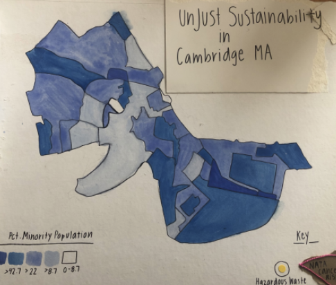
For my project, I decided to focus on Cambridge, Massachusetts. I have lived in Cambridge my entire life, and I have found it to be an extraordinary place to study— It is diverse in race, religion, and economic status, and incredibly rich in culture. This was apparent to me during my time at high school, where our motto was “Opportunity, Diversity, Respect,” and the minority population of the school was 61%. Although I did have peers from many different races, religions, and economic classes, I would only see these students while I was at school; Our individual communities and homes were pretty drastically separated. This separation is incredibly important to understand when analyzing environmental bads within a place— Although Cambridge as a whole is diverse on paper, it has specific areas in which people live based on race and economic status. After further research, I have found that these areas relate to the location of environmental hazards as well. In Cambridge Massachusetts, the largest clump of hazardous waste sites is located in the area with the highest minority concentration. This area is also in the 70th percentile for cancer risk due to air pollution, (the highest in the city) as determined by the National Air Toxic Assessment (NATA) conducted by the EPA. There is a clear connection here between exposure to carcinogenic toxins and race, demonstrating that Cambridge Massachusetts suffers from clear unjust sustainability.
For my artistic representation, I decided to create a multi-layered map of the city made of recycled materials. The base layer shows Cambridge divided into percentages of minority residence. The second layer (visible through a plastic produce bag) shows the location of the city’s 24 hazardous waste sites. The third layer (an additional plastic bag) shows the areas of Cambridge with the highest NATA determined Cancer Risk. (The brown areas are from a recycled paper shopping bag, and the yellow dots are cut from recycled card stock.) I hope that through seeing the environmental issues of Cambridge layered above the areas with the highest minority population, you are able to see the correlation between race and risk.


FS
May 1, 2020 — 5:39 pm
I like how you used different layers to represent the issues. I think there is a connection there, because environmental issues are multilayered. During your research did you find people are aware of the hazardous waste sites in their community?
burkea
May 1, 2020 — 6:06 pm
Thanks so much! I’m glad that you liked the layering- I figured by representing it this way it would be helpful both to see the intersection between race and environmental issues as well as their complexity.
Although I did not interview anyone specifically for this project, I did talk to my parents and a few high school friends about the issues- none of us had any idea about the correlation beforehand!
Anna
May 1, 2020 — 5:40 pm
Your use of the different layers really emphasizes all of the different factors leading to high instances of cancer. It’s a very important project to raise awareness for the disproportionate cancer risks in Cambridge and show how people are more at risk than others.
burkea
May 1, 2020 — 6:08 pm
Thanks! I think that although we do not yet know everything there is to know about cancer and its spread, it is important to highlight what we do! Certain chemicals are known carcinogens, and they target specific groups of people- acknowledging this is the first step towards solving the problem!
galbanv
May 1, 2020 — 6:03 pm
Your explanation of the dynamics of Cambridge was great. I’ve never been but it sounds like a really interesting place. I loved your visual. The layers idea is so creative! It really helps demonstrate your point. Are there currently any efforts to bring attention to this issue?
burkea
May 1, 2020 — 6:09 pm
Thanks! Although I uncovered some efforts to reduce the amount of lead contamination within the city (specifically in the areas surrounding these sites) I saw nothing about the toxic air. Perhaps this project could get the ball rolling?!
Kathryn
May 1, 2020 — 6:03 pm
It’s really discouraging to see such clearly segregated issues like these. Do you know anyone who has been personally affected by contamination from these hazardous waste sites? I also wonder whether there is one type of hazardous site that is predominant in Cambridge?
burkea
May 1, 2020 — 6:42 pm
I agree! Although I have not talked with anyone other than my family about the contamination, I assume that I know a few people who have been personally affected!
As far as information, it was severely limited. It listed ‘no data available’ for almost every section, on each site for the specific hazardous waste sites. However the neighboring town seemed to have tons of information- could this mean there is something that we are not supposed to know?
levinana
May 1, 2020 — 6:14 pm
Really eye-opening project and visual Anna! I especially like your observation that although you interacted with peers demographically different from you at school, your home locations and environments were much more distinct. I wonder how you view this disparity–what role did the education you all received play in mitigating this environmental bad?
Nat
May 1, 2020 — 6:24 pm
Because I’m from Boston, I was looking at the EJ maps of the Boston area. I zoomed into the Cambridge and Somerville area and saw interesting things involved with I think water contamination from MIT. Did you find anything on this?
palaciom
May 1, 2020 — 6:26 pm
I really enjoyed the visual! Its is insane that the level of cancer risk is in the 70th percentile in the area.
brownemm
May 1, 2020 — 6:46 pm
This issue is so important, I really enjoy the way you were able to add layers to your visual. Its so important to understand the way redlining has created deep inequalities, especially relating to health risk. This is also particularly important now as we know people who with pre-existing conditions, especially conditions that impact the lungs, are at a much higher risk of complications from coronavirus and we know African American communities are being disproportionately impacted by COVID-19. It will be interesting to see, as more tests are conducted, to add another layer to this map of known coronavirus cases, especially severe cases.