As you all know, Moodle was upgraded this summer. The main functions stayed the same, but the look/feel of Moodle changed. Below are my personal thoughts regarding the upgrade. My thoughts reflect what I see in the design of the system. If you are experiencing technical issues such as file failures and such, please email those issues to helpdesk@dickinson.edu so we can get them resolved. I also encourage you to watch Brenda’s New Moodle Overview video playlist with this link.
My Thoughts
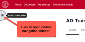
I personally really like how it looks now and I’ve found the addition of the navigation menu on the left-hand side of each course to be very helpful. I’ve always disliked how much we had to scroll in Moodle because most people keep everything on the course homepage categorized by topics or weeks. With the navigation menu on the left, we’re now able to click and go directly to whatever we need to access. In short, the new navigation menu eliminates unwanted/unnecessary scrolling altogether.
I also really like the new text editor. The buttons are all very useful and it’s easy to see what each button does. Additionally, we can click on the down arrow to expand the text editor to reveal even more tools that most people don’t use, but are good to have.
One of those tools revealed by the down arrow is an accessibility checker. No accessibility checker is 100% accurate, but as Marni Jones and I make the rounds talking to as many people as we can about Universal Design for Learning, it’s good to know that you all have access to such a tool right in Moodle. If you’re looking for the button, it’s near the bottom of the editor and looks like a person with a circle around it.
Speaking of accessibility, the addition of so much white space on the course homepages is most welcome! The old Moodle seemed very clogged up with icons and text that was all very close together. The upgraded Moodle uses larger icons and more white space between items. This is a huge win for our students with various disabilities, including low-vision and a few cognitive disabilities.
We’ve received a few Helpdesk tickets asking us to decrease the size of the icons so that people don’t have to scroll so much. If you are worried about too much scrolling, I encourage you to use the navigation menu on the left and please make sure your students know it’s there because this is new for them too. I also encourage you to reach out to my team regarding other options for how to organize your content. There are things you can do with Moodle (even old, pre-upgrade Moodle) that will cut down on how much scrolling you and your students are forced to endure.
My team stands ready to help anyone and everyone with this Moodle upgrade. Please don’t hesitate to ask for help by either emailing your department liaison directly or by emailing helpdesk@dickinson.edu
James D’Annibale
Director of Academic Technology
Note: If your navigation sidebar is collapsed, you can click on the button in the top-left of your Moodle courses to get it to open.
Leave a Reply
You must be logged in to post a comment.