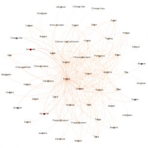
How it was made
- I exported a csv from the database with three columns: native language of sender, native language of recipient, and date.
- I installed and used this tool, Eonydis. http://www.clementlevallois.net/software.php
- Opened that program and selected the file.
- Next clicked the Select Field button.
- I only specified the source, target and date fields. Just click the Next for others. Note, it lets you specify the format of your date, mm#dd#yyyy.
- That then creates a graph file that can be opened by Gephi. Download and install Gephi. https://gephi.org/
- Open Gephi and import the .gexf file you created.
- You network will probably look like gibberish at first. To untangle and made sense of it, choose a Layout and click the Run button. I’ve seen Force Atlas 2 mentioned, but I had the most luck with Fruchterman Rheingold. You can then use the hand to tool to move nodes around. Check out the other tools as well, especially the Heat Map. Click the T (text) button on the bottom of the main window to see your labels. The top box on the left is how you determine if weight is displayed by size or color. Click the ranking tab. I set my Nodes to Degree and then chose the color wheel. Choose the diamond to have the node labels size be a reflection of their weight.
- When your happy with the structure, click the Preview tab at the top. This is where you’ll make it look pretty, or try. Nodes are the dots, edges are the connecting lines. You’ll probably want to check the box for Node Labels, and note the Proportional Size check box as well. Play with colors, labels, and opacity. If you have a time field, you can also enable the timeline. Important note, you have to hit the Refresh button to see your changes.
- Export your file as an image
