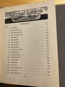
This blogpost will concern Moby Dick with illustrations by Rockwell Kent. The book has 863 total pages and is 5.5×7.5×4 (14x19x10). With 822 of those pages begin for the text and illustrations of the novel, 41 pages of front matter, and 10 pages of back matter. The front matter is composed of the dedication, copyright information, table of contents (which includes a beautiful illustration of Captain Ahab’s ship), an Etymology section, and an extracts section. The extracts section contains quotations from sources that Melville used in the authoring of Moby Dick.
This edition was published in 1930 by Random House, and is set in Monotype Fournier, according to the colophon, and is a condensed version of the Lakeside Press’s three volume illustrated edition of the aforementioned novel. As such, the images within are reproductions of those done by Rockwell Kent for that edition. Thus, this should be considered a special edition but not a first edition as neither the illustrations nor text are original to this particular print run.
This volume is most likely clothbound and shows signs of use around the edges especially on the spine, and at its corners. In particular there is fraying along the top and bottom of the spine. One is also able to see the cardboard underneath the cloth at all of the book’s corners. The cover of the book has the title “Moby Dick” on it and has an image of the whale’s head breaching the water with its mouth open. While the spin says “Moby Dick Illustrated by Rockwell Kent” at the top, has an image of the whale’s tail in the middle, and says “Random House” at the bottom. The ink used for this is silver, and is recessed within the cover, that is, if one runs their hand over the illustrations and title, you can feel that they are slightly lower than the black portion.
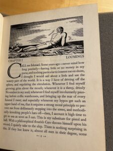
The illustrations in the edition are absolutely beautiful and integrated into the story seamlessly. They occupy space at the beginning of the chapter, usually at the top of the page on which it begins. In the case of Chapter One there are two images. The first, is above the words “Chapter 1” and its title. The image showcases a man lying on his stomach, facing away from the viewer, and looking out to sea. This goes perfectly with the subject matter of the chapter, as Melville details man’s calling for the sea. One can only assume that if we could see the man’s face, it would be clear he is awestruck by the beauty of the ocean. Then, at the very end of the chapter, after the conclusion of the text there is another man, this time sitting on a log, which could be a support for a pier, gazing longingly out to sea, this time with a ship in the background.
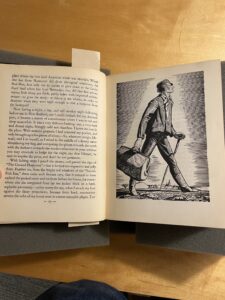
The images are in black and white and are composed of a series of very thin lines. The lines are given length and coloring which create the shapes that Kent is portraying in his illustrations. The drawings add a tremendous amount to the reading of the novel. Particularly in chapter two, where the reader flips the page from 9 to 10, and sees a full-page drawing of Ishmael walking towards New Bedford. The only thought I had when seeing this image for the first time was, “Wow, this is fantastic.” Indeed, the images are the main reason I chose to work with this particular book. While Moby Dick Or The Whale, as is printed on the inside cover, is a classic novel in and of itself, something about the illustrations make it incredibly fun to read. Perhaps, it is because we are first acquainted with pictures in novels as children, and typically, we lose these images as we grow older and read more complicated texts. I cannot help but smile when I see the images in this edition.
This book is fun to read and while the illustrations are absolutely the center of attention, the condition of this book contributes greatly to the reading experience. It feels very solid and does not seem brittle or fragile at all. Oftentimes when reading a book which was printed almost 100 years ago, I feel great anxiety in even touching it. Like one wrong move and this object which has survived generations of readers is going to explode in my hands, and I will be responsible for its untimely demise. This is not how I feel with this edition of Moby Dick. The binding still feels tight and strong, the paper is thick and of solid quality. It does not feel like it would rip if touched in the wrong way, which is common of many editions printed more recently. Indeed, the build quality of this book is extremely high. In addition to this the type face used in this edition is incredibly legible.
Overall, this particular special edition of Moby Dick is a joy to read. While the illustrations are the highlight, and the distinguishing factor of this book, the font, the construction, and Melville’s timeless prose all contribute to an absolutely fantastic reading experience.
Leave a Reply