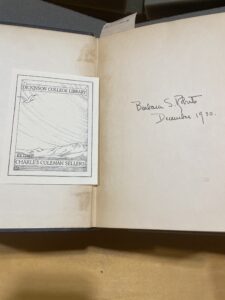
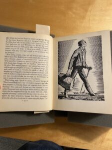
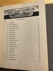
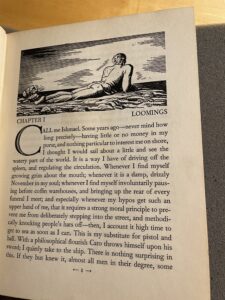
In my earlier two posts about Moby Dick; Or the Whale with illustrations from Rockwell Kent I have given a description of the physical copy and written about its position in the life of the novel more broadly. That is, this edition of Moby Dick popularized the novel and brought it to the attention of readers worldwide. This blog post returns to the copy in the Dickinson College archive. While there is much we can learn from writing about this edition more broadly it is impossible to ignore the differences between specific copies and what that can tell us about its individual history. This one, for instance, holds the signature of “Barbara S. Roberts” on the inside cover.

Roberts was the second wife of long-time Dickinson College librarian and historian Charles Coleman Sellers. Sellers’ attended Haverford College for his undergraduate degree before matriculating to Harvard University where he earned his Master of Arts. From 1937-1949 he served as the bibliographic librarian as Wesleyan University in Middletown, Connecticut before joining the Dickinson College faculty as the curator of our Dickinsoniana collection, our archival materials. Sellers became the librarian of the college in 1956. He earned his doctorate from Temple in 1957 and would retire as Librarian Emeritus with the rank of Professor and college historian at which point he wrote Dickinson College: A History. Seller was incredibly dedicated to Dickinson; a memo put out by the President of the college following his death states that instead of flowers people should donate to the “Charles Coleman Sellers Endowment Fund in care of Dickinson College.” Sellers also won the Bancroft prize for his work on Charles William Peal. (Dickinson College Archives).
Following Sellers’ death his nephews Nicholas and Peter Sellers donated the entirety of his 2,500-book collection to Dickinson College. Archival documents note that about 40% of the Sellers’ collection was made up of duplicate copies, and according to an appraisal done by The Americanist: Scholarly and Antiquarian Books located in Pottstown, PA, the total value of the collections sat at $13,500, though, we have two appraisals: one which puts the value of Sellers’ books at $27,117. This is a significant discrepancy, and there appears to be no reason for this. The Americanist completed both documents in April 1980. Perhaps, the more valuable appraisal includes the value of the shelves, or other items in the Sellers’ library, or the lower value is after the College sold the duplicate copies to friends of the library. Imagine the potential learning lost by this decision.
One should not neglect the role of Barbara Roberts in the curation of this collection. Indeed, at its core, this story is a tale of two people who enjoyed literature and valued the physical culture of the written word. Barbara Sellers’ obituary describes her as a “woman who attempted and accomplished things.” For many years she owned a bookshop and tended it with “business-like acumen and with acute attention to excellence in books.” Charles Sellers’ will leaves the entirety of his collection to his wife. I, personally, would not leave my books to just anyone, and I do not even own anything valuable, thus Sellers’ actions demonstrate his opinion of his wife’s expertise. Indeed, the Will states that the collection is hers to do with as she pleases.
Of course, Roberts owned more than just this copy of Moby Dick, so any number of the books within the collection are hers though many sources from our files place sole ownership of the collection on Charles Sellers.
What this points to is the dedication of the Sellers’ family to the archival trade and the collection of the physical culture of literature. Over the course of this semester our class has focused largely on the efforts of the artisans that turn texts into books. Yet, we must also think about those who owned these elements of material culture. It takes more than just artisans to maintain these critically important elements of our collective literary culture.
Further, we should also question the scope of our lives in relation to our books. I am writing this post in December 2024. 94 years ago, Barbara Roberts signed her name on the inside cover of this copy. Could she have possibly imagined that almost 100 years later, over 50 years after her death, someone studying works from her collection? That the course of her life as a collector serves as inspiration for generations of students with literary interests?
I’ll end this post with two final notes: First, a thank you to the Sellers’ family for providing me with the opportunity to work with this book. Second, perhaps this story can pose a question to all of us: What will our books become once we are gone?
Works Cited
Banks, Sam. Letter to The College Community. February 11, 1980. Folder 1. Charles Coleman Sellers File. Dickinson College Archives and Special Collections, Dickinson College, Carlisle, PA. 2 December 2024.
Banks, Sam. Letter to Nicholas Sellers. March 3, 1980. Nicholas Sellers File. Dickinson College Archives and Special Collections, Dickinson College, Carlisle, PA. 2 December 2024.
—. Letter to Peter Sellers. March 16, 1980. Peter Sellers File. Dickinson College Archives and Special Collections, Dickinson College, Carlisle, PA. 2 December 2024.
Barbara Sellers’ Obituary. July 2, 1979. Barbara Sellers File. Dickinson College Archives and Special Collections, Dickinson College, Carlisle, PA. 2 December 2024.
“Charles Coleman Sellers (1903-1980).” Charles Coleman Sellers (1903-1980) | Dickinson College, archives.dickinson.edu/people/charles-coleman-sellers-1903-1980. Accessed 3 Dec. 2024.
The Americanist. Appraisal of Sellers’ Collection. April 24, 1980. Folder 1. Charles Coleman Sellers File. Dickinson College Archives and Special Collections, Dickinson College, Carlisle, PA. 2 December 2024.
The Americanist. Appraisal of Sellers’ Collection. April 25, 1980. Folder 1. Charles Coleman Sellers File. Dickinson College Archives and Special Collections, Dickinson College, Carlisle, PA. 2 December 2024.


