History of the Book 2024

Dickinson Blog for ENGL 222

Beauty in the Ordinary: In Appreciation of Baedeker’s Palestine and Syria


From a family of printers, German publisher Karl Baedeker revolutionized the concept of a travel guidebook into a detailed companion rich in information on a given region’s illustrations of must-see attractions, colored folding maps, methods of transportation, fine restaurants, culture,
and language all collected and written by specialists of the country. Instantly recognizable by their ordinarily handsome red cloth cover and elegant, italicized golden script, all copies–referred to simply as Baedekers–were editions mass produced for curious tourists, regional scholars and ordinary readers alike. Not well traveled enough to be a tourist or academically adept enough to consider myself a scholar, I was drawn to Karl Baedeker’s Palestine and Syria as it aligned with two courses I’m currently taking: “Islam and the West” and “Religion and Politics in the Middle East and North Africa”. With the hope I could use the content of these courses to inform my understanding of Palestine and Syria, the adventure began.


Despite its modest size (dimensions measuring 6 x 4 x 1 inches, or 16 x 11 x 3 centimeters), it carries a comfortable and compact weight. The copy’s pages are thin and delicate, and turned golden with age. The foreedge is decorated with a simple marbling pattern, resembling a repeated “C” motif. A few pages are marked with water damage and have fraying corners, no doubt having endured years of use. Its once sharp corners have softened and bent. What strikes me as most noteworthy about the condition of this book is the crown of the spine and the pages listing other existing Baedeker guidebooks. The spine and pages listing other copies are in the worst condition.


The red cloth on the spine has started to peel, revealing the bones of the book: its backboard and a peek of binding. The first few pages were brown and disintegrating with age, so that just touching them threatened the paper to crumble. Could the cloth have given out from years of living on a shelf, getting picked off by the top of its spine? Which theoretical lifetime was this? An academic’s copy? Were the pages left out in the sun? Tea spilled across them? Why are these pages in such delicate condition? The more I looked, the more questions I had.


A library stamp from Dickinson College on the inside cover mirrors the name and address of a former owner:

WB Anderson
5214 Foureno dr.
Philly, PA USA


While it could be argued this book has passed through the hands of multiple different owners, for the sake of this project we will consider WB Anderson and Dickinson College as the primary former holders. I can’t help but wonder how Anderson might have acquired this book….Was it purchased for pleasure reading? For academic interest? Despite endless searching, the name and address lead me to a dead end. Palestine and Syria was published in 1912, but wasn’t acquired by Dickinson library until 1931. Where did it spend the first 19 years of its life? With Anderson? Palestine and Syria’s last reader left the guide’s thin, green ribbon of a bookmark open to page 299 on practical notes on Damascus. Curiously, the marker has what looks like pin holes at least an inch between each other. Could this have been a pin cushion for a desperate sewing project? A means of keeping track of needles? A measurement tool? Why are the holes so evenly spaced out between each other? So many questions prompted by such a small strip of fabric!


Curious about how these copies were mass-produced, I consulted an archivist at Dickinson college: Malinda Triller. She explained how as with most mass-produced books, the boards and spine of this book were laid flat. Cloth was then stretched and glued to the book’s skeleton. Its title was then stamped mechanically. I was in awe of the process, having always taken for granted the historical efforts it took to make a modern completed book. From handwritten codexes, to Gutenberg’s moveable type printing press, the mechanical birth of the simple guidebook was preceded by a rich history of the evolution of the written word. To think of the history of bookmaking and what it took for my copy of Palestine and Syria to exist was astonishing.


To my disappointment, Anderson’s copy of Palestine and Syria is devoid of any marks or marginalia. What a powerful clue into the life of this book would writing on the pages have been! The only other mark of a previous owner’s pen besides Anderson’s name and address is an illegible note scrawled near the crease of the preface page. No matter how much I squint, I can’t make out the content of this clue.


An enthusiastic traveler might have noted in their guide where they might have visited, giving their own accounts of their trip. Did this belong to a reader strictly against writing in books?


Palestine and Syria during the original publication of this guide in 1876 weren’t exactly hot travel destinations for American tourists. Traveling ships to the region were few and far between, the political climate at the time unwelcoming towards tourists. With regards to our 1912
copy, archival records show light traffic between the States and Palestinian and Syrian ports, leaving me to believe this travel guide was used more for armchair traveling than as a practical traveler’s companion. As I continue to uncover Palestine and Syria’s story, I look forward to
discovering all of this travel guide’s history and context.


Bibliography


Collelo, Thomas. Syria: A country study. Washington, D.C: Federal Research Division, Library

             of Congress : For sale by the Supt. of Docs., U.S. G.P.O, 1988.


Welcome to Leisure, Travel & Mass Culture: The History of Tourism.” Leisure, Travel & Mass

             Culture: The History of Tourism- Adam Matthew Digital. Accessed October 15, 2024.

              https://www.masstourism.amdigital.co.uk/.


Individuals consulted:

Ian Boucher, Dickinson College
Malinda Triller, Dickinson College

Sandys’ Magnum Opus: The Afterlife Journey of Ovid’s Metamorphoses, 1632

George Sandys’ 1632 publication Ovid’s Metamorphoses Englished, Mythologiz’d, and Represented in Figures was, at the time, only his most recent translation of Ovid’s epic. He first produced a shorter translation, only the first five books of Metamorphosis, in 1621 just before traveling to the Virginian colony of Jamestown (OED). Sandys was a prolific travel writer whose works were read by the likes of Francis Bacon, Michael Drayton, and John Milton, but perfecting his translations of Metamorphosis seemed to be a passion project for him.

Figure 1: George Sandys, courtesy of the Oxford Dictionary of National Biography

After the first illustrated translation of 1632, Sandys published a second illustrated version in 1640. John Legat published this edition in London as John Lichfield, the Oxford printer who published the 1632 edition, had passed away five years earlier in 1635 (OED Leonard Lichfield). The differences between the two illustrated editions are unclear, aside from a portrait accompanying the frontispiece (Figure 2). The latin inscriptions and Roman-style wreath on the subject’s head suggest the portrait depicts Ovid, the original author of Metamorphosis. Long after his death, various other versions of Sandys’ Metamorphosis translations would be published. Not all were expanded editions of the illustrated versions—many were different versions of his earlier English translations. This was likely an economic decision, as illustrated books were considerably more expensive to produce.

Figure 2: Portrait of Ovid alongside the frontispiece in the 1640 illustrated edition. Courtesy of Early English Books Online, scanned reproduction courtesy of The Huntington Library.

It is difficult to determine the true worth of a copy of Ovid’s Metamorphoses Englished, Mythologiz’d, and Represented in Figures, such as the one held in the Dickinson College Archives and Special Collections. Dickinson’s copy has extreme wear on the back cover, which would diminish its worth. Another copy of the same 1632 illustrated edition is listed online for $3,500 by Phillip J. Pirages Fine Books and Manuscripts (LINK). The description provided by the seller indicates slightly less damage to the binding, but similar levels of preservation to the Dickinson copy. However, it would be difficult to determine if the books were truly of a similar condition and therefore of similar value without comparing them side by side. Interestingly, a copy of the 1640 second illustrated edition of the book is listed for $9,500 by Liber Antiques (LINK). This difference in price begs questioning, but it is unclear why the two editions are valued so differently. It could be due to the conditions of the individual copies, or perhaps the second illustrated edition had fewer copies printed and is therefore more rare, but there is no way to be certain without a professional appraisal. Whatever the factor is, it is unlikely that the illustrations themselves contribute to the value. Copies of Sandys’ 1626 translation—not illustrated—can be found online ranging in price from $7,800-$9,000. While surprising, this indicates that the illustrations have little, if any, bearing on the worth of the book.

Discerning the actual fate of the Dickinson College Archives’ copy before it arrived in Carlisle proves a more daunting task. There are not many physical clues as to who owned the book over the years and how it was used aside from a few inscriptions in ink on the title page (See Figure 3).

Figure 3: Title page with handwritten inscriptions at the top of the page.

The phrase “Thomas Chadwick’s Book” can be made out alongside the year “1780.” About an inch to the right, the year “1730” is written. Other marginalia on the page, clearly from another time given the variations in handwriting and ink color, is illegible. The writing tells us that a man named Thomas Chadwick once owned this book. Perhaps he acquired it in 1780, or that was just the year he chose to claim ownership of it in writing. No results come up for Thomas Chadwick in the Oxford Dictionary of National Biography, so it is probable that Mr. Chadwick was by all accounts a regular man who enjoyed classical literature. There are no other identifying marks indicative of other previous owners of the Dickinson copy of Ovid’s Metamorphoses.

While there seems to be scant information on the physical copies of the 1632 illustrated edition Ovid’s Metamorphoses Englished, Mythologiz’d, and Represented in Figures and its subsequent editions, the text itself continues to enjoy longevity. Sandys’ edited translation of Metamorphosis is still printed and sold today. In 1970, the University of Nebraska Press reprinted the original text. That version can be found on eBay for a few hundred dollars. A 2010 reprint by Kessinger Publishing is currently on sale on Amazon, for $54.60 instead of $59.95 (LINK). The single rating on Amazon, titled “The best translation of Ovid’s Metamorphosis” indicates a very happy customer. Also in recent years, faculty at the University of Virginia have digitized the 1632 illustrated edition as an etext for free use. It includes each image with corresponding hyperlinks to the text of each individual book of Metamorphosis and The Aeneid (Sandys’ Ovid 1632 (Linked Table of Contents)–Ovid Illustrated, University of Virginia Electronic Text Center). English professor Daniel Kinney directed the project, which provides online versions of a multitude of different translations and editions of Metamorphosis over the centuries, not just Sandys’ various translations. It tracks the history of reproductions of Ovid’s work, starting in the medieval period before the invention of the printing press. Although nothing beats the holding the real thing in your hands, Kinney and his colleagues’ digitization of Ovid’s Metamorphoses Englished, Mythologiz’d, and Represented in Figures is a good stand-in to view Sandys’ magnificent, celebrated edition of one of history’s greatest epics.  


Works Consulted

Ellison, James. “Sandys, George (1578–1644), writer and traveller.” Oxford Dictionary of National Biography.  January 03, 2008. Oxford University Press. 

Frequently Asked Questions | ABAA. https://www.abaa.org/about-antiquarian-books/faq. 

Roberts, R. Julian. “Lichfield, Leonard (bap. 1604, d. 1657), printer.” Oxford Dictionary of National Biography.  September 23, 2004. Oxford University Press.

Sandys’ Ovid 1632 (Linked Table of Contents)–Ovid Illustrated, University of Virginia Electronic Text Center. https://ovid.lib.virginia.edu/sandys/contents.htm.


Additional Links

Listing of illustrated 1632 edition by Phillip J. Pirages Fine Books and Manuscripts:

https://www.pirages.com/pages/books/ST17496-030/mythology-ovid/ovids-metamorphosis-englished-mythologizd-and-represented-in-figures

Listing of 1640 illustrated edition by Liber Antiques:

https://www.liberantiquus.com/pages/books/4781/ovid-george-sandys-abraham-van-diepenbeeck-artist-publius-ovidius-naso-43-bce-17-ce/ovid-s-metamorphosis-englished-mythologiz-d-and-represented-in-figures-an-essay-to-the

Kessinger Publishing’s 2010 reprint on Amazon:

https://www.amazon.com/Metamorphosis-Englished-Mythologized-Represented-Figures/dp/1169810470

Material Description of Isaiah Thomas’s The History of Printmaking

Fig. 1 The spine

Isaiah Thomas’s book, The History of Printing in America with a Biography of Printers, and an Account of Newspapers which is prefixed with a concise view of The Discovery and Progress of the Art in Other Parts of the World, is a primary resource perfect for anyone interested the in the extensive history of publishing and printing from its origins in China to early America. The copy I will use has many signs of usage and wear, such as water and ink stains, dog-eared pages, and spine breakage. These marks and the worn appearance portray the book’s 214-year-old battle with time and the elements, encouraging me to observe and understand its physical features. 

FIg. 1 The cover

The book was printed in 1810 in Worcester Massachusetts by The Press of Isaiah Thomas and the printer, Isaac Sturtevant. There are 496 pages, and the copy has a length of 21.5 cm, a width of 13 cm, and a height of 4 cm. Tightly sewn together in a white thread—with snippets of thread seen between several of the pages—make opening the book to lay it flat on a table difficult without adding more breakage to the spine. A brown leather, made of calf, covers the spine and corners of the bookboard. Along the spine, there is simple gilded lettering of the shortened title, “The History of Printmaking,” in all capital letters and spaced out evenly along the spine with seven pairs of horizontal lines, and the number one signifying the book is only the first in its volume. Both the front and back bookboards are edge-worn and covered with marbled paper–the original color lost to aging and moisture, the marbling appears as brown drops with black and orange mixed in. The board remains straight and unbowed. The spine has a closed tear on the front bottom of the cover with a crease following the damage along the book’s spine. It’s difficult to hide the tears and damage the book has experienced within the past two hundred years.

Fig. 3 Front endpage

Opening the book to the first end page reveals the bookplate with the only piece of handwriting within the book, belonging to Charles Wesley Pitman, once a member of Congress, who gave the volumes to the Belles Lettres Literary Society, which hosts readings and workshops and is the oldest student organizations at Dickinson College, in 1837. The writing on the bookplate names a student and librarian at Dickinson College, Joseph Salkeld. The label and catalog number on the opposite side of the front cover hid the original handwriting, likely written before the addition of the bookplate since they both contain the same information, which is repeated once again on the next page. Besides the handwritten text, the once plain white endpaper is browned and wrinkled from moisture with a black sponge-like pattern reflected on both sides of the pages. Thomas dedicates History of Printmaking to “The President and other Officers and Members, Of the American Philosophical Society, in Pennsylvania:— and, the Presidents, Counselors and other Members of the American Academy of Arts and Sciences, In Massachusetts.” (Thomas iii-iv) on the pages following the handwritten work.

The pages themselves are readable and remain stitched together. However, similar to the end paper, the whole text block is water-stained from the bottom of the pages to the middle–leaving a brown border between the water-damaged and undamaged sections of the paper. Aging also appears in the brown tint of the fore-edge. The pages surrounding one fold-out plate between pages 70 and 71, made of a different type of paper and written in Latin, imprinted a “ghost” text of its own words and the pages touching it—likely due to either the quality of the paper or ink. There is another stain, not from water, but from blue ink dropping and bleeding onto pages 136 through 162–luckily avoiding the text and landing within the margins. The text is in a Scotch Roman typeface, which notably has thicker vertical and diagonal lines mixed with a few thin vertical lines and curved

Fig. 3 Ink stain

serifs—a common typeface in 19th-century America. There is enough space in the margins and foot of the paper to take notes in—yet the margins only contain ink stains. Some signs of usage are the creases left behind from readers dog-earring the corners of the pages, the ink stain, and the spine breakage. At the head of the pages, there are page numbers and the title of the chapter completely in capital lettering. The pages felt rough almost as if they were a fine grade of sandpaper, and the grain went parallel with the spine, which is understandable considering it is easier to fold with the grain rather than against it. Flipping through the pages of the text is difficult with the stiffness of the paper. The moisture and the aged pages over the centuries created an interesting odor. Although the full-text block remains legible and in good shape for its age, the pages have a harsh texture and stains.

Fig. 4


My interest in Dickinson’s copy of The History of Printmaking started with the marbled cover and its subject. In high school, I enrolled in a class called Art of the Book and afterward continued with an independent study for the rest of the year, in which I learned to make different binding techniques and book forms. My growing interest in the process of making books drew me to the marbling of the paper used for the cover–not only is it aesthetically pleasing, but the simple process of dripping and manipulating colorful inks in water to create beautiful patterns is unlike other art mediums I have encountered. The title itself piqued my interest as well since I also, although not on the same level as my bookbinding, made prints. Despite my experience, I was never able to explore these arts through a historical perspective, understanding the context and culture behind books today, and I look forward to deepening my appreciation and understanding of books and prints with the help of Isaiah Thomas’s History of Printmaking.


The Token and Atlantic Souvenir: An Offering for Christmas and the New Year

The Token and Atlantic Souvenir, An Offering for Christmas and the New Year is a 19th-century illustrated gift book. Gift books were popular in the nineteenth century and contained illustrations, short essays, stories, and poems, most often given to women as gifts during the holidays. People typically looked at and displayed gift books, but they did not read them all the way through like a novel. This work is a first edition, published in 1842 by David H. Williams in Boston, Massachusetts. Different companies published new editions of this book annually, beginning in 1829. Originally, The Token and The Souvenir were separate books, but the publishers merged them in 1833 to become The Token and Atlantic Souvenir, which they published yearly until 1842.   

The elegant look, from the art on the covers to the gilded pages, drew me in. The book has a red leather cover with embossed artwork of a girl holding a painting of a soldier and a flag, sitting next to an eagle with grand architecture in the background. Around the border and spine, there are swirls with flowers and vines. The pages of the book are also gilded around the edges, with gold leaf lettering on the spine. Despite the book’s age, there is not much damage, only wear and tear from years of use. The fabric on the cover is torn at the spine and around the edges, revealing the boards used to build the covers. The binding is mostly intact, though the glue seems to be pulling apart, leaving a few pages loose from the spine. Overall, the book seems to be very well-crafted, with many years of use; this book was well-loved.   

Figure 1: The Spine

Figure 2: Front Cover

There are two title pages in this book. The first one, which is much more ornate, has two illustrations; one on the left page titled “The Bracelet” and one underneath the title, portraying a porch with a pot, flowers, a painting, and a lady walking up the stairs. The title on this page simply says, “The Token,” and the script is drawn, rather than written.   

Figure 3: The Bracelet

Figure 4: Illustrated Title Page

The second title page displays the full title, The Token and Atlantic Souvenir, An Offering for Christmas and the New Year. It contains information on the publisher of the book, including the years and location of the different companies.  

One interesting thing about this book is how it lists out the different companies that published the book, all located in different cities. David H. Williams, the publisher of this particular copy, was a notable publisher that established his own firm in the 1830s. Thomas Cowperthwaite & Co. was known for publishing educational and geographical materials, including atlases and schoolbooks; Henry Perkins worked on religious, educational, and illustrated works. Both publishers were located in Philadelphia, and it’s possible that they collaborated for regional distribution of the book. Collins, Keese & Co. was a New York-based publishing firm during the 19th century, which published a wide range of materials, from Bibles and schoolbooks to gift books and literary works. Cushing & Brothers was a publishing and bookselling firm based in Baltimore. The company was most known for producing religious, educational, and literary works. U.P. James Publishing was a notable publishing company based in Cincinnati, Ohio, which specialized in historical works, novels, educational materials, and popular literature, as well as early American editions of English works and reprints of popular literature. J.C. Dennies & Co. Publishing was a publishing firm based in St. Louis, which was emerging as an important regional hub for trade and culture during this period. Wiley & Putnam was a prominent Anglo-American publishing partnership formed between John Wiley (of New York) and George Palmer Putnam (of London), making them one of the first transatlantic publishing firms. Their focus was to bring British works to America and American works to Britain. Jules Renouard Publishing was a notable French publishing house based in Paris, most known for publishing scholarly works, literary collections, and historical materials. The various publishers were all located in vastly different cities, many of which were centers of culture and commerce; so many different companies all publishing the same book would have expanded its reach.  

Figure 5: Title Page

Following the title page, there is a preface, a table of contents, and an embellishments page. The preface discusses the authors and the publication details, describing the copyrighted works. The table of contents lists the poetry and stories by page, so readers can find specific texts. The embellishments page provides information on the authors and artists, crediting each to their specific work.   

Figure 6: Table of Contents


Figure 7: Embellishments

The book contains many black and white illustrations paired with the poems. There are ten pictures in the book, including the two on the title pages. Each illustration has a piece of tissue paper in front of it to protect it. Surrounding the other eight illustrations, the pages have stains of yellowing, most likely due to the oxidation of the chemicals in the ink of the pictures. Each picture accompanies a poem on the next page.   

Figure 8: The Capuchin Monk Illustration

Figure 9: The Capuchin Monk Prose

Many of the pages contain poems, so they have a title at the top, with the stanzas underneath. The poetry and prose are left-oriented. The typefaces used throughout the book were difficult to identify, but I was able to find close matches through the app What the Font. For the title in the top margins, the font is similar to Boston 1851; the titles of each poem look like Consort Trade; in the poems and other paragraphs, the font is most likely Scotch Roman, as the printer of this book, Samuel N. Dickinson, introduced this typeface in the U.S.  

Figure 10: The Sea Prose

When I hold the book, it feels very solid, as it is relatively heavy. The pages don’t stay open as I hold it, so I must hold them open when both hands or the book will fall shut. The pages do not fall open to any specific page. Due to the embossment on the front and back covers, they are textured and feel bumpy under my hands. I feel like I need to be more careful with it, as the fabric laid over the cover is cracking away where the book bends at the spine.  

I was also able to find information on many of the people that went into creating the book. The paper makers were J.M. and L. Hollingsworth, who were based in Massachusetts, and considered pioneers in the paper industry in the 19th century. The printer was Samuel N. Dickinson, who established the Dickinson Type Foundry. The binder was Benjamin Bradley, who was a renowned case cloth binder in New England. Lastly the engravers were Rawdon, Wright, Hatch, and Smillie, which was an engraving firm known for creating finely detailed illustrations. They helped set the standard for engraved works in the 19th century.  

 It is unusual for books to name those that built the book, as people often overlook these practices. As many people collected gift books, their appearance typically determined their value. Naming those that helped build the book may have emphasized the collaboration that went into making the book special, adding prestige to a collection.  

Figure 11: Bradley Binder Embossment

The inside end pages are pink paper and have clear signs of foxing. On the back endpaper, there is a pencil mark, though I was unable to make out what it says or means. It is possible that the marking is someone’s initials, as it seems to be two or three letters in cursive.   

Figure 12: Pencil marking on inside cover

Works Consulted 

“ HathiTrust Digital Library.” Hathitrust.org, 2024, catalog.hathitrust.org/Search/Home?lookfor=%22Perkins%2C+Henry+1803-1889%22&type=author&inst=. Accessed 9 Oct. 2024. 

“Details For: The Token and Atlantic Souvenir, : An Offering for Christmas and the New Year. › Library Company of Philadelphia Catalog.” Kohacatalog.com, 2024, librarycompany.kohacatalog.com/cgi-bin/koha/opac-detail.pl?biblionumber=277999. Accessed 9 Oct. 2024. 

“Essay on Our Benjamin Bradley Bindings – the Library Company of Philadelphia.” Librarycompany.org, 2024, librarycompany.org/2015/04/16/essay-on-our-benjamin-bradley-bindings/. Accessed 9 Oct. 2024. 

“Flash of the Comet: The Typographical Career of Samuel N. Dickinson on JSTOR.” Jstor.org, 2024, www.jstor.org/stable/40371675. Accessed 9 Oct. 2024. 

“G. P. Putnam and Sons Correspondence an Inventory of the Collection at Syracuse University.” Syracuse.edu, 2024, library.syracuse.edu/digital/guides/g/g_p_putnam.htm#d2e90. Accessed 9 Oct. 2024. 

“G. P. Putnam’s Sons (New York & London) | Organisations | RA Collection | Royal Academy of Arts.” Royalacademy.org.uk, 2024, www.royalacademy.org.uk/art-artists/organisation/g-p-putnams-sons-new-york-and-london. Accessed 9 Oct. 2024. 

“Jules Renouard (1798-1854).” Data.bnf.fr, 2024, ark:/12148/cb153762313. Accessed 9 Oct. 2024. 

“Rare Gift Books.” Brandeis.edu, 2024, www.brandeis.edu/library/archives/essays/special-collections/rare-gift-book.html. Accessed 9 Oct. 2024. 

The. “Token Atlantic Souvenir by Longfellow Henry Wadsworth Stowe – AbeBooks.” Abebooks.com, 2024, www.abebooks.com/book-search/title/token-atlantic-souvenir/author/longfellow-henry-wadsworth-stowe/. Accessed 9 Oct. 2024. 

“The Token and Atlantic Souvenir : An Offering for Christmas and the New Year | WorldCat.org.” Worldcat.org, 2024, search.worldcat.org/title/33211632. Accessed 9 Oct. 2024. 

Maps Galore! A Study of Baedeker’s Great Britain

Baedeker’s  Great Britain: A Handbook for Travellers by Karl Baedeker stood out to me because of the maps inside of it – all 22 of them, as well as 58 visual plans of various buildings and one panorama. When I am holding the book, I feel as if I have travelled back in time, looking at maps of 1906 London. The guidebook contains information exactly relevant to when it was written, including hotel recommendations, popular sports, a brief history of the region, etc. Most of the maps are in color and are of the same material paper as the first three title pages in the book (Fig. 4). Although all of the pages are very thin, these pages have a slippery feel, almost as if they are laminated. The few that are black and white, such as the plans to Chichester Cathedral on page 54, as well as the other pages in the guidebook, feel very similar to the paper one could encounter reading a novel of today, except very thin; in many areas, you can see the shadow text of the previous page through the next (Fig. 9). The pages are slightly yellowed, and in some areas, they are folded over or ripped.

This Baedeker’s Great Britain is a 6th edition copy published in 1906. It could have been published in three locations: Leipzig, with Karl Baedeker as the publisher; London, by Dulau & Co.; or New York, by Charles Scribner’s Sons. There is no definitive publisher in the title page, and there is no editor listed in the book. Baedeker’s is 4.25 x 6.25 x 1.125 in inches, and 10.8 x 15.9 x 3 in centimeters.

The guide is 606 pages long, plus 66 pages of front matter in Roman numerals. Notably, the several foldout maps within the book are not included among the numbered pages. Every 16 pages there are signature marks, on the first page a number or letter, and on the opposite page the same number or letter accompanied by an asterisk. In the introduction, this is done in lowercase letters and the following pages are done with numbers. Examples include “a” followed by “a*”, or “14” followed by “14*”; there are letters through “e” and numbers through “38”.

The book is bound with red cloth, and its title is indented and embossed with gold (Fig. 1). There are several other decorative indentations along the cover. The outer pages are decorated with what looks like a faded marbling design (Fig. 5). The decoration looks scalloped, but there are some variations to it. Although it is faded, along the top pages there is some visible color: black, blue, and some red (Fig. 10).

The binding along the spine of the book has slightly separated from the pages, allowing me to look behind the cover (Fig. 2). It appears to be bound by glue, some form of a connecting or protecting cloth, and staples. Some of these staples are visible through the pages of the book in the index; this was exciting to me because I was expecting thread or something similar, but instead I found metal. Because it is tarnished, I wasn’t certain at first if the staples were thread, but holding the book up to the light caused the few untarnished areas to shine, and seeing behind the spine of the book made it clear to me that they were staples.

There are also two fabric bookmarks attached to the spine, one in black and one in red, held in two different places in the book (Fig. 6). The red one has been severed from the spine and seems to be held there only by time and the memory of what it is supposed to do. This could suggest that there was more use out of this book than originally assumed, considering that there are very few marks in the book made by human hand. There are some dirt spots in the book, mostly in the front or back of it. My first thought was that they could have been crumbs; however, there is no evidence to support that (Fig. 8). In the middle of the book, I found a bug, pressed between pages 250 and 251 (Fig. 12). Upon further inspection, you can make out legs, antennae, and what could have once been wings. Following that discovery, I found several other small bugs preserved inside the guidebook.

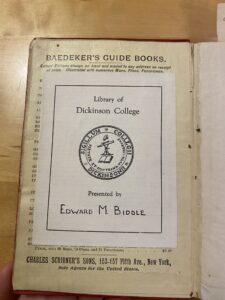
On the front page directly glued to the cover of the book, there is a sticker that says “Library of Dickinson College”, the college logo, and “Presented by Edward M. Biddle” (Fig. 3). This sticker covers a list labeled “Baedeker’s Guide Books”. On the title page at the top right, written in pencil, there is a handwritten notation that says  “E. M.. Biddle, July 6, 1907” (Fig. 3). On the following page containing the imprint statements, there is another note, written in pen, that says the same thing (Fig. 4). The similarities between the handwriting indicate that this was likely written by the same person.

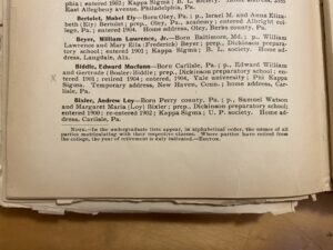
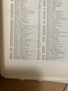
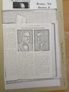
When I asked the archivist librarians at Dickinson if there were any files on Edward M Biddle, we found a list containing 15 Biddles, all of whom attended Dickinson College. This list has 4 Edward Biddles, three of whom could be Edward M. Biddle. We were able to find a file on one Edward Macfunn Biddle, who graduated from Dickinson in 1904, and directly afterward attended Yale (Fig. 7). It is possible that this was his book. If so, there is no way of knowing how he used it. Other than the two handwritten inscriptions, there is only one other annotation within the guidebook; in the same handwriting it says, “Aug 1946 EMBiddle – Gift” (Fig. 9). Beyond these markings. there are several proclaiming the book to be the property of the Dickinson Library, including the sticker at the front of the book, a red stamp that says “Dickinson College Library” along the top pages (Fig. 10), and a raised indentation on the imprint statement page that says “Dickinson College Library”. There is also a black stamp warning readers that “THIS BOOK MAY NOT BE TAKEN FROM THE LIBRARY”. It’s interesting that there are so many marks from the library; one of them even covers up some of the text.  Why might this have felt necessary?


Figure 1

Figure 2

Figure 3

Figure 4

Figure 5

Figure 6

Figure 7

Figure 8

Figure 9

Figure 10

Figure 11

Figure 12          

A Material Description of Edward Topsell’s The Historie of Fovre-Footed Beastes and A Historie of Serpents

Figure 1: title page with the “Gorgon” vingette. As my copy of Beastes is missing its original title page, this is a scanned copy.

 While I understand that history is not divided into inflexible periods, what struck me about Edward Topsell’s The Historie of Fovre-Footed Beastes, printed by William Jaggard in 1607, is that it seemed so anachronistic; I did not expect a bestiary, an anecdotal treatise that is, in my mind, characteristically ‘Medieval,’ to have been created in the early seventeenth century. At once, this made me reconsider the text and its context.

Figure 2: Topsell’s entry on the “Rat.” Note the detailed crosshatching, skin folds, and hair in this accurate depiction of a rat.

Beastes seems caught in this awkward period between eras––Reformation and Enlightenment––when scientific inquiry began supplanting the old dogmas of scholasticism and divine revelation. Like Medieval bestiaries, this codex is a compendium of factual and fantastical creatures with not only physical description of each but accompanying Christian symbology that explains them. In contrast to earlier texts, Beastes displays a subtle hint of the systematism I associated with later periods of bookmaking: it includes a catalog of every author known to Topsell who has written about animals, an epilogue, and an index of Latin and English animal names––all of which were comparatively new to the codex at the turn of the seventeenth century. Moreover, like Conrad Gessner’s Historia Animalium, from which Topsell drew almost all of his material, Beastes displays an interest in classifying the natural world with precise description in an easily accessible form intended for broader audiences. In the prefatory materials, an epistle from the collected works of Conrad Gessner, two introductions by Gessner and Topsell, contains its stated purpose: to inform, amuse, and above all to enlighten, for animals themselves are instructive, pleasing, and divine.

Figure 3: you might note that this print of “Rhinoceros” is stylistically different from the other prints, that is because this is actually a reproduction of Albrecht Dürer’s print of the same name

This early-modern juxtaposition between natural philosophy and natural theology is intriguing. However, my primary reason for choosing this book is, perhaps, less academic; what sealed the deal was the title’s vignette, “The Gorgon”: a creature that appears to be a scaled bull with pig trotters, a cow’s nose, and a woman’s mop of hair (Figure 1). How absurd is that? I would say that’s not what a Gorgon looks like, snake-haired and all, but then I’ve never actually seen one for myself, have I?

Figure 4: the “Mantichora”

These woodblock prints are an incredible feature of this codex; it is replete with them––large and small, of animals, real and imagined, from the benign to the frightful: animals familiar to seventeenth-century England like rats or cats are represented with considerable accuracy (Figure 2 & 5); creatures less familiar to the Continent, like the rhinoceros, are armored in a literal sense, clad in what appears to be fluted plate mail and lamellar (Figure 3); others still, like the “Mantichora,” with its toothy grin that hangs from either ear, considers the reader with a hungry look (Figure 4). Doubtless, it would have been expensive to produce so many prints in a single book.

Figure 5: the “Cat”

Figure 6: manicules

It would seem that past students also enjoyed this book as much as I have. Beastes has the many signs of frequent use––and misuse. The buildup of residual hand oil, indicated by smooth and darkened areas at the foot corners, suggests frequent use. In parts of the book, the damage seems intentional: in the section enumerating the various virtues and vices of the “Cat,” a reader has scratched away the eyes of the accompanying print (Figure 5), perhaps wary of the beguiling gaze which Topsell suggests; other entries, like that on the dromedary, given the cleanness of the tear, seem to have been ripped out of the book entirely!––a souvenir, perhaps? Or did one reader have a particular dislike for humped, desert-going mammalians? There are other examples of readers’ engagement with the book. Marginalia and annotation abound: I have found manicules, underlining, and margin notes throughout the book, signs that the readers sought to highlight information in the text for its later use (Figure 6). In other places, humorously, I found the bored and uneven, graphite scribblings of an uncooperative pupil, perhaps a more contemporary one (Figures 7). Indeed, it seems readers consulted Beastes often; however, these same readers were not, perhaps to Topsell’s chagrin, all that precious about this book.

Figure 7: you can just make out the graphite scribblings on the back endpaper here. Note also that someone, perhaps a former proprietor of this book, signed this book. This will no doubt proove useful when I investigate this book’s afterlife in the following posts.

Figure 8: the spine and raised cords

At seven-hundred and ninety pages, twelve and a half inches long, eight inches wide, and two and a half inches deep, Topsell’s tome is a heavy and unyielding thing and in decidedly poor condition. The eight raised cords along the spine are nearly fully exposed, and only one remains attached to the front board (Figure 8). The somewhat flimsy pasteboards, covered in cracked caf’s skin, have all but separated from their hinges and joints (Figure 9). The endpapers have peeled away, revealing two equally spaced incisions along the outer edges of either board through which green ribbon appears to have been threaded (Figure 10). Perhaps because of the binding’s disrepair, the front matter is similarly damaged. The overall make of the book’s rag paper feels good––fine and smooth––but very thin, so much so that the printed ink bleeds through the pages, and many pages throughout are torn and crumpled.

Figure 9: the cover

I do not believe these were original features of this codex and am certain that it was rebound at least once. In The Historie of Fovre-Footed Beastes, the outer margins are one and three-quarter inches whereas the gutter margins are only one inch; in A Historie of Serpents, the outer margins are two inches, the gutter margins, one inch. This irregularity in formatting indicates that the pages were perhaps cropped to facilitate a rebinding. However, it is also possible the outer margins were deliberately made larger to accommodate the printed marginalia. Notwithstanding this, as discussed above, Topsell compiled and published Beastes and its front matter in 1607; he published Serpents the following year in 1608. Topsell’s introductory notes do not mention Serpents which indicates that, even if Beastes was not rebound to include the later text, if it were, say, taken to a binder only after the publication of the later text the following year, it was not Topsell’s initial intent to compile them. It is also possible that this book was one of those volumes produced in 1658; however, as there is no original front matter, this is something I cannot corroborate.

Figure 10: paste board

What is most striking about the binding is that it is not striking; even in its diminished state, it hosts no ornamentation, no embossing, no gold tooling, no marbling or mottled treatment––nothing. Why would such spartan binding enclose this no doubt expensive and decorative codex? Well, Topsell aimed not simply to impress but to inform and educate, and his audience, scholars, naturalists, aspirant zoologists, autodidacts, and students, likely valued content over aesthetics, facts over embellishment––decorative embellishments, that is, for as we probably know now, there is no such thing as a Gorgon.

An Historical Account of the Incorporated Society for the Propagation of the Gospel in Foreign Parts Containing their Foundation, Proceedings, and the Succeses of their Missionaries in the British Colonies, to the Year 1728

Today, the books we read are generally new, printed within the last fifty years and in good condition. How will these books we read today look in three hundred years? An Historical Account of the Incorporated Society for the Propagation of the Gospel in Foreign Parts Containing their Foundation, Proceedings, and the Succeses of their Missionaries in the British Colonies, to the Year 1728 was an exceptionally high-quality book when first published. After nearly three centuries of use at Dickinson College, parts of the book are in a pitiful state.

As a religion minor, I choose to study this book as I have an interest in early modern religious history, especially the Reformation and British faith disputes in the sixteenth, seventeenth, and eighteenth centuries. I feel that I can learn more not only about early eighteenth-century English Christianity, but also its confluence with London’s colonial policies in North America. I am likely not the first Dickinson student to glance upon its pages. Dickinson has a long tradition as a Presbyterian and then Methodist religious institution, with contemporary publications noting the religious fervor of Dickinson as early as 1823 (“Revival of Religion,” 536). Quite possibly, religion students read the work to learn about the religious demography of early modern North America.

David Humphreys, a Doctor of Divinity and secretary to the Incorporated Society for the Propagation of the Gospel in Foreign Parts, wrote An Historical Account of the Incorporated Society (title shortened). In 1730 Jospeh Downing printed the work in Bartholomew-Close, London. The book measures in at approximately 5 inches (12.7 centimeters) of width, 7.5 inches (19 centimeters) of height, and 1.5 inches (3.8 centimeters) in depth. The page count is 356 numbered pages, 31 introduction pages, and 3 non-numbered pages for a total of 195 sturdy sheets. These dimensions roughly align with those of modern books, albeit with a large page count for the small binding that potentially overburdened the binding. The thick paper is superb quality—dare I say better than the modern paper of our textbooks—and easy to handle. The binding is calf skin and although the rear cover is intact, the front cover no longer exists after centuries of use. With close examination, readers can see faint horizontal lines across each page in areas without text, likely the “chain marks” from hand-made paper production. After centuries of use, the work’s pages are still readable and durable, a testament to the quality of hand-made paper compared to later nineteenth century machine-made paper (Clapperton, 15).

Fig. 1: Spinal binding


Sadly, the binding is in much poorer condition. It is precarious holding Humphrey’s work; so little of the binding remains that pages could easily become torn from the book if readers are not delicate. The binding looks to be composed of leather, with a white string used in the spinal binding (See Fig. 1).

Fig. 2: Signature page marking

The book is no longer one complete work. Rather, the binding splits in different locations (beginning at the map page), creating separate sections of pages bound together. Characteristic of the printing process, most pages include “signature page marks” where a letter represents each section, with each page of the section numbered (See Fig. 2).

The book’s ink is well-preserved, with no prominent ink splotches or bleeds on the paper. The typeface is characteristic of other early modern books. The type setters chose to primarily employ the Letterpress Text font, but some sections (chapter titles in particular) are Italique 1557 (myfonts.com/pages/whatthefont). Almost every page contains certain special italicized words, such as Briti[s]h (See Fig. 3).

Fig. 3: Italicized words

One aspect of the text that may baffle readers is the absence of the letter ‘s.’ Rather than using s in words, Humphreys chose to use f, spelling words such as Christian as Chriftian (as seen in the above image). Despite what readers may perceive today, the “long s” Humphreys employs is simply a different letter model for s, rather than the letter f. Save for this different model for s, the book is easy to read for readers such as myself and previous students.

The arrangement of text in An Historical Account of the Incorporated Society is intriguing. Marginal notes abound on virtually every page. Downing printed these numerous small notes next to the larger text rather than writing any by hand. These marginal additions provide brief context on the topics discussed in the text as in this image that clarifies that changes to the “bylaws and lea[s]es” of the Incorporated Society for the Propagation of the Gospel in Foreign Parts to require a majority quorum of voting members (See Fig. 4).

Fig. 4: Marginal text

Some marginal notes appear to be portions of the text that went unprinted initially, but others are simple comments and do not seem to fit within the larger text. Perhaps Jospeh Downing printed the marginal notes both to add new comments and include sentences missed in the initial printing. Some pages contain catchwords that assist printers by indicating the next page’s first word (See Fig. 5). Numerous pages throughout the book display black and white ornamental illustrations (not images). Decorative border pieces adorn the beginning and end of chapters (See Fig. 6).

Fig. 6: Decorative border

Fig. 5: Catch words


Fig. 7: Fleur-de-lis

Smaller fleurs-de-lis create boundaries between different sections/chapters on the same page (See Fig. 7). The most recognizable illustration is the royal seal of England. The seal appears at the beginning of the Charter/preface section, meant to lay out the goals of the Society and thank the monarchs William III (who assisted in founding the society) and George II (the British king in 1730). These numerous illustrations and gold lining along the edges of the rear cover indicate the significant financial investment made by the Society into printing a visually stunning book that retains its beauty today even without a functional binding. 

The work came to Dickinson College from the collection of well-regarded eighteenth-century Philadelphia politician and businessman Isaac Norris. The Norris Collection holds nearly two thousand books on numerous intellectual topics. Mary Dickinson and her husband John donated the collection to Dickinson College in 1783, the same year the college opened. I am excited to continue the work of previous students in unpacking this beautiful book brought to Dickinson College 241 years ago. 


Works Cited 

Clapperton, R.H. The Paper-making Machine: Its Invention, Evolution, and Development 

          Google Books E-Book, Pergamon Press, 1967. 

          “Revival of Religion.” The Religious Intelligencer, 18 Jan. 1823,  

          proquest.com/docview/137429704/pageviewPDF/A2297C93E1CB46F4PQ/1?                   

          accountid=10506&sourcetype=Magazines. Accessed 15 October 2024.


“What the Font?” My Fonts, myfonts.com/pages/whatthefont. Accessed 23 September 2024. 


Ovid’s Metamorphosis Englished, Mythologiz’d, and Represented in Figures

Figure 1: The Spine

George Sandys’ 1632 edition of Ovid’s Metamorphoses stands out within his oeuvre for one reason—its beautifully drawn illustrations. From the binding, one would never know that the book contained sixteen full-sized lithographs, each exquisitely detailed and depicting a different story from Metamorphoses. The spine reads Ovid’s Metamorphosis, but the title page states the full title as Ovid’s Metamorphosis Englished, Mythologiz’d, and Represented in Figures. An Essay to the Translation of Virgil’s Ӕneis, finally clueing readers into the splendor of the book (See Figures 1 and 2).        Frances Clein designed the lithographs, which Salmon Savery then implemented (Ellison). John Lichfield, an experienced publisher at Oxford University, published this edition. Only his name is credited alongside Sandys’ on the title page.

Figure 2: The Title Page

This copy of Metamorphoses had many oddities, most of which lie in its formatting.  Sandys’ translation is a large, heavy folio, far taller and wider than any book I have ever owned. It contains 549 pages, but there are multiple mistakes regarding the pagination that beg the question of what exactly happened during printing. There are two sections in the text where the numbers skip, omitting pages 47-50 and 122-144. The first instance of missing pages may very well have been a simple mistake as the result of human error and oversight. But the second instance—skipping 22 entire pages—is much harder to ignore. How does such an error happen? Adding to the oddity of it all, the actual story itself does not skip. The text of Metamorphoses flows continuously from page 121 to 145 with the correct catchwords and signatures. By all accounts, no physical pages are missing. The binding remains firmly intact and there are no remnants of pages destroyed or removed. It seems more likely than anything that it is a case of mistype, but again, such an egregious error makes one wonder how no one caught it before it went to print. John Lichfield had worked as Oxford’s printer since 1617, making him a veteran of the craft (Roberts). To have a book he published and printed contain such an error would be almost unthinkable, but in all likelihood we may never know the true circumstances of how the pagination came to be so incorrect. 

Figure 3: The Frontispiece

 Before the actual text of Ovid’s work begins, there are 10 pages of front matter. The text is then separated into fifteen books, followed by a translation of Virgil’s Ӕneis. The black and white illustrations accompany each of the fifteen books depicting their respective myths, but the Aeneid does not have its own illustration. The sixteenth illustration is the elaborate frontispiece alongside the title page (Figure 3). The illustrations themselves are lithographs, evident by the impressions on the backside of each illustration. The pages are in good condition, and all the illustrations are intact except for one. The illustration accompanying book three has a noticeable tear starting in the bottom right corner that extends to nearly half the page. It is poorly taped in the back, and the illustrated side has brown lines and markings along the tear that bled onto the first page of book three (Figure 4).

Figure 4: The ill-repaired tear at the beginning of Book 3

The paper itself has held up well over the centuries, with only a few spots of mildew and occasional stains scattered throughout. The paper has a slight thickness to it and it is smooth and flexible. Based on the date of publication, the pages are most likely cloth-based, made from rag or hemp. I do not have personal experience with telling types of paper through touch, but the Dickinson College Special Collections Librarian, Malinda Triller-Doran, also assessed the pages and confirmed the paper is cloth-based. The binding is calfskin, indicated by its smooth texture and dark brown color. I compared Ovid’s Metamorphosis Englished, Mythologiz’d, and Represented in Figures to other texts in the Archives & Special Collections that were bound in vellum, calfskin, and pigskin as confirmation. 

Figure 5: “The Minde of the Frontispiece”

A unique characteristic of this text is the amount of front matter and paratexts it holds. After the frontispiece and title page, there is an explanation of the frontispiece titled “The Minde of the Frontispeece, and Argument of this Worke” (Figure 5). Following this, there is dedication from Sandys to King Charles I (Figure 6), a panegyric to King Charles I, an address from mythological figure Urania to Queen Henrietta Maria, an address to the reader, and finally two sections on Ovid: “The Life of Ovid” and the aforementioned “Ovid Defended.” Throughout the paratexts are references to Greek myths Ovid included in Metamorphoses, such as those of Circe, Hercules, and of Echo and Narcissus. I found it interesting that Sandys included both a dedication to Charles I and a speech of praise addressed to him. To include both seemed to be excessive, so it is possible that Sandys was trying to curry favor with the king. I was not familiar with the word “panegyric” until reading it here, but upon learning its definition, I understood why Sandys included it in the front matter.

Figure 6: Sandys’ personal dedication to King Charles I

As mentioned previously, the pages and actual text of the book are well-preserved, but the binding is a different matter. The spine is in good condition, but the cover has some severe wear. It suggests that the book was either well-loved or improperly stored, possibly both. Both the front and back covers have discoloration and deep gouges, exposing the board of the book in multiple spots. There is also a stain on the backside of the leather. Different-sized splotches litter the fore edge, matching the external wear on the rest of the book. The text does feature some inscriptions, particularly on the title page. Someone wrote the name Thomas Chadwick alongside the word “Book” and “1780”—likely Mr. Chadwick himself. There is also illegible text written in brown ink above the name. On the flyleaf, in pencil, someone wrote £2.10, suggesting the book sold for that price at some point, but it is impossible to discern when. Ideally, I will be able to uncover more about the book’s history in Part II: Origins, along with the mysteries of the pagination and Sandys’ considerable devotion to King Charles I. 


Works Cited:

Ellison, James. “Sandys, George (1578–1644), writer and traveller.” Oxford Dictionary of National Biography.  January 03, 2008. Oxford University Press. 

 Roberts, R. Julian. “Lichfield, Leonard (bap. 1604, d. 1657), printer.” Oxford Dictionary of National Biography.  September 23, 2004. Oxford University Press.

The Generall Historie of the Turkes

Fig. 1: Title page with Laurence Johnson’s engraving

The first thing one notices about The Generall Historie of the Turkes is its size. Standing a 12 in long by 8½ in wide by 3⅞ in tall and consisting of over 1152 pages, one cannot help but be drawn to it. This curiosity is rewarded when, turning over the cover, you are greeted by an intricate engraving that depicted the title flanked by a colonnade and two armored men (figure 1). The sheer length of the title, The Generall Historie of the Turkes, From the First Beginning of That Nation to the Rising of the Othoman Familie: with all the Notable Expeditions of the Christian Princes Against Them. Together With the Lives and Conquests of the Othoman Kings and Emperors Faithfullie Collected Out of the Best Histories, Both Ancient and Moderne, and Digested into One Continuat Historie Untill This Present Yeare 1603, demands further investigation.

Fig. 2: Bookplate and Munce’s signature

Apart from its artistry of this page, engraved by Laurence Johnson, one can glean much information about the book’s biography. Richard Knolles authored it, and Adam Islip published the work in London 1603, making it a first edition (“Generall Historie of the Turkes First Edition – Richard Knolles”). T. Edward Munce Sr is written on the bookplate, informing the observer who donated the book to Dickinson, where it currently resides (figure 2). A friend named Francis Wayne MacVeagh apparently gave the book to Munce, evidenced by an inscription on the back of the title page, though where he got the book is not apparent. A last name is associated with the book, King James I of England, to whom a lengthy dedication is written just after the title page (figure 3). This regal audience explains the amount of money put into the work.


Fig. 4: The book cover, showing the worn leather binding


Fig. 3: Dedication to King James I

        The Generall Historie of the Turkes’ physical condition has much to tell an observer about the book’s story. The binding, composed of half leather and half stiff fabric according to archivist Melinda Triller, is obviously not original but still is showing its age (figure 4). The leather is heavily worn along the joint making the front cover feel like it might detach from the book. It is also flaking-small, almost powdery bits are left on the desk after handling. The bottom right corner is torn, revealing the cardboard beneath. Despite this exterior wear, the book never feels at risk of falling apart in your hands. Acid from the leather, or perhaps the glue holding down the boards, has stained the end papers that got installed with the new binding, which is of a much sturdier stock of paper than the book itself (figure 2).


Fig. 5: An example of extremely worn pages with repairs

The original paper is of varying quality and state of repair. For the most part it has held up well; the paper is sturdy and thick. However, occasionally, the paper feels quite thin and flimsy, reminding you that the book is centuries old. The most glaring issues are the several pages that are far more worn, its edges frayed and stained (figure 5). These pages have had substantial repair work done to them, with the deteriorated page affixed to a backing of thin paper that has an almost tape-like texture to it. The backing brings the page back to its original proportions and stops more wear from page turning. Some pages in the front matter have been cropped, as evidenced by Laurence Johnson’s name being partially cut off (figure 1).


Fig. 7: Portrait with a poem

The book is full of other of Johnson’s engravings. He made detailed headpieces for the different sections of the history, along with initial letters for each chapter. Most impressive, I would say, are the black-and-white engravings of the Ottoman kings and emperors’ portraits present at the beginning of their respective biographies, as well as that of some of the other important figures such as Skanderbeg (figure 6). The beginning of each monarch’s biography also has a poem, written by Knolles or another poet, and written in both Latin and English about their reign (figure 7). Knolles also put aides for his Christian audience that list some contemporaneous rulers of Europe. These features make this book special and show off the care taken in its crafting.


Fig. 6: Two example portraits


Fig. 8: A page with no paragraph breaks

Fig. 9: Knolles’ use of quotations in the narrative

Reading the book is interesting as a modern person. Paragraph breaks are scarce, some pages having none (figure 8). Perhaps to aid with this, several letters are placed in the margins to break up the walls of text. The largest barrier to surmount, though, is the 17th century spelling. The infamous long s is easy enough to adapt to, but other quirks like how v and u seemingly being interchangeable slows reading down considerably. Trying to parse words such as ‘diuers’ (diverse) is particularly a challenging experience. The content of the book is more chronology that what we would call history, although Knolles tries to explain the Ottomans’ success in an afterword. His narrative style is accentuated by his inclusion of sometimes long quotations of speeches (figure 9). To aid the reader’s understanding of chronology, and to help find certain events, short blurbs are placed in the margins summarizing events.


Fig. 10: Someone notated the book with blue ink

Fig. 11: Another person’s doodles

The last 421 years have left the book with many marks. There are, of course, the various stains one might expect from such an old book, from water or occasional ink. Along with these, though, are some quite intriguing finds. For a few pages starting with pg. 220, someone notated the text with blue ink, underlining certain passages (figure 10). Bayezid I’s conflict in with Tamerlane greatly interested this mystery annotator, it would seem. Another annotator made many doodles and marks around page 468 (figure 11). There is some damage, such as a tear on page 309 and interestingly a burn mark on page 248 (figure 12). The most humanizing, I think, is someone’s math on page 293 (figure 13). This equation to figure out how long ago an event took place really spoke to me, showing how I am connected through this physical artifact to someone from 1722.


Fig. 12: The tear and burn

Fig.13: Someone’s math to figure out how long ago an event occurred


Works Cited

“Generall Historie of the Turkes First Edition – Richard Knolles.” Bauman Rare Books

<https://www.baumanrarebooks.com/rare-books/knolles-richard/generall-historie-of-the-turkes/111711.aspx>

Knolles, Richard. The Generall Historie of the Turkes. Adam Islip, 1603.

The Life and Legacy of P.P. Bliss

Several contributors compiled the tunes of “Gospel Hymns Combined,” Ira D. Sankey, James McGranahan, and George C. Stebbin, D.L Moody, Rev. Robert Lowry, and W. Howard Doane. However, the back cover of the booklet gives special consideration to one name—P.P. Bliss (figure 1).

Figure 1: Back cover of “Gospel Hymns Combined” displaying special consideration to the works of P.P. Bliss.

Born July 9, 1838, in a log cabin nestled within the central corridor of the Pennsylvanian Appalachians just outside of Clearfield County (Reese 1999). Philip Bliss earned recognition as one of the most famous American songwriters in history. So much so, that his peers, including Ira Sankey, respected and acknowledged his superior talent (Reese, 1999).  

Figure 2: Illustration of the 1876 Pacific Express Railway Accident which took the life of P.P. Bliss and 160 others.

His passion for writing Sunday school prayer melodies most likely stems from his early adoption of Christianity in his childhood as well as his work as a schoolteacher at the end of his formative years (Reese, 1999). At the age of twelve, Philip Bliss made his first public confession of Christ and joined the Baptist church. He later engaged in Methodist camp meetings and revival services (Reese, 1999). At the age of eighteen, Philip Bliss became a schoolteacher in New York where his musical talent would be recognized by a number of musical cliques (Reese, 1999). After only 4 years in New York, he returned to his home state and began tutoring pupils to supplement his income. After securing a spot and completing his stay in the Normal Academy of Music in New York, and moving to Chicago thereafter, his career eventually found great success, earning himself more than $90,000, or over three million dollars in today’s currency, nearly all of which was purportedly given to Evangelical charities (Reese, 1999). In Chicago, Bliss would mingle with other contributors of “Gospel Hymns Combined” such as D.L Moody and Ira Sankey, all of whom would regularly collaborate (Reese, 1999). 

Figure 3: The Philip Paul Bliss house, reopened as the Philip P. Bliss Gospel Songwriters Museum in 1965; added to the National Register of Historical Places in 1986.

Tragedy struck Philip’s life in 1876 (Reece, 1999), when a snowdrift upturned the Pacific Express train as it passed through Ashtabula, Ohio, launching hum and 160 others from the rails and down into the icy waters of the ravine 75 feet below (figure 2). Philip Bliss never got the chance to witness the printing of “Gospel Hymns Combined” in 1879, although the book is a testament to his lifelong commitment to gospel music considering the multiple acknowledgements to his work. Philip Bliss stands alone in the musical canon of American Gospel music. His home, now known as the Philip Paul Bliss House, opened as the Philip P. Bliss Gospel Songwriters Museum in 1965 and was added to the National Register of Historical Places in 1986 (figure 3) (Ross, 2009). Just as important as Philip Bliss were the publishers who made it possible to distribute his renowned and much enjoyed music, Biglow & Main of New York and Chicago and John Church & Co. of New York and Cincinnati. 

Figure 4: Formatting of Biglow & Main publishing’s first print, “Chapel Melodies,” 1868.

Founded in 1868 by Sylvester Main and his son Huberty Platt Main, Biglow & Main began as a publisher of hymnals in New York (National Endowment for the Humanities, 2024). Their first publication was “Chapel Melodies” in 1868. The title page nearly identically mirrors the formatting of “Combined Gospel Hymns” apart from the varying fonts (figure 4) and includes music notation (figure 5)—a feature they would depart from in the future publication of “Combined Gospel Hymns”. Notably, this publication also credits Rev. Robert Lowry. Perhaps as a turn of fate, the publishing house appointed Ira Sankey as president in 1895 (National Endowment for the Humanities, 2024). 

Figure 5: Musical Notation included in Biglow and Main’s “Chapel Melodies,” 1868.

John Church & Co. Of New York and Cincinnati co-published this booka music retailer and manufacturing house founded in 1859 in Cincinnati that primarily produced sheet music and pianos (Stinnet, 2024). Despite John Church’s propensity towards sheet music, the publication notably omits music notation altogether, bringing into question why exactly Biglow & Main chose Mr. Church’s company in particular to be a co-publisher of “Combined Gospel Hymns.” One reason might have been the momentum of John Church’s company at that time. Clearly, the publishing house played a significant role in the music industry of the late 1800’s, as The National Register of Historic Places added the original John Church building to their list (Stinnet, 2024), despite no longer being in operation (figure 6). Nevertheless, John Church & Co. Handled both the printing and binding of this book in-house in Cincinnati (Stinnet, 2024). John Church later expanded into cities like New York, Chicago, and Boston after finding great success in Ohio (Adams, 2021). As a result of their success in the music industry, the Royal Manufacturing Company bought Mr. Church’s company as they acquired many others into the fold in 1891 (figure 7).  

Figure 7: Records of the merger between the Royal Manufacturing Company with various music manufacturing and printing houses including John Church & Co.


Figure 6: John Church & Co. Building, Chicago.


Bibliography


Reese, Ed. “Life and Ministry of Philip Bliss.” Christian Biographies, June 13 1999, https://www.wholesomewords.org/biography/biobliss.html


National Endowment for the Humanities. “Biglow & Main.” Hymnary. Accessed October 13 2024. https://hymnary.org/person/BiglowMain


Adams, Nathaniel. “John Church Company & Royal Manufacturing Company – Cincinnati, Ohio.” S. Nathaniel Adams, Documenting history as well as my experiences with repairing and restoring vintage guitars, August 17 2021. https://www.snathanieladams.com/2021/08/john-church-company-royal-manufacturing.html


Stinnet, Michael. “Church, John & Company.” Antique Piano Shop. Accessed October 13 2024. https://antiquepianoshop.com/online-museum/church-john-company/

Ross, Stephen, Ross, Dorothy. “Philip P. Bliss Songwriters Museum.” Wholesome Words. Accessed October 13, 2024. https://www.wholesomewords.org/biography/biobliss16.html

« Older posts

© 2024 History of the Book 2024


Academic Technology services: GIS | Media Center | Language Exchange

Theme by Anders NorenUp ↑