Civ 5 Mod, Colonization of Africa historical scenario

Posted by Todd Bryant in Uncategorized | Leave a comment

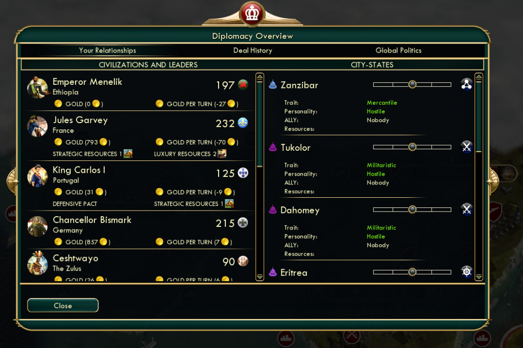
The Dickinson College Colonization of Africa mod for Civilization V, created by Shayna Solomon and Edwin Padilla and advised by Professor Ed Webb and Todd Bryant, aims to teach students the decision-making process of both colonial leaders and those leaders who resisted colonization. The game attempts to represent the starting conditions which were present at the start of the so-called “Scramble for Africa.” The game begins in 1876. We chose this year as the start of the game because it includes exploration as part of the Scramble, as well as representing the desire for conquest.

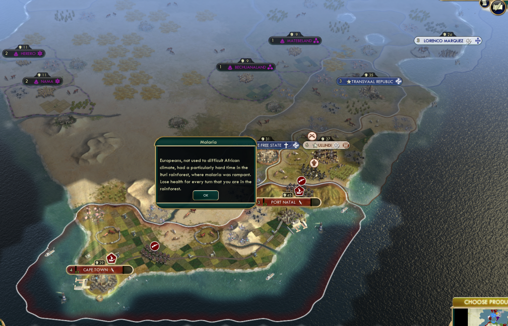
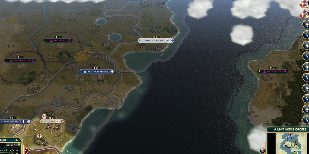
The game focuses on several aspects of society. The geography of Africa has been recreated in game to best represent the proportions of Africa. The game’s map also includes many of the physical barriers which would have limited units’ mobility, such as the Ituri rainforest, or offered defense for a civilization, such as Ethiopia’s defensive advantage of being surrounded by desert and mountains. These aspects of the game help students to understand the difficulty that nations faced when attempting to explore and conquer far outside of their territories. It will also help students to internalize the layout of Africa. Much of Western Europe is also portrayed in the game.

European geographic representation is less exact than that of Africa in part because Civ V dictates that a certain amount of land must be available to feed large populations. Advances in travel technology through modern roads and railroads is conveyed in the game and gives students a sense of the critical nature of this technology, especially in Europe.

The game also focuses on leaders’ differing ability to overcome obstacles and to expand and protect their empires. The comparative military power of each civilization has been ascertained by historical accounts of military size or of battles. The number of troops and their ability to obtain advanced weaponry indicates military strength in this game. Students will feel the major advantages that the English had over the Zulu or that the Ethiopians had in defending themselves against the Mahdi’s followers. They will also notice, however, that sheer numbers and military strategy can sometimes make up for the absence of advanced weaponry.

Other limits to power are money and public opinion. These are also conveyed in the game. Each nation receives 1% of its actual historical GDP in gold, the currency of the game, in order to represent the economic power of each nation. Students will notice that England, for instance, will have more leeway than Portugal in its ability to expand because of its economic strength. Low happiness in the game will cause revolt. This is particularly relevant historically to the recently unified Germany and Italy. Both countries, having not consolidated their power or authority, may be prevented from expanding if they do not make an effort to maintain their populations’ contentment.

There are some significant limits on the ability of the game to accurately represent our research. The first problem is that the game cannot represent chaos and confusion. It does not represent unpredictable weather or military units that fail to do as they are told. The game also cannot represent complex political configurations, like suzerainties. Finally, the game does not convey racism and intra-colony racial issues at all. In places like the British Cape Colony, these were essential to policy decisions.

Regardless of the limits, the game has valuable lessons to teach to students of international relations and of colonization. It shows many of the challenges of managing one’s affairs domestically while trying to expand or protect existing borders. It also teaches historical lessons about the challenges of power differentials during the colonization of Africa.

The mod is available for download on Civfanatics.  Screenshots are available below.  There is also an extensive ReadMe file detailing the research behind the project.
Africa4

Africa3

Africa2

Africa1


Motion Bubble Visualization

Posted by Todd Bryant in Uncategorized | 1 Comment

Select your x axis, y axis, bubble size and set colors to unique. If we use homicides and GDP per capita, do we see a correlation of time. If so, the bubbles should move up and to the right, or down and to the left. Is there a reverse correlation? Do you see any patterns among different countries?

To create, we need the data formatted as so, https://docs.google.com/spreadsheet/ccc?key=0AseK2cPi8K7fdEdRSVJFb1F6MlFTQWRmaFNoVk1Kcnc#gid=0. Important, note how in the spreadsheet with all the data, there’s a space in population. Remove the spaces or Google won’t recognize it as a singe number. Choose three to five countries, and create a chart, then change countries by copy and pasting different data.

Once you have the data, create a Chart -> Trends -> Motion Chart

To export to put on a blog post, click the arrow in the top right of the chart and choose Publish.  Can paste that code into any html page or blog post.

Bubble Chart Tutorial

Posted by Todd Bryant in Uncategorized | Leave a comment

Select your x axis, y axis, bubble size and set colors to unique. If we use # of immigrants and unemployment rate for each axis, we’d expect to find a correlation, so bubbles should move from lower left to upper right or the reverse. Is it true?

To create, we need the data formatted as so, https://docs.google.com/spreadsheet/ccc?key=0AseK2cPi8K7fdFBCcl9lVWg3NnFBUVI2RFpmLVNxU1E&usp=sharing

Choose countries that have data and create your own starting with a Google Docs spreadsheet

Can’t use date ranges in Google Docs, must provide an average year for each decade. We’re dividing decade totals of immigrants by 10 to get an average year. Also need average for unemployment

To speed up data entry, use Excel to add years in decade and divide by total to get average unemployment

To make for easier viewing select columns you don’t need, right click and hide in Excel

Will frequently encounter problems when using historical data. Consider Germany was divided. No unemployment rate given for China, so couldn’t use them. West German population is a guess for 1990 since reunified. No data for Mexico unemployment in the 1960s, found 1970 is 7.0, http://bls.gov/opub/mlr/1994/11/art1full.pdf We can enter that in, or leave it out. If we leave it out, Mexico won’t appear until 1975 With all of these assumptions, it’s important to inform the reader.

Once you have the data, create a Chart -> Trends -> Motion Chart

To export to put on a blog post, click the arrow in the top right of the chart and choose Publish.  Can paste that code into any html page or blog post.

Willoughby Workshops

Posted by Todd Bryant in Uncategorized | Leave a comment

Next week we’ll have our Willoughby workshops, a week of hands on practice for faculty to use and discuss technologies that can help with their teaching and/or research. Most of our notes, as always, are public Google Docs. We’ll encourage them to tweet using #wfp13. Any comments or questions are very welcome.

Dickinson Study Abroad

Posted by Todd Bryant in Uncategorized | Leave a comment

Dickinson study abroad, Fall 2013 and Academic Year 2013-2014

Nodes are either majors or locations. Edges are created by each major going to a destination. Size of node determined by connectionss (degrees).

Download then open this file with Gephi. FYI, this is beta, and it can show sometimes. There’s no “undo”, so save often, very often, if working for real. Choose ‘Directed’ when it opens.
DickinsonStudyAbroad

Click the ‘Overview’ tab above.

Right:
Under ‘Statistics’, run ‘Modularity’. OK and Close

Left:
Partition tab, Nodes, click Refresh.
Choose ‘Modularity Class’ as parameter.
Now we have our communties.

There’s a slider bar for Edge Weight at the bottom, the one towards the left. Slide it left until you can easily see nodes and edges.

Ranking tab, Nodes, size (the diamond shape)
Select ‘Degree’ and Apply
Nodes are large based on number of connections (degrees)
Note where you can change Max size

If you want to rank nodes by color
Ranking tab, Nodes, color wheel
Select Modularity Class and Apply

Layout

Choose Layout ‘Force Atlas’ and run.
Right click and hold to move around.
Scroll to zoom in
Choose Layout ‘Expansion’ and run until you have some space

Bottom
Click the first ‘T’ to show the labels
Click the ‘A’ for ‘Size mode’ and choose ‘Node size’. The larger the node, based on connection, larger font.
Adjust font size with the second slider to right.

Middle
Left click and drag individual nodes so you can see labels and no extreme outliers.

Export
Click the Preview tab above
Select ‘Show labels’ under ‘Nodes’
Make the font size just below to ‘5’
‘Refresh’ at very bottom to see changes

File -> Export -> SVG/PDF/PNG
Choose PNG. In Options specify a larger size, I used 1500 by 1500 for large image.

Small:
DickinsonStudyAbroadSmall

Large:
DickinsonStudyAbroadLarge

Digital Humanities Authors

Posted by Todd Bryant in Uncategorized | 1 Comment

Data extracted from Google Scholar via “Publish or Perish” program. 1000 authors who matched phrase “digital humanities”. Node size is based on their article with largest citation number. Edges created between authors by co-writing article.

Start with DigitalHumanitiesFinalDataImported.gephi This saves importing Nodes and Edges table. All three files are in the Mac Drop folder at Dickinson and in my shared public folder. Also had to create a new column called Citations then move data from Attributes in the column. Otherwise, it doesn’t see the attributes column under Nodes->Ranking

Right click and hold to move whole graph around.
Scroll to zoom.

On Right:
Apply filter to remove nodes without connections. Filters -> Topology -> Degree Range. Make it as least 1.
Under Statistics, run Modularity.

On Left:
Partition -> Refresh next to dropdown -> Choose Modularity -> Apply.
Rankings -> Node -> Size (diamond shape) -> Citations from Dropdown. Apply.
Layout -> Atlas -> Run (Let it go until communities are bunched)
Layout -> Atlas 2 -> Check Prevent Overlap -> Run (just a second to remove the overlap)

Bottom:
Click the first ‘T’, bottom left, to show labels.
Click the ‘A’ that says ‘Size Mode’. Choose Node Size. Label size now also depends on citations.

Done, get ready for exporting image.
Preview Tab above.
Select ‘Show labels’ under ‘Nodes’
Adjust font size just below.
Change ‘Edge thickness’ to ‘2.0’
‘Refresh’ at very bottom to see changes

File -> Export -> SVG/PDF/PNG
Choose PNG. In Options specify a larger size, I used 2500 by 2500 for large image.

Small Image
DigitalHumanitiesSmall

Large Image
DigitalHumanitiesLarge

Atlantic Slave Trade

Posted by Todd Bryant in Uncategorized | Leave a comment

Data from Atlantic Slave Trade Database, http://www.slavevoyages.org/tast/database/search.faces