History of the Book 2024

Dickinson Blog for ENGL 222

Page 2 of 2

An Almanack

With a title like: An Almanack; Containing an Account of the Coeleslial Motions, Aspects, &e. For the year of the Christian Empire, 1691; a reader would expect to peruse the lunar cycles and weather predictions for 1691. This is the intended use for an almanac; a tool for farmers to help predict how crops would perform based on meteorological and astrological predictions for the year. However, the reader would be mistaken as this book is neither an almanac, in the traditional sense, nor from 1691. The present edition of An Almanack was printed in 1843, and the text is almost entirely The New England Primer, not an almanac. The New England Primer is a children’s textbook that was printed and used to promote literacy in America. This edition of An Almanack, apart from the front matter, is The New England Primer written by Benjamin Harris, who while not credited as the author of this book is included on the title page as the original publisher. This inclusion is intriguing as the primer was not added to the Henry Newman text until the second edition print in 1777 and again in the present edition from 1843.  

As if the almanac was not confusing enough in title and author, there is second title page in between the front matter and the primer text. The second title page more clearly identifies the book as The New England Primer printed in 1777. See Figure 1 It is difficult to assume as to why the editor (unknown) of the current edition would include the title page of the previous edition, but it is helpful to identify when and where certain aspects of the current edition were added to the Henry Newman text. 

Fig. 1 The second title page detailing the primer’s addition in 1777

The size of this book should also be stressed. The typical almanac is in quarto size; roughly 12 inches tall. This almanac however is only 4.5 inches tall. It can fit in the palm of one hand and is less than half an inch thick. Compared to a quarto this book is miniscule; another reason being named An Almanack is widely misleading (“Quarto”). 

The almanac has 46 leaves, none of which are numbered, and all show signs of foxing and staining. The pages are likely made of wood pulp as the switch to this material was made in the year prior to its publication and made a stronger paper (Valente). The publication year of the book also helps to determine the body font in this book which I have identified to be Bodoni (Penney). I determined this by researching what font type was widely used in the 19th century, I then used the app What the Font to confirm that the main font used in the book is Bodoni (WhatTheFont). The cover and binding unfortunately share in the signs of aging as the pages. See Figure 2 The book is bound with a cotton ribbon that from repeated use has been exposed on the inside of the book. The blue color from the front and back cover is flaking off from the cardboard, and the book is very delicate because of this.  

Fig. 2 The back cover of the almanac and a page indicating the conditions


The front matter of this book is dense as it spans over 4 leaves. The front matter contains a note from the publisher of the present edition, two advertisements, an introduction to the present edition, certificates, a song and a portrait. The publisher, Ira Webster, notes that all the known information about the origin of The New England Primer is included in one of the advertisements as a part of the front matter. See Figure 3 Webster also notes that the information was copied from a book in the Massachusetts Historical Society’s Library. This publisher’s note and the advertisement mentioned are both printed on the original title page. The advertisement is for The New England Primer enlarged and similarly to this book would have been printed with the inclusion of other writings 

Fig. 3 The title page with the publisher’s note and advertisement

The second advertisement is atypical as it is not an advertisement for another writing but rather a society of women from Boston who vouch for reading the primer. It is also worth mentioning that the editor left a note that this advertisement was from a member of the society and the documents she had access to See Figure 4 

Fig. 4 The Boston Society of Ladies’ advertisement

The introduction to the present edition narrates the story of the Westminster Assembly of Divines and how this led to the Puritan arrival in America with the Shorter Catechism. See Figure 5 The Westminster Assembly of Divines was held by the English long parliament with the intention of reforming the Church of England. From the gathering the Shorter Catechism was written, that is, questions and answers that help to teach the values of the protestant religion (The Westminster Shorter Catechism). The introduction stresses the importance of the catechism to the Puritans, and then questions why these teachings should not continue now, as in 1843, since they are the “richest treasure that ever human wisdom and industry accumulated” (Newman). 

The introduction page also indicates where, when, and how the present edition was printed, and the price at four dollars. See Figure 5 The book was published and sold by Ira Webster in Hartford, Connecticut and was printed by R. H. Hobbs using the stereotyping method. The stereotyping method used durable metal plates, which printed faster and would last longer than other printing methods at the time. The stereotyping method also created exact copies of text on each sheet, the term stereotyping developed from this process (Stereotyping Printing). 

Fig. 5 The introduction to the present edition of An Almanack

The certificates in the front matter can be best qualified as endorsements that are found in modern books. I included a comparison of a certificate from An Almanack and those from a modern book. See Figure 6 The certificates are quoted material from contemporary writers or experts on the subject of the catechism. There is a note from the editor that these were included to add to the validity of the book, and for people likely to have known the authors, they would stress the gravity of the teachings.  

Fig. 6 The right figure is one of the certificates from An Almanack, and the left figure is an example of endorsement in a modern book- People of the Book


After the certificates in the front matter is A Song on Praise. A Song on Praise is a hymnal which reads: 

How glorious is our heav’nly King 
Who reigns above the sky! 
How shall a child presume to sing, 
His dreadful Majesty? 
How great his Pow’r is, none can tell, 
Nor think how large his Grace;  
Not Men below, nor Saints that dwell 
On high before his Face. 
Not angels that stand round the LORD, 
Can search his secret will;  
But they perform his heav’nly word, 
And sing his Praises still. 
Then let me join this holy train, 
And my first off’rings bring; 
Th’eternal GOD will not disdain 
To hear an infant sing. 
My Heart resolves, my tongue obeys, 
And angels shall rejoice, 
To hear their mighty maker’s praise 
Sound from a feeble voice.  

The song was written by Dr. Issac Watts who was known for his writing of hymnals especially in language that children would have been able to decipher (Watts).  

Finally, the portrait incorporated in the front matter is captioned, “The Honorable John Hancock, esq; President of the American Congress.” The portrait is a beautiful seal of John Hancock in side profile and is drawn in a contour line style of portraiture. See Figure 7 Around the portrait are embellishments that resemble roses, and there is a noticeable absence of ink in parts of the picture. John Hancock was from Massachusetts, as was the almanac, which could be the reason for his presence in this book. It is however interesting that he would be pictured in a deeply Protestant book as he was an open advocate for Christianity (Smith).  

Fig. 7 The portrait of John Hancock, artist unknown

Apart from the front matter, this book has user marks on the inside cover. From the handwriting left behind, I was able to identify a former owner of An Almanack to be Alice B. French and her sister Hatty French. Alice also left the city of Bedford, New Hampshire in her inscription. In another post, I will outline further who Alice B. French is and how her life contributes to our knowledge about how this book was read. It is incredibly lucky to have this information left behind in the book for deciphering the life of the book. See Figure 8 

Fig 8. The handwritten pencil inscriptions from the inside front cover


Works Cited 

“Book Descriptions: Glossary of Terms.” Book Addiction, bookaddictionuk.wordpress.com/book-collecting/book-descriptions-glossary-of-terms/. Accessed 7 Oct. 2024. 

Britannica, The Editors of Encyclopedia. “Westminster Assembly.” Encyclopedia Britannica, 24 Jun. 2024, https://www.britannica.com/event/Westminster-Assembly. Accessed 9 October 2024. 

“The New-England Primer Enlarged. For the More Easy Attaining the True Reading of English. To Which is Added, the Assembly of Divines Catechism.” New York Public Library, www.nypl.org/events/exhibitions/galleries/childhood/item/4109. Accessed 7 Oct. 2024. 

Newman, H. (1843). An almanack containing an account of the Coelestial Motions, Aspects, &c. For the year of the Christian Empire, 1691. Ira Webster. 

Penney, Margaret. “Type in History: The Didones.” Sessions College, 26 Nov. 2016, www.sessions.edu/notes-on-design/type-in-history-the-didones/. Accessed 8 Oct. 2024. 

“Quarto.” ABAA Glossary of Terms. The Antiquarian Booksellers’ Association of America, www.abaa.org/glossary/entry/quarto. Accessed 10 Oct. 2024. 

Smith, Gary Scott, ‘John Hancock: Congregationalist Revolutionary’, in Mark David Hall, and Daniel L. Dreisbach (eds), Faith and the Founders of the American Republic (New York, 2014; online edn, Oxford Academic, 16 Apr. 2014), https://doi.org/10.1093/acprof:oso/9780199843336.003.0011, accessed 9 Oct. 2024. 

“Stereotyping Printing.” Indiana State Library, 6 June 2016, blog.library.in.gov/stereotyping-printing/. Accessed 24 Sept. 2024. 

Valente, A. J. “Changes in Print Paper During the 19th Century.” Purdue E-Pubs, docs.lib.purdue.edu/cgi/viewcontent.cgi?article=1124&context=charleston#:~:text=Seems%20that%20somewhere%20along%20the,%2C%20manila%2C%20and%20wood%20pulp. Accessed 7 Oct. 2024.

Watts, Isaac. “SONG I. A general Song of Praise to GOD.” Eighteenth-Century Poetry Archive, 04 Jul 2024 (v1.11 (Summer 2024)). Web. 10 Oct 2024. https://www.eighteenthcenturypoetry.org/works/o5454-w0010.shtml 

Werner, Sarah. Studying Early Printed Books, 1450-1800: a Practical Guide. Wiley Blackwell, 2019. 

The Westminster Shorter Catechism. 1648. 

WhatTheFont. Version 2.4, MyFonts Inc. WhatTheFont. 


A Little Book of Gospel Hymns

At first glance, “Gospel Hymns Combined” seemed too minuscule to contain a complete set of hymns, let alone comprise a combination of several. Unlike typical hymnals, this tome fits in the palm of one’s hand—its unassuming appearance lending itself to the appeal of this little book of gospel hymns. But what was it about this pocket book that was so compelling that it should be donated to a coveted university archive?  The absence of musical notation suggests the owner to be well versed in prayer, and the general disrepair of the book further suggests the owner’s reliance towards it. Perhaps not only because of the verbal text contained within it, but also perhaps because of some deeper personal value. I wanted to discover what value this booklet added to the Dickinson cannon as well as possibly to better understand how owner functioned in their own time through the state of their keepsake.

Figure 1: Degradation of the Cover page of “Gospel Hymns Combined”, 1879.

The cover of the book has been worn down by what appears to have been frequent use, as well as by lignin oxidation due to environmental exposure over its almost 150 years of life (figure 1). Furthermore, there is no title embroidered along its cloth spine. However, the title as transcribed on the dust jacket, which appears to be identical to what would be read on the cover, reads “Gospel Hymns Combined” (figure 2) followed by various subtext “Embracing Volumes No. 1,2 and 3, as used in Gospel Meetings –and– Other Religious Services. Words Only” (figure1). These texts appear in various fonts most likely to catch the eye of the casual passerby, just as we do today with the cover of magazines. Thus, it follows that perhaps this was a widely available book, produced in mass and offered for pennies on the dollar. This is confirmed on the back cover of the book which states its price being offered for both single sale as well as bulk sale (figure 3) marketed towards Sunday schools.

Figure 2: Legible Dust Jacket Title Page Including Full Title, Volume No., and Publishers Biglow & Main of New York and Chicago and John Church & Co. of New York and Cincinnati.

Listed above the preface sits the copyright date of 1879 (figure 4), making it a first edition copy, as printing of the first edition began in 1879. The book was published by Biglow & Main of New York and Chicago, with John Church & Co. of Cincinnati and New York (figure 2). While no editor is credited within the book, the hymns included in this book were compiled and written by D.L Moody, P. P. Bliss, Ira D. Sankey, James McGranahan, and George C. Stebbins (figure 2). Notably however, Rev. Robert Lowry, W. Howard Doane, and Ira D. Sankey were highlighted on the back cover of the book, suggesting a greater part in the organization of the collected volumes, with P. P. Bliss getting notable credit for his work in composing many of the included hymns (figure 3).

Figure 3: Back Cover of “Gospel Hymns Combined”. Among Listed Items are Contributors and Composers, Marketing, Publishers, and Prices.  

The “Gospel Hymns Combined” has a total of 326 Hymns spanning 220 pages with a subsequent index section and is about 40 cm tall, 4 cm deep, and 20 cm wide, though there are no illustrations within the booklets pages despite its ample size. This may be because the paper is of low quality, which is easily discernible from the fragile nature and texture of the pages (figure 5). The pages have almost been fully oxidized and are very thin. Furthermore, hymnals are typically expensive, and the relative affordability of the little book (35¢) leads one to believe that the mass production of these booklets called for a large profit margin to be maintained, which would force the bookmakers to use cheaper paper to keep prices low. The book is bound in original boards, typical for the early 19th century (figure 6). However, because of the economical nature of this book, easily disposable boards were used with a paper jacket wrapped over the hardcover with the pages having been stitch-bound to the boards. Because of the sensational cover pages, the work utilizes several different fonts including Gothic No. 13, Modern/Scotch, Gothic No. 122, OS Extended, and Condensed No. 3, though the majority of the text is printed in Caslon.

Figure 4: Preface Including Copyright and Notes from the Publishers

The front matter contains a plain preface (figure 4) which outlines how the book came into existence as well as an advance to the reader that they might enjoy and find useful the hymns contained. Before the preface, and even before the dust jacket, is a flyleaf with an indistinguishable note in extravagant handwriting followed by what appears to be the ornate signature and handwriting of the author (figure 7) suggesting the author was a teacher or reverend at a Sunday school. Moreover, the scribbles on the back cover and flyleaf suggest that at least once, this book was in the possession of a child, leading one to believe that the wear and tear could have been exacerbated by frequent handling by children. Furthermore, Within the pages are various stains, rips, tears, bumps and bruises which give the book some life.on page 213, there appears to be a dog ear on the top right of the page, which, if intentional, could suggest a favorite hymn of the owner (figure 8). Included in the book is a card tucked between the pages, added many years later, to indicate that this book was donated to the Dickinson College Archives by Dean George Alan.

Figure 5: Back Cover and Back Flyleaf Damage Indicating Low Quality Paper

Figure 6: 1879 Binding Utilizing Original Boards, Hand Stitch-Binding, and Torn Paper Jacket

The book feels very personal to hold. It fits just about in the palm of one’s hand, making it feel more as an extension of one’s own body, as if you forget it is even there. The conventionality of the book’s design lends itself to this quality, which could be an intended purpose beyond its economical aspects. The book was intended for the reader to learn and eventually memorize its contents. The more one would use it, therefore, the less essential it becomes. It was meant to eventually become inconsequential to the reader.

The pages are laid out in sequential order beginning with the first hymn on page one with page numbers sitting in either the top left or right of the pages. The hymns are added one after the other in biblical fashion, with verses crossing over onto the subsequent page with a break between hymns indicated by a bold line. The first letter of each first word of every hymn is printed with a larger type face as was the custom.

Figure 7: Possible Note and Signature from the Author.

Figure 8: Possible Intentional Dog Ear Suggesting a Reader’s Favorite Hymn.


Introduction – A Selection of One Hundred and Forty of the Most Favourite English, Scotch, Irish, and American Songs

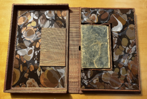
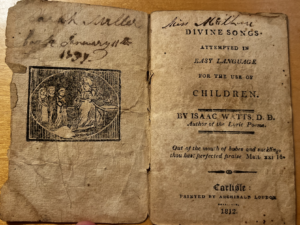
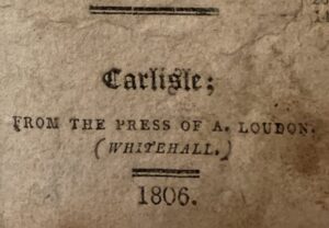
Published in 1806 by Archibald Loudon, A Selection of One Hundred and Forty of the Most Favourite English, Scotch, Irish, and American Songs compiles these lyrics into just 228 small pages. Though only the opening title page displays the full title, publisher, and publishing date, this leaves space for the immense number of transcribed songs within the book. Just 4.5 inches in height, 2.5 in width, and approximately one inch in thickness, the songbook is beautifully pocket-sized—and durable for travel, too, considering it is in one piece despite its age.

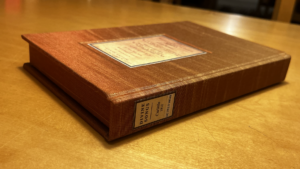
Image of the book’s red leather spine with gold decoration.

Image of the book’s front cover, showcasing its rounded corners and damage to the glossy finish.

Following the title page, A Selection opens with a table of contents that spans for six pages, listing the name of each song in alphabetical order and the corresponding page number. While the “Contents” are straightforward, the songs themselves in the book are listed in no particular order, and often with no specified tune. Occasionally, they feature extended titles: ones that provide hints towards the folks that compiled these “favourites,” specifying what makes the included song valued. For instance, the Marriage of Miss Catty O’ Donovan to Mr. Paddy O’ Rafferty is also included as “THE FAVOURITE NEW SONG OF TID RE I,” a unique title that makes the following lyrics feel novel in comparison to the surrounding transcriptions. Each song is separated only by a small, flower-like design, allowing each tiny page to be used to its fullest. Because A Selection focuses near-exclusively on the titles and lyrics of songs, with nothing but contents pages and the title page describing otherwise, the stories of the songs are front and center. Owners of this book may be expected to know the majority of the song tunes, or be left to enjoy the poetic musicality of the writing above the actual singing of it.

Image of the book’s title page, including the full title and publishing information.

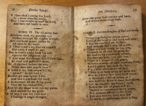
This copy is unassuming and subtly stylish, paired with the charm of its wear-and-tear. The outside features a cover of glossy brown finish, still visible in small spots. Its spine is a thin, richly-red leather, with a decorative gold design of simple lines and elaborate flowers stamped in. “SONGS” is the only word on the spine: an effective description of the book’s contents, as well as a reminder of how it holds these works of art in such high esteem. Within the pages, song titles are centered and in delicate italics, while lyric lines vary in indentation, alternating placement in a way that enhances their musicality without use of sound. Emphasized words or titles are capitalized: for example, the first word of each song, or extended titles. Punctuation is used just as expressively; many lines end in passionate exclamation points or question marks. 

The damage done to the book is perhaps a testament to its pocket-sized role as a companion and its sturdy construction. The texture of the spine’s top is worn, and the middle portion sags from being cracked. The cover’s condensed layers of pasteboard separate at the rounded corners, causing a medium brown, splotchy binding. Bits of solid, brown food can be found close to the book’s center when opened, and all pages suffer from some extent of browned liquid staining. The majority of page corners are folded, curled, slightly faded, or torn—the title page, especially, is torn, with one section ripped out from its side. However, the damage fails to render any text unreadable, likely due to the pages being fabric-based, making them more resistant in comparison to wood pulp. The most concerning damage—the damage obscuring the lyrics which the book seeks to preserve and share—is one small mistake in ink, located on page 201, which blocks some of the word “cheer.” 

Image of page 201, including the partially blocked word.

A Selection appears to be well-loved in more ways than its sustained damage, as it contains curious writing on the inside of its covers as well as on its few blank start and end pages. I have not been able to make out the majority of the writing thus far, as it is significantly smudged and faded. In fact, some smudged handwriting on the back cover appears to have rubbed off from a separate paper altogether, with the book as a makeshift folder. Smeared ink covers one of the blank back pages. “Chas. H.” and an unclear surname is written above “Carlisle PA U.S.A” on the inside front cover. On the inside back cover: “George,” an unclear surname, “his Book 1838 song Book 1838.” George’s sincere ownership of this copy brings to mind a possible explanation for its damage—a long life alongside a person familiar with the compiled songs.

Images of the writing in the book’s inside covers: “George.”

“Chas. H.”

Though it has a long history stretching back to 1806, this copy of A Selection contains a significant air of mystery. The question of who compiled these lyrics, and why, weighs heavy on it. As I work to decipher the additional handwriting in its pages, including the surnames of its prior readers, I consider the mysteries of the book to be one of its best features. By pairing a genuine enjoyment of its music with curiosity, any reader like myself will discover an imaginative realm of possible stories of the life of A Selection.

Bibliography

A Selection of One Hundred and Forty of the Most Favourite English, Scotch, Irish, and American Songs. 1806. SC 398 87 S698. Dickinson College Archives & Special Collections.

Images taken by iPhone within the Dickinson College Archives.

English 222: History of the Book

English 222 is an introductory course in the Dickinson College English Department with a writing emphasis. Student posts explore their public-facing writing style,  describing aspects of the book they have adopted for the semester from the Dickinson College archive.  The goals for the course::

  1. Explore the relationship between the book as a material object and the cultural, technical, and historical elements that influence and make the object. We focus upon the book in the West.
  2. Establish methods of handling and examining books in their various forms. Explore through class readings the historical, theoretical, and imaginative writing on the book. Apply some of the methods of book making in hands-on projects. Work with the ideas of books in a semester-long project and a final project.
  3. Understand the methods of critical bibliography and how bibliographic methods can engage literary theory and history. In the final project students will investigate a topic in book history with independent research and hands-on experimentation, presenting their work in original and persuasive use of media.

French Cookery, The Modern Cook

          French Cookery, The Modern Cook, a Practical Guide to Culinary Art in All its Branches, by Charles Elme Francatelli, stuck out to me out of a myriad of other books. It’s a cookbook, and therefore, it stuck out to me because of the rich history a cookbook can hold. I am very interested in studying and working closely with a book that families would have relied on to cook meals. The content of the book intrigues me as the recipes are very universal. Some are for Indian food, some are French recipes, and some are for filets and other meals that are still very popular. Some of the recipes are rare, like turtle soup, and some still hold up, such as the section on beef roasts. This book has a lot of really interesting recipes that show the book’s age as well as indicators of its past life as a functional recipe book.

          The book’s cover does not include the book’s name or any text in general (see Figure 1). The cover, however, has a golden illustration that looks like a stamp. It is the image of a platter of food with a bowl in the center with serving instruments poking out of the food. It has been indented into the book. It feels like it’s been embedded into the cover as it is bumpy to the touch; the foil, however, feels very smooth. The cover also includes a border called a blind. The blind is in a floral pattern like a vine. Unlike the stamp, this is raised instead of embedded into the cover. Part of the name is included on the spine. The spine says: French Cookery by Francatelli, with another golden image of a similar yet different platter of food. The first time the whole title appears is on the title page.

        The title page includes more information, stating that the cookbook has been “Adapted as well for the largest establishments as for the use of private families.” Under the author’s name, he gave credit to his mentor, saying, “Pupil of the celebrated careme and late mater d’hôtel and chief cook to her majesty the queen.” The title page includes “with numerous illustrations.” Lastly, the title page states that this book was published in Philadelphia by Lea and Blanchard in 1846 (see Figure 2). Two separate editions were published, one being the “London Edition.” It states nowhere that this is the London edition, so assumably, this is the other edition. There is no editor credited, and since this is a cookbook of a very accomplished chef, there most likely wasn’t one. This book also includes a forward, an index, and a glossary. The book includes 588 pages total, including blank pages. Of the 588 pages, 576 of these pages had type on them, and 540 pages of this book were recipes. In total, there are 1447 recipes included in this cookbook. The physical book is 10 inches high, 6.5 inches long, and 1.5 inches wide.

        This book is made with fairly high-quality paper. All but three pages are still fully intact. The paper is thick, and the only damage is on the edges of the page. The binding is made of cloth bound by glue and string (see Figure 3). This is clear because the bottom of the spine has started to break and separate from the cover. You can see the cover and the cloth starting to peak out of the bottom. I could not determine the font; however, the qualities are similar to Times New Roman; the letters have similar head serifs. This cookbook includes multiple illustrations. Every illustration is in the same design as the cover illustration, without the gold coloring; they are all in black and white (see Figure 4). They all depict serving platters or suggest proper servings for certain recipes. In total, there are 55-60 illustrations accompanying the recipes. The end of the book includes 36 pages of advertisements (see Figure 5). Most of these advertisements include images, and they all are for other lifestyle books.

      The book is broken up into chapters and sub-chapters. At the beginning of a chapter, the general recipe types are laid out under the title of the section. Each page that includes recipes has a very consistent layout. Each recipe is titled in an italicized font, and the recipe is a paragraph describing the steps and ingredients needed for the dish; this does not include any measurements. If there is an illustration, it is under the recipe. When a new sub-section is introduced, it is separated from the previous section by a squiggly black line. Each page is headed by what type of recipe is on the page. Some recipes have a note at the bottom of the page indicated by an asterisk. Some other discrepancies from the typical layout are later recipes that refer back to the earlier ones (such as sauces), using parenthesis to indicate this. Near the end of the book, before the advertisements, there is a section of recipes correlating to a day a year; these also break the typical layout. There are different ideas for meals based on the day of the year, in total, there are 365 meal ideas.

       The recipe book feels very used and loved. The pages are oily, which reminds me of my grandmother’s old cookbooks that have cooking oil on each page. This book has clearly been used for cooking. A handful of pages are dog-eared, which indicates that these pages include recipes that the original owner frequently used. It’s a sturdy book, which is good for a cookbook as these books endure a lot. If being used in a kitchen, it’s going to be around food, fire, and other things that can hurt the book if it’s not durable. It’s not that heavy, however, which is another quality that is good for a cookbook because whilst cooking, books get moved around frequently. The book is intended for domestic use as well as professional; the title page states its intended use. A few pages of the book have started separating from the binding, showing its age. Reading and touching the book as an artifact feels a bit wrong. It seems very intimate as this was used by someone who appreciated the recipes and presumably cooked for their family. It also feels very nostalgic as it transports me to a time when I would cook with my family.

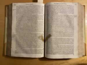
        The book includes a signature on the title page, belonging to a Mrs. B. Stilingfleck (see Figure 2). This is the only writing in the book that is not the original text. Every page has light brown stains; these stains are mildew due to aging and the way it was stored. This is called foxing and is common in old books. On page 475, there is a very small amount of crushed-up brown powder that resembles coffee grounds. This substance created an oil that seeped through and stained the next four pages. Between pages 42 and 43, there is a long, frayed gold fabric coming from the spine (see Figure 6). I believe this is part of the binding that has started to unravel. Lastly, as mentioned before, three pages (273, 392, 393) of the book are torn on the sides. Each page is torn similarly it can be assumed that this was an error in the book-making process. It looks as if the pages weren’t cut, and the owner cut them after buying it.

Works Used:

French Cookery, The Modern Cook, a Practical Guide to Culinary Art in All its Branches, by Charles Elme Francatelli

The Secrets of Alexis

The Secrets of Alexis

Evangeline Clausson

Fig. 1 – Title Page

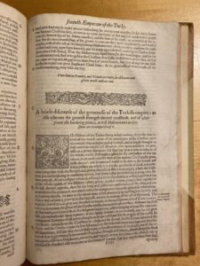
Vastly popular throughout the mid-16th and early 17th centuries (The Hospital), The Secrets of Alexis is a collection of remedies for any number of ailments and recipes for everything from hair growth and clearing acne to removing stains or making inks. It was published first in 1555 in Venice (in Italian) under the name Secreti del Alessio Piemontese (WorldCat). Many editions were published in various languages (The Hospital, 313) over the next several decades, such as this English 1615 edition. The title page expands upon the title, calling it The Secrets of Alexis: containing many excellent remedies against divers diseases, wounds, and other accidents. With the manner to make distillations, parfumes, confitures, dyings, colors, fusions, and meltings. This edition is described as “newly corrected and amended, and also somewhat more enlarged in certaine places, which wanted in the former editions.” It was printed by William Stansby in London for Richard Meighen and Thomas Iones [Jones] [Fig. 1].

Fig. 2 – Title Page for Part 3

The book is divided into five sections, the middle three having special title pages. These pages accredit William Warde as translator for parts two and three and Richard Androse for the fourth. These pages are dated 1614, suggesting that they had been printed earlier or that the book was re-dated to seem more up to date. They also feature a printer’s device showing a bear and three crests in a border with “NON SOLO PANE VIVET HOMO: Luke 4” (“man shall not live by bread alone”) written on it around a man-dog-angel hybrid with a scythe and wheat standing before a large book which says “bevbum Dei manet in afernum:” (“the child of God remains in the afterlife”) [Fig. 2].  This religious imagery is fitting with the book’s 6 pages of “The Epistle,” which explain how these remedies do not mean to remove suffering or give men the powers of God, but simply to help men live better by the will of God.

Fig. 3 – Dedication Page

The front matter consists of the epistle, a “to the reader,” and a dedication “To the Right Honovrable Francis, Lord Rvssell, Earle of Bedford” (A2). [Fig. 3] Francis Russell was a royal envoy recieving the Prince of Piedmont in 1554 and then was in Italy in 1555, meaning this dedication wasn’t arbitrary: Russell was a political figure with connections to the author’s home (Dale).

Fig. 4 – Bookplates

This volume features a bookplate showing mountains with a bird and a cloud and the name “Charles Coleman Sellers” at the bottom. Sellers gifted this book to the Dickinson College archives in memory of his late wife, Helen Earle Gilbert, as noted on a Dickinson commemorative bookplate on the adjacent page. [Fig. 4]

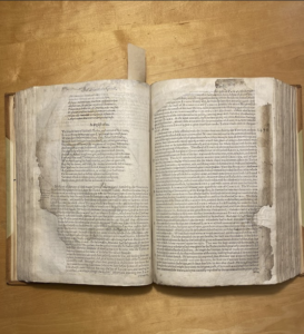
Each page is roughly 7.5 inches tall and 5. 63 inches wide. The book is 1.56 inches thick with 348 numbered leaves and 8 unnumbered—6 of the epistle and a blank page at the beginning and end of the volume. The front cover and several of these first pages have become detached from the whole. The volume has also split in two at page 130. The edges of each page are to varying degrees discolored, leaving them a warm brown as compared to the inner-page’s sandy-peach color. Many pages have small dot stains, where perhaps a drop of something had fallen on the page. A few pages have larger areas of discoloration, likely due to a liquid being spilled, though these areas are confined to just a few pages and do not hinder the book’s readability. [Fig. 3]

Fig. 5 – Cover

The cover is simple in appearance. It is dark brown and quite splotchy, likely made from mottled calf skin or another variety of leather. [Fig. 5] The only decorative elements are thin black lines pressed into the cover. The edges are frayed, with particularly damaged locations, such as the dent on the outer edge, revealing an almost orange underside of the leather as well as what appears to be pasteboards underneath. The raised bands on the spine indicate it is cord bound. [Fig. 6] The paper is incredibly durable, with only the edges and first few pages, which are more exposed, seeing any deterioration.

The damage as well as few pencil markings bracketing specific passages [Fig. 7] suggest the book was well used at some point, particularly the first half. These pages come apart more easily and the binding feels looser (not just because it’s detached from the main cover, though that may also be a result of its greater use) suggesting that the book was open to these pages more often than those later in the book.

Fig. 6 – Spine

Each page uses two fonts, a basic type font for headings and a variant of blackletter for the recipes. I ran both through two font identifiers (listed below), but I was unable to identify exactly which font either was. The center-aligned headers being in a different font paired with the larger first letter of each remedy helps clarify where sections start and end as the pages are otherwise just remedy after remedy. Occasionally pages have little blocks of printed text in the margins defining or elaborating on terms in the main text.

Fig. 7 – Sample page with pencil brackets

I chose this book because in flipping through, I initially assumed that it was a housekeeping/home remedy guide of some sort, and based on that, I thought it was written by a woman as that is who kept the house, not considering their limited literacy. It is highly unlikely that The Secrets was written by a woman, though wealthy women were known to keep little recipe sets, so it is possible (Bela, 60-61). More likely, however, is that the author was either Girolamo Ruscelli or Alessio Piemontese. As a clergyman and alchemist, Piemontese seems the more probable author, though two late 16th century sources name Ruscelli as the author and that has generally been accepted since (Bela, 53-63).  The book is still wonderfully interesting as it gives insight into what daily ailments were and how people tried to solve them, though I am disappointed that the housekeeping-type recipes are largely confined to stain removal.


Works Cited

Bela, Zbigniew. “The Authorship of The Secrets of Alexis of Piemont” Kwartalnik Historii Nauki i Techniki, vol. 61, no. 1, 2016, pp. 52-73. ResearchGate, https://www.researchg ate.net/publication/11726225_Who_really_is_an_author_of_Alexis_of_Piemont’s_secrets.

Dale, M. K. “Russell, Francis (1527-85), of Amersham and Chenies, Bucks. and Russell (Bedford) House, the Strand, Mdx.” The History of Parliament, https://historyofparl iamentonline.org/volume/1509-1558/member/russell-francis-1527-85. Accessed 7 October 2024

“The Secrets of Alexis: containing many excellent remedies against divers diseases, wounds, and other accidents. With the manner to make distillations, parfumes … and meltings …” WorldCat, https://search.worldcat.org/title/5621135. Accessed 3 October 2024.

“The Secrets of Alexis.” The Hospital, vol. 16, no. 407, 1894, pp. 313.


Works Consulted

Ferguson, J. “The Secrets of Alexis. A Sixteenth Century Collection of Medical and Technical Receipts.” Proceedings of the Royal Society of Medicine vol. 24,2 (1930): 225-46.

Ruscelli, Girolamo. The Secrets of Alexis [Pseud.]: Containing Many Excellent Remedies against Divers Diseases, Wounds, and Other Accidents. With the Manner to Make Distillations, Parfumes … and Meltings … Newly corrected and Amended, and also Somewhat more enlarged in certaine places, Which wanted in the former editions., Printed by W. Stansby for R. Meighen, 1615.

“The Secrets of Alexis [pseud.]” Library of Congress, https://www.loc.gov/item/49043523/. Accessed 3 October 2024


Font Identifiers Used

What the Font: https://www.myfonts.com/pages/whatthefont

Font Squirrel: https://www.fontsquirrel.com/matcherator

Moby Dick; Or The Whale with Illustrations from Rockwell Kent

This blogpost will concern Moby Dick with illustrations by Rockwell Kent. The book has 863 total pages and is 5.5×7.5×4 (14x19x10). With 822 of those pages begin for the text and illustrations of the novel, 41 pages of front matter, and 10 pages of back matter. The front matter is composed of the dedication, copyright information, table of contents (which includes a beautiful illustration of Captain Ahab’s ship), an Etymology section, and an extracts section. The extracts section contains quotations from sources that Melville used in the authoring of Moby Dick.


            This edition was published in 1930 by Random House, and is set in Monotype Fournier, according to the colophon, and is a condensed version of the Lakeside Press’s three volume illustrated edition of the aforementioned novel. As such, the images within are reproductions of those done by Rockwell Kent for that edition. Thus, this should be considered a special edition but not a first edition as neither the illustrations nor text are original to this particular print run.

            This volume is most likely clothbound and shows signs of use around the edges especially on the spine, and at its corners. In particular there is fraying along the top and bottom of the spine. One is also able to see the cardboard underneath the cloth at all of the book’s corners. The cover of the book has the title “Moby Dick” on it and has an image of the whale’s head breaching the water with its mouth open. While the spin says “Moby Dick Illustrated by Rockwell Kent” at the top, has an image of the whale’s tail in the middle, and says “Random House” at the bottom. The ink used for this is silver, and is recessed within the cover, that is, if one runs their hand over the illustrations and title, you can feel that they are slightly lower than the black portion.

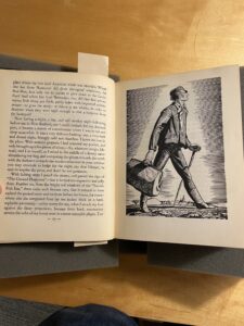
            The illustrations in the edition are absolutely beautiful and integrated into the story seamlessly. They occupy space at the beginning of the chapter, usually at the top of the page on which it begins. In the case of Chapter One there are two images. The first, is above the words “Chapter 1” and its title. The image showcases a man lying on his stomach, facing away from the viewer, and looking out to sea. This goes perfectly with the subject matter of the chapter, as Melville details man’s calling for the sea. One can only assume that if we could see the man’s face, it would be clear he is awestruck by the beauty of the ocean. Then, at the very end of the chapter, after the conclusion of the text there is another man, this time sitting on a log, which could be a support for a pier, gazing longingly out to sea, this time with a ship in the background.

            The images are in black and white and are composed of a series of very thin lines. The lines are given length and coloring which create the shapes that Kent is portraying in his illustrations. The drawings add a tremendous amount to the reading of the novel. Particularly in chapter two, where the reader flips the page from 9 to 10, and sees a full-page drawing of Ishmael walking towards New Bedford. The only thought I had when seeing this image for the first time was, “Wow, this is fantastic.” Indeed, the images are the main reason I chose to work with this particular book. While Moby Dick Or The Whale, as is printed on the inside cover, is a classic novel in and of itself, something about the illustrations make it incredibly fun to read. Perhaps, it is because we are first acquainted with pictures in novels as children, and typically, we lose these images as we grow older and read more complicated texts. I cannot help but smile when I see the images in this edition.

            This book is fun to read and while the illustrations are absolutely the center of attention, the condition of this book contributes greatly to the reading experience. It feels very solid and does not seem brittle or fragile at all. Oftentimes when reading a book which was printed almost 100 years ago, I feel great anxiety in even touching it. Like one wrong move and this object which has survived generations of readers is going to explode in my hands, and I will be responsible for its untimely demise. This is not how I feel with this edition of Moby Dick. The binding still feels tight and strong, the paper is thick and of solid quality. It does not feel like it would rip if touched in the wrong way, which is common of many editions printed more recently. Indeed, the build quality of this book is extremely high. In addition to this the type face used in this edition is incredibly legible.

            Overall, this particular special edition of Moby Dick is a joy to read. While the illustrations are the highlight, and the distinguishing factor of this book, the font, the construction, and Melville’s timeless prose all contribute to an absolutely fantastic reading experience.

“The Frugal Housewife,” A Revolutionary How To Guide

Dickinson College Archives and Special Collections Department holds significant research material ranging from medieval times to the present, and while located at a small institution, it is home to a wide range of rare books, photographs, and other artifacts. Of these historical materials, Lydia Maria Child’s revolutionary cookbook entitled “The Frugal Housewife” stands out as especially loved. At first glance, the book is barely that – it is no longer bound and must be held together by a ribbon. As we take a closer look, the cookbook is more than it seems, and it holds more than the originally printed recipes and remedies.

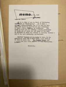
In a conversation with Dickinson College Archivist Malinda Triller-Doran, she informed me that while the book’s journey to our archives is not explicitly known, we can guess that it was once a part of Charles Coleman Sellers’s Library and was donated to the Archives with the rest of his collection after his death in 1980 (Triller-Doran).

The full title of the book is “The Frugal Housewife: Dedicated to Those Who Are Not Ashamed of Economy.” The audience for this book is presumably the average, middle- or lower-class housewife in America. Most of the included recipes are simple and require minimal ingredients, and in addition to the normal recipes expected in a cookbook, a significant portion of the book is reserved for remedies and advice for topics outside of the kitchen, including laundry and cleaning tips.

This specific edition is the fourth edition, and was published in Boston, Massachusetts in 1831 by Carter, Hendee, & Babcock. The size of the book (5in x 7.5in x 1 in) suggests its economy. A larger-sized book would not be affordable by the audience, and it is more convenient for storage and use at this moderate size. This cookbook is 118 pages, but pages 109 – 112 are missing. This mishap could be due to the poor state of the binding and the fact that most of the pages are no longer connected. The paper itself, while no longer bound together, is thick, with clean-cut edges, and, in comparison to the deteriorating state of the binding, has held up exceptionally well over time. While yellowed and stained on every page, none of the paper is torn or ripped, and only five pages have been bent at the top right corner. This folding looks accidental but could also have been a bookmark for the owner. The typeface is difficult to determine, as it looks like Times New Roman, or some other serif font. After running a picture through font identification software, I think the font is “Aquatic Rough (WhatFontIs.com).”


While the book was not printed with illustrations or pictures, a previous owner – presumably an “M. Cady” based on the repeated signatures across the front cover – marked up the book with drawings, signatures, additional recipes, and other inscriptions. The first page of the book was once a blank protective sheet but has since been lined and written on both sides with multiple recipes for frosting, cookies, cake, sausages, and steam pudding. In addition to this once-blank page, the blank spaces on pages 80, 103, and 113 are home to more personal recipes. While the print is messy and the pencil is mostly faded, from what I can tell the recipes are for “Pork Cake Loaves,” “Sausages,” and “Good Common Cake Loaves.”

Although the front and middle of the cookbook housed mostly inscribed recipes, the back cover is covered in drawings of birds, fathers, flowers, and a face. There is a passage at the top that has since been crossed out, but from what I can tell is another recipe including ingredients like butter and buttermilk.

These recipes and the writing on the front cover were in the same handwriting and pencil as the “M. Cady” signature, and after further investigation, this woman is presumably Mary Cady (previously Mary Webb, married to Hiram Cady). Apart from the repeated “M. Cady” stamps and signatures, there is an additional signature that reads “Mrs. Hiram Cady.” After a deep internet search, I found a picture of a woman named Mary Webb who married a Mr. Hiram Cady, who passed away in 1876 (WikiTree). I cannot find much else on her other than her burial location in Washtenaw County, Michigan. There is one recipe on the back cover in a different, darker handwriting for a Beef dish. There are two more names inscribed but they are completely illegible.

The front matter of the book includes the aforementioned, no-longer-blank page, a title page, a page containing two notes, and the introductory chapter. The title page is nearly identical to the cover of the book, including the full title (“The Frugal Housewife: Dedicated to Those Who Are Not Ashamed of Economy”), a dedication, two quotations – one by Benjamin Franklin and one with no source – the edition of the book, and publication information.

The page with notes contains one from Lydia Maria Child stating her reasoning and additions to this edition and one from the Clerk of the District of Massachusetts emphasizing its publication location. In place of a table of contents at the beginning of the book, there is instead an alphabetical index at the end, beginning with “Advice, General” and concluding with “Pastry.”

The organization of the book is clear and simple, and extremely easy to skip through. Since it holds recipes and remedies, a reader will use it for specific reasons and may need to skip around to find the entry they are looking for. The short paragraphs, clear titles, and alphabetical index make this a convenient manual for the average reader. Food groups include “Herbs,” “Meat Corner, or Salted, Hams &c,” “Puddings,” and more. Remedies include small healing tips, specifically for burns and cuts, in addition to more first-aid style tips. The author takes a familiar, conversational tone, using both first person and addressing the reader directly in certain passages.

The physical condition of the book emphasizes how loved this book was, proving its convenience and popularity. This is not a book that is held and flipped through. It is quick to lie flat, suggesting its long history of laying on a table or kitchen countertop. This book is similar to our modern-day “Cooking for Dummies,” with both easy, clear recipes and significant advice and remedies. Child goes above and beyond for her reader by delving deeper than the assumed recipes of a cookbook to include tips and tricks for chores and tasks outside of the kitchen. Despite this information on this cookbook, the catch-all guide to being an economical housewife holds more secrets – in both its typed content and added inscriptions – that I look forward to uncovering over the course of the semester.


Works Cited

Child, Lydia Maria. The Frugal Housewife : Dedicated to Those Who Are Not Ashamed of Economy. Fourth edition / corr. and arr. By the author, to Which are added, Hints to persons of moderate fortune., Carter, Hendee and Babcock, 1831.

“Find Any Font from Any Image.” Upload Image, www.whatfontis.com/?s3. Accessed 22 Sept. 2024.

“Mary (Webb) Cady.” WikiTree, 28 June 2023, www.wikitree.com/wiki/Webb-14437.

“Mrs. Hiram Cady (Mary Webb).” Ypsilanti Historical Society Photo Archives, quod.lib.umich.edu/y/yhsic1/x-08073/PHOTO08073?lasttype=boolean%3Blastview. Accessed 14 Oct. 2024.

Triller-Doran, Malinda. Personal interview with the author. 18 September 2024.

Newer posts »

© 2024 History of the Book 2024


Academic Technology services: GIS | Media Center | Language Exchange

Theme by Anders NorenUp ↑