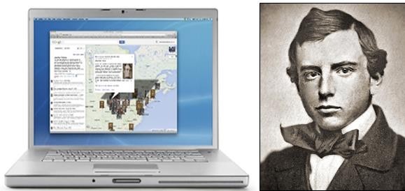
Finding and presenting truth is even more complicated in the digital age than ever before. The tools of this era provide unprecedented resources for scholars who seek truth (or at least greater knowledge) within their disciplines but the multiplicity (as Henry Adams might term it) of information and platforms also creates confusion. Some of this debate in recent years has erupted out of the concept of “big data,” and what it means to the future of scholarship. Seminar participants should be able to define the term and should also be able to explain its pros and cons. A recent column from the New York Times by professors Gary Marcus and Ernest Davis offers one useful introduction to this important topic. There is also a fear over the future of artificial intelligence and its potential role as “our machine master,” as columnist David Brooks put it recently. The debate over big data and artificial intelligence has mostly focused on research, but the presentation of data through infographics is also a subject of immense importance to any digital humanist. The skills required to create multi-media data-driven presentations are currently at a premium. This recent blog post offers some advice about infographics from Nate Silver, one of the leading practitioners in this field today.
From “big data” to “big history is a leap, but not as large as one might imagine. There has been an explosion of interest recently in the presentation of world history as a way to focus student minds on the larger forces of history. This is a trend driven in part by the philathropy of Bill Gates, the Microsoft co-founder, whose devotion to big history was recently the subject of a long, fascinating essay in the New York Times Sunday Magazine. In that essay, students will learn about the work of an Australian academic named David Christian. Check out an example of his approach, here in this video from TED Talks, that features what he labels an “18-minute history of the world.”
