Maps can be either primary or secondary sources, but regardless, they always contain some kind of interpretation. Sometimes that realization surprises map users, but it shouldn’t. All maps select data and present them from a definite point of view. Subway maps highlight routes and stops for mass transit riders. Street maps feature roads and landmarks useful for automobile drivers. Global maps chose where to center the earth, how to draw the political boundaries or whether to feature natural terrain. The list goes on.
The wide range of choices involved in map-making should become even more obvious in this new digital age where importing data into maps through the use of layers helps transform the process into something more obviously interactive and interpretive . The integration of data into maps is the hallmark of something known as GIS (geographic information system). National Geographic has a good, short post on the basics of GIS which all students in this seminar should read. And a few years back, the New York Times offered a helpful article on how historians are using GIS to re-imagine key events from the past, such as the Battle of Gettysburg.
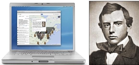
Admittedly, there is something a little intimidating about GIS. For many years, the process was restricted to a limited number of experts relying on sophisticated and expensive software. The good news is that today, the process of digital map-making is being opened to a wider public in a manner not dissimilar from how Wikipedia has been disrupting the traditional domain of encyclopedias. Check out this interview with art historian Suzanne Blier who is using a free open source tool from Harvard called WorldMap to create some exciting maps about Africa. If you have any extra time, it’s also worth browsing some of the maps at WorldMap (such as TweetMap, which allows you to map the frequency of tweets from around the world that use a specific word or phrase). Or if you want to experiment with some new-style maps that are a little easier to create but still appealing in their own way, check out some of the custom-made Google maps from the House Divided Project, such as this one on the rise and fall of Atlantic Slavery:
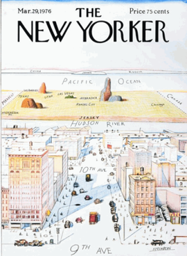
Perhaps the most famous modern map of the world, via The New Yorker (Saul Steinberg, 1976)
And some other interesting maps from 2012, via GIS Lounge
Or a useful deconstruction of the standard electoral college map from the 2008 election, via some political map-makers at the University of Michigan.