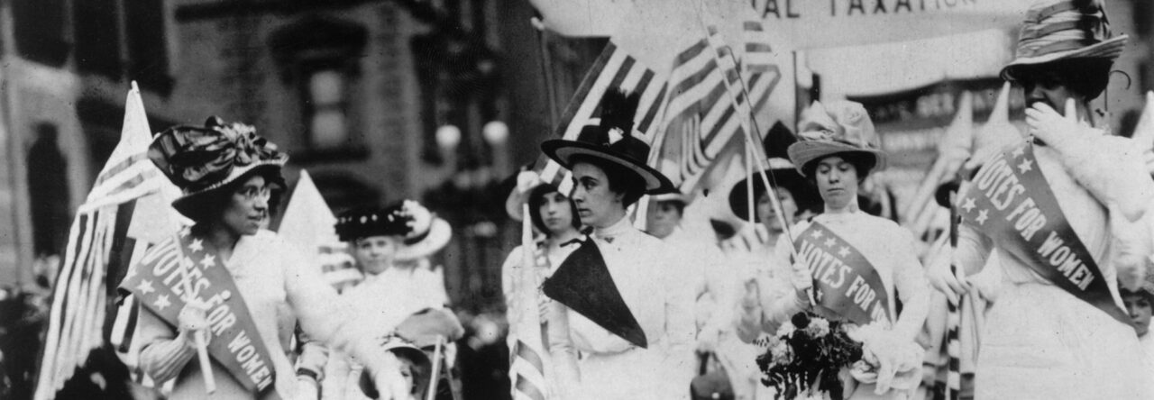
Alexander Keyssar explains the fits and starts of expanding (and sometimes contracting) nineteenth-century American democracy in chapters 2 and 3 of his book, The Right to Vote (2009 ed.). But how best to visualize this complicated story?
Madeleine Gardner offered one valuable approach by trying her hand at creating some infographics based on her notes from Keyssar. All students would benefit from this type of model. Almost every learning study concludes that visualizations help memory. Associating images with facts is the best way to remember them –far better than underlining, cutting-and-pasting, or even rewriting them.
Even if you lack the time to generate charts, graphs, or maps, there’s usually great benefit in simply finding an image online to associate with some kind of textual insight. Consider this famous painting from George Caleb Bingham. It is called “Stump Speaking” (1854), from his trio of paintings on American elections. You can find out more about this series here, but also look below how just combining a striking quotation from Keyssar’s book along with the image helps underscore the interpretation.


Leave a Reply
You must be logged in to post a comment.