Prof. Carol Ann Johnston

Author: zunigas

The Rosebud: A Final Vestige of a Dying Practice


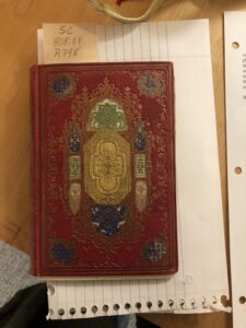
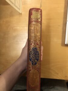
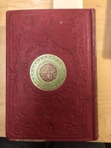
         The Rosebud is a fascinating aspect of a practice that has been rendered  obsolete and lost to time. This book is an example of a “gift book” or “annual”, which were typically illustrated collections of poetry, fables and prose, popular in the 19th century (A 19th-Century Fad). As a point of clarification, though the terms “gift book” and “annual” are often used interchangeably, a small difference exists in that “annuals” refers to editions of any such anthology of different works or magazines with extra aspects or illustrations printed for purchase at the end of the year (Gift Books and Annuals | Encyclopedia.Com). The main draw of these gift books was that the covers were lavishly decorated, with gilt edges and ornately decorated binding. The Rosebud’s bright colors and intricately embossed cover and spine designs make it a shining example of such a book. These annuals often served as gifts for women and children, with The Rosebud likely intended as a romantic gesture, due to its name representing a flower. Flower language was a popular method of courtship in this era (The American Gift Book). Gift books also served to further political causes, with a number of abolitionist gift books being circulated between 1839-1857 (Gift Books and Annuals | Encyclopedia.Com)

Gift books hit the peak of their popularity in 1848 to 1851, with thousands of copies of certain popular annuals such as The Atlantic Souvenir being circulated throughout England, the United States, and later to Canada and South America (The American Gift Book). In the 1850’s however, the popularity of gift books began to decline. Because The Rosebud was published sometime in the 1850’s, it was one of the later gift books to be circulated. This possibly explains why there is so little information on The Rosebud itself online, as it was likely not particularly popular due to the gift book’s waning relevance as a genre. The downfall of annuals and gift books was likely caused by a number of factors. Importantly, publishers had begun to employ marketing strategies such as publishing their gift books just before the Christmas season, thus creating intense competition between publishers. Additionally, those authors that gained notoriety from their writing contributions to gift books began to publish their writing independently, both exceeding the popularity of gift books and  effectively rendering the content within them redundant and unnecessary (The American Gift Book). Ultimately, they simply grew out of fashion in the late 1850’s, with little to none still being published by the time of the Civil War. 

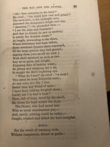
In terms of the fate of this edition of The Rosebud, there is some information that can be gleaned from its appearance. Firstly, the interior appears to be almost completely free of damage. This is not uncommon in gift books, as their purpose was not necessarily to be read as you would a typical book. Instead, they were similar in concept to today’s coffee table books, intended to be displayed on tables and shelves, and to be flipped through at random. The Rosebud falls in line with this purpose, as the writing and poetry segments are not in any particular order. 

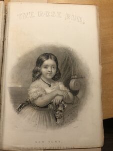
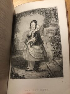
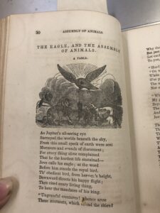
 Another aspect that was common with gift books is that the engravings contained within them were often removed and displayed, due to their beauty and detail. An interesting detail to note is that  this particular edition of The Rosebud has all of its illustrations intact, perhaps lending credence to the fact that The Rosebud was not a popular or well known gift book. 

It is not readily known how many editions of The Rosebud were printed, but according to The Arsenical Books Database, at least two editions were bound with a green onlay containing a small amount of arsenic. This was a somewhat common practice in the 19th century, as the bindings and onlays containing this arsenic were a brilliant, beautiful green color, making books that utilized it stand out from others (ARSENICAL BOOKS DATABASE – Winterthur Museum, Garden & Library). According to the database, the method in which the arsenic was applied was an ornamental onlay similar to that of this edition of The Rosebud, so it is not completely out of the realm of possibility that this edition contains arsenic. It is not likely that The Rosebud was ever reprinted any later than the short time it was in circulation, as it was published at the tail end of the lifespan of the gift book. It has not been scanned online, and there are few sporadic editions available for online purchase on sites such as Etsy. 

In short, the specific details of the afterlife of this edition of The Rosebud remain mysterious. It emerged towards the downfall of the gift book’s cultural relevance, and faded quickly into obscurity. Its contents and illustrations have been seen by relatively few, and information is sparse. Ultimately, it serves as a marker of a unique cultural practice of the 19th century, and an ancestor to modern coffee table books, meant to be looked at rather than read. 


Works Cited

A 19th-Century Fad: The Illustrated Gift Annual | New-York Historical Society. https://www.nyhistory.org/blogs/a-19th-century-fad-the-illustrated-gift-annual. Accessed 27 Mar. 2023.

ARSENICAL BOOKS DATABASE – Winterthur Museum, Garden & Library. http://wiki.winterthur.org/wiki/ARSENICAL_BOOKS_DATABASE. Accessed 5 Mar. 2023.

Gift Books and Annuals | Encyclopedia.Com. https://www.encyclopedia.com/arts/culture-magazines/gift-books-and-annuals. Accessed 27 Mar. 2023.

The American Gift Book. https://www.abaa.org/member-articles/the-american-gift-book. Accessed 5 Mar. 2023.

The Rosebud: Origins

The Rosebud, an ornate gift book composed of various fables and tidbits of knowledge by various authors. Therefore, there is no author listed. Curiously, the authors of each work are not listed, and the only credit given is to the publisher, Leavitt and Allen. 

Leavitt and Allen was established in 1851 when George Ayers Leavitt took over his father, Jonathan Leavitt’s publishing firm after his death and took on a partner, John K. Allen. The company was located in Lower Manhattan, and first settled on Dey St, what would be called Broadway today. 

Leavitt and Allen were best known for publishing gift books, also called annuals, which were a common gift in the 19th century. They were often anthology style collections of short fiction, poetry, fables and essays, with ornate and beautiful decorative covers. Their purpose was essentially to be displayed and sometimes flipped through, but served as what we would contemporarily refer to as a “coffee table book.”  They were often used as a courtship gift. In particular, many gift books such as The Rosebud were purposely given names of flowers to signify their purpose as a romantic gesture, as “flower language” was a common courtship tactic during this time. Often gift books would come with a “presentation plate” that marked their purpose as a gift. 

The building Leavitt and Allen worked from also housed their printer and business partner, John Fowler Trow. Trow was born in 1810 in Andover, Massachusetts. He first came into the printing business due to working at his brother-in-law’s printing business, where he acquired knowledge of Greek and Hebrew type. He established a newspaper in April 1832 that only lasted until July 1832, after which he moved to New York City and worked under various publishers before establishing his own printing and bookbinding company, where he worked until his death. Trow is notable for being among the first to introduce electrotyping to the printing business, which was a means of creating duplicate plates for letterpress printing (Electrotyping | Britannica), as well as his publication of Trow’s New York City Directory. He worked with Jonathan Leavitt under the name Leavitt and Trow, and worked with Leavitt and Allen until 1849, after which the printer of the business remains unknown. (John Trow).

An interesting aspect of The Rosebud is that there is no editor listed. Many gift books by Leavitt and Allen published in the 1850’s were edited by Timothy Shay Arthur (Timothy Shay Arthur) but The Rose Bud has no listed editor despite having a very similar look and genre of other gift books from that particular time period. It is unclear if there was an editor at all, or multiple, as the only credit given in The Rosebud is to the publishers. 

Many gift books published by Leavitt and Allen are bound in Morocco leather, and ornately tooled and later machine embossed. With the invention of the stamping press in the 1830’s, ornate designs became even easier. Additionally, gold leaf was a common feature in the covers as well as gilt edges to both protect the pages and contribute to the ornamental look of the book. It is unlikely this is the case in this particular edition, but an interesting aspect of the binding is that it is possible that the green onlays included in the ornamentation of the cover may actually be poisonous, as arsenic is a key component in some emerald green pigments for  binding and onlays. There are some Leavitt and Allen published works that incorporate arsenic binding,  including two editions of The Rosebud  that do use arsenic green onlays, but it is unclear if the edition that I possess has these components(ARSENICAL BOOKS DATABASE – Winterthur Museum, Garden & Library). The color of the green onlays is similar to those used in the arsenic bindings, but it is unconfirmed. 

Works Cited

ARSENICAL BOOKS DATABASE – Winterthur Museum, Garden & Library. http://wiki.winterthur.org/wiki/ARSENICAL_BOOKS_DATABASE. Accessed 5 Mar. 2023.

Electrotyping | Britannica. https://www.britannica.com/technology/electrotyping. Accessed 1 Apr. 2023.

John Trow. https://prabook.com/web/john.trow/3761698. Accessed 5 Mar. 2023.

Timothy Shay Arthur. http://www.tsarthur.com/gift.html. Accessed 5 Mar. 2023.

The Rosebud (1850-1856)

The Rosebud: A Book not Intended to be Read 

The Rosebud, published sometime in the 1850’s by Leavitt and Allen,  is an enigmatic book containing such pieces of writing as fables, instruction on manners and other biblical concepts, and text on aspects of knowledge such as the study of natural history. There is no particular structure to the book, leading to theories that it could be a gift book: a type of book popular in the 19th century that was intended to give as a gift and not intended to be directly read. This is further evidenced by the extremely dense table of contents, its ornamental appearance, and the fact that it appears to not actually have been read. 

The front cover of The Rosebud is what appears to be Morocco leather dyed red (fig.1), with extremely intricate gold floral and structural elements with green and blue detailing. The designs are ornate, and painted with what appears to be gold leaf, as it is still very vibrant, and the gold detailing shines in the light. The front cover design is horizontally symmetrical, with the structural elements suggesting a steeple type design, evoking the look of gothic architecture. The spine has “The Rosebud” in gold and stamped or carved  into the leather (fig.2), with gold leaf floral designs and more structural design elements such as columns and feathered ornamentation decorating the edges of the spine, still suggesting the visual motifs of a church. The back cover has a circle in the middle with a symmetrical floral design (fig.3), with the same gold leaf and green intricate detailing present. There are more floral patterns around the middle and edge of the cover, but rather than being decorated with gold or color, they are simply stamped into the leather. Even so, the intricate detailing is clearly visible. All the cover designs are able to be felt by running your finger over them, both highlighting the intricacy and care that went into the designs, as well as suggesting that the designs have not worn away over time.  The edges of the cover show some wear down as the corners bend in and are fraying slightly, and the outer edges are somewhat bumpy and dented. There are some dark spots suggesting a spill of food or ink, and the edges are stained and dirtied slightly. Overall however, the brilliance and beauty of the original cover quite literally still shines through. 

The book itself is in remarkably good condition, despite its age. The spine still feels intact and the binding is secure with the exception of the front cover which is loose, indicating that the binding is starting to fall apart. The paper of the pages appears to be of good quality. The damage is minimal. Additionally, the paper has gilt edges, making the pages of the book shimmer in the light when the book is closed, as well as protecting the edges of the pages. The inside of some of the pages are spotted, as well as some pages having larger stains (fig. 4), suggesting foxing of some sort. Some of the text and illustrations have bled onto the next pages and left imprints of words or images. However on the whole, the book feels somewhat fragile to hold and read, but not quite as delicate as one would expect from a book this old. The pages are a bit stiff but are not torn, and turn well. The spine is also stiff and can make it difficult to open the book fully, but shows very few signs of wear or falling apart. There is actually so little damage to the pages and interior structure of the book that it appears unused. There is little marking or imperfection that would suggest this book was well read beyond the front cover. This adds to a possible theory that this was intended as a gift book, akin to a coffee table book, intended to be displayed and read sporadically and in a nonlinear fashion. 

There are numerous illustrations in the book, most protected by a thin sheet of different, translucent  paper. There appear to be two distinct styles of illustrations, one of which is an extremely detailed true engraving (fig.5). We know that it is a true engraving, because if you rub your finger on it, the material gets on your fingers (Archivist, personal communication 20203).  There are also many smaller illustrated pieces for different fables, which appear to be in a different and less detailed style of engraving (fig.6). The true engravings are depicting children in scenarios such as playing with bubbles, posing with animals or posing with their family. The smaller illustrations are specific to the fable or section of writing they are paired with, often appearing on top of or below the fable. 

The front matter of the book includes an illustration on the front cover, two different title pages, one with a true engraving illustration and one with a more simple illustration, and a table of contents for both the more detailed engraved illustrations, as well as each fable and section of text. The table of contents has incredibly small and dense text, rendering it barely readable and difficult to use, indicating little intent to make items easy to find.  The more simple engravings are not in the table of contents for the illustrations. 

The font used appears to be most similar to Baskerville, which was designed in the 1750’s by John Baskerville. It shares the characteristics of the font, which include crisp edges and various serif designs on letters such as b or x, and aspects such as the lowercase g having an “ear” or a small design on the top of it that flips up. Features such as the lowercase g nor being closed and the unique swash tail of the uppercase Q are a match to the standards of the Baskerville font, which were key in identification (Bishop 2020).The first word or two words of every new fable or section is in a smaller font size, and is uppercase. Each new fable is separated by rules (fig.7), and the margins are smaller in fables written like poems or with dialogue. There are more informational sections, such as the section on Zoology, in which each section (Quadrupeds, Fishes, Birds, Reptiles and Serpents) are merely separated by a heading in a smaller typeface in the middle of the page. 

In short, The Rosebud is most likely intended as a gift book, not intended to be read due to its near pristine condition despite its age. It is visually elegant, but the contents are random and scattered. 


Works Cited

Bishop, Mark J. “Baskerville Typeface Specimen — a UI Case Study.” Medium, 1 June 2020, https://uxdesign.cc/baskerville-typeface-specimen-a-ui-case-study-1eeff7663bd7.

Archivist, Name Unknown, Short Discussion, February 2, 2023


Fig.1

Fig.2

Fig.3

Fig.4

Fig.5

Fig.6

Fig.7


© 2024 History of the Book


Academic Technology services: GIS | Media Center | Language Exchange

Theme by Anders NorenUp ↑