The Rosebud: A Book not Intended to be Read
The Rosebud, published sometime in the 1850’s by Leavitt and Allen, is an enigmatic book containing such pieces of writing as fables, instruction on manners and other biblical concepts, and text on aspects of knowledge such as the study of natural history. There is no particular structure to the book, leading to theories that it could be a gift book: a type of book popular in the 19th century that was intended to give as a gift and not intended to be directly read. This is further evidenced by the extremely dense table of contents, its ornamental appearance, and the fact that it appears to not actually have been read.
The front cover of The Rosebud is what appears to be Morocco leather dyed red (fig.1), with extremely intricate gold floral and structural elements with green and blue detailing. The designs are ornate, and painted with what appears to be gold leaf, as it is still very vibrant, and the gold detailing shines in the light. The front cover design is horizontally symmetrical, with the structural elements suggesting a steeple type design, evoking the look of gothic architecture. The spine has “The Rosebud” in gold and stamped or carved into the leather (fig.2), with gold leaf floral designs and more structural design elements such as columns and feathered ornamentation decorating the edges of the spine, still suggesting the visual motifs of a church. The back cover has a circle in the middle with a symmetrical floral design (fig.3), with the same gold leaf and green intricate detailing present. There are more floral patterns around the middle and edge of the cover, but rather than being decorated with gold or color, they are simply stamped into the leather. Even so, the intricate detailing is clearly visible. All the cover designs are able to be felt by running your finger over them, both highlighting the intricacy and care that went into the designs, as well as suggesting that the designs have not worn away over time. The edges of the cover show some wear down as the corners bend in and are fraying slightly, and the outer edges are somewhat bumpy and dented. There are some dark spots suggesting a spill of food or ink, and the edges are stained and dirtied slightly. Overall however, the brilliance and beauty of the original cover quite literally still shines through.
The book itself is in remarkably good condition, despite its age. The spine still feels intact and the binding is secure with the exception of the front cover which is loose, indicating that the binding is starting to fall apart. The paper of the pages appears to be of good quality. The damage is minimal. Additionally, the paper has gilt edges, making the pages of the book shimmer in the light when the book is closed, as well as protecting the edges of the pages. The inside of some of the pages are spotted, as well as some pages having larger stains (fig. 4), suggesting foxing of some sort. Some of the text and illustrations have bled onto the next pages and left imprints of words or images. However on the whole, the book feels somewhat fragile to hold and read, but not quite as delicate as one would expect from a book this old. The pages are a bit stiff but are not torn, and turn well. The spine is also stiff and can make it difficult to open the book fully, but shows very few signs of wear or falling apart. There is actually so little damage to the pages and interior structure of the book that it appears unused. There is little marking or imperfection that would suggest this book was well read beyond the front cover. This adds to a possible theory that this was intended as a gift book, akin to a coffee table book, intended to be displayed and read sporadically and in a nonlinear fashion.
There are numerous illustrations in the book, most protected by a thin sheet of different, translucent paper. There appear to be two distinct styles of illustrations, one of which is an extremely detailed true engraving (fig.5). We know that it is a true engraving, because if you rub your finger on it, the material gets on your fingers (Archivist, personal communication 20203). There are also many smaller illustrated pieces for different fables, which appear to be in a different and less detailed style of engraving (fig.6). The true engravings are depicting children in scenarios such as playing with bubbles, posing with animals or posing with their family. The smaller illustrations are specific to the fable or section of writing they are paired with, often appearing on top of or below the fable.
The front matter of the book includes an illustration on the front cover, two different title pages, one with a true engraving illustration and one with a more simple illustration, and a table of contents for both the more detailed engraved illustrations, as well as each fable and section of text. The table of contents has incredibly small and dense text, rendering it barely readable and difficult to use, indicating little intent to make items easy to find. The more simple engravings are not in the table of contents for the illustrations.
The font used appears to be most similar to Baskerville, which was designed in the 1750’s by John Baskerville. It shares the characteristics of the font, which include crisp edges and various serif designs on letters such as b or x, and aspects such as the lowercase g having an “ear” or a small design on the top of it that flips up. Features such as the lowercase g nor being closed and the unique swash tail of the uppercase Q are a match to the standards of the Baskerville font, which were key in identification (Bishop 2020).The first word or two words of every new fable or section is in a smaller font size, and is uppercase. Each new fable is separated by rules (fig.7), and the margins are smaller in fables written like poems or with dialogue. There are more informational sections, such as the section on Zoology, in which each section (Quadrupeds, Fishes, Birds, Reptiles and Serpents) are merely separated by a heading in a smaller typeface in the middle of the page.
In short, The Rosebud is most likely intended as a gift book, not intended to be read due to its near pristine condition despite its age. It is visually elegant, but the contents are random and scattered.
Works Cited
Bishop, Mark J. “Baskerville Typeface Specimen — a UI Case Study.” Medium, 1 June 2020, https://uxdesign.cc/baskerville-typeface-specimen-a-ui-case-study-1eeff7663bd7.
Archivist, Name Unknown, Short Discussion, February 2, 2023
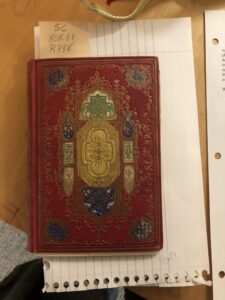
Fig.1
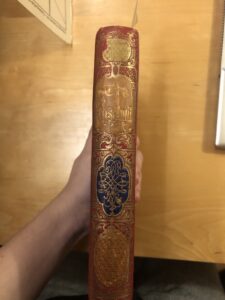
Fig.2
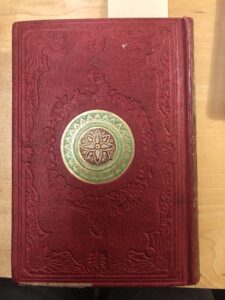
Fig.3
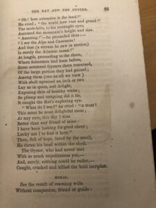
Fig.4
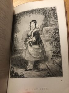
Fig.5
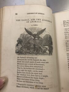
Fig.6
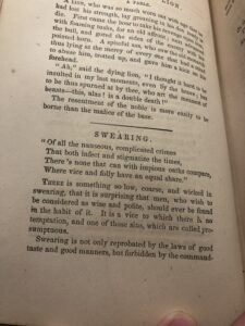
Fig.7
Leave a Reply