My first impression of this book was that it likely would be quite heavy and would perhaps disintegrate in my hands. After all, it was an imposing size and rather old. To my surprise, the book turned out to be lighter than anticipated, and only the front cover feels at all precariously attached. The pages, slightly warped, give a satisfying crinkle as one turns them; they are made of a reasonably thick laid rag paper with horizontal chain lines.
The book measures 7.5 inches (19.5 centimeters) by 11 inches (25 centimeters) by (roughly; the boards have bowed) 1.25 inches (3 centimeters). The binding is a brown, fine leather with some moderate cracking present on the front and back covers, which both have the letters “TN” blind stamped in the center. A gilded design containing a crown, the letter C, and “Camperdown Library” is stamped into the front cover over “TN”; the end edges of the cover are also tooled with a gilded dashed line. A small portion of the spine is missing toward the top, allowing a glimpse at the quires. While I was unable to determine the type of leather, the very fine grain and the smooth, shiny surface seem to make calfskin a possibility. An answer as to when the book was last bound also eludes me, but I suspect that the book has been rebound since 1619, first because the binding is in rather good shape compared to the other books of similar age in the library and also because some annotations made in the margins appear to start or end past the edges of the pages, indicating that the edges may have been trimmed by a bookbinder at a later date. This means that the edges of the pages, which are currently red, would have to have been edge-painted after being trimmed.
The inside of the front cover features a bookplate in memoriam of Edwin Eliott Willoughby ’22, Dickinson alumnus and former chief bibliographer of the Folger Shakespeare Library, whose rare book collection was donated to Dickinson by his sister Frances L. Willoughby ’27 upon Edwin’s death in 1959. The inside of the back cover has been stamped “THIS BOOK MAY NOT BE TAKEN FROM THE LIBRARY.”
The first leaf is blank, and upon turning it one finds the glued-in title page, which is rather wanting in concision (see fig. 1). The full title reads, with capitals and italics rendered as they appear on the page, “A CATALOGVE and Succeſsion of the Kings, Princes, Dukes, Marqueſſes, Earles, and Viſcounts of this Realme of England, ſince the Norman Conqueſt, to this preſent yeare, 1619” (Brooke). Below that is a subtitle: “TOGETHER, With their Armes, Wiues, and Children: the times of their deaths and burials, with many of their memorable Actions” (Brooke). The reader learns below this that Ralph Brooke, the author, intends to “reform” recently published errors in similar catalogues (Brooke). Under that is a Latin inscription, and finally the bottom of the page reveals that William Jaggard is the publisher and that the book was sold in his shop in Barbican, London. Though I will cover them in further detail in a later post, Ralph Brooke and William Jaggard, both of whose names are printed in small capitals (along with, strangely, the word “TOGETHER”), deserve brief descriptions: Brooke was a famously combative member of the College of Arms known for criticizing the quality of other heralds’ work, while Jaggard was a successful London printer and bookseller best known for printing the First Folio.
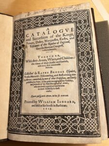
Fig. 1: The title page.
The front matter first contains a message addressed to James I in which Brooke elaborates on his stated goal of reforming errors in catalogues of the nobility. After this is a second and similar letter to Edward Somerset, fourth earl of Worcester, who served as Lord Privy Seal to James I. Brooke then provides a list of the errors he has identified and is seeking to remedy.
The main numbered body of text is an alphabetical list of the noble titles and the genealogies of those holding the titles. The pages follow a standard formula, listing the holders of that title and their arms and providing a brief summary of their lives and actions. The page numbers 16-17 repeat once, but the content differs, meaning that the book’s final page number of 276 is less than accurate. After this is a table of contents listing the noble titles contained in the preceding pages. The book ends with a dense two-page list of printed errata which are to be corrected manually by the book’s owner (fig. 2); the clear ease with which printed errors could occur in the 16th century would seem to suggest that Brooke’s criticism is made in bad faith.
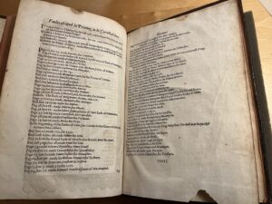
Fig. 2: The back of the book contains a list of errata.
The font that Jaggard used clearly belongs to the Garamond family, but this is not the only form of text which appears; the letters to James and Somerset begin with elaborate initial capitals. While all catalogue entries I have seen for other copies describe the border as “ornamental,” it appears to be a single large piece with cruder, more varied lines than one would expect from a metal ornament, suggesting perhaps a woodcut. Ornaments, however, do appear on several pages; the table of catalogues is surrounded by an ornamental border, while the letters to James and Somerset feature ornaments at the tops of the pages, as do the entries for the various catalogues of nobles. A particularly ornate ornament appears below the list of errors in the front matter. The only illustrations in this book are heraldic shields, all in black and white. Curiously, visual depictions of the arms are confined to the pages about the kings of England; all the shields on all the pages about the nobility—which make up the entirety of the numbered text, the vast majority of this book—are blank, although the French blazons for each are nonetheless written below. This seems to be the case in all extant copies of which I am aware; it is an especially strange decision to have taken since the extensive title clearly promises “Arms.”
This book has clearly been used, and the question “by whom” finds at least a partial answer on the title page, at the top of which is written “Sir Samuell Thomas Newman his Booke 1640” in a deep reddish ink (Newman). Someone, either Newman or another owner of the book, has also written numerous corrections in the margins of the main text in a similar ink. These follow the errata listed in the back of the book. An annotation to the entry about Robert Dudley, 1st Earl Leicester, for example, supplies the correct date of 1588 for Dudley’s death where Brooke has mistakenly printed 1586 (see fig. 3). In addition to the annotations in ink, one correction made to the life of Edward III appears to have been written in pencil.
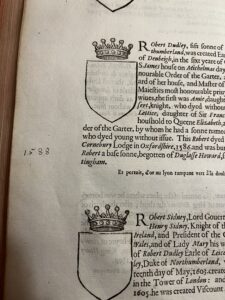
Fig. 3: The date of Dudley’s death has been corrected from 1586 to 1588 according to the provided list of errata.
The reader of the Catalogue will observe that the pen of an early owner (possibly Newman) is not the only thing that has marked this book since its creation, nor even the only thing that has marked the title page. The title page has an unrepaired hole to the left of the word “Princes,” and the entry for Edward III, which appears generally more worn than the rest of the book, has a large rip toward the inside edge of the page. There are small rips on several other pages, including the errata page, which is missing a semicircular chunk from the center of its bottom edge. Foxing is present throughout the book, and several stains have penetrated through multiple layers of paper. A particularly strange stain, which takes the form of a series of overlapping squiggles and may be in ink, appears on the top left of page twelve. Most spectacularly of all, though, on the second page of the entry about King John, a fly has been crushed directly over the king’s first name (see fig. 4).
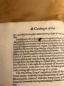
Fig. 4: King John’s name is obscured by a fly.
Looks great!