The particular book I chose was a lovely little first edition with the audaciously long title of The Life of Merlin, Surnamed Ambrosius, His Prophecies, and Predictions Interpreted, by Thomas Heywood and printed in 1641 by J. Okes in London. It’s a small book of about 6’’ by 7’’ with a 1’’ depth, 219 sheets, with a leather binding and a hand-marbled cover that has definitely seen better days (Figure A).
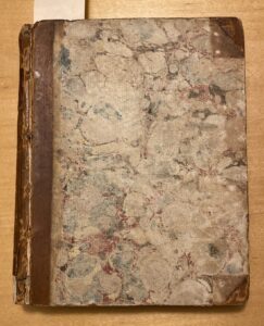

Figure A: cover design & display of the spine.
I was taken with the book as soon as I saw it– the cover was fascinating, and there’s something inherently enchanting about holding something printed before the United States existed and with handwriting in it to boot. It was even a first edition, and one that, as I searched, seemed to be rather scarce at this point. As I investigated the book further, its character seemed to grow larger and larger. A sort of cursory once-over revealed that pages had been torn out from the front, leaving only blank sheets before the title. When I looked up the facsimiles of other prints of the book, I came to the realization that there was supposed to be a wood-etching print of Merlin himself sitting underneath a tree (Figure B).
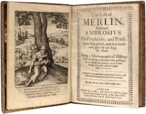
Figure B: The wood-etched illustration meant to be in the front of the book. Image sourced from the WorldCat database.
Then again, it wasn’t an unexpected find– the cover was completely separated from the rest of the book, to the point that its binding was even somewhat exposed. According to Jane Greenfield’s ABC Of Bookbinding, the binding style “wouldn’t have changed very much from [the] 16th century,” and bookbinders usually would have used either hemp or linen for the binding in single supports with the covers being calf or goatskin (107). There was also a variety of front matter that seemed very standard for its time– the illustration, had it still been whole, would have been first, and then there was a very sincere epistolary dedication to someone named “Master James Mettam” and then a “To the Reader” section where Heywood details why he is writing of Merlin’s prophecies despite him living in ‘heretical pagan’ times. A table of contents follows that with a few sentences outlining each chapter, and then the final part of the front matter is titled “A Chronographical History of the Kings of Britain, from the first plantation of this Island by Brute and his Cousin Curinaeus, to the Reign of King Vortiger,” which I believe is an ordering of all of the British Kings up until King Charles (Figure C).
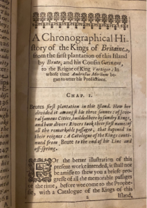
Figure C: A demonstration of the front matter of the book.
Once the chapters begin, the formatting is done in such a way that there are clear left and right hand margins following the spread of the book (it’s an English book so it reads left to right), which add on little pieces of further clarifying information about whatever is being referenced, as demonstrated in Figure D.
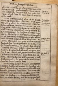
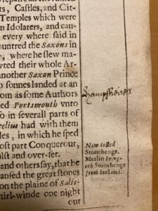
Figure D: A demonstration of marginalia, as well as an organic annotation.
There is also a vast amount of ornamentation, typically marking the conclusion and introductions of each subsequent chapter. At the ends of each chapter, there are smaller ornamentations used, such as those in Figure E, whereas for the beginnings of chapters decorated letters are added to the introductory line of the text. Some of them are particularly grandiose, such as the ‘H’ in Figure F when chronicling King Henry’s reign.
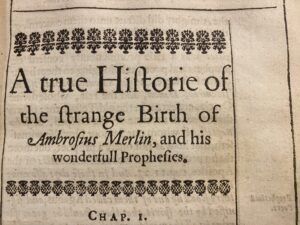
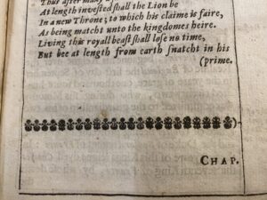
Figure E: Examples of the ornamentation used to mark chapters.
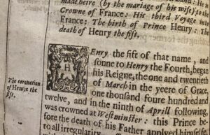
Figure F: An example of the decorative lettering used to denote the beginning of a new chapter.
When a chapter ends, the next page is usually the start of the following chapter, but sometimes there is simply just a space or ornamentation before the next begins. The pages are laid out a bit differently from how a modern book would be printed (which of course makes sense, considering the ~400 year difference) in that there is barely a margin at the top– the book title is boxed in by the sort of lined margins that are presented and then immediately after it is text, which is about what I would estimate is a 12 or 14 point font of something like 1545 Faucheur Normal or Grit Primer, though the app I used to try and determine these gave me a different font for practically every word. The use of ornamentation marks the start and close of every single chapter, with gratuitous spacing in between, likely a byproduct of the way the type is laid out. Continuing on with the investigation, I asked archivist Malinda Triller-Doran– who was assisting me overall– what she thought of the actual paper. She said that it was cloth-based because of the chain lines on all of the pages, but that it was also comparably thinner to other books in a similar time period, something that I confirmed when I looked around at some of the other books that my peers were working on and discovered the paper in them was of a much higher density and quality. This I think made my book more susceptible to tearing and wear, as there was… so much going on throughout the book.
On the title page and final text page, as well as several pages in between there are doodles, writings or just scribbles from what appears to be ink. In Figure G, the previous owner seems to have written “Arthur Bradley” and “Hannah Bradley” on the last page, as well as “therefore” and some letters in illegible red ink.
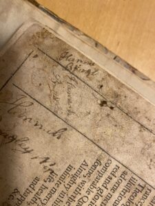
Figure G: Various examples of the writings throughout the book.
Some pages just have swirls doodled on them, as if someone were absentmindedly using the book to work with a pen, either to test the pen’s usage or the paper’s ability to keep the ink from spreading. There is also something written in red– though I can’t quite make out what it is beyond perhaps a “g”– on the beginning page of the “To The Reader” segment of the book. There are also pages with damage to them– Figure H shows one which has a piece taken out of it in a way that looks as if it would’ve been done by an exact-o-knife or something for its precision.
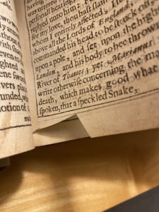
Figure H: An oddly cut (?) page.
Something has clearly been spilled on pages 222 and 223, and I also managed to find an entire squashed bug nestled between pages 372 and 373 (Figure I).
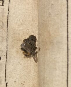
Figure I: The mystery bug.
I actually have this bug now, in a bit of tissue paper in a box, because the archivist was a little repulsed by the idea of it staying in the book, and it’s really quite bizarre-looking. At first glance, I thought it was a fly, but it has a striped body– I think I might ask further about what it might be from someone who knows more about insects and has a microscope at hand. It might not be that old, but it was unlikely to have been squashed here in the archives, and we only received this copy of the book in the 1960s, so there was plenty of opportunity for bug murder by prior owners. The point is– there is evidence of a wealth of use throughout the book, and it is something that is delicious to think about. How many hands has this passed through? Was the quick-to-annotate Arthur Bradley the one who squashed a bug between the pages, or stabbed something sharp and distinctly pen-like through at least twenty? Furthermore, what is the story of the cover? The marbling style seems indicative of sprinkle marbling, at least from what I could ascertain from page 18 in Iris Nevins’ book Traditional Marbling as shown in Figure J, but the marbling seems to have been added on top of the leather, if we’re looking at the corners of the cover as in Figure A.
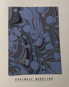
Figure J: The presumed marbling style of the cover, as done by Iris Nevins.
Were there some metal embellishments added to these corners that have since fallen off? Every time I open the book, I’m struck with a kind of glee– the knowledge that there have likely been hundreds of people to hold the text, and that those who still wrote in calligraphy annotated pages is such an oddly humbling feeling. I’d certainly like to discover how this book came to rest in my hands, and perhaps understand some of the people involved with it along the way.
Works Cited
Alexander, Jonathan James Graham. The Decorated Letter. London: Thames and Hudson, 1978. https://archive.org/details/decoratedletter0000alex/page/14/mode/2up.
Greenfield, Jane. ABC of Bookbinding. Oak Knoll Press, 1998.
Nevins, Iris. Traditional Marbling, Alembic Press, Kennington, Oxford, 1985.
Wolfe, Heather. “Was Early Modern Writing Paper Expensive?” Was Early Modern Writing Paper Expensive Comments, Folger Shakespeare Library, 13 Feb. 2018, https://collation.folger.edu/2018/02/writing-paper-expensive/.
“WorldCat: World’s Most Comprehensive Database of Library Collections.” OCLC.
Leave a Reply