Month: April 2022 (Page 1 of 8)
The Evesham Mapamundi puts an emphasis on contemporary architecture(Barber 13-, which my map of 10 of Kempe’s destinations simply doesn’t. (Barber 22, 13,33)This is created through the many buildings, including a castle in Jerusalem, that are present.(Barber 14) It is very possible that this was simply done to make the map appear more interesting for many viewers, but could have also been potentially helpful for travelers. The islands on the Evesham Mappamundi seem to have had a lot of thought put into them, however they don’t seem to be very convincing because of how similar their rectangular shapes are.(Barber 14).The modern map is much more detailed with regards to shape. In addition, there are not any borders between places in Europe or any other of the other continents which is different from my map which has yellow lines depicting borders on the Evesham Map (Barber 14). One of the castles near Jerusalem looks as if it is completely out of proportion because it touches both sides of the small peninsula that it is on (Barber 14) These can point to many things, such as the artist not having gone to any or most of the places that he drew to needing to draw something a certain way at the request of his patron. The artist of the Evesham map was also much more concerned with using colors that popped and kept their viewers’ attention(EBay.com) whereas the map I plotted for my assignment had a more natural color scheme that included a lot of green. The Evesham map does not contain a lot of representation of land being green, which makes me believe that the author’s intention of making this map have enough religious symbolism in order to belong in a church made him in such as spiritual state that there was not a concern for making land on earth look like real land, because heaven was in his eyes the far more important world. What is also very interesting is that Jerusalem’s and Europe’s terrain is the same color, making it seem to viewers that Jerusalem and Europe are naturally similar looking places. Barbar paints the artist as religious so this would make sense(EBay, Barber 22)
The Red sea takes up a lot of space in the Evesham Mappamundi’s upper right corner, which is contrasted with the map that I plotted Kempe’s journey on, not affording it any significance. Like the drawing of Adam and Eve, this was very likely created because of the author’s expression of his devout Christainity, which I believed I discussed in my Medieval Map essay.(Barber 14, 22)The thin border of water, which I assume represents the ocean, shows how the artist for whatever reason wanted to depict the water as something that was under his own control.
As my plotted map only includes the places that Kempe traveled to(Kempe 1-176), it covers a lot less space than the Mappamundi. I also believe that the Evesham Mappamundi makes everything look so nice that it would have been a nod to God for having created the world in the way that it is depicted here. Everything seems to be drawn with so much care as to honor the artist’s maker. (Barber 14)
Works Cited
Barber, Peter. “The Evesham World Map: A Late Medieval English View of God and the World.” Imago Mundi, vol. 47, 1995, pp. 13–33, http://www.jstor.org/stable/1151300. Accessed 28 Apr. 2022.
EBay.com, LARGE HARDBACK MAP THE EVESHAM WORLD MAP 1415 A.D. CELEBRATES ENGLISH COMMERCE, Ebay.com Accessed April 28, 2022,https://www.ebay.com/itm/185377531779?hash=item2b295ca783:g:z7QAAOSwNC5dVr1c
Margery Kempe, the Book of Margery Kempe, translated by BA Windeatt, Peguin Books, 1975
Modern map sources https://docs.google.com/document/d/1ppRhwWdYvRzDDbQpikbEDUpQ2UY-g_uxF1euW8ylhnw/edit?usp=sharing
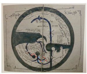
Ibn Hawqal’s World Map
- Bukhara
- Karawarazm (Kath)
- Jujaniya
- Zamjan
- Jit
- The Ghuzz
- The Banjanak
- The Bashghirds
- Saqaliba (Bulghar)
- The Rus
The differences between Ibn Hawqal’s KMMS world map and my modern Google map are almost immeasurable. More than millennium separating their creation dates, my modern Google map and Hawqal’s KMMS map could not be more different. The first and probably most obvious difference is the style of illustration. The Google map is a more accurate representation of the land. It has details regarding the terrain, tan indicating hot deserts, dark green indicating mountains, and white for areas covered by snow. Bodies of water drawn to size, relative to one another, with each bend in a river noted. The Hawqal map uses geometric shapes and minimal color. The bodies of water are rough estimates if anything. Seas, Gulfs, and Oceans grouped together because their distinction was not important. Their purpose was to indicate that there was water over in that direction, not to tell a reader what river they are crossing. Although rivers were dark blue, seas and oceans were a green-blue color. The land was not denoted with any color. This speaks to the purpose of the Hawqal map to not be used for exact navigation, but to be paired with a manuscript describing the distances and cities on the map. Another noticeable difference is the orientation of the maps. The Google map place North at the top and South at the bottom. The Ibn Hawqal map orients oppositely. The Google map also features the entire world if you were to scroll further in any direction. The Hawqal map, features just the reaches of the Muslim world, then drawn around is an “encompassing sea.” This was not necessarily to indicate the end of land in the world, just simply the end of knowledge of it. How the maps portray a nation or country’s borders is another significant difference between the two maps. While the Google map is exact and precise, the Hawqal map remains geometric. The Hawqal map draws out rectangular like boxes with the nations written in Arabic inside them, no specific cities are labeled. Medieval cultures understood the world differently than modern day cultures in that they understood people to be separated by cultural nations rather than borders. Borders were irrelevant to them if the people did not consider themselves of that nation.
There are a plethora of differences between our modern world map and the Psaltic Mappa Mundi that Felix Fabri most likely used to trace his journey. For one, the modern world map that we use derives from satellite footage of the earth, and is therefore an accurate depiction of its landmass, water content, plates, etc. The Psaltic Map, which predates Felix Fabri’s journey to The Holy Land about 200 years, focuses less on accuracy of location and more on the importance of points relative to Jerusalem and other biblical landmarks. For example, despite their separation by large masses of water, Italy (Roma) and Jerusalem are depicted in proximity to each other, and the illustration does not depict a body of water that separates the two locations. In fact, Italy and Jerusalem are separated only by landmass on the Psaltic map, which implies that traveling from one place to the other can be accomplished on foot or on horseback, which is not the case!
In addition to the differences in accuracy and purpose between the Psaltic map and the modern world map, there is also a major difference in the maps’ orientations. Our modern world map is oriented from left (west) to right (east), and it captures lands that were undiscovered during the Middle Ages (i.e. North America). The Psaltic map, however, is circular, an attempt to depict the roundness of the earth. In addition, east is oriented at the top of the map where Jesus is depicted and Jerusalem is mapped in the center of the entire map. These were intentional choices made by the artist. East being located towards the top of the map near the deepcition of Jesus and Adam and Eve implies the region’s closeness to God, morality and purity. This ideology aligns with that of Felix Fabri, who revered places like Mt. Sinai, Mount Carmel and the Joppa Port. The farther away from the top of the map a region is, the less morally upstanding it is.