Page 5 of 39

Comparing Modern and Medieval Maps: Ibn Fadlān and the Land of Darkness

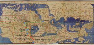
The impact of mapping Ibn Fadlan’s journey on a modern map and Medieval map is striking because of the differing proportions of the two maps. I used the Charta Rogeriana, a compilation of the smaller maps from the Tabula Rogeriana, to approximate Fadlan’s journey on a map that would be as close as possible to what his group would have used to navigate. What is immediately noticeable is the orientation of the two maps. Modern maps are oriented with north at the top but Medieval Islamic maps orient with south at the top. Fadlan comments multiple times about the “cold of hell” that he experiences as he moves farther north. This idea is compounded by the extreme distance Fadlan appears to have travelled. Baghdad, his starting point, is very close to the center of the world on this medieval map, since it is close to Mecca. In comparison, Fadlan’s final destination of Bulghar appears to be close to the edge of the world. This creates a powerful visual of how differently Baghdad and Bulghar are thought of. Map makers of the time were well aware that the Earth is a sphere and the world was simply flattened in order to be viewed better on a piece of paper, just as we used different map projections to do today. However, the symbolic nature of medieval maps cannot be ignored. The power of the Abbasid caliphate, based in Baghdad, is emphasized due to its position close to the center of the world. In this way, the distance between Baghdad and Bulghar is real spatially, but possibly also spiritually in the beliefs of people living near Baghdad, where the map would have been created. In the modern map the proportions of the continents are more accurately depicted with Eastern Asia, Russia, and Siberia taking up huge swaths of land to the East. In the Medieval map, the East, in general, could be described as squished in comparison. The Abbasid caliphate, which Ibn Fadlan served, influenced the creation of this Medieval map and this is very clear since it’s seat, Western Asia, dominates the map because of its primary position at the center of the world and size in comparison to other areas. The leg of the journey shown between Baghdad and Bukhara also emphasizes this point. In the modern map, constrained to about the same size and viewpoint of the Charta Rogeriana, visually takes up about 1/6th of the width of the map. On the Medieval map this leg takes up about 1/4th of the map. This demonstrates the importance of the land owned by the Abbasid caliphate and their allies; it is shown as expansive and central to travel throughout the world. In comparing the two maps, it is also clear that the Arabian Peninsula is also the most accurately mapped. This speaks to the fact that geographers of the time would know their own land the best, but also to the enduring legacy of the Abbasid caliphate. The lost map of Al-Khwārazmi, a geographer that worked for the Abbasid in the 9th century, informed the creation of the Tabula Rogeriana and therefore the Charta Rogeriana. The Tabula was created in Sicily in the 12th century and the Arabian Peninsula is still the most accurate portion of the map in comparison to modern standards.  


Margery Kempe Medieval Travel Map Reflection

When I transferred my modern map onto the Hereford Mappamundi, there were many noticeable differences between the two maps. Firstly, the modern map showed accurate terrain and distances between locations, making it easier to understand how long it would take to travel from place to place. The medieval map is a T-O map so it is oriented with Asia at the top. There is no concept of true distance on the medieval map. Since the continents are not accurate in shape or size, the locations Margery traveled to are more abstract and you have to estimate where they would be. There is also a more detail about people that Margery may encounter on her journey, but no details on the terrain. The modern map has lines of latitude and longitude, making it easy to plot points accurately. Additionally, the modern map has many more detailed locations on it whereas the medieval map has set locations. To plot all of the points takes some estimation when the cities are not on the map.

Additionally, on the medieval map is oriented with north to the left and Jerusalem at the center of the map. The modern map which I detailed Margery’s journey on doesn’t have a center because the viewer can orient the map however they wish with the digital viewing technology. Although, it is worth pointing out that most modern maps have Europe at the center- indicating a Euro-centric ideology because Europe is centered in the middle. Similarly, for the Medieval map, Jerusalem is in the center of the map. Clearly, Jerusalem is oriented as the center of the world, emphasizing the importance of Jerusalem in the Christian World. The medieval map also includes other religious locations like the Garden of Eden, located at the very top of the map, clearly indicating that this map was drawn with Christianity as the focus. The modern map, however, is geographically accurate, with no religious motivations at all.

The modern map is in English, making it very easy to locate the ten locations. However, the medieval map is in Norman French and the writing is barely decipherable. Even if I could see the writing, I wouldn’t be able to understand the language. I used the Hereford Map website to help me place my initial locations (Rome, Jerusalem, and Venice). I then estimated where the other locations would be based on a modern map, estimating proximity and location.

The Hereford Mappamundi would be virtually useless to a traveler like Margery, unlike the modern map. The medieval map offers no real references for time and distance, and is not even an accurate representation of the shapes and and continents. Actually using a map like the Hereford map would lead to a very confusing journey, because there is no indication of distance and terrain. Traveling with a map, or even looking at it before the journey, would offer very little, if any, insight into how long and what the journey would look like. Additionally, the Mediterranean is incredibly inaccurate, making it impossible to plan for a sea voyage.

« Older posts Newer posts »

© 2024 Mapping the Global Middle Ages


Academic Technology services: GIS | Media Center | Language Exchange

Theme by Anders NorenUp ↑