The often-quoted Robert Burns line “the best laid plans of mice and men,” which originally used the word “schemes” but I’m guessing that Burns would forgive us, aptly describes the last weeks of many installations, especially one with as many customized parts as In the Light of the Past. I had originally planned on talking about building of the light box table that was included in the show, and while I’ll still mention it in the course of this article, I want to talk a first about how to scramble when a show hits a design or installation bump … or huge, suspension-destroying pothole, if you’re not lucky.
You’ll notice that the images included in this article are largely the same as The Big Build: Part I, that’s intentional and not due to the author’s general exhaustion (acute) or laziness (never!). Let’s look at the walls first. The construction of the fake walls with the recessed shelves went better than expected, and with the help our extremely talented campus electrician, the installation of the fiber optic lighting system was even more professional that its original incarnation. You can see the circles of the lights on the back of wall of the shelf in the picture below, which shows the recessed openings before they were painted black.
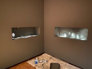
Now take a look at the shelves with walls painted black, the daguerreotypes installed, and the lighting finished. Notice what’s missing? The octopus armed holders that were going to suspend the works from the back wall.
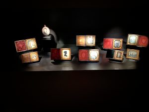
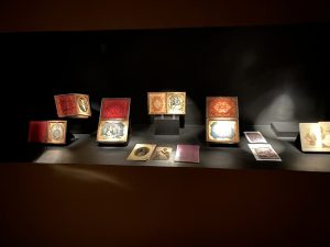
In the course of any exhibition, a designer/installer will run into unexpected challenges… in fact, you build time into the calendar to accommodate these challenges when you can. In our case, the archival metal holders proved to be problematic in two unexpected ways. First, when the arms of the holders where cut down to be shaped around the photograph cases, the resulting tips of the arms were sharp to the touch. Within a mount making studio, these ends would have been filed down and possibly coated to provide a safe contacted point with the object. We did not have the facilities or materials to perform this modification and risk of putting 150-year-old photograph cases next to sharp metal was too great.
Second, the connection point for the arms to the back wall of the shelves was a metal plate that would have been screwed into place. This system would have worked well if the holders had been safe enough to take the daguerreotypes in and out without risk of damage. When it was obvious we could not move the photographs once they had been installed into the holders, it became arduous to attached the holders to the back wall. The holders with photographs in place covered the access to the screw plate and made attaching the holder impossible. In less technical terms, we had to abandon the whole mounting plan and start over… with only a week to go until the opening.
Here is where a good collaborative relationship between museum principles becomes very important. The director, whose idea it was to suspend the works within the shelves, came up with a new approach to have the daguerreotypes held on mini easels on the surface of the shelf floor. We would use display blocks to add interest by changing the elevation on several pieces and exploit the depth of the shelf by placing the photographs in both the foreground and background. As a designer, it helps tremendously when the person who asked for a particular design element helps to find an alternative when they are confronted with the reality that the initial approach won’t work. Solution in hand, I spent the next two nights building custom mini-easels to hold the daguerreotypes and three more hours manipulating and adjusting the fiber optic system. The end result is the image you see above.
Unlike the wall case mount challenges, the creation of the light table went flawlessly. We needed to build a light table because the exhibition included a number of transparencies that required backlighting to be seen. The original concept was a series of light box shelves, which would have made the wall project look child’s play. In the end I came up with the idea of one large, two section table that recalled the old illuminated slide library decks… and saved us about two weeks of build time. In short order, the capable combination of our set designer/carpenter and our electrician constructed and wired up the table I had designed to hold the large light panels.
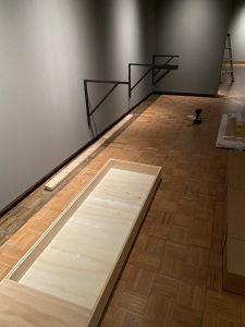
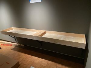
But where to find custom-sized, large, dimmable LED light panels for this kind of function? Museum display companies can fabricate these kinds of tables, but the cost is prohibitively high, particularly during unusual economic times such as these. We turned instead to an advertising supplier that created LED panels to backlight posters and commercial signage. They were able to put together two custom panels with just the specs we needed for less than 20% the cost of a traditional display. These panels were then installed in the table, linked to a dimmer switch, and attached to a motion detector that would turn the lights on for 15 seconds at a time when people entered the room. Archivally sound and fiscally responsible… it’s like winning the lottery twice in the exhibition design world.
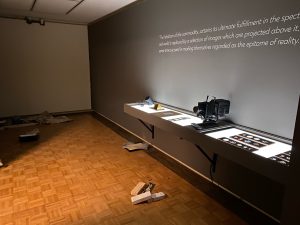
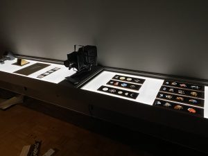
The effect is really quite nice.
And so we come to the end of the big build projects for the current exhibition and to the end of another Tales from the Vault.
Stay tuned for more behind the scenes look at the museum world.
-James Bowman
