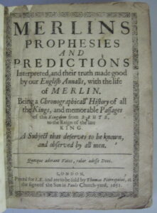
The Historie of foure footed beastes and The Historie of serpents were compiled by Edward Topsell in the 17th century in his effort to give the English language a treatise on animal biology (this kind of book is also known as a bestiary, and moreover Topsell’s work is more similar to renaissance bestiaries than to scientific works of the 17th century due to its inclussion of fantastic creatures and constant references to classic works) that dignified the vernacular language as no other had done before, according to Topsell himself; scientific works were, at that time, still published in Latin.
The readers of the book were probably university students, as indicated by the presence of marks in the margins with which one could more easily search for the desired information about each creature, natural remedy or reference in some classic author to these animals in his works. In addition to the fascinating content and Topsell’s ambition of wanting to translate four creature treatises into English (although he was prevented from doing so by his death), this book is known for its stunning illustrations, including a version of the rhinoceros that is very reminiscent of Albrecht Dürer’s woodcut engraving dating from 1515.
Nowadays we have a stricter understanding of scientific and academic works, in the sense that they are the result of a process that follows a method through experimentation, verification of theories by means of objectivity, and the possibility of repeating experiments given the circumstances described in the study’s presentation. This being so, Topsell’s work, seen through today’s eyes, does not fall within the same framework and comes as a great surprise to us because of the collective (and fantastic) nature of its creation. This was already explored, in part, when discussing Topsell’s expectation that his contemporary readers would help him continue to complete this ambitious endeavor in the English language. Helen Westhrop, Rare Books Library Assistant at University of Reading, talks about how Gesner’s original “work was made possible by the network of leading naturalists throughout Europe who sent him ideas, plants, gems and animals” (Featured Item). In other words, its origin was already a collaboration of voices.
However, when considering it a collective work, this also applies to another more important part of the book: the illustrations. The reality is that Topsell “borrowed heavily (and directly) from earlier treatises” (University Libraries). To further reinforce this point, Susan Isaac, Information Services Manager at the Royal College of Surgeons of England’s Library, reflects on the case of the rhinoceros. According to her, the illustrations chosen by Topsell, and specifically the one dedicated to the rhinoceros, were “an example of how [he] acknowledged his sources and reused material from them in his book” (The familiar and the fantastic). Isaac also makes it a point that Gesner –the main source of our 17th-century beast compiler– learned of the existence of a rhinoceros from the visit of a German contemporary to Lisbon, which at the same time was the one that inspired Albert Dürer to create his famous woodcut engraving of the exotic animal (it’s even known that it was called Ulysse!).
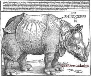
Albert Dürer’s woodcut of a rhinoceros, 1515
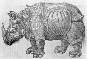
Topsell’s Historie of foure footed beastes’ woodcut of a rhinoceros, 1607
As for the other illustrations in Topsell’s Historie of Beastes, it is believed that already Gesner’s work contained woodblocks from a certain Lucas Schan of Strasbourg, and not all of them belonged to him but mostly the ones referring to birds (S. Kusukawa). It is possible that Topsell collaborated with other artists for his compilation as well, but more accurate information wasn’t found.
The importance of these other illustrations lies in the fact that Topsell may have directly collaborated in their creation, influencing them with his moral and religious ideas. It should not be forgotten that this is a bestiary compiled in English for readers to contemplate the divine creation. For this reason, I am especially interested in Helen Westhrop’s ideas, who even talks about illustrations of animals in this book that resemble human qualities. “The lion has a human expression with a carefully dressed mane and demonstrates Topsell’s belief that his animals have human intrinsic worth and moral qualities as well as a hatred of mankind” (H. Westhrop). This is the kind of content that neither Gesner originally introduced in his work nor could be found in other bestiaries, since Topsell was a man of the church and imprinted this religious morality in all his work. It is, therefore, one more element that makes it a unique work, and thus a rare book.
Works consulted:
Isaac, S. (2018, March 16). The familiar and the fantastic: The Historie of Foure-Footed beastes by Edward Topsell, 1607. Royal College of Surgeons. Retrieved March 29, 2023, from https://www.rcseng.ac.uk/library-and-publications/library/blog/the-familiar-and-the-fantastic/
Kusukawa, S. (2010, July). The sources of Gessner’s pictures for the Historia animalium. Annals of Science. 67 (3): 303–328. Retrieved 12th May, 2023, from http://www.rhinoresourcecenter.com/pdf_files/128/1286404337.pdf
University of Washington. University Libraries. “The Historie of Serpents.” Edward Topsell, 1608. Retrieved May 9th, 2023, from https://www.lib.washington.edu/preservation/preservation-services/conservation/topsell
Westhrop, H. (2007, March). Edward Topsell, The History of Four-footed Beasts and Serpents, 1658. Special Collections featured item for March 2006 by Helen Westhrop, Rare Books Library Assistant. University of Reading. Retrieved May 10th, 2023, from https://collections.reading.ac.uk/special-collections/wp-content/uploads/sites/5/2020/01/Featured-Item_Topsell_compressed.pdf


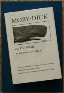
 to indirectly engage in conversation with the audience (as seen in the front matter pictured here). This librarian is a thinly disguised representation of himself, considering he compiled the thorough references to whales (touching on their symbolic meaning that will be expanded upon) in past literature. However, at the time of publication, the public was widely unaccepting of