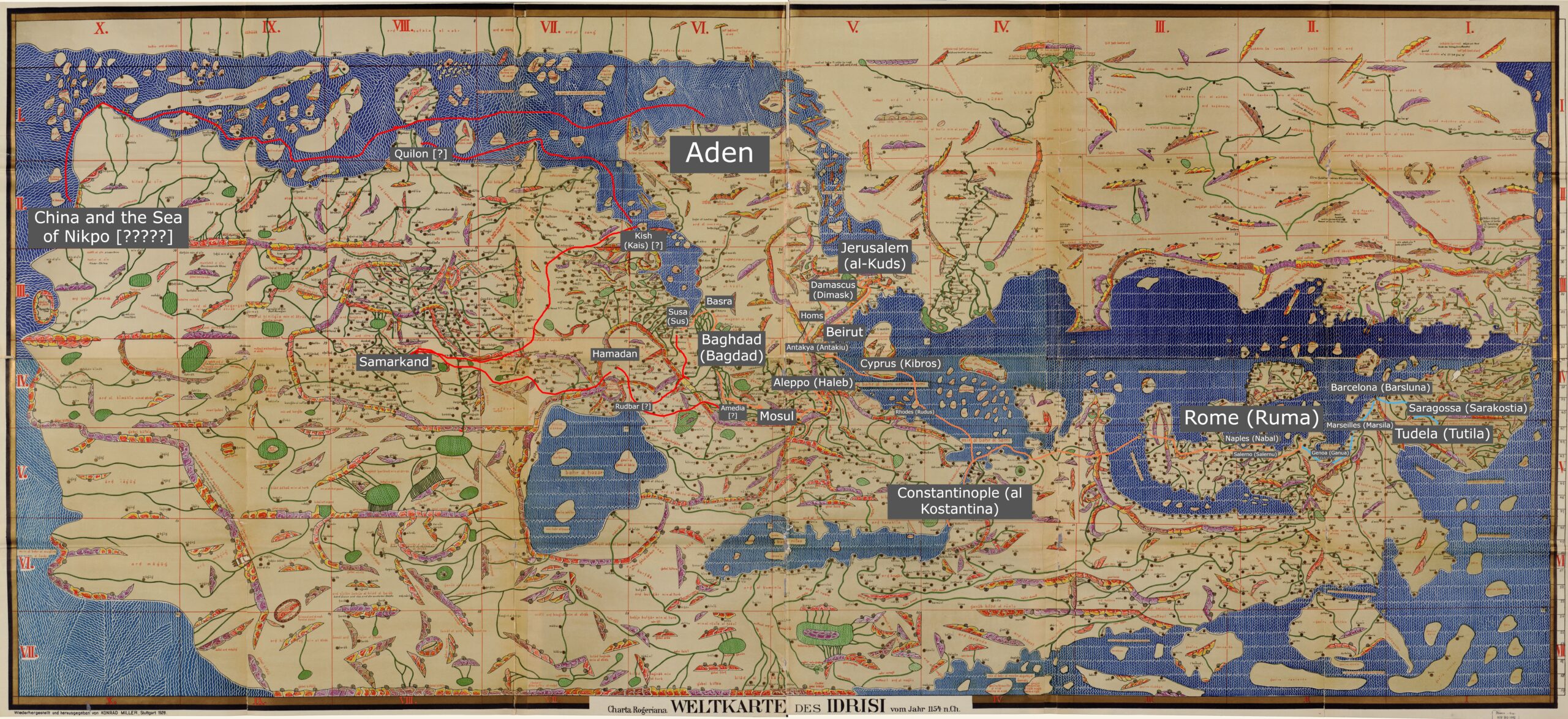
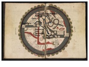
For this assignment, I redid my modern map to focus on a different part of Mandeville’s text. I took locations he describes in chapters 14 and 15 and mapped them on a modern map and the Hereford Mappa Mundi. While it was a little challenging to map some locations onto the modern map, as some of the place names Mandeville uses are different than they are today, it was much easier than mapping on the Hereford map. This was partially due to different technology between the two; Google Maps is intuitive to me and I understand how to use it efficiently, but I found it challenging to zoom in enough on the Hereford map and read the place names. I found myself wishing I had a high resolution, searchable version of it, like a fully searchable version of the interactive website, so I could simply look up where Ethiopia or Ezurum are on the Hereford map. I also found it hard to work with the Hereford map because of the language barrier – all of the writing is in Latin, and it was tricky to decipher the handwriting. I ended up using the modern map and a few different websites that pointed out specific places on the Hereford map to find locations in relation to each other. For example, one website had a cropped image of Babylon and the Euphrates river, which I used alongside my modern map to find some other locations in relation to the Euphrates. I also was able to find places such as Hereford, Jerusalem, Crete, and Mt. Etna to get my bearings and help decipher where locations such as Armenia were. However, I was not able to find exact locations of any places in my chosen route (with the exception of the Euphrates river), so I ended up making my best guess and circling areas where I thought these places were.
Comparing the two maps, I am not confident in my placement of several places, primarily Ethiopia and India. However, Mandeville is not accurate in his placement of them either. Making guesses about where places are in relation to each other seems in the spirit of a medieval travel narrative – I have not visited any of these places myself, so I used the resources at my disposal to make an educated guess about where they might be. Looking at the modern map, I question Mandeville’s proposed route – from the beginning of this route, he seems to zigzag and go back and forth more than is necessary, beginning at Trabzon, then going to Armenia, then turning around and going back towards Trabzon to reach Ezurum. Mapping the journey on the Hereford map exaggerates this problem, especially when it comes time to map Ethiopia and India. This is partially why I question my placement of these two locations, because it doesn’t make sense to me to go such a long ways west (down on the medieval map), then turn around and go almost the exact same journey east (up on the medieval map). Mandeville puts India and Ethiopia close to each other, but as I couldn’t read the place names on the Hereford map, I based my points on the modern map. I would like to know whether the Hereford Mappa Mundi is closer to a modern map in terms of accuracy, or whether the geography is closer to Mandeville’s text.