Page 3 of 39

Benjamin of Tudela Map Comparison

Unsurprisingly, plotting the journey of Benjamin of Tudela on both a modern and medieval map shines a light on many differences in the way that we view the world as opposed to Benjamin of Tudela.

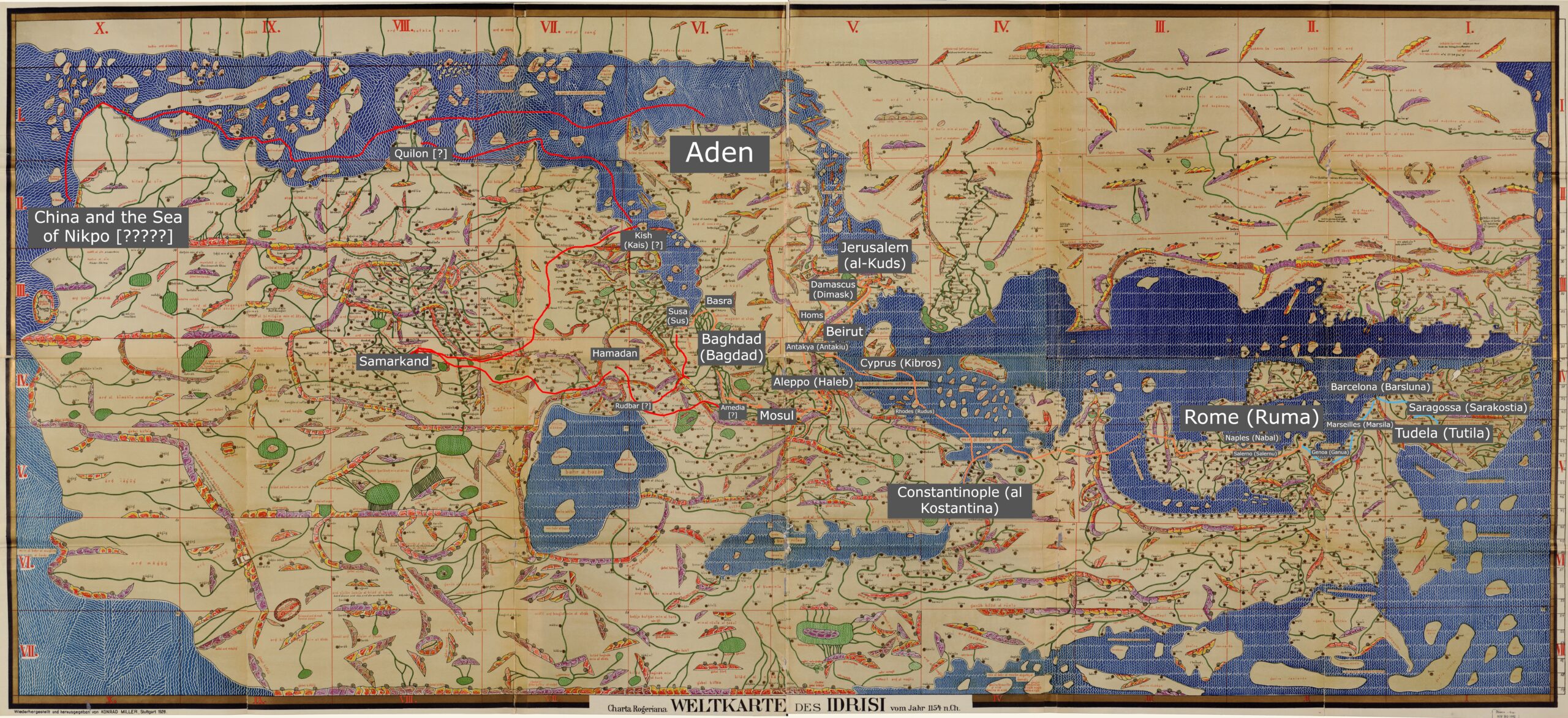
The first glaring fact when it comes to the visualization on the medieval map is the scope. When looking on a modern map, his travels are impressive, even if one removes the places that he likely did not get to. The Tabula Rogeriana, on the other hand, makes his reported journey stretch from one end of the world to the other (not literally, for it was common knowledge for hundreds and hundreds of years that the world was round). From “Tutila” to “al-Sin”, the particular distortions of this map make it seem that Benjamin of Tudela had passed through a majority of the world’s lands. This is in addition to the fact that the points that are plotted in this map are not representative of his entire itinerary, so there are even more lands that he wrote he had passed through.

There are three major distortions that seem to cause the scope of Benjamin of Tudela’s journey to grow. The first is that Europe is enlarged, and Asia and Africa are diminished, making the lands that he wrote about in more detail (because he actually went to these places) appear more significant than the lands that he spent less time in. The second is the absence of the Americas for obvious reasons. The third is the many distortions made to the southern hemisphere. There is land in these areas, but the shape of almost anything south of Arabia is entirely unrecognizable and seemingly much less dense in terms of geographical features and settlements. This creates the impression that that there isn’t much of import to explore in that part of the world, and the viewer values more the lands that Benjamin’s journeys were meant to have taken place.

While the broad scope of his journey appears more impressive, some of the distances between particular locations seem more reasonable on the medieval map than on the modern. The locations marked in red on the modern map indicate places that Benjamin of Tudela likely did not travel to, and the decision of whether or not it was likely he went to a particular location was made mostly based off the fact that the routes that he would have had to take were highly erratic and nonsensical.

There are two main reasons why this is not quite the case on the medieval map. First off, some of the locations that he wrote about were not featured on the Tabula Rogeriana, particularly Rudbar and Amedia. These locations’ absence make it plausible that contemporaries could have believed that Rudbar and Amedia were on the route from Susa to Hamadan, making Benjamin of Tudela believe he could pass off actually going through those locations. This theory would further exemplify that Benjamin of Tudela did not really travel to these places, and that common knowledge was that Rudbar and Amedia were inland towns betwen Susa and Hamadan.

The second reason is that land distortions make routes that are actually irrational appear more reasonable. A significant example of this is the distance between Hamadan and Samarkand. On the Tabula Rogeriana, it visually appears to be about the same distance as that between Hamadan and Aleppo (Haleb). In reality, the direct distance between Hamadan and Aleppo is roughly 650 km, while the distance from Hamadan to Samarkand is over 1000 km. At this point, Benjamin of Tudela had traveled well over 1000 km, but in his itinerary there is shockingly little information about the lands between these two places. In the text, it appears as if the journey between Hamadan and Samarkand is no big deal, while in reality it makes absolutely no sense how he could have gotten that far east given the textual evidence to work off of.

Benjamin of Tudela Medieval Map

Zoom in to see all the locations!

The blue route simply marks his terrestrial travel from his home to the first major location, Rome (Ruma).

The orange route marks the rest of his plausible route.

The red route indicates places that he likely did not travel.

When a location is followed by one or more question marks that just indicates that it either wasn’t on the Tabula Rogeriana or that I just didn’t find it. China and the Sea of Nikpo have several question marks because……. I truly just can’t figure out what he thought was going on in that corner of the world.

John Mandeville Map Comparison

For this assignment, I redid my modern map to focus on a different part of Mandeville’s text. I took locations he describes in chapters 14 and 15 and mapped them on a modern map and the Hereford Mappa Mundi. While it was a little challenging to map some locations onto the modern map, as some of the place names Mandeville uses are different than they are today, it was much easier than mapping on the Hereford map. This was partially due to different technology between the two; Google Maps is intuitive to me and I understand how to use it efficiently, but I found it challenging to zoom in enough on the Hereford map and read the place names. I found myself wishing I had a high resolution, searchable version of it, like a fully searchable version of the interactive website, so I could simply look up where Ethiopia or Ezurum are on the Hereford map. I also found it hard to work with the Hereford map because of the language barrier – all of the writing is in Latin, and it was tricky to decipher the handwriting. I ended up using the modern map and a few different websites that pointed out specific places on the Hereford map to find locations in relation to each other. For example, one website had a cropped image of Babylon and the Euphrates river, which I used alongside my modern map to find some other locations in relation to the Euphrates. I also was able to find places such as Hereford, Jerusalem, Crete, and Mt. Etna to get my bearings and help decipher where locations such as Armenia were. However, I was not able to find exact locations of any places in my chosen route (with the exception of the Euphrates river), so I ended up making my best guess and circling areas where I thought these places were.

Comparing the two maps, I am not confident in my placement of several places, primarily Ethiopia and India. However, Mandeville is not accurate in his placement of them either. Making guesses about where places are in relation to each other seems in the spirit of a medieval travel narrative – I have not visited any of these places myself, so I used the resources at my disposal to make an educated guess about where they might be. Looking at the modern map, I question Mandeville’s proposed route – from the beginning of this route, he seems to zigzag and go back and forth more than is necessary, beginning at Trabzon, then going to Armenia, then turning around and going back towards Trabzon to reach Ezurum. Mapping the journey on the Hereford map exaggerates this problem, especially when it comes time to map Ethiopia and India. This is partially why I question my placement of these two locations, because it doesn’t make sense to me to go such a long ways west (down on the medieval map), then turn around and go almost the exact same journey east (up on the medieval map). Mandeville puts India and Ethiopia close to each other, but as I couldn’t read the place names on the Hereford map, I based my points on the modern map. I would like to know whether the Hereford Mappa Mundi is closer to a modern map in terms of accuracy, or whether the geography is closer to Mandeville’s text.

Comparison of Ibn Battutah Modern Map and Medieval Map

There are marked differences between the modern map of Ibn Battuta’s travels and the medieval map of his travels. The most obvious difference is that the modern map is intended to be geographically accurate and is made with satellite imaging. Ibn al-Wardi’s map was not intended to be geographically accurate but was meant to represent a cosmological understanding of the world. Because of this, the medieval map and travel route depicted on it is completely distorted. The distances between locations appears shorter than it is. It also represents bodies water in more abstract ways, not accurately depicting the coastlines and river distances. It makes the Nile River look incredibly wide when it is compared with the Arabian sea. Because bodies of water are distorted, medieval people’s understanding of the size and scope of them may not have been clear. There is also the issue of what the map is centered on. For the modern map, any place in the world can be chosen as the “center.” It is all arbitrary because it is a globe. When you click on the map, it automatically centers around the middle of the Arabian desert because that is the most central point in relation to all the points located on the map. The medieval map is completely different. Because it is a cosmological map, it has Medina and Mecca directly in the center. This indicates their importance and the centrality of Islam to life and their understanding of the universe. Medina and Mecca are towards the bottom of the modern map. Overall, it is interesting to compare the two maps because the intentions behind their creation and representation are completely different, which causes them to look different. It is important to note that the points I chose for Ibn Battutah are all located in the Middle East, which is shown at least semi-accurately on the map. If I had chosen points in sub-Saharan Africa, India, or China, the points would not have made any sense at all because these locations are distorted on the medieval map.

« Older posts Newer posts »

© 2024 Mapping the Global Middle Ages


Academic Technology services: GIS | Media Center | Language Exchange

Theme by Anders NorenUp ↑