Prof. Carol Ann Johnston

Category: Introduction to Adopted Book

Students in ENGL 222 at Dickinson College describe their adopted book from the DIckinson Archive.

Moby-Dick; or, the Whale

Moby Dick by Herman Melville is widely considered one of the greatest American novels, renowned for its complex allusions and thoughtful prose. The 1979 Arion Press edition of Moby-Dick; or, the Whale stands out not just for its literary brilliance, but for the fine craftsmanship of the physical book. The copy of the classic in the Dickinson archives’ possession is referred to as the Deluxe California Edition, which contains photographic representations of the original content of the primary 1979 production. However, the fact that these pages are copies does not detract from the aesthetic value of the work. While the original edition was considerably rare with 265 editions, there are 750 copies of the California deluxe and trade editions in collections and archives (Moby Dick or, the whale, www.ucpress.edu). I chose this particular book to intimately study because it is a familiar story that has taken on an interesting new physical form. The book stands out for its significant size, with the cover spanning 14 by 9 ¾ inches. Although this size is reduced from the initial version, it creates a more accessible and convenient text by making it less expensive and easier to read. The compressed size allows the reader to hold it in their hands, and the large text is convenient for reading. I also found it intriguing that this book appeared to be unread and unused, sparking my curiosity to dive deeper into its history despite its relatively short history.

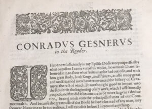
The introductory note by James D. Hart identifies the typeface to be 18-point Goudy Modern, which was designed in 1918 (“Goudy Modern”). Additionally, the aptly named Leviathan font is used for the titling capitals and large blue drop caps at the beginning of each chapter. This font was designed specifically for the Arion Press edition of Moby Dick by Charles Bigelow and Kris Holmes — this is clearly an example of the deliberate attention to detail regarding the connection between the presentation of the book and the literary content. This thread of continuity is also represented in the deep ocean blue color of the text, mimicking the aesthetic of Moby Dick.

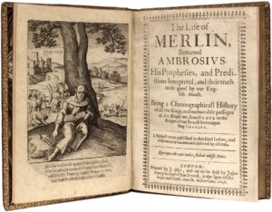
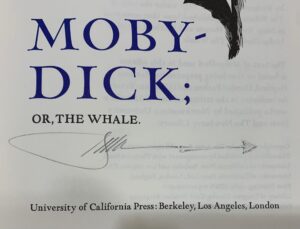
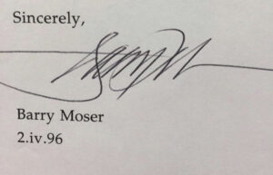
In the brilliant title page, the reader is greeted with a meticulously detailed woodcut portrait of Herman Melville, set askew from the title of the work in a large, powerful font. The title is in the Leviathan, consistent with the beginning of each subsequent chapter. Underneath the title, the signature portrays the history of this book’s journey to Dickinson College. In 2002, Friends of the Library purchased Moby-Dick; or, the Whale to display the works of their guest speaker of the year, Barry Moser. His signature artfully transforms into an arrow or harpoon, following the style of the book. The publisher name is centered at the bottom of the page,

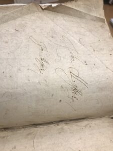
Although the creator of the signature is unclear in the book, I examined Barry Moser’s signatures on other works and reasoned that he signed this copy when he visited.

Finding out the person behind the signature was like an unfurling mystery, encouraging me to look at people with connections to the book and examine trails of evidence.

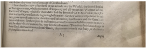
along with Melville’s dedication and declaration of admiration for his dear friend Nathaniel Hawthorne on the next page (Phillips). Also prior to the beginning of the text, an etymology explores the origins of the word whale — setting up the scene for the blend of history and fiction in the work.

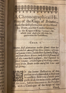
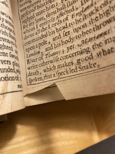
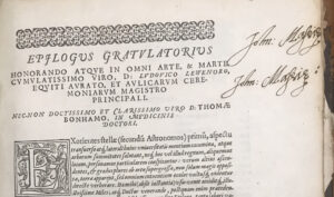
Additionally, an extract incorporates Melville’s comical excerpt from a sub-sub librarian to demonstrate simultaneously his sense of humor and knowledge of whale references. He details the carelessness of the “librarians’” collection of quotes from notable literary works that mention the sea creatures; in fact, he is commenting on the notion that the reader will not appreciate all of the work he put into this collection by deeming the librarian somewhat incompetent. This front matter ironically generates a jovial mood that is contradicted by the relatively somber atmosphere of the literature’s content. Moreover, an elaborate map exhibits the somewhat convoluted route the famous Pequod took, bringing the story to life. After the story is completed, this book features a colophon that provides information regarding the publication of Moby-Dick; or, the Whale, making the fine details of the publication of the book clearly accessible to the public.

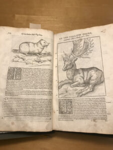
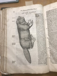
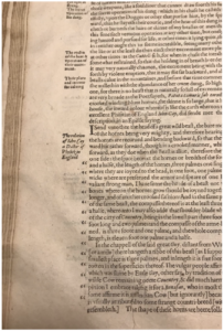
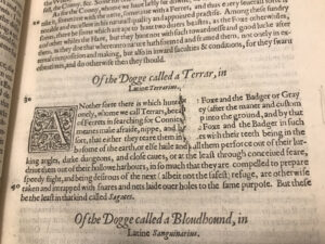
Furthermore, the book is ornamented with 100black and white images, each enhancing the reading experience by providing contextual clues and aesthetic adornments to the writing. The illustrations are intricate woodcut engravings created by the previously mentioned Barry Moser, known for his dazzli
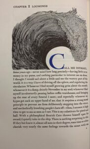
ng engravings spotlighted in works such as Dante’s Inferno and a vividly detailed King James Bible (“A Brief History of Pennyroyal Press”). One can see the texture of the engravement, detailed by small slashes and stark contrasts between ink and paper. James D. Hart asserts that primary characters are never illustrated to allow the readers to imagine their faces — instead, technical depictions of boats and whales are sprinkled throughout the text (“A Note on the California Edition”). Notably, the famous first line of Moby Dick is amplified by the dramatic illustration of a monumental wave that skillfully incorporates the curvature of the first letter C, marrying the text and the artwork.

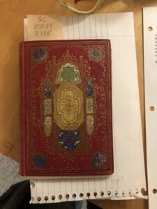
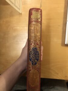
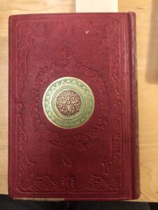
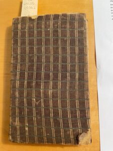
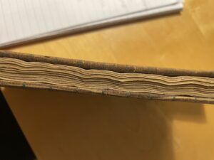
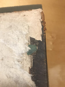
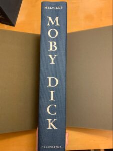
Additionally, the binding is an interesting combination of sewing and adhesive along the spine. The glue is the primary source of keeping the book intact, while the stitching holds the pages together. The book also has a visible light blue and white thread headband that accentuates the silver lettering stamped on the exterior smooth spine. The unadorned cover of the book is made out of a Moroccan blue buckram cloth, mimicking the goatskin of the original edition of the book. The endpaper marking the front and back of the book is also a rich shade of dark blue, which is contrasted by the paper constituting the book.

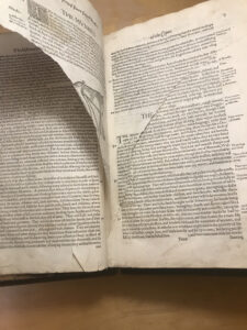
The paper is remarkably high quality, described as “dampened handmade paper by platen letterpress” in the introductory passage, “ANote on the California Edition”. The pages are thick, heavy yet flexible, slightly yellow, loud when flipped, and smooth to the touch. The edges of the pages are very precisely cut and laid out in a reader-friendly format. Page numbers are located at the bottom left-hand corner, being the only other material on the page other than text or images. It is also important to note that the beginning of a new chapter does not signify a new page — instead, there is a small amount of space before the title of the new chapter and drop cap. Interestingly, there are 609 pages in the physical book, yet only 576 of them contain Melville’s story. A handful of the remaining pages are dedicated to front matter (title page, extracts, table of contents, publication information, etc.) and the colophon, yet a significant portion of the remaining pages are left starkly blank.

Overall, the book seems to be in pristine condition. There are no apparent signs of usage, and the physical book has been maintained beautifully. However, the slipcase did demonstrate slight signs of use, discoloration, and fraying. When examining this book, I felt as though I was holding a valuable work of art. The attention to even the most minute details in this work was impeccable, in turn creating a masterpiece of a physical book.


Works Cited
“A Brief History of Pennyroyal Press.” Barry Moser-Pennyroyal Press, https://www.moser-pennyroyal.com/brief-history.
“About Arion Press.” Arion Press, https://www.arionpress.com/arion-about.
“Artist & Illustrator Barry Moser Autographed Typed Letter, Signed by the Author!” Worthpoint, https://www.worthpoint.com/worthopedia/artist-illustrator-barry-moser-1844097006.
“Goudy Modern in Use.” Fonts in Use, https://fontsinuse.com/typefaces/47/goudy-modern.
Greenfield, Jane. ABC OF BOOKBINDING: An Unique Glossary with over 700 Illustrations for Collectors & Librarians. Oak Knoll Press, 1998.
Melville Herman et al. Moby-Dick or the Whale. Arion Press 1979.
“Moby-Dick by Herman Melville, Illustrated by Barry Moser, Arion Press, 1979.” Classic Editions, https://www.classiceditions.com/moby-dick-by-herman-melville-illustrated-by-barry-moser-arion-press-1979/.
“Moby-Dick, or, The Whale.” OCLC WorldCat.org, https://www.worldcat.org/.
“Moby Dick or, the Whale.” University of California Press, https://www.ucpress.edu/book/9780520045484/moby-dick-or-the-whale.
Phillips, John. “Melville Meets Hawthorne.” American Heritage, 1 Feb. 2023, https://www.americanheritage.com/melville-meets-hawthorne.

Ralph Brooke’s Catalogue: An Introduction

My first impression of this book was that it likely would be quite heavy and would perhaps disintegrate in my hands. After all, it was an imposing size and rather old. To my surprise, the book turned out to be lighter than anticipated, and only the front cover feels at all precariously attached. The pages, slightly warped, give a satisfying crinkle as one turns them; they are made of a reasonably thick laid rag paper with horizontal chain lines.

The book measures 7.5 inches (19.5 centimeters) by 11 inches (25 centimeters) by (roughly; the boards have bowed) 1.25 inches (3 centimeters). The binding is a brown, fine leather with some moderate cracking present on the front and back covers, which both have the letters “TN” blind stamped in the center. A gilded design containing a crown, the letter C, and “Camperdown Library” is stamped into the front cover over “TN”; the end edges of the cover are also tooled with a gilded dashed line. A small portion of the spine is missing toward the top, allowing a glimpse at the quires. While I was unable to determine the type of leather, the very fine grain and the smooth, shiny surface seem to make calfskin a possibility. An answer as to when the book was last bound also eludes me, but I suspect that the book has been rebound since 1619, first because the binding is in rather good shape compared to the other books of similar age in the library and also because some annotations made in the margins appear to start or end past the edges of the pages, indicating that the edges may have been trimmed by a bookbinder at a later date. This means that the edges of the pages, which are currently red, would have to have been edge-painted after being trimmed.

The inside of the front cover features a bookplate in memoriam of Edwin Eliott Willoughby ’22, Dickinson alumnus and former chief bibliographer of the Folger Shakespeare Library, whose rare book collection was donated to Dickinson by his sister Frances L. Willoughby ’27 upon Edwin’s death in 1959. The inside of the back cover has been stamped “THIS BOOK MAY NOT BE TAKEN FROM THE LIBRARY.”

The first leaf is blank, and upon turning it one finds the glued-in title page, which is rather wanting in concision (see fig. 1). The full title reads, with capitals and italics rendered as they appear on the page, “A CATALOGVE and Succeſsion of the Kings, Princes, Dukes, Marqueſſes, Earles, and Viſcounts of this Realme of England, ſince the Norman Conqueſt, to this preſent yeare, 1619” (Brooke). Below that is a subtitle: “TOGETHER, With their Armes, Wiues, and Children: the times of their deaths and burials, with many of their memorable Actions” (Brooke). The reader learns below this that Ralph Brooke, the author, intends to “reform” recently published errors in similar catalogues (Brooke). Under that is a Latin inscription, and finally the bottom of the page reveals that William Jaggard is the publisher and that the book was sold in his shop in Barbican, London. Though I will cover them in further detail in a later post, Ralph Brooke and William Jaggard, both of whose names are printed in small capitals (along with, strangely, the word “TOGETHER”), deserve brief descriptions: Brooke was a famously combative member of the College of Arms known for criticizing the quality of other heralds’ work, while Jaggard was a successful London printer and bookseller best known for printing the First Folio.

Fig. 1: The title page.

The front matter first contains a message addressed to James I in which Brooke elaborates on his stated goal of reforming errors in catalogues of the nobility. After this is a second and similar letter to Edward Somerset, fourth earl of Worcester, who served as Lord Privy Seal to James I. Brooke then provides a list of the errors he has identified and is seeking to remedy.

The main numbered body of text is an alphabetical list of the noble titles and the genealogies of those holding the titles. The pages follow a standard formula, listing the holders of that title and their arms and providing a brief summary of their lives and actions. The page numbers 16-17 repeat once, but the content differs, meaning that the book’s final page number of 276 is less than accurate. After this is a table of contents listing the noble titles contained in the preceding pages. The book ends with a dense two-page list of printed errata which are to be corrected manually by the book’s owner (fig. 2); the clear ease with which printed errors could occur in the 16th century would seem to suggest that Brooke’s criticism is made in bad faith.

Fig. 2: The back of the book contains a list of errata.

The font that Jaggard used clearly belongs to the Garamond family, but this is not the only form of text which appears; the letters to James and Somerset begin with elaborate initial capitals. While all catalogue entries I have seen for other copies describe the border as “ornamental,” it appears to be a single large piece with cruder, more varied lines than one would expect from a metal ornament, suggesting perhaps a woodcut. Ornaments, however, do appear on several pages; the table of catalogues is surrounded by an ornamental border, while the letters to James and Somerset feature ornaments at the tops of the pages, as do the entries for the various catalogues of nobles. A particularly ornate ornament appears below the list of errors in the front matter. The only illustrations in this book are heraldic shields, all in black and white. Curiously, visual depictions of the arms are confined to the pages about the kings of England; all the shields on all the pages about the nobility—which make up the entirety of the numbered text, the vast majority of this book—are blank, although the French blazons for each are nonetheless written below. This seems to be the case in all extant copies of which I am aware; it is an especially strange decision to have taken since the extensive title clearly promises “Arms.”

This book has clearly been used, and the question “by whom” finds at least a partial answer on the title page, at the top of which is written “Sir Samuell Thomas Newman his Booke 1640” in a deep reddish ink (Newman). Someone, either Newman or another owner of the book, has also written numerous corrections in the margins of the main text in a similar ink. These follow the errata listed in the back of the book. An annotation to the entry about Robert Dudley, 1st Earl Leicester, for example, supplies the correct date of 1588 for Dudley’s death where Brooke has mistakenly printed 1586 (see fig. 3). In addition to the annotations in ink, one correction made to the life of Edward III appears to have been written in pencil.

Fig. 3: The date of Dudley’s death has been corrected from 1586 to 1588 according to the provided list of errata.

The reader of the Catalogue will observe that the pen of an early owner (possibly Newman) is not the only thing that has marked this book since its creation, nor even the only thing that has marked the title page. The title page has an unrepaired hole to the left of the word “Princes,” and the entry for Edward III, which appears generally more worn than the rest of the book, has a large rip toward the inside edge of the page. There are small rips on several other pages, including the errata page, which is missing a semicircular chunk from the center of its bottom edge. Foxing is present throughout the book, and several stains have penetrated through multiple layers of paper. A particularly strange stain, which takes the form of a series of overlapping squiggles and may be in ink, appears on the top left of page twelve. Most spectacularly of all, though, on the second page of the entry about King John, a fly has been crushed directly over the king’s first name (see fig. 4).

Fig. 4: King John’s name is obscured by a fly.

The Rosebud (1850-1856)

The Rosebud: A Book not Intended to be Read 

The Rosebud, published sometime in the 1850’s by Leavitt and Allen,  is an enigmatic book containing such pieces of writing as fables, instruction on manners and other biblical concepts, and text on aspects of knowledge such as the study of natural history. There is no particular structure to the book, leading to theories that it could be a gift book: a type of book popular in the 19th century that was intended to give as a gift and not intended to be directly read. This is further evidenced by the extremely dense table of contents, its ornamental appearance, and the fact that it appears to not actually have been read. 

The front cover of The Rosebud is what appears to be Morocco leather dyed red (fig.1), with extremely intricate gold floral and structural elements with green and blue detailing. The designs are ornate, and painted with what appears to be gold leaf, as it is still very vibrant, and the gold detailing shines in the light. The front cover design is horizontally symmetrical, with the structural elements suggesting a steeple type design, evoking the look of gothic architecture. The spine has “The Rosebud” in gold and stamped or carved  into the leather (fig.2), with gold leaf floral designs and more structural design elements such as columns and feathered ornamentation decorating the edges of the spine, still suggesting the visual motifs of a church. The back cover has a circle in the middle with a symmetrical floral design (fig.3), with the same gold leaf and green intricate detailing present. There are more floral patterns around the middle and edge of the cover, but rather than being decorated with gold or color, they are simply stamped into the leather. Even so, the intricate detailing is clearly visible. All the cover designs are able to be felt by running your finger over them, both highlighting the intricacy and care that went into the designs, as well as suggesting that the designs have not worn away over time.  The edges of the cover show some wear down as the corners bend in and are fraying slightly, and the outer edges are somewhat bumpy and dented. There are some dark spots suggesting a spill of food or ink, and the edges are stained and dirtied slightly. Overall however, the brilliance and beauty of the original cover quite literally still shines through. 

The book itself is in remarkably good condition, despite its age. The spine still feels intact and the binding is secure with the exception of the front cover which is loose, indicating that the binding is starting to fall apart. The paper of the pages appears to be of good quality. The damage is minimal. Additionally, the paper has gilt edges, making the pages of the book shimmer in the light when the book is closed, as well as protecting the edges of the pages. The inside of some of the pages are spotted, as well as some pages having larger stains (fig. 4), suggesting foxing of some sort. Some of the text and illustrations have bled onto the next pages and left imprints of words or images. However on the whole, the book feels somewhat fragile to hold and read, but not quite as delicate as one would expect from a book this old. The pages are a bit stiff but are not torn, and turn well. The spine is also stiff and can make it difficult to open the book fully, but shows very few signs of wear or falling apart. There is actually so little damage to the pages and interior structure of the book that it appears unused. There is little marking or imperfection that would suggest this book was well read beyond the front cover. This adds to a possible theory that this was intended as a gift book, akin to a coffee table book, intended to be displayed and read sporadically and in a nonlinear fashion. 

There are numerous illustrations in the book, most protected by a thin sheet of different, translucent  paper. There appear to be two distinct styles of illustrations, one of which is an extremely detailed true engraving (fig.5). We know that it is a true engraving, because if you rub your finger on it, the material gets on your fingers (Archivist, personal communication 20203).  There are also many smaller illustrated pieces for different fables, which appear to be in a different and less detailed style of engraving (fig.6). The true engravings are depicting children in scenarios such as playing with bubbles, posing with animals or posing with their family. The smaller illustrations are specific to the fable or section of writing they are paired with, often appearing on top of or below the fable. 

The front matter of the book includes an illustration on the front cover, two different title pages, one with a true engraving illustration and one with a more simple illustration, and a table of contents for both the more detailed engraved illustrations, as well as each fable and section of text. The table of contents has incredibly small and dense text, rendering it barely readable and difficult to use, indicating little intent to make items easy to find.  The more simple engravings are not in the table of contents for the illustrations. 

The font used appears to be most similar to Baskerville, which was designed in the 1750’s by John Baskerville. It shares the characteristics of the font, which include crisp edges and various serif designs on letters such as b or x, and aspects such as the lowercase g having an “ear” or a small design on the top of it that flips up. Features such as the lowercase g nor being closed and the unique swash tail of the uppercase Q are a match to the standards of the Baskerville font, which were key in identification (Bishop 2020).The first word or two words of every new fable or section is in a smaller font size, and is uppercase. Each new fable is separated by rules (fig.7), and the margins are smaller in fables written like poems or with dialogue. There are more informational sections, such as the section on Zoology, in which each section (Quadrupeds, Fishes, Birds, Reptiles and Serpents) are merely separated by a heading in a smaller typeface in the middle of the page. 

In short, The Rosebud is most likely intended as a gift book, not intended to be read due to its near pristine condition despite its age. It is visually elegant, but the contents are random and scattered. 


Works Cited

Bishop, Mark J. “Baskerville Typeface Specimen — a UI Case Study.” Medium, 1 June 2020, https://uxdesign.cc/baskerville-typeface-specimen-a-ui-case-study-1eeff7663bd7.

Archivist, Name Unknown, Short Discussion, February 2, 2023


Fig.1

Fig.2

Fig.3

Fig.4

Fig.5

Fig.6

Fig.7


The New Edinburgh Dispensatory

The faded exterior of The New Edinburgh Dispensatory gives little note of the remarkableness of its content aside from the golden lettering and scarlet background remain the only part of the outside still with color (Figure 1). The definition of a dispensatory according to the Oxford English Dictionary as “a book in which are described the composition, method of preparation, and use of medical substances” clarifies the book’s content without having to read within (“Dispensatory”). Though published in 1806, the book remains in strong condition, despite the pages’ consistent age tanning (“Aged Tanned”). The thick pages and covers are all still attached as shown from the bottom of the internal spine (Figure 2). Though faded, the book’s back and front cover are sturdy boards, as defined by the ABC for Book Collectors (Carter 47-48). Based on the quality of the non-vellum paper and boards, the book likely was bound in the 1780s-1830s edition binding style (Carter 86). Overall, the Dispensatory’s accessibility occurs because of the book’s good construction.

Figure 1: Dispensatory Spine

Figure 2: Internal Spine

The Dispensatory’s inside also shows a similar high quality, whether from the pages’ physicality or actual meaning conveyed. The only exception occurs for a couple of pages near the middle where the pages display intense brown stains across the pages (Figure 3). This phenomenon of foxing occurs in cases of age or excess humidity or fungus (“Foxed”). Additionally, typographic markers of age include the use of the long “s” sound in modern day that otherwise appears as an “f” in older texts (Johnston). Finally, the book’s content situates itself in broader early 19th century scientific understanding. For example, scientific debate reflects through discussion of the element mercury, stating, “[Mercury] has no action on the body…It is not poisonous as was vulgarly [supposed],” which is no longer recognized as fact (Duncan 225). Thus, diverse markers of age are displayed throughout the book’s content and physical features.

Figure 3: Foxed Page

An examination of the book’s content matter reveals a comprehensible and sensible layout regarding all things medicinal. The book divides into three sections of the “Elements of Pharmacy,” Materia Medica,” and “Preparations and Compositions.” The “Elements of Pharmacy,” as shown in the depiction of the principles of electricity, presents a numbered list detailing scientific principles (Figure 4). “Materia Medica” then moves to detailed description of plants and their medicinal usage (Figure 5). Finally, “Preparations and Compositions” describes creation and handling chemical concoctions (Figure 6). Unique appendixes follow each. For Section I, this includes tables explaining elemental affinities, tables describing chemical reactions to hot and cold temperatures, weights of measurement, solubility tables, illustrated diagrams and explanations, and a chemical symbols table (Figures 7-14). Comparatively, the second section appendix notes substances that have not been included in the British pharmacopoeias, but still exist abroad (Figure 15-16). Finally, a Latin index and English index complete the book’s end (Figure 17-18). A small illustration of a cherub also appears on the book’s last page appropriately holding a “Finis” banner (Figure 17). To help the transition from previous editions, the Dispensatory also clarifies a list of updated terms for reference (Figure 19). Overall, the page layout creates a thorough guide to contemporary scientific theory and methodology.

Figure 4: Aged-Tanned Elements, or Section I

Figure 5- Materia Medica, or Section 2

Figure 6-Preparations and Compositions (Section III)

Figure 7- Element Affinities (Appendix I)

Figure 8- Freezing Point Table (Appendix I)

Figure 9- Temperature Table (Appendix I)

Figure 10- Weight Table (Appendix I)

Figure 11-Solubility Table (Appendix I)

Figure 12- Illustrated Diagram (Appendix I)

Figure 13- Diagram Explanation (Appendix I)

Figure 14- Chemical Symbols (Appendix I)

Figure 15-Appendix II Overview Page

Figure 16- Section II Appendix

Figure 17- Latin Index

Figure 18- English Index

Figure 19- Names Changed

Discussion with Dickinson College’s Archival librarian also revealed more information about the book’s surprises and mysteries. Though the signs of use and damage are limited, they are not altogether gone, but rather few and far between. The front page appears to have water damage, but that is relatively the only place occurring at great extent (Figure 20). Page 474 appears to have some unknown dark substance stuck to a page, too (Figure 21). Amusingly, pencil doodles of some sort of animal are drawn on the unmarked blank backside of the illustration page next to page 115 (Figure 22). However, Pages 166-167 appear to have a tear, which the archivist identified as what would likely come from putting fingers through the page (Figure 23-24). However, there were also strips of paper affixed to both side ends. The paper had cursive writing, making the initial deciphering difficult. But with further help, the archivist theorized the strips of paper to most likely be an attempt at repair, as putting the strips at the end would not obscure the text itself (Triller-Doran). Yet, the repair came at a cost to the book, as stains from the glue can be found having bled over to other the other pages (Triller-Doran). It’s also hard to determine who made these repairs, for though the strips speak of a request, there are no records to show if this corresponds as a marker of the actual repair or mere coincidence (Triller-Doran).

Figure 20- Title Page with Water Damage

Figure 21- Substance-marked page

Figure 22-Doodles

Figure 23- Page 166 with the tear and failed repair

Figure 24- Page 167 with the tear and failed repair

Of course, the preface tells another interesting historical and personal tale. The most recent inscription tells us that this book was a gift to Dickinson College from alum Frank Keefer, and in the original possession of his great grandfather Joseph van der Schot (Figure 25). This theme of familial legacy also appears in the book’s authorship. The Dispensatory’s three parts were compiled by Doctor Andrew Duncan junior, hence the spine title of Duncan’s Dispensatory. On the dedication page, the author dedicated the book to his father, Dr. Andrew Duncan senior (Figure 26). This leads to interesting questions about implicit intersections of personal relationships in this book, such as was the son inspired by the path of the father? Or was the career something expected of the son? Whatever the case, The Edinburgh New Dispensatory provides many fascinating personal, material, and informational questions and even mysteries starting from its base physical features.

Figure 25- Original Purchase Inscription

Figure 26- Dedication Page


Works Cited:

“Age-Tanned.” Biblio, Inc., https://www.biblio.com/book_collecting_terminology/Age-Tanned- 210.html.  Accessed 11 February 2023.

“dispensatory, n.” OED Online, Oxford University Press, September 2022,   www.oed.com/view/Entry/54975. Accessed 3 March 2023.

Carter, John. ABC for Book Collectors. Oak Knoll, 1998.

Duncan, Andrew. The New Edinburgh Dispensatory. Worcester, 1805.

“Foxed.” Biblio, Inc., https://www.biblio.com/book_collecting_terminology/Foxed-69.html. Accessed 2 March 2023.

Johnston, Carol Ann. History of the Book, Dickinson College, 2 February 2023, Carlisle, PA. Lecture.

Triller-Doran, Malinda. Personal Interview. 10 February 2023.


The Frugal American Housewife (1836)

A twentieth edition of The American Frugal Housewife by Lydia Maria Child (penned Mrs. Child), published in 1836, originally caught my eye due to its title and binding. To start, the binding of the book is wrapped in patterned cloth (Figures 1 and 2).


                   Figures 1 and 2


The cloth is thin and where it is frayed reveals the material of the binding underneath cardboard in fine paper or leather (Greenfield, 109). Due to the cloth covering, it was challenging to determine what the cover was made of upon first examination. However, I was fortunate enough to examine an earlier edition of this book also housed in the Dickinson College Archives (an eighth edition printed five years earlier; Figure 3).


                          Figure 3

This edition is not bound in cloth and appears to be made from compressed layers of cardboard. This led me to assume that the cover from the twentieth edition was made similarly, if not exactly. The comparison also raised the question of how the cloth cover came to be on the book. It looks homemade, with loose stitches and stings crossing over the inside cover, where the cloth is glued down (Figures 1 and 2). Was it sold that way? Was it a special edition? Did a previous owner sew on a decorative covering?

The title of the book also caught my attention. The term “American Housewife” seems misogynistic now, although in the context of the 19th century the term was seen as socially acceptable. The author was also simply credited as “Mrs. Child,” emphasizing her marriage and husband’s last name. However, upon further research I was surprised to discover that Lydia Maria Child was an abolitionist, Native American Rights activist, and Women’s Rights activist (“Lydia Maria Child,” 1). Her work was successful and had an influence on the general masses. This could be in part because she was a well-known author before publishing this book; her name was recognizable and could have aided in book sales. The book focuses on providing information and tips for moderate and low income households that did not employ staff. A motivation for authoring this book could be accessibility in providing the lower classes with a range of information from cooking to teaching your daughter proper etiquette and learning about herbs and remedies.

The book was published in Boston by the American Stationers’ Company and has thirty-two editions (“American Frugal Housewife,” 1). There is no editor listed. There are 132 pages, including front matter, an index, and a torn blank sheet (Figure 4).


                                 Figure 4

The only front matter the book contains is an introduction chapter, a title page with a black and white publishing logo, and a black and white illustrated diagram of four animals, bodies cut into sections and numbered, with corresponding labels explaining the location of different cuts of meat (Figures 5 and 6).


Figures 5 and 6


After having met with the Dickinson College Archivist Malinda Triller-Doran, I made an educated guess that the paper used is rag-based. Cloth based paper was popular in the early 19th century, with pulp-based paper becoming more mainstream in the mid 1800s as a cheaper alternative (Valente, 2). I think the paper is rag-based due to the date of publication, the lack of noticeable pulp, and the texture. Pulp based paper normally gets brittle with age and moisture, and while there is some water damage present (Figure 7), the paper itself remains in good quality.


Figure 7


In the beginning of the book there is a note that the title was changed to include the word “American” to distinguish it from an English version with the same title for copyright purposes (Figure 8).


Figure 8


The cloth on the cover as mentioned before is frayed and thin, and the cardboard binding makes the book light to carry, in contrast to the hardcover larger cookbooks of today. The binding is coming undone on the cover and the spine is tearing (Figure 9), but the pages are still held tightly together. While there are only a few tears (Figure 10), there are numerous stains throughout the book.


Figures 9 and 10


There is a bit of foxing—dark stains suggesting moisture (Figure 11). There is also a wide stain at the bottom of the book, noticeable on a few pages. This could be suggestive of some sort of spill (Figure 12). As this book was made to be used in the kitchen, the stains could be from dirty hands in a messy kitchen, oil or water. The pages are also slightly warped when looking at the book from the side, suggestive again of moisture (Figure 7). This could be attributed to the book’s storage, and also to a kitchen environment. Because there are so many unknown variables in a kitchen, and so many ingredients, it is hard to identify what might have caused a stain.


Figures 11 and 12


There are ornamentations throughout the book that serve as spaces between passages (Figure 13). I struggled to find the exact font used as I ran multiple pictures through What the Font but came up with nothing. The font looks like and could be Caslon, invented in the 18th century by William Caslon I, or something related (Coale, 1). The introductory chapter has a small Dickinson stamp, a mark of the archives. There are also written numbers in pencil in the front matter (Figure 14). When I met with the archivist, she was not positive as to what the writing meant, however, it appears to be dates: 1874, 1875, 1858. The dates could be markings from when the book switched hands, when the college acquired it (the exact year is not known as the donor, Charles Coleman Sellers, often gifted and sold the college books from his collection, although he was not alive during the dates listed), or notes from a former dealer of the book.


Figures 13 and 14


Works Cited

“American Frugal Housewife.” Applewood Books,    

https://www.applewoodbooks.com/American-Frugal-Housewife-P2007.aspx.

Coale, Brian. “Caslon, When in Doubt, Use Caslon.” Casey Printing – Commercial Printing, Labels & Folded Cartons, 30 Aug. 2013, 

https://www.caseyprinting.com/blog/2013/typography/caslon-when-in-doubt-use-caslon#:~:text=Cited%20as%20the%20first%20original,1692%E2%80%931766)%20in%201722.

Greenfield, Jane. “Glossary of Book Binding’s Structural Evolution.” ABC of Bookbinding a Unique Glossary with over 700 Illustrations for Collectors & Librarians, Oak        Knoll Press U.a., New Castle U.a., 1998, p. 109.

“Lydia Maria Child.” Poetry Foundation, Poetry Foundation,

https://www.poetryfoundation.org/poets/lydia-maria-child

Valente, AJ. “Changes in Print Paper during the 19th Century – Purdue University.” Changes in      

Print Paper During the 19th Century, Purdue University , 2010,

https://docs.lib.purdue.edu/cgi/viewcontent.cgi?article=1124&context=charleston


The Life Of Merlin, Surnamed Ambrosius by Arthur Heywood: Part One

The particular book I chose was a lovely little first edition with the audaciously long title of The Life of Merlin, Surnamed Ambrosius, His Prophecies, and Predictions Interpreted, by Thomas Heywood and printed in 1641 by J. Okes in London. It’s a small book of about 6’’ by 7’’ with a 1’’ depth, 219 sheets, with a leather binding and a hand-marbled cover that has definitely seen better days (Figure A).

Figure A: cover design & display of the spine. 

I was taken with the book as soon as I saw it– the cover was fascinating, and there’s something inherently enchanting about holding something printed before the United States existed and with handwriting in it to boot. It was even a first edition, and one that, as I searched, seemed to be rather scarce at this point. As I investigated the book further, its character seemed to grow larger and larger. A sort of cursory once-over revealed that pages had been torn out from the front, leaving only blank sheets before the title. When I looked up the facsimiles of other prints of the book, I came to the realization that there was supposed to be a wood-etching print of Merlin himself sitting underneath a tree (Figure B).


Figure B: The wood-etched illustration meant to be in the front of the book. Image sourced from the WorldCat database.

Then again, it wasn’t an unexpected find– the cover was completely separated from the rest of the book, to the point that its binding was even somewhat exposed. According to Jane Greenfield’s ABC Of Bookbinding, the binding style “wouldn’t have changed very much from [the] 16th century,” and bookbinders usually would have used either hemp or linen for the binding in single supports with the covers being calf or goatskin (107). There was also a variety of front matter that seemed very standard for its time– the illustration, had it still been whole, would have been first, and then there was a very sincere epistolary dedication to someone named “Master James Mettam” and then a “To the Reader” section where Heywood details why he is writing of Merlin’s prophecies despite him living in ‘heretical pagan’ times. A table of contents follows that with a few sentences outlining each chapter, and then the final part of the front matter is titled “A Chronographical History of the Kings of Britain, from the first plantation of this Island by Brute and his Cousin Curinaeus, to the Reign of King Vortiger,” which I believe is an ordering of all of the British Kings up until King Charles (Figure C).  

Figure C: A demonstration of the front matter of the book. 

Once the chapters begin, the formatting is done in such a way that there are clear left and right hand margins following the spread of the book (it’s an English book so it reads left to right), which add on little pieces of further clarifying information about whatever is being referenced, as demonstrated in Figure D.

Figure D: A demonstration of marginalia, as well as an organic annotation.

There is also a vast amount of ornamentation, typically marking the conclusion and introductions of each subsequent chapter. At the ends of each chapter, there are smaller ornamentations used, such as those in Figure E, whereas for the beginnings of chapters decorated letters are added to the introductory line of the text. Some of them are particularly grandiose, such as the ‘H’ in Figure F when chronicling King Henry’s reign.

Figure E: Examples of the ornamentation used to mark chapters.  

Figure F: An example of the decorative lettering used to denote the beginning of a new chapter.

When a chapter ends, the next page is usually the start of the following chapter, but sometimes there is simply just a space or ornamentation before the next begins. The pages are laid out a bit differently from how a modern book would be printed (which of course makes sense, considering the ~400 year difference) in that there is barely a margin at the top– the book title is boxed in by the sort of lined margins that are presented and then immediately after it is text, which is about what I would estimate is a 12 or 14 point font of something like 1545 Faucheur Normal or Grit Primer, though the app I used to try and determine these gave me a different font for practically every word. The use of ornamentation marks the start and close of every single chapter, with gratuitous spacing in between, likely a byproduct of the way the type is laid out. Continuing on with the investigation, I asked archivist Malinda Triller-Doran– who was assisting me overall– what she thought of the actual paper. She said that it was cloth-based because of the chain lines on all of the pages, but that it was also comparably thinner to other books in a similar time period, something that I confirmed when I looked around at some of the other books that my peers were working on and discovered the paper in them was of a much higher density and quality. This I think made my book more susceptible to tearing and wear, as there was… so much going on throughout the book.  

On the title page and final text page, as well as several pages in between there are doodles, writings or just scribbles from what appears to be ink. In Figure G, the previous owner seems to have written “Arthur Bradley” and “Hannah Bradley” on the last page, as well as “therefore” and some letters in illegible red ink.

Figure G: Various examples of the writings throughout the book. 

Some pages just have swirls doodled on them, as if someone were absentmindedly using the book to work with a pen, either to test the pen’s usage or the paper’s ability to keep the ink from spreading. There is also something written in red– though I can’t quite make out what it is beyond perhaps a “g”– on the beginning page of the “To The Reader” segment of the book. There are also pages with damage to them– Figure H shows one which has a piece taken out of it in a way that looks as if it would’ve been done by an exact-o-knife or something for its precision.

Figure H: An oddly cut (?) page. 

Something has clearly been spilled on pages 222 and 223, and I also managed to find an entire squashed bug nestled between pages 372 and 373 (Figure I).

Figure I: The mystery bug. 

I actually have this bug now, in a bit of tissue paper in a box, because the archivist was a little repulsed by the idea of it staying in the book, and it’s really quite bizarre-looking. At first glance, I thought it was a fly, but it has a striped body– I think I might ask further about what it might be from someone who knows more about insects and has a microscope at hand. It might not be that old, but it was unlikely to have been squashed here in the archives, and we only received this copy of the book in the 1960s, so there was plenty of opportunity for bug murder by prior owners. The point is– there is evidence of a wealth of use throughout the book, and it is something that is delicious to think about. How many hands has this passed through? Was the quick-to-annotate Arthur Bradley the one who squashed a bug between the pages, or stabbed something sharp and distinctly pen-like through at least twenty? Furthermore, what is the story of the cover? The marbling style seems indicative of sprinkle marbling, at least from what I could ascertain from page 18 in Iris Nevins’ book Traditional Marbling as shown in Figure J, but the marbling seems to have been added on top of the leather, if we’re looking at the corners of the cover as in Figure A.

Figure J: The presumed marbling style of the cover, as done by Iris Nevins.

Were there some metal embellishments added to these corners that have since fallen off? Every time I open the book, I’m struck with a kind of glee– the knowledge that there have likely been hundreds of people to hold the text, and that those who still wrote in calligraphy annotated pages is such an oddly humbling feeling. I’d certainly like to discover how this book came to rest in my hands, and perhaps understand some of the people involved with it along the way. 


Works Cited 

Alexander, Jonathan James Graham. The Decorated Letter. London: Thames and Hudson, 1978. https://archive.org/details/decoratedletter0000alex/page/14/mode/2up. 

Greenfield, Jane. ABC of Bookbinding. Oak Knoll Press, 1998.  

Nevins, Iris. Traditional Marbling, Alembic Press, Kennington, Oxford, 1985. 

Wolfe, Heather. “Was Early Modern Writing Paper Expensive?” Was Early Modern Writing Paper Expensive Comments, Folger Shakespeare Library, 13 Feb. 2018, https://collation.folger.edu/2018/02/writing-paper-expensive/.  

“WorldCat: World’s Most Comprehensive Database of Library Collections.” OCLC. 


«The Historie of foure footed beastes» and «The Historie of Serpents»: Books of living (and fantastic) creatures

The last time I worked with lists of words in alphabetical order from another period, I was studying Spanish monolingual dictionaries from the 18th century, and what I most enjoyed  from them at the time were the definitions of animals, as I found them amusing and they made me think about how different the notions of dictionary then and nowadays are. In the case of The Historie of foure footed beastes, what drew me to it was that it seemed  like an antiquity containing eye-catching illustrations; it reminded me of my earlier experience and motivated me to a closer study of the book, even though it doesn’t identify itself as a dictionary (the first English dictionary, by Robert Cawdrey, appearing in 1604, then followed by Samuel Johnson’s A Dictionary of the English Language, in 1775). 

When reading this book, the overwhelming documentation used to write the descriptions of the creatures listed in it leaps out. The book refers to classic texts, provides an exhaustive list of authors and sources consulted, and gives an account of the names of the species discussed in different languages. It is a book that, for reasons that I later analyze in detail, seems to have been conceived for a didactic purpose. Holding it, having it in my hands, is not easy because of its large size (22 x 33 x 8 cm. / 9 x 13 x 3 inches, approximately) and its very poor state of preservation, which makes it a delicate object to handle and observe carefully but which also shows the great use that has been given to it. 

There is no information on the book’s covers nor its spine about the title. In this case, a Xerox of what is believed to be the title page  gives information about this book, although it may not be this edition. In the back of the print, presumably made by the archivist or owner of the book, Library of Congress is written down, specifying where this first page was xeroxed. That is to say, this book does not preserve its first title page, but furthermore it has in its place information from a book that does not match this one. The reason for this affirmation is that, in the copy, only includes the title of the first book of living creatures: The Historie of foure footed beastes (see Figure 1), first published in London, in 1607, but the book that is here being described includes a second part, published originally in 1608, entitled The Historie of Serpents. Or, The second Booke of living Creatures. What we know: both parts were written by Edward Topsell, and printed and edited by William Jaggard. But what is the title, then, of the copy kept in the Archive? One option is that this volume could have been one of the 1658 copies of History of Four-Footed Beasts and Serpents, published more than thirty years after Topsell’s death, but that volume was printed by E. Cotes, for G. Sawbridge, not by Jaggard. This leads me to think that it is a previous copy of a volume including the two books, maybe as a selling technique conjured by the printer, previous to the actual 1658 copy that brought them together after the author’s death. Apparently, Topsell had planned to publish four parts of this history of living creatures, one on four-legged beasts, one on snakes, and later on, birds and fish. However, as G. Lewis would comment on the matter: «Signs of haste, and perhaps of boredom, are evident already in the book on serpents. Despite the fact that Topsell lived on for another twenty years, the intended volumes on birds and fishes never appeared» (Lewis). 


Figure 1

Edward Topsell was notably enough no zoologist, but a clergyman who borrowed and translated from Latin to English mainly Konrad Gesner’s well-known bestiary, Historia Animalium, in order to compose these works.The collaboration with Gesner would be proved by the fact that Gesner includes an Epistle “To the Reader” as part of the front matter of Topsell’s text, although it is still a matter to be explored in depth. 

The Historie of Foure Footed Beastes has a front matter consisting of the missing title page, a dedicatory letter to reverend Richard Neile, the letter from Gesner “To the Reader”, one from Topsell “To the learned Reader”, a catalogue included by Topsell with all the authors that had previously written about the beasts, a Latin catalogue of the same content, and an “English Table” with the names of every four-footed beast that he knew of (including, interestingly enough, unicorns, of whom he expressed his disbelief but nevertheless importance as a recurrent creature in other texts). The Historie of Serpents is separated from its first part of four-footed creatures by two blank sheets. Its front matter consists of a dedicatory letter addressed, once more, to reverend Richard Neile, a letter to the reader by Topsell, a “Table of the severall Serpents, as they are rehearsed and described in this Treatise following”, and the so called “Generall Treatise of Serpents”, followed by the text in itself (and its questionable –at least from today’s point of view– idea of serpents; one of them being bees included in the serpent category). In the back matter, there is an “Epilogus Gratulatorius” entirely written in Latin, where Ludovico Leonoro and Thomo Bonhamo are praised, followed by “A table of the names of al the Foure-footed-Serpents” and “A table of all the Latine names of Serpents without legges, as well corrupted as those in use”, meaning that he included the classical Latin terms along with those used in the Vulgar Latin language. 

E. Willoughby is the name that links this particular copy to the Archive, as it was donated to the library by the Willoughby family, in memoriam. This information can be found in the front paste-down endpaper which has a stamped card on it. (See Figure 2)

Figure 2

Inside the book, illustrations are of great importance (Figures 3, 4), as well as the ornaments at the beginning and at the end of some sections displaying floral and animal motifs (Figures 5, 6), all produced by wood engravings ––the artist of the woodblocks is unknown. In terms of the content of the pages, the book has larger margins on the outer side, and small font in the main text, although it is changeable depending on the section (e.g. “OF THE DOG” and “Of the the biting of a mad Dog”).

Figure 3

Figure 4

Figure 5

Figure 6

The display or layout of the page is diverse and the illustrations are framed within the text differently every time (Figures 7, 8).  

Figure 7

Figure 8

Noteworthy elements can be found reading a regular page from the main text of either book. Such elements are catchwords in the end of some initial and ending pages used to ensure that the manuscript would be assembled correctly (Figure 9); letters under the footline of some pages known as signatures and meant to serve as indicators of the correct order of sheets when the book is arranged (also see Figure 9); headers indicating different sections in every page; quotation marks placed at the outer margin of the page whenever long verbatim citations were included (Figure 10); the names of authors cited and other key words printed at the outer margins too (see also Figure 10), that served presumably as a guide to the reader, maybe another technique meant to facilitate quick referencing, to indicate at a glance where more specific information is located in the text, like the fact that the text is numbered every 10 lines in the center of the page. 

Figure 9

Figure 10

The entire book seems to have had a very useful life, with numerous stains, signs of aging and deterioration, as well as the negative effects of water stains and brittle, scuffed edges, cracked sides, holes and even ripped pages. (See the following figures 11, 12, 13):


The book binding is some sort of thinned leather folded around a piece of hard cardboard that was laced-in, and is separated from the rest of the codex but for one binding chord that kept it from falling apart completely. Most of the leather from the sides and spine is eroded, exposing the pieces on the inside of the binding, as is appreciated in the following images:

Figure 14

Figure 15

The pages are of a very thin, fragile paper, whose quality is questionable since it bleeds through and lets us see the text of the verso from the recto side. It also does not seem to have been taken care of even when it was printed, as I came upon a detail in which the paper has torn and no letters have been printed on that piece (Figure 16). 

Signs of use throughout the whole book include marginalia such as scribbled notes, drawn manicules that indicate relevant sections for the reader (Figure 17), underlined sections in pen ink, various “X” marking an important line, but also ink stains, pencil marks resulting from having pointed without intending to write anything or to point out a specific point, and clumsily written shapes in pencil that are constantly repeated on the last page of the book. These last ones remind us of a bored child or student repeating the same drawing over and over again in his book (Figure 18). 

Figure 16

Figure 17

Figure 18

On a final note, there are several inscriptions of a not very readable signature, two of them in the back free endpaper, written in colored ink, that could have been made by the same hand that drew the manicules and the underlined parts in ink in the book (Figure 19), and another two with same ink in the “Epilogus Gratolatorius” (Figure 20). A theory for their existence is that they were part of some kind of testing of the paper’s quality, a seemingly normal practice at the time, as in our time checking the ink of a pen making a doodle in the page would be. 

Figure 19

Figure 20

Works consulted and cited 

“Glossary of Manuscript Terms.” Folgerpedia, https://folgerpedia.folger.edu/Glossary_of_manuscript_terms.  

Greenfield, Jane. ABC OF BOOKBINDING: An Unique Glossary with over 700 Illustrations for Collectors & Librarians. Oak Knoll Press, 1998.  

Isaac, Susan. “The Familiar and the Fantastic: The Historie of Foure-Footed Beastes by Edward Topsell, 1607.” Royal College of Surgeons, 16 Mar. 2018, https://www.rcseng.ac.uk/library-and-publications/library/blog/the-familiar-and-the-fantastic/.  

Lewis, G. “Topsell, Edward (Bap. 1572, d. 1625), Church of England Clergyman and Author.” Oxford Dictionary of National Biography, 23 Sept. 2004, https://www.oxforddnb.com/display/10.1093/ref:odnb/9780198614128.001.0001/odnb-9780198614128-e-27557?rskey=5wM8rj&result=1.  

Mulley, Jessica. “Book Descriptions: Glossary of Terms.” BookAddiction, 23 Dec. 2022, https://bookaddictionuk.wordpress.com/book-collecting/book-descriptions-glossary-of-terms/.  

Nicholson, James B. A Manual of the Art of Bookbinding Containing Full Instructions in the Different Branches of Forwarding, Gilding, and Finishing ; Also the Art of Marbling Book-Edges and Paper ; the Whole Designed for the Practical Workman, the Amateur and the Book-Collector. Henry Carey Baird, 1856.  

Poortenaar, Jan, et al. The Art of the Book and Its Illustration. Harrap, 1935.  

Wells, Stanley. “Jaggard, William (c. 1568–1623), Printer and Bookseller.” Oxford Dictionary of National Biography, 23 Sept. 2004, https://www.oxforddnb.com/display/10.1093/ref:odnb/9780198614128.001.0001/odnb-9780198614128-e-37592?rskey=RbFE6I&result=1.  

Willoughby, Edwin Elliott. A Printer of Shakespeare; the Books and Times of William Jaggard. Haskell House, 1970.  

© 2024 History of the Book


Academic Technology services: GIS | Media Center | Language Exchange

Theme by Anders NorenUp ↑