
As someone who wants to work at a museum, I enjoy different ones (even on a day where I visit four) and seeing how they formulate their exhibitions and present their collection. I also enjoy seeing how children interact with museums, as I want to combine museum education with my love of medieval art. The National Portrait Gallery, however, was not the best museum I have been to thus far. In fact, the quality of the art aside, I was largely disappointed.
Going in, I expected the portraits to be largely of the elite ruling class and others who had some power, whether political, artistic, or scientific. The collection was predominantly white elites (mainly males). This is understandable, as that was who was most likely to be in a position of power through the majority of England’s history. While portraits are not as readily available of the lower classes, they do exist. The NPG seemed to overlook this fact until very recent history. (Even then, the portraits chosen to be featured in the permanent collection tended to have an element of celebrity rather than being chosen for the lesson they can teach about daily life in a given period.) After finishing the Tudor section, my interest levels were in automatic decline and the museum had very little to reverse that. Its one redeemable feature was the interactive computer stations that went past the simple didactics in the collection. Yet, even that was lacking: it was written for an average adult.
There should have been a version of the interactive stations specifically designed (and easily accessible) for children. (Supposedly there was a map for children, but I did not see any families with one. Did anyone??) The NPG is a family destination: tourists (who make up a presumably large part of the museum’s audience) do take their children there (I witnessed several families) and there needs to be something more that acknowledges this more interwoven into the permanent collections. Instead of a dad timing his son to see how long he could walk from one end of a wall-long portrait to the other, I should have witnessed a dad engaging his son with a museum map for children. (This is something that I have seen in almost every other museum on this trip, which made the issue more obvious to me. If a family chose not to use the available map, then the museum still has the responsibility to help engage a wider audience.)
One of the few portraits that spoke (amidst the celebrity portraits) to me was a small model of a full-scale statue of Albert Ball by Henry Poole. Ball, a WWI pilot, shot down 43 enemy planes before being killed in action. At 21, he is one of the few people who appeals to a largely universal audience: English viewers for his patriotism, history buffs (WWI geeks specifically), art historians for his glimpse into war-era art, younger children of all backgrounds because of his heroic story (everyone loves a good hero, yeah?), 20-somethings who wonder if they can make a difference, and wanderers because of the persona that radiates from the work itself, capturing the power and passion of a young hero. Yet, even the portrait I liked the most stuck true to the NPG’s “requirements” for display: white and elite. (The portrait was given by Ball’s father, Sir Albert Ball). It did, however, lower the average age of the collection’s sitters by a few years… Picking a younger sitter for a comic book-esque family guide would have engaged the children. Who better than a WWI hero to be the leader? (This could easily be inserted in the visit with a small map and identifying pictures on didactic panels to let families know that a certain portrait would be more interesting for a younger audience.)
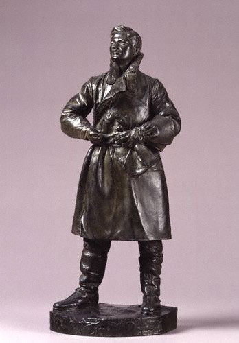
Albert Ball by Henry Poole, 1920s, http://www.npg.org.uk/collections/search/portrait.php?locid=50&page=1&rNo=6
After visiting the NPG’s education website (http://www.npg.org.uk/learning.php), I realize that there are educational activities available for families; I do want to give them some credit. However, I wish there were more in the gallery on a daily basis rather than on weekends or just for school groups.
To recap. The negatives: a lack of engaging material (even the interactive bits got boring after a short while, and specifically for the younger members of the audience) and a less than diverse “cast” of sitters. The positives: the collection itself (overall stellar artworks) and the opportunity to think up some (hopefully) creative activities that if I were the Curator of Education I would consider adopting. (Who knows? Maybe I will borrow these from myself in the future at an internship…) Oh, one other thing, what was up with the atrocious color scheme in the Regency wing? It detracted from the experience for me because there were times I noticed the wall color before the portraits, which should never happen, especially at a major national institution!