On my second day of volunteering at the Norwich Cathedral egg hunt, I was signed up to work with Susanne, another volunteer. She turned out to be a lovely woman, and while we went around delivering Cadbury’s finest chocolate eggs, we chatted about an assortment of things. I learned that she has two daughters, both of whom studied abroad in the States while they were getting their degrees. It was nice to talk to a British “soccer/football mom”. Working with her made me realize that although I have gotten to meet British students and teachers, I haven’t interacted very much with adults outside of academia. There is an entire generation of people we are missing out on. I wonder if that would have been different had the program involved a home stay family.
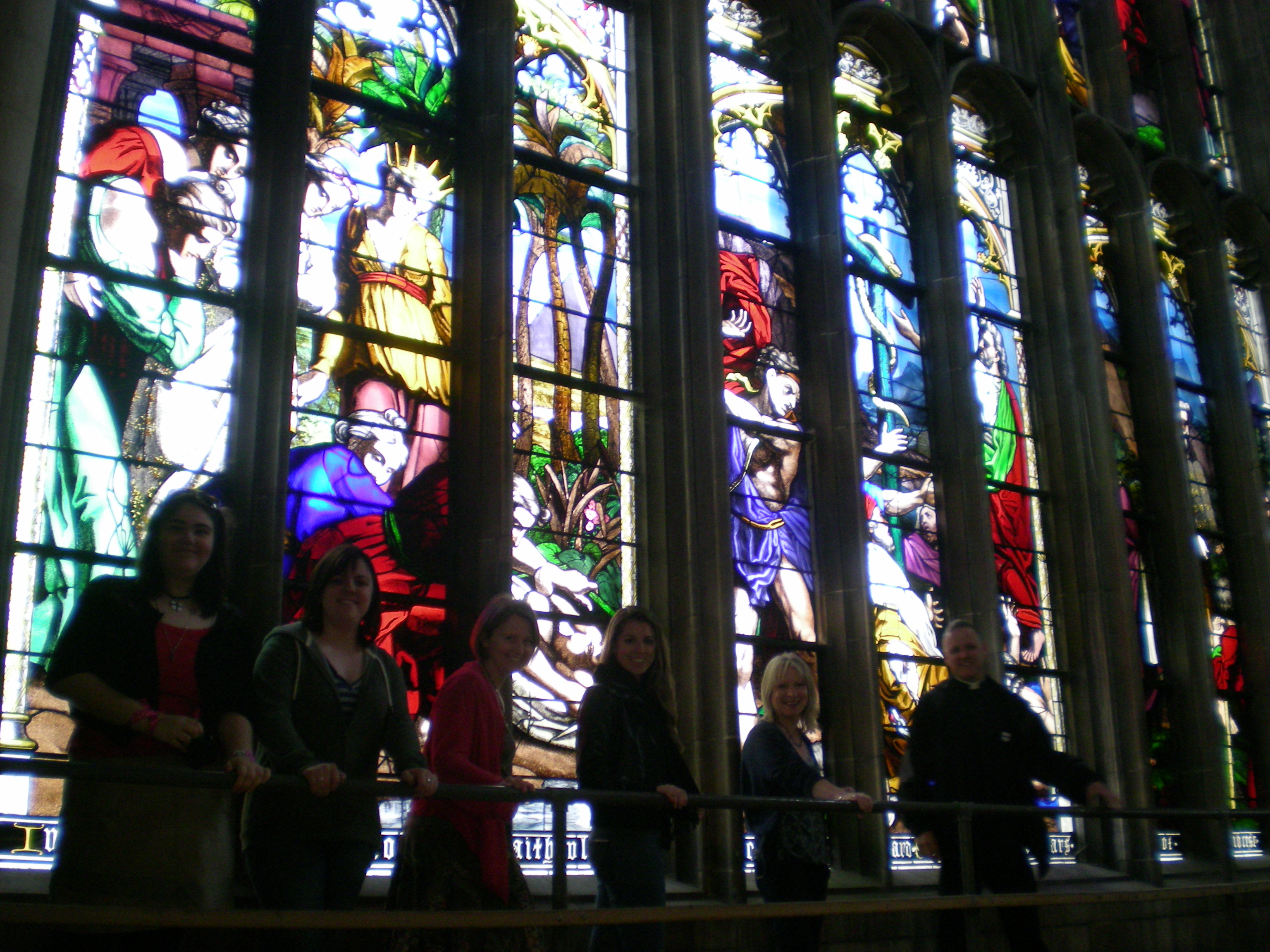
On a different note, this day was very exciting because our supervisor, Juliet, took us on a tour of the upper level of the Cathedral. This section is not open to the public or even to most members of the church, so it was a great privilege to be invited. We got to walk right underneath the big stain glass windows, so close that I could touch it. We also walked right onto the organ.
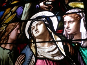

As we walked along each wall of the Cathedral, Stephenie and Juliet explained the significance of a lot of the architecture and some of the more intricate designs. There were carvings in the wall, most of them dated, and we made a game of trying to find the earliest ones. It’s rather mind boggling to think of all that history wrapped up in one building.
Date: 13/4
Supervisor: Juliet Corbett
Hours:10-3 (5)
Total Hours: 9
Tags: 2010 Sarah
September 21st, 2010 · No Comments
The way I feel about England’s museums (BM in particular) is the same way I feel about Tom Brady. They are both morally flawed, but too beautiful for me to honestly give a damn. So in that spirit lets forget about the mistreatment of Greece and Bridget Moynihan and just admire the physical beauty and inherent cultural value of the objects themselves. Sure, the jewelry collection in the Victoria and Albert represents the opulence, indulgence, and filthy wealth of the upper classes and royalty, but look how sparkly those diamonds are! The intricate cloisonne! The colorful enamel! The gemstones! Don’t hate the tiara because a spoiled rich woman owned it, admire it for its elegant design and exquisite craftsmanship.
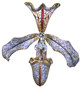
Hair ornament in the form of an orchid, made by Philippe Wolfers, Belgium, 1905-7. Museum no. M.11-1962. Image from the Victoria and Albert Museum website
I also must say, setting aside moral issues and countrys’ bruised egos, what is truly in the best interest of the objects themselves is for them to be left alone. Art and artifacts should be handled and moved as little as possible to avoid damage and the acceleration of deterioration. Professor Earenfight, who curates the Trout Gallery and teaches the museum studies course at Dickinson, likes to say that art and artifacts are like the elderly. They are set in their ways, used to their specific atmosphere, and the best thing for them is to disrupt their comfort as little as possible. The bottom line is, virtually all of the objects in London’s museums are priceless and definitely irreplaceable. The transportation of any of these objects across countries and continents is absolutely horrifying from an art conservation/curatorial point of view.
In any case, how great is it that we can get into all of these places for free? Sure, government subsidization lends itself to government censorship, but the fact that I can just wander in off the street, as I am, and walk right up to Jan van Eyck’s The Arnolfini Portrait, or Joseph Wright’s An Experiment on a Bird in the Air Pump, or the ship burial treasure from Sutton Hoo, or the Rosetta Stone and countless other treasures more than outweighs any negative aspects for me. London’s collections are among the finest in the world, and they are open to everyone. Now that’s beautiful.
Tags: 2010 Rachel
September 21st, 2010 · 1 Comment
It seems like everyone I talked to in our program strongly disliked the Victoria and Albert Museum. I don’t know what they were thinking, because I thought it was one of the most amazing places I have ever been. I loved how random it was – it really epitomized British eccentricity. The V & A seemed to be completely lacking in order from one room to the next, whereas other museums that we have been to, like the British Museum or the London Museum seem to be arranged more logically. But I really like how chaotic it was. It added the element of surprise which made me laugh aloud. I think the key is to go in with a game plan. Know which exhibits you want to see beforehand, that way you organize your visit accordingly. Any interesting sites you find along the way can just be a fun little bonus.
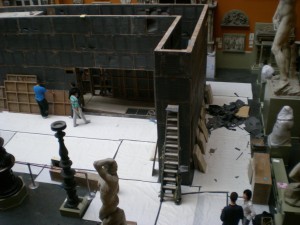
So what was the most interesting part of such a fascinatingly bizarre place? No, not the jewelry, although my eyes were glued to several dazzling tiaras, but what I found most intriguing was being able to watch the museum staff put together an exhibit. I felt like I was backstage at a play, watching the people who work behind the scenes. I never realized how much work it would take to create even just one exhibit. There were at least ten or fifteen people working on the room. Some were doing physical work, lifting and moving planks of wood, while others looked over papers on clipboards and directed traffic. However, I was a bit mystified because I didn’t know what it was exactly that they were building and I still don’t know what it had to do with that particular room of the museum. It just looked like they were plonking down a big ol’ wall in the middle of the room. And as far as I could tell there were no signs posted anywhere with “coming soon” information, so I’ll just have to make another trip back to London in a few months to see what it looks like.
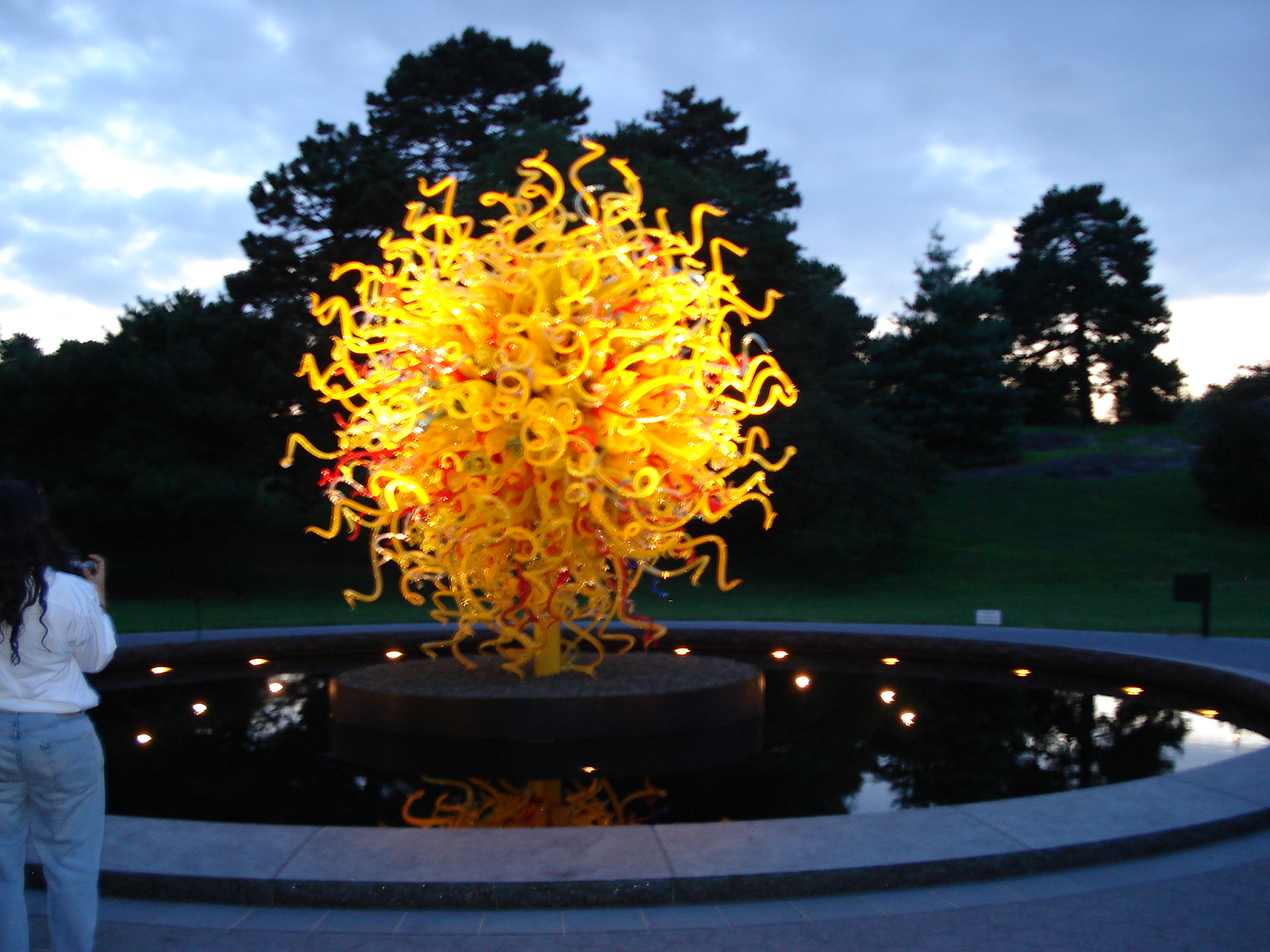
I also got really excited when I saw the piece by Dale Chihuly. The artist is known for his work with glass, creating huge and intricate structures. I was fortunate enough to be able to see his exhibit back home at the Botanical Gardens in New York with my family, and so when I recognized his work in the V&A, it was like seeing a little piece of home.

This is a piece at the Victoria and Albert Museum
Here’s one from home:

Tags: 2010 Sarah
September 21st, 2010 · No Comments
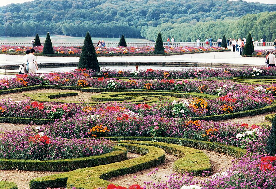
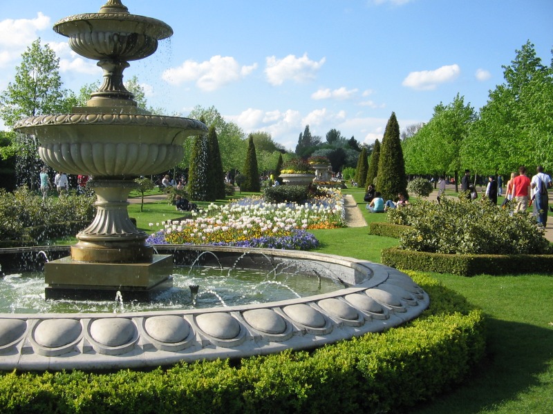
From what I’ve begun to gather, the English (or, Londoners) aren’t particularly fond the French or French culture. I overheard a conversation on the street that ended in, “Do I look bloody French to you?”. Not quite sure of the motivation behind the outburst, but anti-French sentiment, while not rampant, is a visible part of popular English culture. It’s strange, then, that some of London’s most prominent physical elements should mesh so completely with the French formal ideal: parks.
The classic French conception of beauty in nature is that none can exist without the existence of order- of the human hand altering the chaotic natural mass into a structured, geometric product. From what I’ve seen of the layout of Regent’s park, the Brits have just about the same idea. Many people have commented that parks in London seem to be, first and foremost, places to enjoy the beauty of the precisely-planned horticulture. We see meticulously trimmed hedges, flowers planted with regard to color scheme, and white fountains as centerpieces. While running in Regent’s the other afternoon, I saw teams of gardeners replacing soil and adjusting flowerbeds. The beauty lies not only in pure nature, but in the reordering and distribution of it.

http://www.gardens-to-visit.com/2009/02/versailles-2.html
It’s hard to think of a better example of this systematic restructuring than in Versailles. The hedges are pruned to an almost impossible degree of uniformity, the flowers are separated with care, and there are man made monuments throughout (to serve as an even more solid testament to the strength and genius of the designers. The same artistic values and technical skill are visible in Queen Mary’s Garden in Regent’s park.

http://www.londonrelocationservices.com/blog/tag/west-london-relocation
The rows and rows of flowers in the garden do not grow in natural patterns, as might be typical in American parks or gardens. Like their French counterparts, the English gardeners have devised color schemes, strict rows, and tight upkeep standards on all the elements of the space (note the uniformity in the hedges around the fountain and the flower patches). These areas of the park are not meant for “fun” in the typical American park sense of the word- we were glared at for tossing a frisbee in the garden a few days ago. They’re a medium of artistic expression, and I’m starting to appreciate them more and more. I do think, however, that instead of badmouthing the French, Londoners should take some time to stop and smell the roses. It’s through these gardens that we can see real, fundamental similarities in an important aspect of the two cultures.
Tags: 2010 Patrick · Uncategorized
September 20th, 2010 · No Comments
I think it will be beating a dead horse at this point to talk about the lack of diversity in the National Portrait Gallery, but I guess I have to a little bit, so sorry horsey. Truthfully, the whole politically correct, inclusive way of thinking about representation is a late 20th century idea. Until that time, when the movement towards serious examination of who is telling/included in the historical narrative was underway, the rich white male’s story was the story, and if it was questioned, it wasn’t questioned openly. So, it was no surprise to me to see walls covered in portraits of the aristocracy and the very famous movers and shakers, and to see no portraits of the poor, lower classes, or racial minorities. (It’s important to note that portraits were mainly done by commission, and to sit for a portrait was time consuming. The lower classes wouldn’t have been able to afford or have the leisure time to have their portraits painted.)
I was, however, surprised by the number of portraits of women I saw. Still not as many as men, but much more than I was expecting. One portrait in particular that caught my attention was the self-portrait of Mary Beale.

Mary Beale, by Mary Beale, oil on canvas circa 1665 (Image from the National Portrait Gallery website)
I was immediately drawn to the richness and depth of the color (this is much more apparent in person). The draping of the Beale’s crimson and steely-plum silk dress suggests a solid, strong body beneath. Her expression is self-assured, yet humble, and she appears competent and adept. After admiring the painting for purely aesthetic reasons, I was even more interested when I read the accompanying text.
Beale worked as a professional painter from the mid-1650s, specializing in portraiture. She was the first Englishwoman to become a portrait painter of real distinction. A daughter of a Suffolk clergyman, by age 27 Beale was a very much in-demand portraitist, particularly for the clergy. Beale’s husband Charles, whom she married at age 19, was also a painter, and he acted as a studio assistant to Beale as well as kept records of all of her commissions. In the self-portrait above, a painter’s palette hangs on the wall in the background, referencing her profession, and she holds in her hand a canvas depicting her two sons, Bartholomew (1656-1709) and Charles (1660-1726).
It was so satisfying to see in the National Portrait Gallery a portrait of woman who was valued for something more than royal or aristocratic blood, or being a wife or mistress to someone of royal or aristocratic blood. How incredibly progressive, in the 17th century no less, for a woman to be honored and admired for her work as something other than being a madonna or a whore. To me, Mary Beale resembles quite closely the “ideal” modern woman. She was a wife and mother, but she was also a respected, talented, accomplished career woman, and that is what takes the historical precedence.
Reference:
Schubert, Gudrun. “Beale, Mary.” In The Oxford Companion to Western Art, edited by Hugh Brigstocke. Oxford Art Online, http://www.oxfordartonline.com/subscriber/article/opr/t118/e213 (accessed September 20, 2010).
Tags: 2010 Rachel
September 15th, 2010 · 1 Comment
I know the “museum subsidization misrepresents history” discussion has been beaten very nearly to death over the past few weeks. Believe me, I wouldn’t start it up again unless I thought I might be able to bring something new to the table. So here it goes.
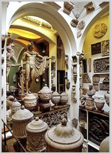
The collection at the Victoria and Albert Museum is a sight to behold. Above the information desk there’s a staggeringly beautiful Chihuly chandelier that looks like some kind of giant hourglass made out of blue and yellow grapevines. There are hundreds upon hundreds of ornate crucifixes, rows of Classical and post-Classical sculptures, and dimly lit rooms lined with ruby brooches and diamond-encrusted scepters and ivory-inlayed lockets and 24-carat gold hair clips. It’s impossible not to be blown away (if not taken aback) by the opulence of the spread.
Yeah, there’s also a bunch of East Asian art downstairs somewhere.
But wait! You missed the coronation robe with opal and pearl sequins and the chalice with the eight-kilogram gold handle and the swords- God, those swords- with enough jewels in each to fund its own war. I know I’m not the only one who left the V & A having already forgotten about the seemingly mundane artifacts in the Korean, Japanese, or Chinese exhibition halls. There’s been a lot of speculation about whether or not curatorial decisions might have been influenced by government interests (in short, put a bunch of really colorful, sparkly British trinkets next to a bunch of boring, not-so-sparkly Asian trinkets to show off the obvious superiority of the Empire’s art) as a result of subsidization. I’ll be the first to admit that I started out very much on the side of the cultural conspiracy theorists. I think, though, that we might be approaching this from the wrong angle. There might not be foul play here after all.
It all comes down to what we, as westerners, value in art. The V & A is a huge museum. It’s almost impossible to take in every last artifact. So what are we drawn to? We’re drawn to sparkle. We’re drawn to lots of jewels and lots of gold, the more the better. Westerners value sparkle. We’ve been trained and conditioned to gauge an item’s merit in terms of carats, not craftsmanship. The fact that we’re more likely to come away from the museum with a more awestruck reverence of a weighty saphire brooch than of a painstakingly lacquered Chinese wine jug isn’t a result of some sneaky government agenda. We’re just intrinsically predisposed to like that sort of art more. It’s an almost vulgarly simple idea, but it has been a defining aspect of western popular culture for centuries. We would much rather see jewels than silk weavings, crowns than ceramics. Eastern culture values harmony, simplicity, and order in objects. Western culture values rarity and opulence. This is no trick planned by the curators. Even if the less immediately visually striking Asian art section were moved to the main level of the museum or doubled in size, it wouldn’t matter. As long as there are jewels and golden scepters for westerners to gawk at, the V & A will always be a museum, first and foremost, fueled by the splendor of those artifacts. This may or may not lead to a disproportional reverence of one region’s culture over another’s. It’s not a matter of misrepresentation of art or history on the part of the museum- it’s a matter of a fundamentally skewn collective perception of what is or isn’t worthy of appreciation.
Tags: 2010 Patrick
September 15th, 2010 · 2 Comments
Unless you have previous knowledge of the museum beforehand, the John Soane Museum will initially confuse you. Expecting to see another massive and imposing building, the Soane Museum is actually just an inconspicuous house located amidst the London city chaos. Without much of an introduction, I wandered inside holding my purse in a clear plastic bag—the reason for which I learned later on—immediately into Sir John Soane’s past. I wandered through the intricate maze of tall and narrow doorways and winding staircases, coming across only a small number of plaques describing Soane and his belongings. I gradually learned he was an English architect, remembered most for his remarkable skill and his design of the Bank of England.
John Soane’s house was incredible. The detail in the architecture was intricate and the colors and designs were nuanced and distinct. Besides the building itself, the objects it housed seemed for the most part entirely out of place. For example, a large open room, extending from a stone basement to a glass roof, exhibits a myriad of ancient Greek stone architectural pieces. Apparently the room is intended for students to wander through feeling as if in Greece while learning about the architecture. Although I appreciated the museum by the end of my personal tour, I could compare it to another museum I visited in Boston and did not enjoy it nearly as much.
Greek Architecture Exhibit, John Soane Museum
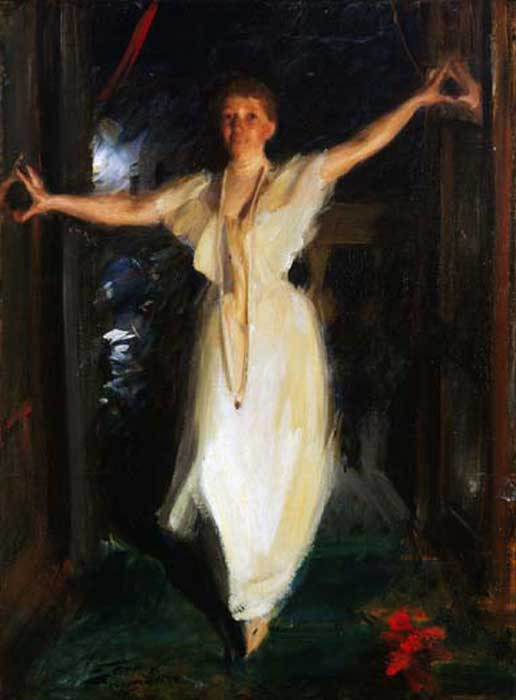
The Isabella Stewart Gardner Museum in Boston, Massachusetts is similar to the John Soane Museum in that it’s a personal home that displays the past owner’s invaluable possessions. Isabella Gardner was not an architect like Soane, but rather a remarkable art collector, patron of the arts, and philanthropist. Unlike the Soane Museum, the Gardner Museum offered a tour as soon as the visitor entered—something vital when there’s an apparent lack of plaques, brochures, and audio guides. Furthermore, the organization and presentation of the pieces in the Gardner Museum was more effective. Instead of a disorganized jumble, Gardner’s rooms centralized the visitors’ focus on one main piece and designed the rest of the art in the room to reflect and elaborate on the piece’s expression. For example, one room displays a striking, passionate sort of painting, while other sculptures, drawings, plants, and the room’s decoration further emulate the painting’s dark, mysterious emotions.

Painting in Isabella Stewart Gardner Museum
In the end, I enjoyed the John Soane Museum as an exploration of one man’s architectural talent and creativity, the rare objects he collected, and his life in 18th and 19th century England. However, it became a challenge when I compared it to another somewhat similar museum that I much preferred over the Soane.
Tags: 2010 Mary · Museums

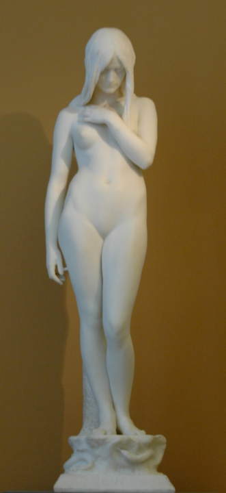
“Eve” by Thomas Brock, 1899
Seeing the Victoria and Albert Museum is a must. And you most definitely should enter the museum via the Tube entrance. Prior to my visit, I naïvely believed the Victoria and Albert Museum would display art from Queen Victoria’s reign to illustrate the period—I found myself mistaken. Upon entering V&A from the underground tunnel, I immediately stepped foot into a series of small, dark rooms off to the right. The rooms modestly displayed furniture and tapestries from Europe dating from the seventeenth to nineteenth century. I then wandered into the main museum hallway above ground and explored the diverse assortment of sculptures extending down a long hallway. Taken aback, I quickly realized the V&A actually displayed a much broader range of art. By the end of my visit, I found that was a huge understatement. The Victoria and Albert Museum is enormous and houses a collection of almost every type of visual art.
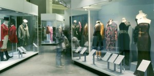
Fashion Exhibit
The museum map became somewhat useless and rather bothersome as I wandered through the labyrinth of art. Branching off of the main sculpture room—which included work from a favorite sculptor of mine, Rodin—were displays of art from China, the Islamic Middle East, Japan, Korea, South Asia, and South-East Asia. Another room I thoroughly enjoyed was a room presenting fashions from Italy, the United States, Japan, England, and France. The clothing dated from the eighteenth century through today. I only explored parts of the first floor and I still had five more levels!
Plaster-casted Sculpture Exhibit (personal photo)
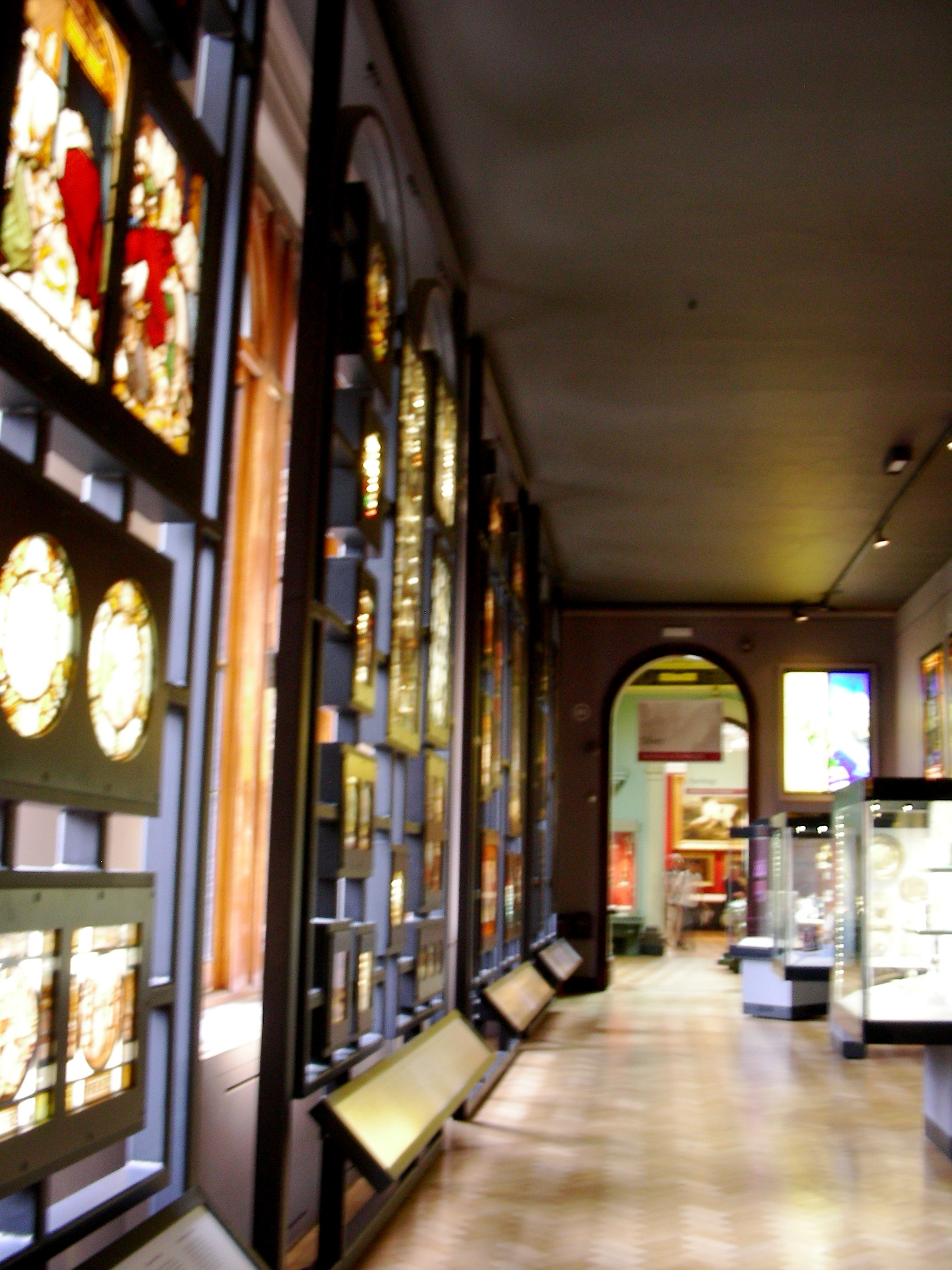
Throughout the remainder of my museum tour, I discovered collections of photography, mini architecture models, prints, drawings, paintings, tapestries, sacred silver and gold, and stained glass. There were also two massive rooms of plaster-casted architecture and sculptures dating from the eighteenth century, when plaster-casting famous works was popular for museum displays. Numerous rooms displayed eclectic exhibits of Medieval and Renaissance European art from the fourth to seventeenth century. When I finally stumbled into a dark hidden room of priceless jewelry dating back from 1500 BC, I was irrevocably astounded. I was lost in the Victoria and Albert museum but when discovering all these sorts of extraordinary pieces of art, who didn’t want to be?

Stained-glass Exhibit (personal photo)
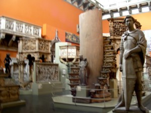
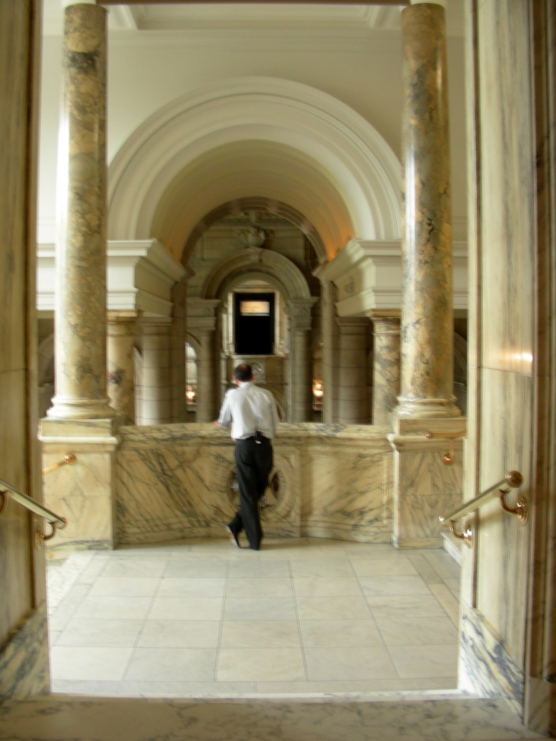
On the whole, the museum’s collection was incredible (if that’s not obvious already). I was completely taken aback by the wide array of art displayed, as well as the priceless items included—countless pieces of silver and jewelry, as well as Leonardo da Vinci’s notebooks and Raphael’s paintings (coming soon). However, the organization of the museum is a contentious topic. The pieces of art come from all over the globe and date back to 1500 BC. Also, obviously, the museum includes almost every type of art. To mitigate this challenge of organizing the art, the museum’s ironically set-up like a maze. The different rooms intertwine and lead you through every floor, and each room is included in the art display. For example, doorways to Renaissance Europe boast beautiful marble columns, tiled floors mimic mosaics on display, monolithic architectural structures make Italian plaster-casted sculptures seem authentic, and aged brick walls and cobblestone floors bring life to the medieval ironwork.

Large-scale Medieval and Renaissance Architecture (personal photo)
From what I could gather, it seems as though the Victoria and Albert Museum is a massive collection of treasures donated by organizations and wealthy individuals. For one, the galleries of donated art pieces ostentatiously display the donor’s name on the wall. Overall, the V&A Museum is a display of wealth—both of England’s monetary wealth and of its wealth of knowledge in the arts. The museum has put on display priceless pieces of art from around the world. The English are subtly, but really quite clearly, boasting. Typical.

One Exhibit’s Entranceway (personal photo)
Tags: 2010 Mary · Museums
September 3rd, 2010 · 1 Comment
Our trip to the National Portrait Museum was a fantastic experience, giving an eye opening look into famous icons in England dating back all the way to the 17th century. However, that was all it gave, was a look into the faces of rich families and celebrities in England. The museum itself began with elegant portraits of royal British families such as the Tudors and the Stuarts. Fancy galleries seperated by large arched doorways provided the backdrop for all these paintings of wealth. By the time one arrived at the section concerning 19th and 20th century portraits, the portraits of royal family members dropped slightly in numbers and the paintings became a bit more abstract. However, never did they shy away from only portraying the celebrity aspect of all these people. Needless to say, the common man did not receive a portrait. I would have liked to see at least one portrait that portrayed an everyday Londoner, but one can assume that just wouldn’t happen; either because the portrait costs a large amount of money to have done for you, or the artist did not find the common man interesting enough.
Amidst all the glory and wealth illustrated in the earlier portraits in the gallery, one practically leaped off the canvas at me for a different reason.
This portrait, amongst all the glorified, epic depictions of wealth and royalty, shows Paine in a very distorted and dark look, rather than the clean and pristine style of most royal portraits. It is inserted right smack in the middle of the 18th century portraits of Revolutionaries and Royalty. The portrait lacks definition in its lines and Paine’s body almost seems to seep into the background in an odd blend of himself and the darkness around him. In addition, the painting also seems to have a somewhat forboding feeling about it, which differed from nearly every painting surrounding it, where the environment was a large royal hall or a fancy room with the subject seated in a comfy chair. This portrait inserts Paine amongst the darkness, the unknown, something that makes you uncomfortable but fascinated at the same time. A great portrait amongst a great gallery. Cheers.
Tags: 2010 Benjamin
September 3rd, 2010 · 5 Comments
As someone who wants to work at a museum, I enjoy different ones (even on a day where I visit four) and seeing how they formulate their exhibitions and present their collection. I also enjoy seeing how children interact with museums, as I want to combine museum education with my love of medieval art. The National Portrait Gallery, however, was not the best museum I have been to thus far. In fact, the quality of the art aside, I was largely disappointed.
Going in, I expected the portraits to be largely of the elite ruling class and others who had some power, whether political, artistic, or scientific. The collection was predominantly white elites (mainly males). This is understandable, as that was who was most likely to be in a position of power through the majority of England’s history. While portraits are not as readily available of the lower classes, they do exist. The NPG seemed to overlook this fact until very recent history. (Even then, the portraits chosen to be featured in the permanent collection tended to have an element of celebrity rather than being chosen for the lesson they can teach about daily life in a given period.) After finishing the Tudor section, my interest levels were in automatic decline and the museum had very little to reverse that. Its one redeemable feature was the interactive computer stations that went past the simple didactics in the collection. Yet, even that was lacking: it was written for an average adult.
There should have been a version of the interactive stations specifically designed (and easily accessible) for children. (Supposedly there was a map for children, but I did not see any families with one. Did anyone??) The NPG is a family destination: tourists (who make up a presumably large part of the museum’s audience) do take their children there (I witnessed several families) and there needs to be something more that acknowledges this more interwoven into the permanent collections. Instead of a dad timing his son to see how long he could walk from one end of a wall-long portrait to the other, I should have witnessed a dad engaging his son with a museum map for children. (This is something that I have seen in almost every other museum on this trip, which made the issue more obvious to me. If a family chose not to use the available map, then the museum still has the responsibility to help engage a wider audience.)
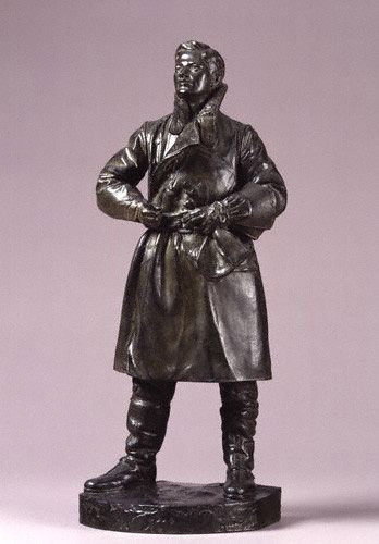
One of the few portraits that spoke (amidst the celebrity portraits) to me was a small model of a full-scale statue of Albert Ball by Henry Poole. Ball, a WWI pilot, shot down 43 enemy planes before being killed in action. At 21, he is one of the few people who appeals to a largely universal audience: English viewers for his patriotism, history buffs (WWI geeks specifically), art historians for his glimpse into war-era art, younger children of all backgrounds because of his heroic story (everyone loves a good hero, yeah?), 20-somethings who wonder if they can make a difference, and wanderers because of the persona that radiates from the work itself, capturing the power and passion of a young hero. Yet, even the portrait I liked the most stuck true to the NPG’s “requirements” for display: white and elite. (The portrait was given by Ball’s father, Sir Albert Ball). It did, however, lower the average age of the collection’s sitters by a few years… Picking a younger sitter for a comic book-esque family guide would have engaged the children. Who better than a WWI hero to be the leader? (This could easily be inserted in the visit with a small map and identifying pictures on didactic panels to let families know that a certain portrait would be more interesting for a younger audience.)
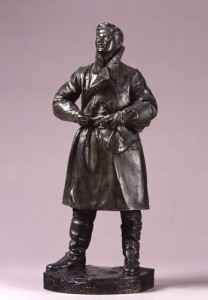
Albert Ball by Henry Poole, 1920s, http://www.npg.org.uk/collections/search/portrait.php?locid=50&page=1&rNo=6
After visiting the NPG’s education website (http://www.npg.org.uk/learning.php), I realize that there are educational activities available for families; I do want to give them some credit. However, I wish there were more in the gallery on a daily basis rather than on weekends or just for school groups.
To recap. The negatives: a lack of engaging material (even the interactive bits got boring after a short while, and specifically for the younger members of the audience) and a less than diverse “cast” of sitters. The positives: the collection itself (overall stellar artworks) and the opportunity to think up some (hopefully) creative activities that if I were the Curator of Education I would consider adopting. (Who knows? Maybe I will borrow these from myself in the future at an internship…) Oh, one other thing, what was up with the atrocious color scheme in the Regency wing? It detracted from the experience for me because there were times I noticed the wall color before the portraits, which should never happen, especially at a major national institution!
Tags: 2010 Stephenie


