Entries from August 2009
When I heard that we would be going to Stonehenge, my first reaction was to check if Stonehenge was indeed the default desktop background for most PCs. Upon learning that it was, I became even more excited. Is that nerdy?
I absolutely loved Stonehenge. My mom had originally told me that it was used as a type of sundial, and a friend of mine told me to “enjoy being tortured and thrown into a mass grave” when I mentioned we were going there. I hadn’t realized that there was so much speculation surrounding its practicality, and I think it’s fascinating that nobody knows for sure what it was used for or how it was created. To be honest, I wish I was able to attend on my own, perhaps at night. It’s such a beautiful place, so it makes sense as a tourist attraction; however, I do think the sheer amount of people takes away from the lonely beauty it seems to radiate. I also didn’t realize that what exists now is not how it once looked. Trying to imagine what it looked like as a full work proves difficult, but it must have been spectacular.
Bath was also a lovely place. After many days of group activities, I enjoyed wandering around by myself and exploring the center of town. The park was particularly relaxing, and the one pound fee to enter was entirely worthwhile. Since pigs are my favorite animal, I was excited about the flower pigs that marked the entrance…it didn’t even occur to me that they relate back to the founding of Bath until someone told me that they aren’t there for my personal entertainment. Oops.
To me, exploring the Roman baths did feel like stepping back in time, especially in the indoor displays. I felt that the entire arrangement was very advanced for a people who lived such a long time ago. There were even changing rooms and a system of pipes (even if they were lead), which surprised me. I also didn’t know that the baths were not solely used for bathing, but also for social aspects, sacrificial rituals, and commerce in general. When I had the chance, I felt the water…it was pleasantly warm. Kudos to the Romans for creating such an exquisite spa and resort.
It was also fun poking around little shops, tea rooms, and cathedrals while appreciating various street shows in between (including an opera singer and a violinist). The nature of the Bath Cathedral solely as a tourist attraction was a bit disappointing, but overall, I enjoyed both the historical content of Bath and simply exploring on my own.
Tags: Amy
August 30th, 2009 · 1 Comment
August 29, 2009
In my last blog, I mentioned how much I didn’t like the Tate Modern. Conversely, but maybe not surprisingly, I LOVED the National Gallery. I was especially excited to see works by Monet, and loved “The Grand Canal, Venice” in particular. Since Van Gogh is one of my favorite artists, I was also amazed to see “Sunflowers” and “A Wheatfield with Cypresses” in person. We continued to wander through rooms containing paintings by Renoir, Picasso, and many artists that I did not recognize (I found some new favorites to look into…Camille Pissarro, for one, who painted “Portrait of Felix Pissarro” and “The Boulevard Montmartre at Night”). I was impressed by the sheer size and detail in many of the paintings, as well as their incredible preservation. I always imagine paintings from so long ago to look old, but these looked as if they were painted yesterday.
The overwhelming majority of the museum’s earliest paintings focused either on mythology or the Virgin Mary/Jesus, and it gave me an idea about just how important these topics were to past generations. Maddie and I discussed how Jesus is almost always interpreted as a tall, thin, fair complexioned man when in reality, he was probably short, squat, curly haired and dark in complexion based on his geographical location. We also thought that “The Virgin and Child before a Firescreen” by a follower of Robert Campin looked almost modern due to how old fashioned it was. It seemed, to us, that art has come full circle in some ways. I was also surprised to stumble upon “The Birth of the Virgin” by Master of the Osservanza, because I’ve never thought or seen record of Mary’s birth. The focus is almost always on the birth of the Christ child, and it was interesting to see another portion of the Biblical story that is entirely overlooked.
Tags: Amy
August 28, 2009 To start, I had my first authentic fish and chips experience in England the other day at a restaurant along the Thames. I’ve found that English restaurants are occasionally difficult to navigate because they’re separated into so many sections depending upon what you want and where you want to eat it. The complication turned out to be entirely worthwhile, though, because the food was delicious! I had no idea that choosing the type of fish is part of the meal (I had haddock). I was quite excited about it, to say the least. After that, we left for the Tate Modern. I normally try to appreciate modern art even if I don’t particularly like it, but I had a hard time enjoying this museum. Perhaps it was my state of mind or tiredness, but I really did not like any of the pieces I saw and couldn’t seem to get any meaning out of them. At one point, we stepped into an exhibit that was marked as containing explicit material. I completely understand that some art is meant to be controversial, but this was legitimately disturbing (I’ll refrain from description in case others haven’t yet seen it). After seeing the video and feeling uneasy, I decided to leave. I’d love to hear what sorts of reactions others had to that exhibit, and what they got out of the museum as a whole because I do feel like I’m missing something.
Tags: Amy
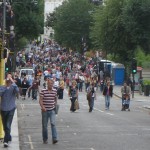
Today I explored the Notting Hill area and I could imagine it as a vibrant but mostly quiet neighborhood. This holiday weekend however it was transformed by the Carnival that takes over the streets. Carnival has been held annually for almost fifty years and has exploded into one of the largest festivals in London. The event was originally a local West Indian festival that now draws hundreds of vendors in twenty square miles of streets. The streets explode with people, music, and the smells of traditional Caribbean food like jerked chicken or curried goat. The festival goes on for three days the largest and busiest being Monday. I went on Sunday which is considered the children’s day, so the parades were made up of children who would dance down the streets with each different group in charge of a different theme. Due to the massive amounts of people attending the festival the crowds also draw a strong police presence and varying reactions from the residents.
Multiple houses and stores had plywood up in front of their storefronts or the gates of the houses to stop people from entering their yards or defacing their property. Certain streets were cordoned off so that only residents were allowed to enter those sections. What was truly surprising was the variety of participants. A huge portion of the visitors were white Brits interspersed with a multitude of ethnic groups including Indian and Muslim, so identified by the bright saris and full hijabs. However after the initial parade another passed later filled with not just members of the black London population but Caucasian and other groups as well. It was incredible to see an event that can trace its roots back to a small local event for the area to what is now a major attraction to the entire city.
Tags: Uncategorized
August 30th, 2009 · 1 Comment
I’ve noticed that my blogs tend to have an incredibly critical tone to them. As a person who usually is quite positive and tries to find the good in all situations, such a pattern is a bit upsetting or at least surprising to me. Thank goodness for the Cabinet War Rooms offering me the chance to mix up the tone a bit. What seems to be most upsetting to me about certain places I have visited while in England is if that place operates behind a façade of what it really is. St. James’ Park is beautiful and promises peaceful relaxation but is only enjoyed by a select few. Bath is beautiful because that’s what tourists want to see. The Cabinet War Rooms are a bit on the pricier side of the spectrum so admittance could be seen as selective in ways. But assuming you have the twelve pounds and some change to get in, you’re guaranteed to see and experience all that the rooms were during World War II. That sense of ‘real-ness’ is something I most appreciated about the museum. The Blitz completely changed the London atmosphere during WWII, and somehow the museum was able to capture the feelings of anxiety that one can only imagine were present in the city at that time.

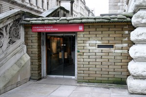
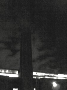
Outside view of The Cabinet War Rooms
Upon entering the museum, a feeling of eerie tension is almost inescapable. A most unpleasant guard very solemnly asked to look through my bag before I was to be admitted into the museum. I cracked an admittedly bad joke about how many maps I was carrying in it and how that might be difficult to look around in the bag. Laughter, a smile, even a twinkle of the eye was completely absent in his reaction. I recognize that he must get similar jokes all the time but his stern mood definitely set the mood for what was to come in the rest of the museum. Now, this may seem an odd experience to enter into the blog especially when I’m hoping to highlight how wonderful the museum was. Truly, I would have appreciated if he had acknowledged my attempt at being friendly but I think it’s actually good that he didn’t. The museum wasn’t a happy one. It shouldn’t have been. It was a preservation of a shelter that was put in place to ensure that communication and governance could continue in the case that an air raid might occur. As the Blitz is still a very real and felt occurrence in London’s history, the museum that seeks to capture that time should do that as fully as possible. So, having learned my lesson about keeping my jokes to myself, I proceeded through the rest of the museum. The lighting was dim, the people going through the museum quiet, the rooms closed off, and the lay out confusing. Again, this may sound like a negative review of the place but it’s exactly the opposite. More than any of the readings of personal accounts or facts about the destruction of the bombings, it was the tense atmosphere found in the museum that made the Blitz seem the most real to me. I was guided by a very thorough audio tour and yet still never knew where to go. Yes, this was frustrating but imagine how living and working in that space must have been. Churchill and his staff were living and working in that dreary underground space trying to carry on as positively and normally as possible. They were in the midst of a war with a threat of an air raid always present and surrounded by the people who are relying on them to not mess up. And if that isn’t enough pressure, they were underground- the situation could, arguably, not have been more confusing and frustrating. Those feelings are still alive in the museum. Yes, it’s a tad disconcerting to feel that strange in a museum but if you push past the feeling of ‘wow, I feel a bit uncomfortable’, you realize how fitting that feeling is for the location.
I realize that I took an odd way to describing a positive side of a museum by essentially saying “it was creepy but cool!” But that’s not so much the message. The message to me is that the museum successfully steered clear of any type of gimmicky portrayal of the war rooms and offered its visitors a chance to really sense what being in the war rooms might actually have been like. Now if only we can get rid of the cheesy gift shop and lower the price…I’ll save that for another post though.
Tags: Audrey · Museums

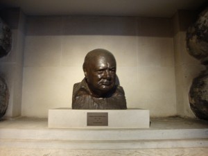
Churchill Bust
Today I visited both the Cabinet War Rooms/Churchill Museum and the Sir John Soane Museum and what struck me most about both of these very different museums was their presentation. The approach that these two museums took with presentation are very different from each other, and therefore striking in different ways. Having put on an exhibition myself during the past school year, I know the decisions involved in creating a show.
Although I visited both the Cabinet War Rooms and the Churchill Museum, I was much more impressed with the set up of the Churchill Museum, so that will be my focus here. Upon entering the Churchill Museum, the first thing I noticed was the color scheme: blue and grey/silver. This was continued throughout the exhibition which gave it cohesion and unity. This exhibit also mainly used interactive media like audio and video. My favorite section of the museum was the wall of black and white photos (keeping with the color scheme of the museum) that were back lit and place in deep silver frames. As you walked along the line of photos, motion sensors on the floor active clips from Churchill speeches that related to the photos. I found this combination of visual and audio stimulation to be very engaging.
Besides the color scheme, I also loved the various either lit up, scrolling, or painted Churchill quotes throughout the exhibition. Often when people picture art exhibitions they picture paintings and history exhibitions they picture photographs and artifacts. Adding text was just another way this exhibition engaged the audience successfully. As an English major and art minor, I found the quotes pleasing both because they were well chosen for their content, and also because they were presented in a very aesthetically pleasing way.

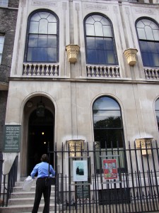
The Sir John Soane
The Soane Museum, on the other hand, had an equally engaging yet completely different layout. As opposed to the open, spacious, unified by color Churchill exhibit, the Sir John Soane Museum was in Soane’s home with tiny hallways, narrow stairwells, and rooms packed with busts and statues. Unfortunately no photographs were allowed in the museum, and only a photo could really convey the feeling of the museum—or home. That was the thing, this was the architect Sir John Soane’s home, more or less just the way he left it. The walls were covered in paintings and relief sculptures from various time periods. The banisters, tables, and other available wall space was covered in busts and other types of statues. Every windowsill and flat surface had something on it. The bookshelves were packed and the floors were all lined with various floral printed rugs. There was literally just enough room for a person to walk around the room or through the hallway. As I entered I had to place all my carried belongings in a plastic bag to be carried in front of me because there was not room enough for me to hold things at my sides as I walked. The stairwells winded around and as I walked, with my head always facing upward, I could not help but to think about the kind of man who would collect and appreciate these works of art, let alone live crammed in a house with them!
This exhibition overwhelmed me. I paced and paced around the house, and even saw a wall UNFOLD to reveal even more paintings! Most of the artwork was classical. Many of the paintings were landscapes. But it was not necessarily the artwork itself that made me love this museum, but the presentation. As I walked through the front door of the house and was instructed to turn off my mobile phone, I suddenly had this feeling that I was going through the wardrobe into Narnia. It was no longer busy modern London, it was 18th century England. The small spaces kept the museum goers quite, and I had a feeling of calm silence and awe as I entered room after room of wall to wall, floor to ceiling, art. Really, what could be better than that?
Ultimately I know that neither the content of the historical Churchill Museum or the classical busts and landscapes of the Sir John Soane Museum would have captivated me nearly as much had they not each been presented in such engaging ways. When it comes to being good at something practice, practice, practice. And when it comes to an exhibition its presentation, presentation, presentation!
Below is a slideshow of photos from the CHurchill Museum.
Tags: Megan · Museums
I realized that I forgot to discuss at any length my trip to various art museums in London. So, here is an account of my foray into the wider world of art—according to Britain.

The National Gallery looks out onto Trafalgar Square (find a history of the building here). The building itself is massive and houses thousands of paintings in room after room. The group that I went with found themselves lost in the maze of interconnected rooms. Sure, the collections are divided by period, but when one was distracted by William Turner or Titian, one room seemingly spilled out into the next. Disoriented and confused, it often took several minutes before we could find our way out of the labyrinth.
I should note that we only saw about twenty, maybe thirty, percent of the museum. We were warned that you could spend hours and even days on end in the museum but never truly heeded the warning.
Tired and ragged, we trekked on to the National Portrait Gallery. I should pause for a moment, for I went into this museum with low expectations. I never expected this museum to house any works of art but the typical “woman-seated-staring-at-a-diagonal” type of portrait. Or a bust of an obscure member of Parliament from the 18th century. I did not want to see this, to be honest, because I prefer art with sunlit scenery, some shock value, or images that did not focus solely on human features. I imagined myself walking mindlessly through halls lined with hundreds of identical portraits.
The National Portrait Gallery had all of that, but I’ve never been so wrong about a museum. I found paintings, photographs, busts and other, more abstract, media used to trace the human features of celebrities, average people, and, yes, even obscure members of Parliament. But even the people I did not recognize were immortalized by outstanding and, in many cases, awe-inspiring portraits and sculptures. Take, for instance, one of the paintings submitted to the 2009 BP Portrait Award. They were just incredible (here’s one example). This museum gracefully balanced the shocking and the more tame, the popularized and the relatively obscure. It’s all I ask for in a museum, and something rarely seen in art museums I have seen in the past.
This brings me to the next art museum I visited – the Tate Modern. Again, I think a pause is in order. Having only one course surveying the history of art since the Renaissance, I cannot declare myself all-knowing with regard to art. By the same token, I can appreciate all art. Especially when its definition is psychologically and visually questioned and, in some cases, shattered. I appreciate modern art for this reason; it tacks on an imminent and bold question mark next to the word “art,” and thereby forces us to question the painting/photograph/slideshow/etc. before us. “I could (never) do this” is often heard at these exhibits. As an art history professor explained to me during the course, these people (the Rothkos, Koons, and McCarthys) of the world) DID do it. And that is why it is art. Their expressions of limitless passion and angst and joy spill out into these exhibits, begging for a smiling or a wincing, almost riotous, audience.

The Tate Modern at night. Disturbingly brooding? Or pleasantly shocking?
Although I have studied art prior to visiting these museums, I looked for a distinctly “English” way of displaying art. Their art included famous works Americans can only view on posters or through a search on the Internet. Moving beyond that initial shock of standing before works including Turner’s “Rain, Steam and Speed”, you can look around and see throngs of art-hungry visitors to the museum. Look closer, and you hear French, Italian, and other languages. Crowds of people from across Europe and, more specifically, England fill the labyrinthine halls. Surely not everyone in London is an art connoisseur, but there’s certainly much diversity to be seen.
Whether you’re revolted or relaxed by the work, at least you had a reaction. Art is universal, it seems, whether you’re in America looking through great art in a book or you’re the very room containing that work.
_____________
If you are interested in some light reading, I suggest an article by Jack Handey in the New Yorker a few years ago. It’s pretty funny and mocks some of the more criticized aspects of modern art.
Tags: Brandon

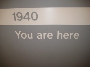
As I entered The Cabinet War Rooms and Churchill Museum I noticed a sign that appropriately read “1940 – You are here.” The War Rooms especially had the effect of transporting me back through the decades and directly into the blitz years. I let myself become immersed in the time period, trying to experience the War Rooms as they would have been experienced during the blitz. Walking through the halls and listening to the recordings of secretaries furiously punching at typewriters, phones ringing, air raid sirens screaming and the distant, guttural peal of bombs – like some Gregorian chant – , I felt as though I truly was there.
Living quarters were by no means spacious or luxurious. Winston Churchill and his staff lived in small bedrooms with small twin beds – some cots, even – and small furniture, and they cooked in a small kitchen. The fact that the Prime Minister lived and worked in a somewhat average space – though his accommodations were by no means completely Spartan – impressed me. It reminded me of how The Queen Mother rejoiced at the bombing of Buckingham palace and felt that she could now more closely connect and identify with her subjects. Churchill, in this way, was living in a similar fashion as those who elected him.
The War Rooms themselves were built underground. It consisted of several levels including a sub-basement or crawl space area. The Rooms were protected by steel-reinforced concrete up to three metres thick, depending on the area. The halls seemed labyrinthine – I’m not sure if the Rooms were laid out this way throughout the blitz, or if they were re-arranged when the museum was opened, though many of the rooms were left just as they were.
The Churchill museum was equally as interesting, though it brought up current issues as well as those from the past. One section in particular focused on Churchill’s sentiments towards the Indians. In rather “politically correct” and certainly “British” words, a placard mentioned that Churchill took a social Darwinist approach with his policies towards India, claiming that if Great Britain had not intervened, the religious factions in the country would surely turn against one another in a barbaric warfare. I was not particularly surprised by this, unfortunately, considering the problems dealing with race and ethnicity seen so frequently throughout the latter half of the 20th century. In fact, perhaps those later problems were actually rooted within the racist history of previous British policy.
Overall, the museum was very informative and interesting, especially the Cabinet War Rooms section. The ability of the exhibit to situate the visitor in the heat of the blitz renders this museum truly successful in meeting the goal that all museums should strive to achieve;reaching – and truly affecting – its audience.
Tags: Anya · Museums
While going through the British Museum, the National Gallery and the Tate Modern I noticed the lack of British art and artifacts represented throughout these museums. I learned in my Museum Studies class that even major museums in America there are this lack of American artwork in them. Of course this is mainly because America is such a young country and we are beginning to establish our place in the art world just like other older countries have done. Even so, why is Great Britain still under represented, even within their own country?
I began to observe in every major museum in London that I’ve visited to so far this lack of British art. At the National Gallery there were only a few rooms (about 3) dedicated to the country’s artists. For being the “National Gallery” it seemed to be dominated quite a lot by Italian and French artwork. By viewing the layout of the gallery, it is easy to notice the complete lack of British art. It is also noticeable that it is not even the focal point of the museum, but the rooms displaying the artwork are pushed off to the side.
The British Museum also did not live up to its name. Great Britain only had about 4 parts of the entire “British” Museum showing British artifacts, mostly from the Medieval and Roman time periods. The majority of the museum displayed their stolen “acquisitions” from other parts of the world. And still even in this museum Great Britain was not the focal point in the least, for what is one of the first places you see when you walk in but the stolen Egyptian artifacts.
The Tate Modern also did not display many British artists. The gallery seemed to be dominated by American, French and all other countries other than Great Britain. Even America had a much larger place in this museum because of their prominence and prestige amongst the modern and post-modern art world. If you do a quick browse of this museum’s layout, it is easy to see hardly any British artists.
Why I believe there is a general lack of British art and artifacts is because most museums in a large city are meant to show off the prominence and power of that country. In the British Museum, Britain is still shown as a world power and it proudly displays the “booty” they have collected from their conquests of these other countries. Even in the new modern and post-modern art museum, the Tate, these same ideas still play through, just less pronounced than the other two. Museums are still viewed, even in the 21st century, as places of national pride and places to show off your conquests and the “treasures” to the rest of the world.
Tags: Alli · Museums
August 29th, 2009 · 1 Comment
Today we wandered, via the scenic route, over to the Victoria and Albert Museum in South Kensington. We knew that it would be an eclectic and eccentric collection, but we were in for a surprise…
Upon exiting the convient tunnel linking the Tube to several well-visited museums and sites in the area, we found ourselves in a ground floor sculpture hall. Randomly picking a direction to walk in, we wandered into in the fashion section. (Aidan and Brandon were thrilled.) In this collection we found everything from hautecouture to Elizabethan-era ensembles. Some of these clothes were truly shocking! One such item reminded Kelley of a woolly mammoth, but alas, it was a apres ski jacket. While we were lingering by a shirt made from a parachute and some heavily-sequined items, we could see into an exhibit of Raphael’s cartoons.

The Woolly Mammoth, erm, Apres Ski Jacket (picture taken from the website of the Victoria and Albert Museum)
A cartoon is a preliminary drawing for either a tapestry or a painting. In this case, the drawings were for a series of tapestries commissioned for Pope Leo X and they depicted a number of scenes from the Bible. We were impressed with the sheer size and careful preservation of the drawings. As one of the completed tapestries was present, it was also interesting to see what the finished product looked like.
We decided simply to wander from exhibit to exhibit in order to understand the Victoria and Albert collection as a whole. We were met with limited success. While the museum contains an extensive array of artifacts from around the globe, we found that there was no logical flow pattern in the museum. For example, we went from Korea to the European Cast Court (essentially a large number of copies of well-known facades and memorials) and again from finely-painted late 19th century tables to the radios of the 20th century. Essentially, we were confused. Why were these objects here and what is the purpose of their order? What is the collection of the Victoria and Albert trying to say to the visitor? It reminded Grace of a really nice yard sale. To Kelley, it was like searching around her grandparent’s basement. We found the artifacts to be very interesting and laid out well within their exhibits,we just question the museum’s purpose as a whole. That said, it was a worthwhile way to spend an afternoon. (We highly recommend going out into the garden and watching the children playing in the paddling pool!)

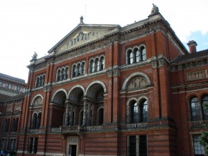
The architecture of the V&A from the garden
Tags: Grace · Kelley · Museums · Uncategorized


