Entries Tagged as '2010 Patrick'
September 21st, 2010 · No Comments
England’s religious identities are many. The influx of Muslims, Sikhs, and Hindus over the past century has turned the nation into a melting pot of both cultures and faiths. With the complexity of the social makeup of the city, it’s hard to pin down a “religious identity” for the whole of London. That being said, I think that one place of worship certainly has to be regarded as the national symbol for faith and strength- St. Paul’s Cathedral. While the religious denotations of the church are ever present, I don’t think the fact that it is a place of Christian worship is necessarily what gives it its majesty or its importance to Londoners across the metropolis. It is, above all, a symbol of a culture; strong and resilient, huge and complex, beautiful in its intricacies. There are two major times in London’s history during which the citizens of the city- Christian or not- have needed St. Paul’s.
Rebuilding after the Great Fire-
The Great Fire of 1666 ravaged the city whole. It gutted the mostly wood-lined streets and left a smoldering heap in its wake. The old St. Paul’s Cathedral (on whose ashes Wren’s St. Paul’s is built) was utterly destroyed. Wren sought to bring a new, majestic design to the table- he wanted a Renaissance-style dome to crown his masterwork and to be visible for miles around. While the design was initially scoffed at, his beautiful dome was completed and stood as the tallest structure in the city for three centuries. The cathedral is a symbol of Christianity, to be sure. But it is also, almost more importantly, a symbol of London’s rebirth from the depths of the catastrophe of 1666. The visible and towering symbol of Britain’s strength most certainly gave Londoners hope that their city was not only being restored, but taken to new heights.
The Blitz-
In terms of pure physical damage to the city, the only event that comes close to the devastation of the Great Fire is the Blitz. Nazi bombers annihilated much of the city in waves of attacks, night after night. Much of the history of the city was lost in the bombing raids, but the most important symbol of London’s strength miraculously remained. The iconic photograph of St. Paul’s, seemingly engulfed in flames but standing tall and true, is the embodiment of the church’s significance. Wren built the cathedral from the ashes of one fire with the intention that it would be a symbol of the strength of God and the strength of the city. The fact that the symbol itself resisted a second fire, an even greater test of resolve, is testament to its stature as the guiding light of London’s people. Christian or Muslim or Sikh, it’s impossible for Londoners not to stand in reverence (or, at least, in awe) of this building.

http://www.johndclare.net/wwii6b.htm
Tags: 2010 Patrick
September 21st, 2010 · No Comments
From what I’ve begun to gather, the English (or, Londoners) aren’t particularly fond the French or French culture. I overheard a conversation on the street that ended in, “Do I look bloody French to you?”. Not quite sure of the motivation behind the outburst, but anti-French sentiment, while not rampant, is a visible part of popular English culture. It’s strange, then, that some of London’s most prominent physical elements should mesh so completely with the French formal ideal: parks.
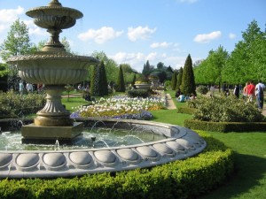
The classic French conception of beauty in nature is that none can exist without the existence of order- of the human hand altering the chaotic natural mass into a structured, geometric product. From what I’ve seen of the layout of Regent’s park, the Brits have just about the same idea. Many people have commented that parks in London seem to be, first and foremost, places to enjoy the beauty of the precisely-planned horticulture. We see meticulously trimmed hedges, flowers planted with regard to color scheme, and white fountains as centerpieces. While running in Regent’s the other afternoon, I saw teams of gardeners replacing soil and adjusting flowerbeds. The beauty lies not only in pure nature, but in the reordering and distribution of it.

http://www.gardens-to-visit.com/2009/02/versailles-2.html
It’s hard to think of a better example of this systematic restructuring than in Versailles. The hedges are pruned to an almost impossible degree of uniformity, the flowers are separated with care, and there are man made monuments throughout (to serve as an even more solid testament to the strength and genius of the designers. The same artistic values and technical skill are visible in Queen Mary’s Garden in Regent’s park.

http://www.londonrelocationservices.com/blog/tag/west-london-relocation
The rows and rows of flowers in the garden do not grow in natural patterns, as might be typical in American parks or gardens. Like their French counterparts, the English gardeners have devised color schemes, strict rows, and tight upkeep standards on all the elements of the space (note the uniformity in the hedges around the fountain and the flower patches). These areas of the park are not meant for “fun” in the typical American park sense of the word- we were glared at for tossing a frisbee in the garden a few days ago. They’re a medium of artistic expression, and I’m starting to appreciate them more and more. I do think, however, that instead of badmouthing the French, Londoners should take some time to stop and smell the roses. It’s through these gardens that we can see real, fundamental similarities in an important aspect of the two cultures.
Tags: 2010 Patrick · Uncategorized
September 20th, 2010 · 3 Comments
This afternoon a barman told me a story about his pub. He said that in the corner across from where I was sitting Charles Dickens wrote his novels (he didn’t elaborate further) and that on the top floor 1800’s government officials came up with legislation. There is history, he said, in this place. It’s too bad that I’d seen exactly the same decor and menu in three other London pubs.
It’s no secret that modern London’s pubs are mostly corporate-owned and operated. I’ve been to maybe fifteen and there have been four or five structural models that each follow- each one corresponding to a different corporate owner (Young’s, Fuller’s, etc.). While each pub in any given structure has its own name, they’re all, in actuality, links in the corporate chain. There are pros and cons to this little situation. The food that the pubs churn out is relatively low priced and consistently good quality. The regulations within the corporate structure make sure of that. The pubs themselves are, usually, well-maintained in terms of cleanliness and furnishings. They give off airs of old-country quaintness and warmth. Those are the pros.

http://www.flickr.com/photos/lastrounds/429522540/
The cons are a little bit more subtle. The pubs are warm and the seats are comfortable. The music is American. The bartenders are Bulgarian and Italian. I don’t know if it’s a fair complaint to make, but it seems like these pubs are much more Ruby Tuesday’s than Leaky Cauldron (for all you Harry Potter fans). The authenticity seems to have been drawn out as the corporate model has taken hold. When I think “London pub” (or, thought, before I got to know the city) the images conjured are more rugged and organic than what I see now. It’s not that I have anything against cleanliness or order. I just expected the neighborhood pubs to be visually representative of the neighborhoods themselves. Instead, they seem to be systematically reproduced molds of what is perceived to be “authentically English”. Correct me if I’m wrong, but if “authenticity” becomes something striven for, quantified, and fabricated, doesn’t it cease to be authentic?
Tags: 2010 Patrick · Uncategorized
September 15th, 2010 · 1 Comment
I know the “museum subsidization misrepresents history” discussion has been beaten very nearly to death over the past few weeks. Believe me, I wouldn’t start it up again unless I thought I might be able to bring something new to the table. So here it goes.
The collection at the Victoria and Albert Museum is a sight to behold. Above the information desk there’s a staggeringly beautiful Chihuly chandelier that looks like some kind of giant hourglass made out of blue and yellow grapevines. There are hundreds upon hundreds of ornate crucifixes, rows of Classical and post-Classical sculptures, and dimly lit rooms lined with ruby brooches and diamond-encrusted scepters and ivory-inlayed lockets and 24-carat gold hair clips. It’s impossible not to be blown away (if not taken aback) by the opulence of the spread.
Yeah, there’s also a bunch of East Asian art downstairs somewhere.
But wait! You missed the coronation robe with opal and pearl sequins and the chalice with the eight-kilogram gold handle and the swords- God, those swords- with enough jewels in each to fund its own war. I know I’m not the only one who left the V & A having already forgotten about the seemingly mundane artifacts in the Korean, Japanese, or Chinese exhibition halls. There’s been a lot of speculation about whether or not curatorial decisions might have been influenced by government interests (in short, put a bunch of really colorful, sparkly British trinkets next to a bunch of boring, not-so-sparkly Asian trinkets to show off the obvious superiority of the Empire’s art) as a result of subsidization. I’ll be the first to admit that I started out very much on the side of the cultural conspiracy theorists. I think, though, that we might be approaching this from the wrong angle. There might not be foul play here after all.
It all comes down to what we, as westerners, value in art. The V & A is a huge museum. It’s almost impossible to take in every last artifact. So what are we drawn to? We’re drawn to sparkle. We’re drawn to lots of jewels and lots of gold, the more the better. Westerners value sparkle. We’ve been trained and conditioned to gauge an item’s merit in terms of carats, not craftsmanship. The fact that we’re more likely to come away from the museum with a more awestruck reverence of a weighty saphire brooch than of a painstakingly lacquered Chinese wine jug isn’t a result of some sneaky government agenda. We’re just intrinsically predisposed to like that sort of art more. It’s an almost vulgarly simple idea, but it has been a defining aspect of western popular culture for centuries. We would much rather see jewels than silk weavings, crowns than ceramics. Eastern culture values harmony, simplicity, and order in objects. Western culture values rarity and opulence. This is no trick planned by the curators. Even if the less immediately visually striking Asian art section were moved to the main level of the museum or doubled in size, it wouldn’t matter. As long as there are jewels and golden scepters for westerners to gawk at, the V & A will always be a museum, first and foremost, fueled by the splendor of those artifacts. This may or may not lead to a disproportional reverence of one region’s culture over another’s. It’s not a matter of misrepresentation of art or history on the part of the museum- it’s a matter of a fundamentally skewn collective perception of what is or isn’t worthy of appreciation.
Tags: 2010 Patrick
September 9th, 2010 · 3 Comments
“Doctors, patients, poets, Christians and cannibals” are what the program for “Bedlam”, Nell Leyshon’s new play, promises. The first female-written play ever to be produced for Shakespeare’s Globe Theatre focuses on Bedlam Mad Hospital, an institution whose practices are drenched as much in sex, exploitation and alcohol as in science. Visionary? Maybe. Crazy? Absolutely.
The central plot revolves around Dr. Sidney Carew, a “mad doctor” who typically treats patients with a mixture of leeches, solitary confinement and contempt. It’s only when a new governor with some modern ideals comes to town that the doctor’s methods begin to be questioned. As Carew’s questionable sanity and alcoholism are brought to light, we begin to wonder if the “mad doctor” is, in fact, mad himself. All this time, we see a few separate plot threads take shape- one regarding May, a beautiful, crazed country girl apparently tipped into madness after the departure of her beloved “Billy”, and another detailing the strange pseudo-sexual rapport between Laurence, a self-proclaimed genius playwrite, and Gardenia, presumably his former mistress. Intriguing? It certainly should be, but what could (or should) have been a probing examination of sanity, sexuality, and ethics in medicine quickly devolves into a mismash of conflicting messages and mindless staging. What’s most disappointing, though, is the fact that not a single character or plot is developed to its potential.
Throughout the play we see a cast of colorful and crazy characters, many of them immediately interesting and compelling (a mad painter who’s violently obsessed with capturing the likeness of a beautiful but insane patient- what’s not to like?), parade vulgarly around the stage. Leyshon conceives these characters to inhabit her Bedlam Hospital but she seems to have stopped there- the only character in whom we see any sort of change or development is Dr. Carew as he tumbles further into madness. By the end of the play, May, the beautiful, insane patient, is still every bit as beautiful and every bit as insane. Laurence is still as self-infatuated as he is when we first see him. Billy is still naive. The governor is still an unbelievable Disney-inspired Prince Charming. The painter, from whose first scene I was excited about and attached to, is forgotten and unexplored. It’s as if Leyshon didn’t get the memo. She has a device (portraiture) through which to develop something really, truly poignant: at what point does physical beauty lose out to inward ugliness? can art drive someone to insanity? should obsession be followed or suppressed? There are so many routes that could’ve been taken here. Instead, the painter is dragged into a cell early in the second act and not heard from again. What a waste.
To make matters worse, the thematic concerns of the play are almost as muddled and confused as the staging (which isn’t helped by the fact that the lights at the Globe are permanently fixed). Leyshon’s primary motives are obvious- she wants to shed light on the humanity of the so-called “mad”, and on the inhumanity of how they are dealt with. It’s a perfectly noble aim. There’s even a point at which Tom O’Bedlam, a patient, gives a rather beautiful soliloquy pleading with the audience not to forget the man he once was.
The problem is, (warning- about to give away the ending) the laughable final scene in which a blindly infatuated Billy marries May, who is still hearing voices and talking to birds, thematically contradicts Tom’s speech entirely. There is absolutely no humanity in May. Her madness is even used as a device of humor during what should be the emotional climax of the play. “Let’s all laugh at the stupid crazy people” is not, I think, what Leyshon intended the lingering message of her play to be. But that’s what I came away from it with. I’ll give it this- the play had its funny moments. The rapport between Gardenia and Laurence was well-written. But I can’t forgive Bedlam for kicking to the curb the beautiful and complex paths it could’ve easily taken.
Tags: 2010 Patrick
September 3rd, 2010 · 3 Comments
The works in the National Portrait Gallery are nothing more and nothing less than you’d expect from a collection of British heroes and icons. A pale Lady Diana laughs with her sons. Rows of Tudors sit in the same position, same facial expression, same symmetrical balance. I can’t believe how much one of them looks like Jeremy Irons. James Joyce looks as weaselly as I’ve ever seen him. British history was written by the British- either the intellectual elite or the monarchy. That’s who’s represented here. Over the span of the entire museum I counted two non-white Brits. Maybe I missed a few, but the fact still remains that Britain is visibly a nation overrun by cultural and class elitism. It’s no surprise, nor is it unique to the Isle. Still, including a few of the notable Black, Indian, or East Asian historical figures in the portrait gallery housed in one of the most culturally diverse cities in the world doesn’t seem like too much to ask. A city and a nation dedicated to fostering a people of many backgrounds should be dedicated to celebrating a heritage of many origins.
The portrait which most struck me is of a man who wouldn’t have agreed with this sentiment. Jan Christiaan Smuts was a British-South African who was a major proponent of segregation between African Blacks and European colonizers. Politics and morals aside, the military man Smuts (or his portrait, anyway) exemplifies what seems to be a perpetual process of one-upmanship in the British community.
Portraits are, if nothing else, a statement that you’ve made it; you have the experience, you’ve earned the recognition. Might as well show yourself off by hiring someone to paint your likeness. Smuts takes it further. A not-so-inconspicuous inclusion of a chest full of army pins and badges in the upper/left half of the canvas serves as a reminder that Smuts is the real deal. It’s the perfect visual representation of the superiority complex which Smuts clearly had. I’m beginning to think of it as a “look at me” incentive; as mentioned before, all of the British officers depicted in portraits are white and they all wear similar uniforms. Smuts puts his accomplishments on display to set himself apart from the pack. It’s almost more a portrait of an ideal- a machismo, militarist ideal- than of a man. Based on Britain’s imperialist tendencies, it seems like that mindset wasn’t unique to Smuts.
He just broadcast it best.

http://www.npg.org.uk/collections/search/largerimage.php?mkey=mw05872&search=ss&firstRun=true&sText=smuts&LinkID=mp04169&role=sit&rNo=0
Tags: 2010 Patrick
[kml_flashembed movie="http://www.youtube.com/v/0_N3ivscSJg" width="425" height="350" wmode="transparent" /]Photo slideshow with narration: http://www.youtube.com/watch?v=0_N3ivscSJg
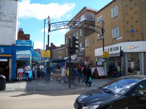
We travelled to the Market (located in the borough of Southwark) via the Tube’s northern line, which we exited at Kennington. From there, we proceeded to walk for about 10 minutes through residential neighborhoods until we arrived at the Market, the main entrance of which was announced by a large lettered gate.


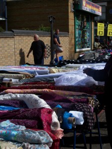
The Market, while not as large as many of the others London has to offer, was unique and vibrant. The majority of the goods were, somewhat unusually, clothing, shoes, accessories and textiles, as well as electronics, cosmetics, Cds & Dvds and other assorted items.
Many of the items were American-themed or American-style clothing or otherwise imported. The small amount of stalls with food were predominantly fruit and veg stands.
The vendors (and many of the customers- presumambly, the residents of the neighborhood) were typically either Jamaican/Afro-Caribbean, Middle Eastern or Eastern European, as well as a small number of Cockneys.
The vendors and customers engaged in an almost perpetual friendly sort of argument with each other: we overheard one conversation between an elderly Cockney vendor and his elderly female Cockney customer. After giving her his prices, he added “Tha’s cheap- betta than th’supermarket” and she replied snarkily “Tha’ ‘taint cheap- tha’s ‘spensive.” We didn’t experience much of the hassling that is typically found at marketplaces: we were pretty much left alone and didn’t hear
any creative vendor’s attempts to bring customers to their wares. However, on our way back were heard slightly more vocal advertisement and, on one memorable instance, a use of Cockney slang-insults to get attention: “1.50, hey, Lady wiff the mustache, over ‘ere!”
After we had covered the whole market (which stretched about 3 blocks) we explored the surrounding area which was mainly residential and consisted largely of low-income estate complexes (immediately recognizable through the tell-tale
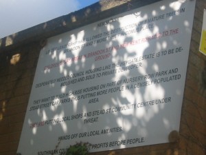
sign of laundry lines across the balconies). Again, we mostly encountered people similar to the vendors of the market: largely immigrants or foreigners as well as lower class white Brits. While the neighborhood was relatively well maintained in terms of infrastructure, there were some physical signs of its standing as a lower class area: we found a telephone box with its windows smashed in and its inside completely covered in broken glass and cigarette stubs. In addition to this, many of the buildings were surrounded by barbed wire and a number of walls and fences were in a state of decrepitude. However, the area also contained some nice (but small) parks and at least two handsome churches. We were struck by several banners and posters put up by members of the community, protesting the borough council’s various planned developments to the area, some of which would encroach upon their parks. 
Speaking of religion . . . in the market, we found about 3 Christian bookstands, alongside many self-help books by American preachers. We also noticed a large Muslim population with many women wearing headscarves and other traditional garb. We detected a strong sense of community among the ethnic/religious groups: there were many hairdressers and stores catering exclusively to the Afro-Caribbean women as well as Jamaican DVD/Music stands for the men. There were multiple Halal butchers and restaurants as well as fishmongers.

All in all, the East Street Market and surrounding Southwark clearly exemplify a vibrant, diverse and community-oriented place.
Tags: 2010 Elizabeth · 2010 Patrick · 2010 Sean · Markets
August 26th, 2010 · 1 Comment
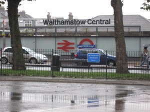
For our Tube exercise, we travelled to Walthamstow. It is relatively far east (think Salaam Brick Lane east).
We started our journey at the Goodge Station and took the Northern Line north to the Warren Street station where we changed lines and rode the Victoria Line all the way east to the Walthamstow Central Station.
On the Tube, as in Watching the English, most people just kept to themselves. A few people were conversing loudly, but this was not the norm. Most people were travelling by themselves and avoided eye contact.
We noticed that the number of people on the line thinned out as the train travelled east. This seemed to be a reflection upon the geographic location of the stop and its relation to the socioeconomic standing of that area of London.
The obvious reason that people would travel to this stop is its proximity to nearby train and bus stations as well as open-air markets and shopping centers.

The area surrounding the station seemed to be primarily Afro-Caribbean and Middle Eastern. Many of the shops were targeted towards- and in fact, labelled for- these ethnicities.

Interactions between people on the street and in the mall were very lively and fast-paced. We observed (and heard) a vendor singing to advertise his goods and his patrons joined in. The fruits and banners in the market were brightly colored and visually stimulating, adding to the vibrancy and vividness of the scene.
Although there were no traditional monuments or plaques in the area, we came upon a library that was an interesting blend of modern and 18th – early 19th century design.

The architectural grandeur and elegance of its exterior served as a sort of centerpiece for the neighborhood.
In order to get back to Arran House, we took the Victoria Line from Walthamstow Central Station to the Finsbury Park Station. We then switched to the Picadilly Line and followed it to Holburn Station. From there we braved the rain and made our way (slowly) back to the hotel.
While on the underground on the way home, we had a fairly similar experience to that of the original trip. It was relatively uncrowded- we were able to sit all the way back- and people did not interact. A pair of men who had been talking loudly in the station continued their conversation on the train, much to the annoyance of a young mother sitting near them. She did not chastise them for their behavior but instead quietly looked away and rolled her eyes. This simple interaction seemed to us to be quintessentially British, at least based on Kate Fox’s observations.
Tags: 2010 Jessica · 2010 Patrick


