When I visited the National Portrait Gallery the other day, I was pretty bored by the Tudor and Stuart portraits. If only we had portraiture of the ‘true lives’ of those figures rather than just stuffy, formulaic paintings. However, I was much happier when I finally got to the meat of the museum and started to see some literary and philosophical heavy hitters pictured. When we went on our Bloomsbury walk, I enjoyed hearing about the lives of the many interesting people who’ve lived here. It was neat to go one layer deeper at the Portrait gallery and see some portrayals of the society we’d heard about. In particular, I found a painting by Augustus John of Lady Ottoline Morrell. (Exhibit A):

#mce_temp_url#
The caption informed me that Lady Morrell was a socialite who entertained the likes of Aldous Huxley at her home in Bloomsbury. I was initially attracted to the photograph for its unattractiveness. Ms. Morrell seems to have some serious defect of the mouth in this portrait. A search of the NPG’s collections reveals two facts about Ms. Morrell’s likeness. First, the portrait I saw hanging in the gallery was accepted in lieu of taxes by Her Majesty’s government in 1990 and subsequently given to the gallery. Second, the Augustus John portrait is one of several hundred portraits of Lady Morrell which the museum holds (I got to page 6 of 60 of portraits before I stopped looking). None of the other portraits seemed to show the same deformed mouth as this one. And this, the one portrait with the markedly unattractive feature was the painting chosen for inclusion in the gallery. Curious.
I next came to a portrait of Aldous Huxley which showed him as a young man. Beneath the painting was a caption which informed me that Huxley had written the collection of essays, The Doors of Perception, while on mescaline. Fun fact there. Here’s the portrait of Huxley…. (Exhibit B):

#mce_temp_url#
All of this made me wish I could have been hanging around Bloomsbury during the days of Woolf, Huxley, and Morrell. Of course, they probably wouldn’t have let me in….
Categories: 2010 Daniel · Museums
Tagged: Huxley, National Portrait Gallery, Otterline Morrell, Woolf
September 6, 2010 · 1 Comment
John Elliot Burns, whose portrait was painted by John Collier, was a labor leader in the late 19th and early 20th century. He was also the first member of the working class to be elected to a cabinet.

photo courtesy of NPG website
In the piece, Burns has his hands on his hips and a somewhat contemplative yet subtly stern expression. To me, the hands-on-hips symbolizes his discontentment with the conditions for the working class of London, those whom he led as a labor leader. This is a classic position of humans to show malaise. The angle of his head and raised eyebrows seem to suggest a bit of a “what of it” attitude. To some degree, these features balance his bodily position. If he were to have a furrowed brow and straightened head, he may appear too antagonistic to those he was trying to persuade (members of parliament, etc.). The profound facial features reinforce his strength of character, with defined cheek bones and dark eyes, beard, hair, and eyebrows. His beard also makes him look older and more experienced in life.
Lastly, the relatively simple suit, shirt, and tie combination shows that he is not a man of superfluous extravagance. This simple attire reflects the plain dark brown background. As opposed to many of the other portraits in the galleries, where many posed in front of extravagant rooms, by the lake, or the countryside. Burns was not one for such extravagance, or at least he was not portrayed in this portrait as such. This again helps reinforce the idea that he was a man working for increased rights for laborers, a man of the people.
Overall, I think this is a great portrait that casts Burns as a strong man working for workers’ and laborers’ rights.
As to who was and was not in the gallery, as everyone else has concluded: it is primarily rich white people. To me, this makes quite a bit of sense. For the vast majority of British history, older affluent white people have been in power, subjugating the rest of everyone else. I find it highly unlikely that any of these aforementioned people thought “wow, I should really get a portrait painted of my lowly dockworkers, that would be a great piece for that national portrait gallery one day.” In no way do I endorse the absence of a wider variety of people. Though getting later into British history, i.e. after the mid 19th century when there has been less rampant subjugation, yes, there should have been more portraits included of other races/economic classes.
However I’m not quite sure who to blame for this. I believe (I may be wrong) that the vast majority of the portraits were done privately and then donated to the museum. These portraits are probably quite expensive to have painted, and thus most could not afford them for quite some time. Perhaps certain groups of people simply choose not to have their portraits done, even if it has become lately feasible for them. I feel like portraiture has certainly become less popular over the past century, which may explain the absence of the groups of people who have lately gained rights/power/money/etc. recently. Though I find it unlikely, another possible explanation is that perhaps the curators have many portraits featuring minorities and simply choose not to display them. I certainly hope that is not the case.
Categories: 2010 ChristopherB
Tagged: John Burns, John Collier, National Portrait Gallery
My favorite painting from the gallery is a portrait of Ben Jonson. A playwright and poet of the Jacobean era, Jonson received some distinction with the works Bartholomew Fair and The Alchemist, both of which I have not read – and for good reason. Unlike his contemporary, Shakespeare, Jonson has completely fallen off the map, having none of the distinction and prestige of his fellow bard. Jonson, as it were, is not “canonical.” In any case, Jonson’s poor rep didn’t prevent me from enjoying his portrait. Indeed, an interesting point about portraiture is that there seems to be a sort of discrepancy between the the artist and the subject. Take for instance the portrait of Shakespeare. Our interest lies with the subject, Shakespeare, and not the artist. Conversely, in Van Gogh’s Portrait of Dr. Gachet we are interested in the fact that the painting’s author is Van Gogh, and less so by the fact that the painted figure was someone called Gachet. And of course other times, the interest is mutual – Da Vinci’s Mona Lisa. Its interesting to note how the discrepancy lessens as you go further through the timelines in the gallery. The Tudor, Stuart, and Jacobean rooms are very much indicative of the British brand of class system and ideology. But as you reached the portraiture of the early 20th century, you find friends drawing each other (i.e. Bloomsbury group).

© National Portrait Gallery, London
The artist who painted Ben Jonson’s portrait is Abraham van Blyenberch, a flemish artist of whom I know little about and care even less. Yet I found it to be one of the most original portraits in the gallery, rivaling that of the ones of Tennyson and Sir John Fieldings. Instead of the traditional rigidness we’ve come to expect from the Renaissance, Blyenberch’s Jonson is refreshingly relaxed. He looks slightly bemused, his head tilted just enough so that it conveys a sense of contentedness and ease. Even so, the portrait still relates to the viewer an august demeanor, probably due to the variations of bronze in the background, hair, and face. When I first looked at the work, I immediately thought of Rembrandt; Jonson’s beady, penetrating eyes echoes that of the psychic dimension of the Dutch master’s self portraits. Although Rembrandt would create his most famous pieces almost a generation later, the style we associate with that region seems to be diminutively intuited by Blyenberch. Through this portrait of Jonson, we are able to look beyond the British stiff upper lip.
Categories: 2010 Sean · Museums
As a college student in this day and age, the 21st century, certain aspects or principles of life tend to be on my mind like every other student in America. Specifically I ponder whether my future career will have worldly riches at the forefront or intellect and the communities well being. As my young mind tries to figure this out I was caught off guard in the National Portrait Gallery, in the section of the museum that is labeled “The Tudor Dynasty”. As this title suggests the majority of these portraits were of Kings and Queens and nobility ranging from King Edward II to King Edward VIII. However, among all these nobles and riches sat a man by the name of Sir Thomas Chaloner.
Sir Thomas Chaloner, unlike any of the other Tudors in that room, was not born into greatness but instead earned it, through sheer determination and the use of an insightful mind. He was a statesman, one of the first England ever saw. He served under four different Tudors, was knighted after participating in the war against the Scots in 1547; he is best remembered as the first English translator of Praise of Folly. Besides having such an amazing and extensive resume, what caught my attention was what I saw within his portrait. Just as I ponder about what my life will say about me, so did Sir Thomas Chaloner ponder the same question five centuries ago. However, he was able to find an answer. His portrait depicts him in a frontal view with a very unwelcoming facial expression. In his hand he has a scale; on one side there is gold and the riches of the world on the other lies a stack of blazing books that outweigh the “transitory nature of earthly treasures.” Above him is a Latin inscription that refers to the Assyrian King Sardanapulus’ realization on material riches, “they fade black and begrimed with soot as though gold were nothing else but smoke…” ( You may find more information on the portrait at http://www.npg.org.uk/collections/search/portrait/mw01174/Sir-Thomas-Chaloner?search=ss&firstRun=true&sText=Sir+Thomas+Chaloner+&LinkID=mp00823&role=sit&rNo

Although I know Sir Thomas Chaloner, like the majority of humans, had many faults I commend him for devoting the intelligence he did gather for the improvement of society. I only wish to take the privileges I have received so far and will receive in the future to improve our 21st century society in one way or another; whether it be helping a child understand their homework , or having an active part in legislation. Only time will tell if I achieve this, in the meantime I will keep searching for my own answer.
Categories: 2010 Jamie
Tagged: National Portrait Gallery, Tudors
I visited the Tate Modern this week determined to disprove my growing suspicion that modern art is an Emperor’s New Clothes type hoax designed to make me look like an idiot. Unfortunately, the first time I visited I only had half an hour. So I rushed through a floor of splattered paint and a white room filled with off white canvases that, according to Agnes Martin, were supposed to represent “weightlessness and infinity” rather than the possibility that the museum staff had run out of white paint.
Then I came back a few days later when I had more time, and as luck would have it the first exhibit I came across was Art & Language by Michael Baldwin and Mel Ramsden with the promising description that “viewers are now confronted by themselves, thereby questioning a long-held notion of painting transcending reality.” I understand that some art is supposed to be philosophical, but it was a mirror on canvas, which makes it the exact equivalent of that scene in my favorite childhood movie, Neverending Story (costarring a delightful dragon puppet) in which the main character has to face himself in a metaphorical mirror to save the land of Fantasia. Obviously the best movie ever created, but not art. It made me angry.
So I went through the next few rooms with the mirror as a yardstick for my expectations and found the following pieces:
- Giuseppe Penone’s Tree in 12 Metres (two trees in a museum)
- Peter Fischli and David Weiss’s Untitled (some guy’s messy garage in a museum)
- Keith Arnatt’s Self Burial (a bunch of pictures time elapsed pictures of a guy sinking in quick sand)
I list these pieces because they were really underwhelming until I looked at them a second time, and they turned into basically the coolest things ever. The Tree in 12 Metres was actually two perfect trees shapes carved out of a giant block of wood. Every messy garage item was a replica carved, textured and painted with polyurethane foam and acrylic paint (this includes an old rubber tire, an unvarnished wooden bench with knots, and a bunch of other distinctly textured items). The time elapsed photographs interrupted a TV program once a day in sequence showing for 5 seconds without any explanation.

I’ve been seeing this pattern everywhere, and I feel like the British must have a huge penchant for Easter eggs. The Bloomsbury walk was covered in historical landmarks that I always thought were a huge deal. In the United States, Virginia Woolf’s house would at least be a small museum as opposed to the small plaque next to an otherwise occupied building. The Victoria and Albert Museum was a whole other level of hidden amazing things. Along with a novelty bustle that plays God Save the Queen every time the wearer sits down (classy), one of DaVinci’s notebooks, marked in tiny writing, was sitting in a random corner (The other five of his notebooks that the museum has are just in storage right now. No big deal). Do they just have so much history here that they have to ignore some of it so as not to turn the country into a museum? Or does that obsession with understatement that Kate Fox talks about seep itself all the way in British history so that they hide their great achievements in a corner out of amusement and feigned modesty? It seems so contradictory to what I would expect from a former empire. I expect neon signs. Not that I’m complaining. I don’t think I would get this excited about a foam tire replica under any other circumstances.
Tree of 12 Metres
(Giuseppe Penonoe) from Tate.org
Categories: 2010 Jesse
Tagged: Giuseppe Penone, Keith Arnatt, Peter Fischli, Tate Modern, Victoria and Albert Museum
Friday night, I stopped into a pub to watch the evening’s football match as the England national team embarked on their quest to put their World Cup misery behind them and qualify for the European Championships in 2012.
As England took the field, faces around the pub were not filled with joy, but with scepticism. There were not cheers of “Come on England,” but groans that perfectly relayed to me as a foreigner how the footballing nation had been feeling all summer since its agonizing 4-1 exit at the hands of Germans two months earlier. In the team’s first competitive match since the world cup, the squad knew they had to perform. The day’s headlines in the sports section highlighted the importance of getting the team a strong win; for, although England faced easy opposition in the qualification round, the patience of their fans was drawing thin.
In the Three Lions’ previous game, a friendly against Hungary, fans booed. Similarly, this summer in South Africa, after drawing 0-0 against a meagre Algeria side, fans booed. And, as was made blatantly obvious by the regulars at The Rising Sun, at kick off, they were not pleased with their Three Lions. What is even more peculiar than the fan’s dissent is the England players’ tolerance for them. After England’s dismal exit from World Cup in June and even preceding the team’s friendly against Hungary players consistently came forth to defend their fans’ right to boo.
After noticing this odd characteristic of criticism toward the national side, I asked the two stalwart England fans I had been chatting with throughout the match as to why fans felt entitled to judge and criticise England’s form and results. The two blokes, Rory and Paul, both asserted their right to be critical, but noted a few crucial limitations. Paul said, “I am English, and England has always been my home. When football is this important, as it is in England and the rest of the world, they represent all of us, our country and the way we live. You never boo England before any competitive match, only friendlys, but you can boo after any pathetic result, such as the 4-1 loss to Germany.”
It is this element of entitlement and right of opinion present in English football that I have noticed many other places in English culture. In the Museum of London, an exhibit catered to this same form of entitlement of opinion, asking Londoners pertinent questions on how London should be managed, raging widely from what type of construction should constitute London to how many trees should be planted. Unlikely as it was that the exhibit influenced any official opinion, yet there was far from a scarcity of opinions, again underscoring the general right of the English to voice their concerns and protect and preserve Englishness.
This entitlement of opinion, I feel, is linked with the same protectionist sentiments of “English National Identity” that we have encountered frequently in our readings. The right to be critical, the right of opinion and the right to preserve are all intensely imbedded into Englishness. Whether it be the fear of England’s national team letting down the nation, or the nation changing into something disastrously un-English, the English feel entitled to voice their opinions and protect against these changes.
These ideas are unequivocally absent in America. We seem to define and pride ourselves as being a “melting pot” and that our national identity is a lack of one specific set of ideals or social norms. We feel that being a diverse nation of all races and backgrounds is in fact who we are, whereas the English staunchly believe in specificity of Englishness.
It will be interesting to study during my year how these notions of entitlement and protectionism influence, uphold and define Englishness, what it means to be English and the right and privileges pertaining thereunto. During this year, I want to discover what compiles Englishness and how this protectionism functions within its society.
Categories: 2010 Luke · Uncategorized

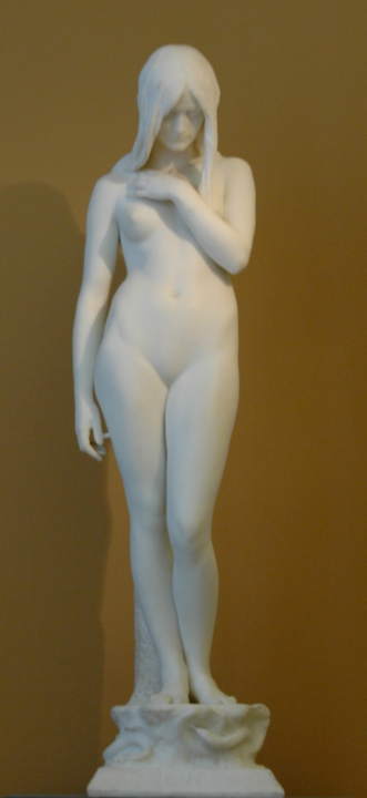
“Eve” by Thomas Brock, 1899
Seeing the Victoria and Albert Museum is a must. And you most definitely should enter the museum via the Tube entrance. Prior to my visit, I naïvely believed the Victoria and Albert Museum would display art from Queen Victoria’s reign to illustrate the period—I found myself mistaken. Upon entering V&A from the underground tunnel, I immediately stepped foot into a series of small, dark rooms off to the right. The rooms modestly displayed furniture and tapestries from Europe dating from the seventeenth to nineteenth century. I then wandered into the main museum hallway above ground and explored the diverse assortment of sculptures extending down a long hallway. Taken aback, I quickly realized the V&A actually displayed a much broader range of art. By the end of my visit, I found that was a huge understatement. The Victoria and Albert Museum is enormous and houses a collection of almost every type of visual art.
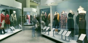
Fashion Exhibit
The museum map became somewhat useless and rather bothersome as I wandered through the labyrinth of art. Branching off of the main sculpture room—which included work from a favorite sculptor of mine, Rodin—were displays of art from China, the Islamic Middle East, Japan, Korea, South Asia, and South-East Asia. Another room I thoroughly enjoyed was a room presenting fashions from Italy, the United States, Japan, England, and France. The clothing dated from the eighteenth century through today. I only explored parts of the first floor and I still had five more levels!
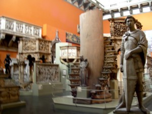
Plaster-casted Sculpture Exhibit (personal photo)
Throughout the remainder of my museum tour, I discovered collections of photography, mini architecture models, prints, drawings, paintings, tapestries, sacred silver and gold, and stained glass. There were also two massive rooms of plaster-casted architecture and sculptures dating from the eighteenth century, when plaster-casting famous works was popular for museum displays. Numerous rooms displayed eclectic exhibits of Medieval and Renaissance European art from the fourth to seventeenth century. When I finally stumbled into a dark hidden room of priceless jewelry dating back from 1500 BC, I was irrevocably astounded. I was lost in the Victoria and Albert museum but when discovering all these sorts of extraordinary pieces of art, who didn’t want to be?

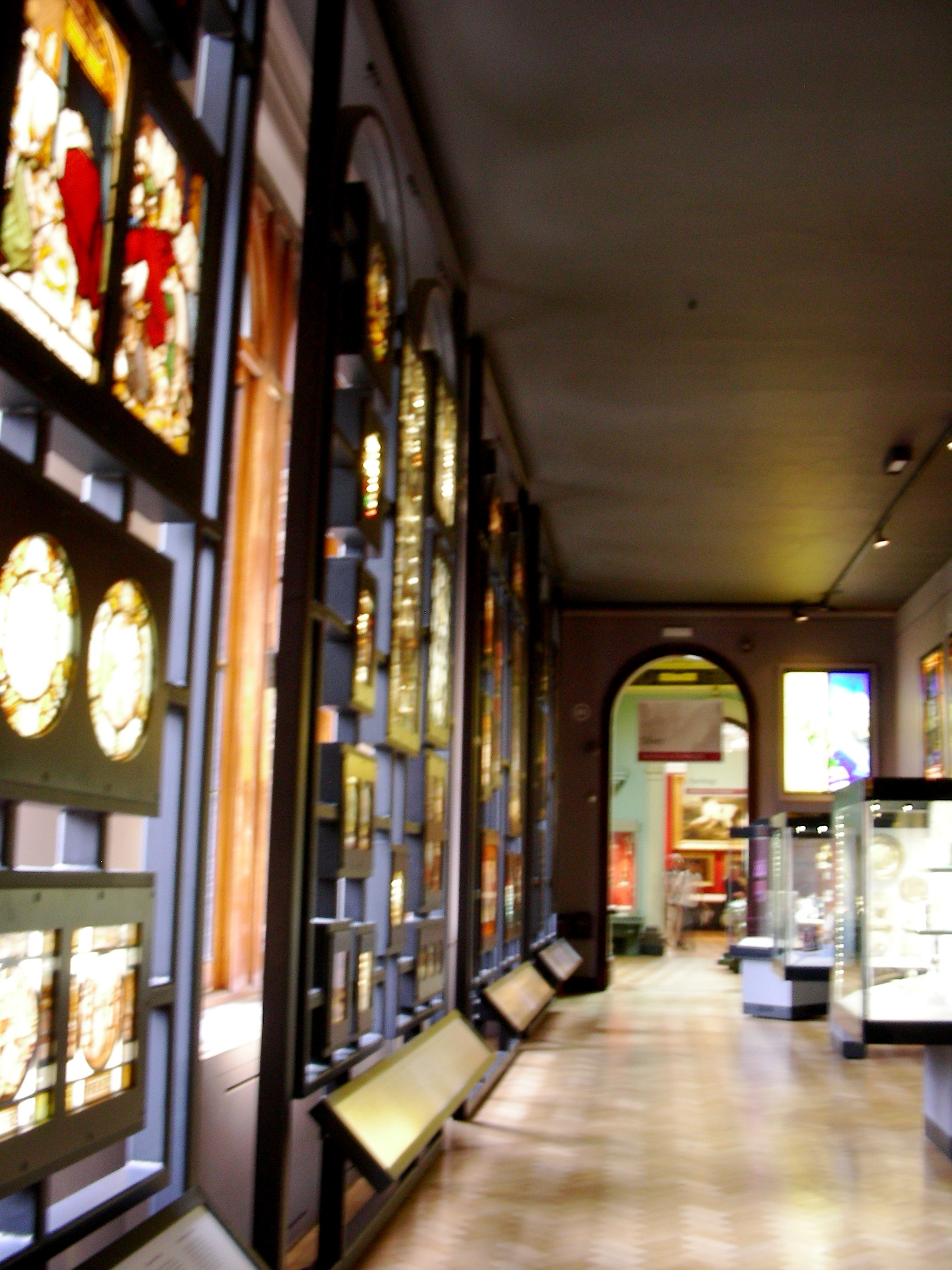
Stained-glass Exhibit (personal photo)
On the whole, the museum’s collection was incredible (if that’s not obvious already). I was completely taken aback by the wide array of art displayed, as well as the priceless items included—countless pieces of silver and jewelry, as well as Leonardo da Vinci’s notebooks and Raphael’s paintings (coming soon). However, the organization of the museum is a contentious topic. The pieces of art come from all over the globe and date back to 1500 BC. Also, obviously, the museum includes almost every type of art. To mitigate this challenge of organizing the art, the museum’s ironically set-up like a maze. The different rooms intertwine and lead you through every floor, and each room is included in the art display. For example, doorways to Renaissance Europe boast beautiful marble columns, tiled floors mimic mosaics on display, monolithic architectural structures make Italian plaster-casted sculptures seem authentic, and aged brick walls and cobblestone floors bring life to the medieval ironwork.

Large-scale Medieval and Renaissance Architecture (personal photo)
From what I could gather, it seems as though the Victoria and Albert Museum is a massive collection of treasures donated by organizations and wealthy individuals. For one, the galleries of donated art pieces ostentatiously display the donor’s name on the wall. Overall, the V&A Museum is a display of wealth—both of England’s monetary wealth and of its wealth of knowledge in the arts. The museum has put on display priceless pieces of art from around the world. The English are subtly, but really quite clearly, boasting. Typical.

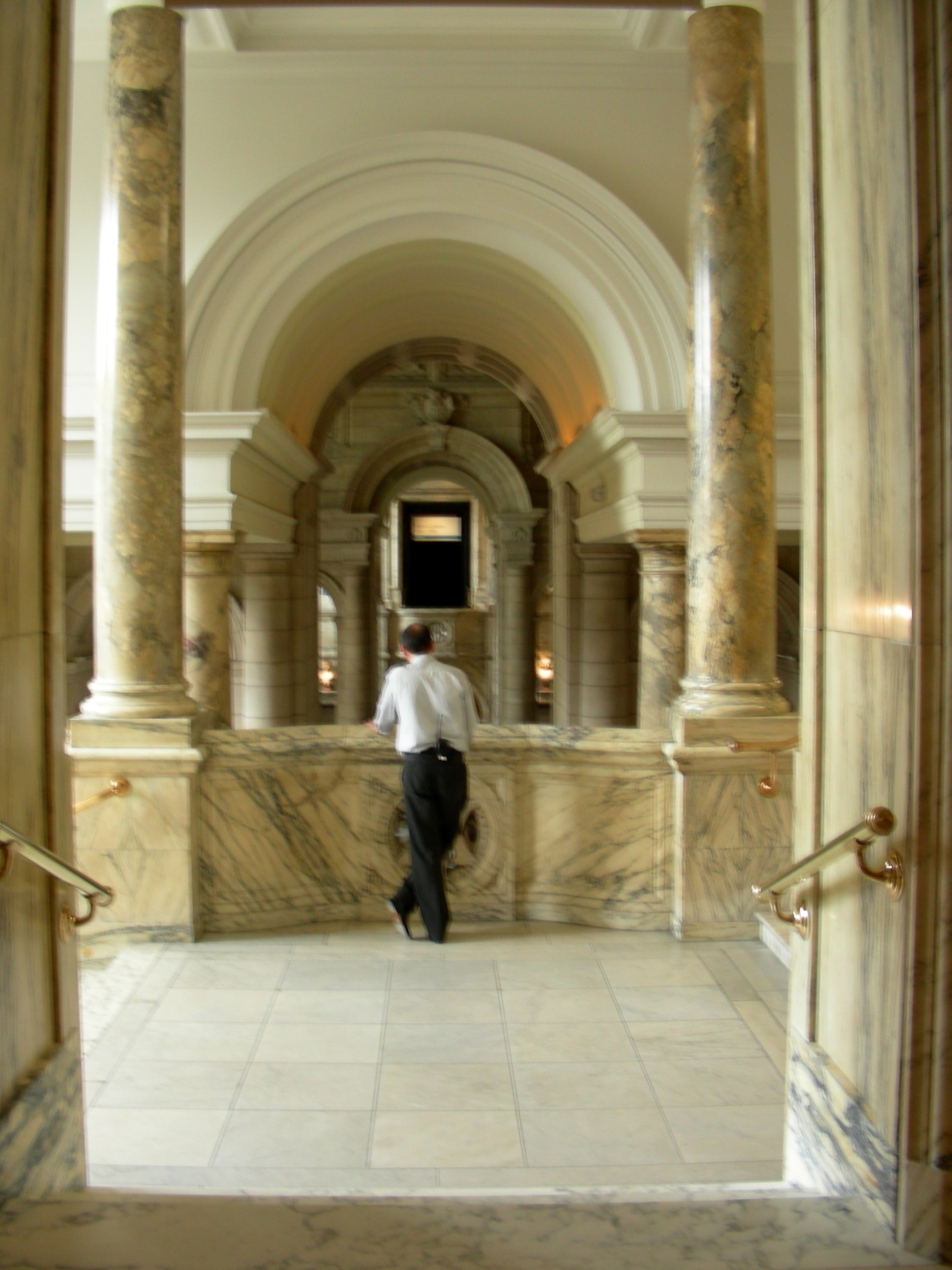
One Exhibit’s Entranceway (personal photo)
Categories: 2010 Mary · Museums
Tagged: Art, Museum, The V&A, The Victoria and Albert Museum
I have been juggling with what to say in this post. I have been sifting through my likes and dislikes concerning the National Portrait Gallery and have come to a couple conclusions: Their collection is awesome, but it is incomplete and the lay out of the rooms was misleading and without enough direction.
Just as everyone has recognized, the collection consisted primarily of portraits of white people. Looking back, I really don’t remember seeing any portraits that focused on any other person of a different race. Because of this, the collection failed to do what I had expected it to do. If I had no knowledge of British history, than I would not have been able to draw an accurate account form this collection. I expected to walk through the rooms and see, as the portraits became more and more recent, examples of the diversification of England, of its people, and of its actions. Colonialism and imperialism representation was so underwhelming. But then I start to question what the point of the gallery is… What is the point? Without recognizing the importance of an array of different people, from all races, on England and its history as an empire, or even contemporary, there really is no point. Like I said before, I expected to get a glance at British history from walking through this collection, but it was so incomplete that it lost much of its meaning.
My second point, which is not about the collection itself, but how it was laid out, is also related to how I feel the gallery did a poor job representing the history of the nation. I would have like arrows. Seriously. I would have like to have been told where to start and which rooms to go into next. I understand that by the end the rooms became thematic, but I still believe they should have been placed one after another. Only dabbling in chronological order is confusing.
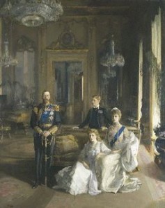
(Lavery, John. The Royal Family at Buckingham Palace. 1913. The National Portrait Gallery, London.)
I chose the portrait above in particular to look at because it was unusual and stood out from all the others. It was the portrait of the royal family in 1913 by Sir John Lavery. Its immensity was the first thing that caught my eye. It was of Prince Edward, King George V, Queen Mary and Princess Mary. The two women were sitting and the men were standing behind them. However, they did not take up the whole canvas. Most of the portrait was actually of the room. There were mirrors, chandeliers, couches, and tables. I began to focus more on the surroundings than the people in the painting. There was a window with light shinning through, casting shadows of the royal family. The corners of the room were dark. There was an open door behind the family, leading into another room. The dimensions of this portrait were fascinating and I spent a lot of time creeping through all its levels with my eyes. Another thing I noticed was the the whole family was looking forward except for Prince Edward, who was looking at his father. Again, Lavery is playing with dimensions, but this example is dealing with time. This glance that Edward is giving King George V takes the portrait out of static. Its not just right here, right now, but it is also about what is to come. I thought that was awesome.
Categories: 2010 David · Uncategorized
When people at home learned that I was going to be studying in Europe all year, many of them said something along the lines of, “Oh, watch out, they hate Americans.” The incredible sense of encouragment and support that I took from this statement aside, I was a bit worried and started reading Kate Fox like it was the Bible of Englishness. Now that we’ve been here for a bit, however, I’ve noticed some variations in English behavior and have witnessed some interesting responses to my American-ness.
It’s true that hardly anyone talks on the Tube and people rush by each other in the streets seemingly without giving notice of their fellow travelers. Kate Fox’s rules seem to be holding true. At the Hard Rock Cafe, however, all of those rules were thrown to the wind. We’ll start in the bar—the bartenders, two young men, were clearly showing off and attracting attention to themselves and their drink-pouring abilities. At one point, one of the waiters even jumped on a bartender’s back. They were *gasp* boasting. Granted, they had already had a few drinks themselves by this point, and one of them assured me that he was going to drink more later when I tried out the “And one for yourself?” rule. The rule-breaking then continued with our server, who had no problem at all pulling up a chair to our table, poking gentle fun at us, putting her arm around someone’s shoulders, etc… She was much more dynamic and got much more personal than I expected. I don’t know if Fox’s rules are more relaxed at Hard Rock because it’s such a tourist attraction, or if it’s because the atmosphere just attracts more outgoing people. I don’t believe that the fact that we were a large group of young Americans played a part in this interaction, though.
Most people whom I’ve interacted with simply nod and smile a bit when they hear my American accent, as if to say, “American–that’s why it’s taking her so long to count the proper change.” Two instances gave me a lot to think about, however. I was at a sandwich shop one night, and the cashier asked me where I was from. We started talking a bit, and it turns out that he not only knows where Pennsylvania is, but has the dream of traveling from the East Coast to the West Coast someday. He’s been working in England for seven years in order to save money to get to America. He’s originally from Brazil, but has lived and worked in most countries in Western Europe, making his way westward. He was so positive about the States, and he gave me a pound off of my sandwich for talking to him. I’m thinking that he was just excited to find someone who would talk to him about something other than the weather. I saw this need to reach out to a friendly stranger in the British Museum, as well. I was standing in front of the Rosetta Stone, listening to the podcast, when someone tapped me on the shoulder and asked where I was from. Completely un-English behavior! Woah. I said, “the States,” because most people who have asked me that have been British, but this guy looked at me like I was an idiot. “Which state?” he asked. He explained that he’s from Missouri and is here on his quarter-life crisis with his father, and was in need of something to do. His father’s contribution to the conversation consisted of, “New England! Ah!” It was a very odd interaction, and, being pretty shy, I was taken aback. But again, I think that they were just really excited to talk to someone who would have a conversation with them, and bonus! spoke in an American accent.
I’m interested to see if this kind of interaction continues as I’m here for longer, and I especially want to see if they continue in Norwich. I feel that they’re possible in London because there are so many tourists and a larger population of non-native Brits.
Categories: 2010 Holly
September 4, 2010 · 1 Comment
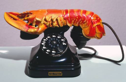
While normally not a fan of modern art, I nonetheless visited the Tate Modern today, and had a pretty good time. Converted from the former Bankside Power Station in the late 1990’s, at the same time several other attractions opened on the South Bank (including the new Globe Theatre and the Millennium Bridge), the museum features international modern art from such artists as Andy Warhol and Salvador Dali. It’s the inclusion of one of Dali’s works, Lobster Telephone, in the museum’s collection that particularly interested me, because of its, um… unique… style. For those not familiar with Dali’s work, he was a very well-known surrealist, and this work, in which he placed a lobster on top of an old style telephone and took a picture of it, does not disappoint.

http://www.tate.org.uk/servlet/ViewWork?workid=2988&tabview=image
Unfortunately, I wasn’t able to locate the work in the museum, though it was featured in the museum’s movie on the fifth floor, and is definitely in the museum’s collection. I’m really not sure what draws me to this work, but it might be its combination of simplicity and randomness. The first time I saw it, I almost laughed because it was so unexpected. I was disappointed that I couldn’t find it, but it didn’t ruin my two hours at the museum, which I would recommend to anyone traveling to London.
Categories: 2010 MatthewM · Uncategorized


