August 30th, 2009 · 1 Comment
Today Sarah, Chelsea and I made a journey to the Victoria and Albert Museum. Upon immediately entering the V&A, we noticed that it was going to be a hodgepodge of all sorts of items. The first room we entered featured various nudie sculptures that caught our attention. Then to our right we noticed the “Fashion” exhibit. The “Fashion” exhibit featured everything from a 1700s brocade ball gown to futuristic designs. Being in a girly mood, we decided to go to the jewelry section next, we can dream can’t we?
On the way, we stumbled upon an ironworks exhibit, gargantuan columns, and Asian textiles. One of the best exhibits, we thought, was the Theatre and Performance gallery. This exhibition housed anything from ballet costumes to miniature set designs and various recordings of performances. This kind of exhibit, we felt, was rare compared to the other museums we had visited.
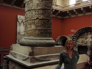
Alli morphed by a gargantuan columnNo caption needed.
As a whole, we felt that this museum showed more socio-cultural exhibits than the rigid British Museum and National Gallery. The 20th Century exhibit showed anything from an iMac to early cell phones. It included a section about technology as an astestic, featuring a pink vacuum cleaner from the 1970s. This museum tended to show more “everyday life” items rather than royal jewels and strictly upper class items that are less easy to relate to. Even the jewelry exhibit included less elaborate pieces, such as funerary rings, that did not necessarily belong to royalty or a famous name. These items weren’t just “dug up from the ground” and put on display, but they were placed in a better context.
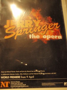
No caption needed.
Additionally, the V&A seemed to be more “British,” containing the most number of galleries dedicated to English artifacts and history. They had 13 rooms entitled “British Galleries: 1760-1900” whereas the British Museum only had 2 rooms and the National Gallery had 4. It is interesting that these two museums are considered “national” museums and yet they have the least amount of national artifacts.
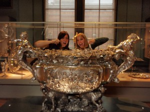
Sarah and Alli drinking from the giant punch bowl
Tags: Alli · Chelsea · Museums · Sarah
I heard only good opinions about the British Museum so I was excited when I finally got the chance to visit it. Of course, what I heard was true as the British Museum was incredible. The exhibits were numerous and very well done. I had the opportunity to visit sections on Egypt, India and Japan. The artifact which struck me the most was the Rosetta Stone. One of the greatest discoveries ever was right in front of my face. It was hard to believe that I was actually staring at it and not at a textbook picture which we are all familiar with.
The Indian and Japanese exhibits were also amazing. Each had new information which, as a History major, I find fascinating. I also think that the diversity of the British Museum speaks to the diversity of London. So much culture is packed into such a small place in both the museum and in London. It is that ability to have so much together and have it work which made the British Museum spectacular, as is the case with London.
The Tate Modern is another story. I am not a big art person so I really didn’t know what to expect. I heard about the explicit nature of some of the work, and naturally I had to see what all the fuss was about. Overall, modern art is interesting, but I am not sure if it is for me. I did like the piece which was just a huge table and four chairs. I thought the best was a piece in which the words “The End” were covered by long grass. Nonetheless, the vast majority of the artwork did not appeal to me. As for the explicit works, I didn’t see any artistic value in them. Granted, I don’t know much about art, but I still think I didn’t find much “art” in them.
Tags: Andrew F
August 30th, 2009 · 1 Comment
August 29, 2009
In my last blog, I mentioned how much I didn’t like the Tate Modern. Conversely, but maybe not surprisingly, I LOVED the National Gallery. I was especially excited to see works by Monet, and loved “The Grand Canal, Venice” in particular. Since Van Gogh is one of my favorite artists, I was also amazed to see “Sunflowers” and “A Wheatfield with Cypresses” in person. We continued to wander through rooms containing paintings by Renoir, Picasso, and many artists that I did not recognize (I found some new favorites to look into…Camille Pissarro, for one, who painted “Portrait of Felix Pissarro” and “The Boulevard Montmartre at Night”). I was impressed by the sheer size and detail in many of the paintings, as well as their incredible preservation. I always imagine paintings from so long ago to look old, but these looked as if they were painted yesterday.
The overwhelming majority of the museum’s earliest paintings focused either on mythology or the Virgin Mary/Jesus, and it gave me an idea about just how important these topics were to past generations. Maddie and I discussed how Jesus is almost always interpreted as a tall, thin, fair complexioned man when in reality, he was probably short, squat, curly haired and dark in complexion based on his geographical location. We also thought that “The Virgin and Child before a Firescreen” by a follower of Robert Campin looked almost modern due to how old fashioned it was. It seemed, to us, that art has come full circle in some ways. I was also surprised to stumble upon “The Birth of the Virgin” by Master of the Osservanza, because I’ve never thought or seen record of Mary’s birth. The focus is almost always on the birth of the Christ child, and it was interesting to see another portion of the Biblical story that is entirely overlooked.
Tags: Amy
August 28, 2009 To start, I had my first authentic fish and chips experience in England the other day at a restaurant along the Thames. I’ve found that English restaurants are occasionally difficult to navigate because they’re separated into so many sections depending upon what you want and where you want to eat it. The complication turned out to be entirely worthwhile, though, because the food was delicious! I had no idea that choosing the type of fish is part of the meal (I had haddock). I was quite excited about it, to say the least. After that, we left for the Tate Modern. I normally try to appreciate modern art even if I don’t particularly like it, but I had a hard time enjoying this museum. Perhaps it was my state of mind or tiredness, but I really did not like any of the pieces I saw and couldn’t seem to get any meaning out of them. At one point, we stepped into an exhibit that was marked as containing explicit material. I completely understand that some art is meant to be controversial, but this was legitimately disturbing (I’ll refrain from description in case others haven’t yet seen it). After seeing the video and feeling uneasy, I decided to leave. I’d love to hear what sorts of reactions others had to that exhibit, and what they got out of the museum as a whole because I do feel like I’m missing something.
Tags: Amy
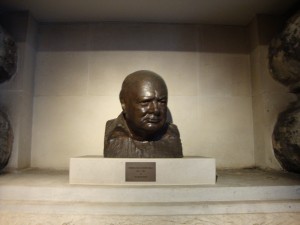
Churchill Bust
Today I visited both the Cabinet War Rooms/Churchill Museum and the Sir John Soane Museum and what struck me most about both of these very different museums was their presentation. The approach that these two museums took with presentation are very different from each other, and therefore striking in different ways. Having put on an exhibition myself during the past school year, I know the decisions involved in creating a show.
Although I visited both the Cabinet War Rooms and the Churchill Museum, I was much more impressed with the set up of the Churchill Museum, so that will be my focus here. Upon entering the Churchill Museum, the first thing I noticed was the color scheme: blue and grey/silver. This was continued throughout the exhibition which gave it cohesion and unity. This exhibit also mainly used interactive media like audio and video. My favorite section of the museum was the wall of black and white photos (keeping with the color scheme of the museum) that were back lit and place in deep silver frames. As you walked along the line of photos, motion sensors on the floor active clips from Churchill speeches that related to the photos. I found this combination of visual and audio stimulation to be very engaging.
Besides the color scheme, I also loved the various either lit up, scrolling, or painted Churchill quotes throughout the exhibition. Often when people picture art exhibitions they picture paintings and history exhibitions they picture photographs and artifacts. Adding text was just another way this exhibition engaged the audience successfully. As an English major and art minor, I found the quotes pleasing both because they were well chosen for their content, and also because they were presented in a very aesthetically pleasing way.
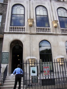
The Sir John Soane
The Soane Museum, on the other hand, had an equally engaging yet completely different layout. As opposed to the open, spacious, unified by color Churchill exhibit, the Sir John Soane Museum was in Soane’s home with tiny hallways, narrow stairwells, and rooms packed with busts and statues. Unfortunately no photographs were allowed in the museum, and only a photo could really convey the feeling of the museum—or home. That was the thing, this was the architect Sir John Soane’s home, more or less just the way he left it. The walls were covered in paintings and relief sculptures from various time periods. The banisters, tables, and other available wall space was covered in busts and other types of statues. Every windowsill and flat surface had something on it. The bookshelves were packed and the floors were all lined with various floral printed rugs. There was literally just enough room for a person to walk around the room or through the hallway. As I entered I had to place all my carried belongings in a plastic bag to be carried in front of me because there was not room enough for me to hold things at my sides as I walked. The stairwells winded around and as I walked, with my head always facing upward, I could not help but to think about the kind of man who would collect and appreciate these works of art, let alone live crammed in a house with them!
This exhibition overwhelmed me. I paced and paced around the house, and even saw a wall UNFOLD to reveal even more paintings! Most of the artwork was classical. Many of the paintings were landscapes. But it was not necessarily the artwork itself that made me love this museum, but the presentation. As I walked through the front door of the house and was instructed to turn off my mobile phone, I suddenly had this feeling that I was going through the wardrobe into Narnia. It was no longer busy modern London, it was 18th century England. The small spaces kept the museum goers quite, and I had a feeling of calm silence and awe as I entered room after room of wall to wall, floor to ceiling, art. Really, what could be better than that?
Ultimately I know that neither the content of the historical Churchill Museum or the classical busts and landscapes of the Sir John Soane Museum would have captivated me nearly as much had they not each been presented in such engaging ways. When it comes to being good at something practice, practice, practice. And when it comes to an exhibition its presentation, presentation, presentation!
Below is a slideshow of photos from the CHurchill Museum.
Tags: Megan · Museums
While going through the British Museum, the National Gallery and the Tate Modern I noticed the lack of British art and artifacts represented throughout these museums. I learned in my Museum Studies class that even major museums in America there are this lack of American artwork in them. Of course this is mainly because America is such a young country and we are beginning to establish our place in the art world just like other older countries have done. Even so, why is Great Britain still under represented, even within their own country?
I began to observe in every major museum in London that I’ve visited to so far this lack of British art. At the National Gallery there were only a few rooms (about 3) dedicated to the country’s artists. For being the “National Gallery” it seemed to be dominated quite a lot by Italian and French artwork. By viewing the layout of the gallery, it is easy to notice the complete lack of British art. It is also noticeable that it is not even the focal point of the museum, but the rooms displaying the artwork are pushed off to the side.
The British Museum also did not live up to its name. Great Britain only had about 4 parts of the entire “British” Museum showing British artifacts, mostly from the Medieval and Roman time periods. The majority of the museum displayed their stolen “acquisitions” from other parts of the world. And still even in this museum Great Britain was not the focal point in the least, for what is one of the first places you see when you walk in but the stolen Egyptian artifacts.
The Tate Modern also did not display many British artists. The gallery seemed to be dominated by American, French and all other countries other than Great Britain. Even America had a much larger place in this museum because of their prominence and prestige amongst the modern and post-modern art world. If you do a quick browse of this museum’s layout, it is easy to see hardly any British artists.
Why I believe there is a general lack of British art and artifacts is because most museums in a large city are meant to show off the prominence and power of that country. In the British Museum, Britain is still shown as a world power and it proudly displays the “booty” they have collected from their conquests of these other countries. Even in the new modern and post-modern art museum, the Tate, these same ideas still play through, just less pronounced than the other two. Museums are still viewed, even in the 21st century, as places of national pride and places to show off your conquests and the “treasures” to the rest of the world.
Tags: Alli · Museums
August 29th, 2009 · 1 Comment
Today we wandered, via the scenic route, over to the Victoria and Albert Museum in South Kensington. We knew that it would be an eclectic and eccentric collection, but we were in for a surprise…
Upon exiting the convient tunnel linking the Tube to several well-visited museums and sites in the area, we found ourselves in a ground floor sculpture hall. Randomly picking a direction to walk in, we wandered into in the fashion section. (Aidan and Brandon were thrilled.) In this collection we found everything from hautecouture to Elizabethan-era ensembles. Some of these clothes were truly shocking! One such item reminded Kelley of a woolly mammoth, but alas, it was a apres ski jacket. While we were lingering by a shirt made from a parachute and some heavily-sequined items, we could see into an exhibit of Raphael’s cartoons.

The Woolly Mammoth, erm, Apres Ski Jacket (picture taken from the website of the Victoria and Albert Museum)
A cartoon is a preliminary drawing for either a tapestry or a painting. In this case, the drawings were for a series of tapestries commissioned for Pope Leo X and they depicted a number of scenes from the Bible. We were impressed with the sheer size and careful preservation of the drawings. As one of the completed tapestries was present, it was also interesting to see what the finished product looked like.
We decided simply to wander from exhibit to exhibit in order to understand the Victoria and Albert collection as a whole. We were met with limited success. While the museum contains an extensive array of artifacts from around the globe, we found that there was no logical flow pattern in the museum. For example, we went from Korea to the European Cast Court (essentially a large number of copies of well-known facades and memorials) and again from finely-painted late 19th century tables to the radios of the 20th century. Essentially, we were confused. Why were these objects here and what is the purpose of their order? What is the collection of the Victoria and Albert trying to say to the visitor? It reminded Grace of a really nice yard sale. To Kelley, it was like searching around her grandparent’s basement. We found the artifacts to be very interesting and laid out well within their exhibits,we just question the museum’s purpose as a whole. That said, it was a worthwhile way to spend an afternoon. (We highly recommend going out into the garden and watching the children playing in the paddling pool!)
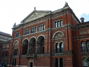
The architecture of the V&A from the garden
Tags: Grace · Kelley · Museums · Uncategorized
 Skate Park
“It should not be hard for you to stop sometimes and look into the stains of walls, or ashes of a fire, or clouds, or mud or like places, in which… you may find really marvelous ideas.” (Leonardo da Vinci)
There are no stains at the National Gallery, no ashes left at St. Martins-in-the-Fields church, no mud at Westminster Abbey. The marvelous rooms at the Gallery were spotless, eye-catching, almost enormous in their own way. The paintings were the definition of time’s constant, pitiless motion. Ageless. St. Martin’s church was divine, the concert we were there to see provided me with a sense of tranquility. The 3000 graves of the Kings and Queens at the Westminster Abbey were serene, spotless and preserved. Protected, like a caring mother protects a child during the most crucial years of his or her life. I have always been a lover of the arts, a person who admires the individual talent of those who seek self expression, yet the stains that I saw at the places above represented a personal frustration with the lack of representation of the, what some may call, “dark history,” I am thirsty for a history I have yet to explore.
As I walked the art-filled rooms of the National Gallery my soul wondered with joy, I was amazed at the pieces of art that stood in front of me: Van Gogh, Da Vinci, Michelangelo!!! I had seen these popular paintings on TV and magazines but I never thought I would the opportunity to SEE them, I was in disbelieve! yet the little girl in me who struggles to promote diversity at a predominantly white institution of higher education couldn’t help but to wonder: “Are there any non-white pictures in this entire gallery?!” I guess this is part of the challenge.
When I applied to the program I expected to encounter a culture not so different from my own, but these differences appear to be overpowering the few commonalities I can find and in this way I am challenged. Some who read this blog post may think, what is she talking about? or she is clearly exaggerating, but I come from a place of predominantly diverse communities, a place where our family members, teachers and friends are the Kings and Queens of of our history and they don’t need a $2 million shrine to prove it. I am challenged by the historical representations of the paintings and yet I am intrigued by the walls of the graffiti-filled skate park walls. I question myself for being unable to feel the same type of joy for both, for choosing the walls of the skate park (under the Royal Festival Hall) over the majestic walls of the National Gallery.
I continue to move forward, hungry to explore the unrepresented history. Desiring to spend more time speaking to a protester outside of the National Gallery, an activist, fighting for what he believed to be remnants of “institutionalized racism.” In him I find some comfort. Standing with him I felt inspired again. I was reminded that history, like art, evolves and is dependent on the author’s perspective. I must continue to appreciate what is in front of me, meanwhile assisting myself in the development of my own interpretations. I must not choose between graffiti and the precious work of Van Gogh but rather entertain my soul with both.
I think I may have found “really marvelous ideas.”
Tags: Flow
August 26th, 2009 · 1 Comment

After a morning class discussion on Ethnic London, I headed with some friends to Trafalgar Square to spend the afternoon in the National Gallery. As an artist and art lover, visiting the National Gallery has been on my high priority list. Not only is it a very large museum, but the collection spans over several centuries. It includes work by some of my favorite artists, Jan Van Eyck and Botticelli, and it is nicely spread out over well organized and numbered rooms.

Tourist pose by the lion
As soon as I entered the museum, I knew there was no way I would finish it all in a day. I was overwhelmed just looking at the interior architecture! I picked up one of the museum’s detailed colored coordinated and numbered maps, decided on left, and entered paradise. Yes, I was one of those people who stood right up against the barrier, nearly put my face in the paint, and twisted my head into awkward angles so I could “see the quality of the paint.” Having just finished my Fundaments of (Oil) Painting class at Dickinson, I was completely engrossed and fascinated with the brightness and sharpness of the paint when the artists painted on wood.
I only made it through the 16th and some of the 17th century works, which tend to be of a more religious nature. So many paintings depicting the life and death of Christ, or the various Saints, reminds me not only of the political nature of those time periods, but also the importance of religion. So much of England’s history and beauty steams from the country’s religious roots. People flock to the churches of England as tourist attractions, forgetting that they were once places of worship. People stare at paintings of Christ, forgetting the meaning and significance tied to the image.

Hanging out by the National Gallery
While I hope at least most people appreciate these works for there aesthetic beauty, mastery of skill, and creative perspectives, I hope that every once and a while, we all think about the mindset of the artist. What is this a painting of? For whom and why? What does this image mean? I try to ask myself these questions with every work of art I look at, in hopes I will appreciate it a little more.
To view a slideshow of photos from my time at The National Gallery, Westminster Abbey, and the South Bank please click here.
Tags: Megan · Museums
August 25th, 2009 · 1 Comment
After a delightful performance by E.L.F. trio in St. Martin in-the-Fields, I walked over to the National Gallery with some classmates. I was about to enter a museum with one of the most extensive collections of artwork from the 13th to early 20th centuries, and I was in heaven. As an art history major, art museums, especially one as large as this one, make me feel like a kid in a candy store. Our group made a plan to meet up at 4pm and so Kelley and I headed off to the Sainsbury Wing to investigate paintings from the 13th to 15th century. Although I prefer modern art, I found the works in this section very moving. Of course, they all had a Christian connotation and most of them were placed in a church at one time as an altarpiece or as part of a triptych. As a Reform Jew, I really don’t know much about Christianity outside of the Old Testament; however, everyone can appreciate the beauty of these paintings and the emotions they evoke. After passing through room after room of the Virgin Mary and Christ I began to wonder, why is the Virgin always depicted in blue robes? The blue is a similar shade in every painting, somewhere in between the color of a clear sky at dusk and a robin’s egg. Naturally, I looked it up when I returned to the Arran House. Some of the answers I found ranged from the ridiculous “because it’s her favorite color” to the more academic explanation, “blue was the color Byzantine empresses wore.” All I can say is that the particular shade of blue is a color I’ve only ever seen in these paintings, so I guess I’ll leave it as ‘the Virgin Blue.’
As we moved through the rest of the museum I was overcome with joy… I was seeing some of my favorite lessons come to life. When you see a picture that you study in your textbook or in a slide comes to life, it’s like seeing it for the first time all over again. Major players like Masaccio, Titian, Raphael and Bellini were all here. It was hard for me to believe that I was actually standing in front of THE Aronlfini Wedding Portrait by Jan van Eyck. This paining first began my love affair with the Dutch school of painters and semiotics…. now I was here, in front of it. I could actually see the dog (for fidelity), the removed shoes (the marriage as a religious sacrament), and the reflection of Van Eyck himself in the mirror along with the inscription “van Eyck was here.” Also, for anyone who is interested, his bride is NOT pregnant. She is simply wearing the style of dress that was popular at this time period. I was even able to see Holbein’s The Ambassadors (1533) and walk across the room to see the anamorphic perspective skull.
However, when I walked into the 19th and early 20th century gallery my heart really began to race. As Kelly will attest, I did audibly gasp when I saw Gauguin’s Still Life with Mangoes (1891-6). This section was by far my favorite. The late nineteenth century painters were the first school to paint modernity; they disregarded all the set rules, added some color and painted the world around them rather than the bible or portraits. Degas, van Gogh, Cezanne, each one brought paining to a new place either with subject matter, texture or color. The Degas gallery was especially moving. I am fascinated with his series that captures the private movements in women’s lives. He takes everyday scenes intimate such as a woman drying herself off after a bath or having her hair combed and turns it into a story for the viewer. We are left wondering, who is she? What is she doing? Why?
Of course, I could not make it through the entire gallery in one day. So I plan on returning soon to take in the 17th century (including one of my absolute favorites, Vermeer) and to revisit the early-modern painters. Everyone should visit the National Gallery, regardless of his or her “art background.” It really is the crown jewel in the world of art museums. I anyone wants to come back with me, please let me know.
Tags: Grace · Museums


 Skate Park

