September 10th, 2009 · 2 Comments
I had a huge problem with the Victoria and Albert Museum. Maybe that’s not the most gracious of ways to begin a post but it’s the only way that seems fitting. I was really excited to go to the museum. Not only had I heard only rave reviews from my classmates but I had also been introduced to just a taste of all the many ways that Victoria and Albert aided the arts and science communities on our very first day here on our tube stop adventure. I was expecting a museum that displayed some of the finest collections of art-sy and science-sy things shown off in an almost magical way. What did the museum show me though? Wedding dresses. The only thing I remember from all of the exhibitions is the fashion room. Maybe that wasn’t the best room for a person like me to go into (I’m not the best at coordinating colors and prints but, in my defense, I at least know that plaid and stripes don’t go together). Still, I think that a person without the least bit of fashion sense should be able to go into an exhibit in this type of museum and not come out with a feeling of outrage. Now, I have been researching feminist literary figures in the Bloomsbury area for the past week so maybe I’m a bit more sensitive to gender issues than I might normally be. That being said, the fashion room was laid out in a way that seemed to make the statement that the epitome of female dress could be found in a wedding dress. I don’t know if I’m alone in this sentiment but that statement couldn’t be more belittling or insulting. In my mind, glorifying a wedding dress in this way fits into the mindset that women are to only aspire to be a wife. I have nothing against marriage and think that being a stay-at-home-mom is quite a respectable position in life. But to be limited to such a role is wrong and it is exactly that limitation that I feel the fashion room in this museum was advertising.
Women have for years been actively pursuing equal opportunities in the workplace and home alike. Many women from the London area made great strides in assuring these opportunities came about. In the literary world, Virginia Woolf, George Eliot, Vera Brittain, Jane Austen– these are just a few of the women who pushed their way to the forefront of the literary world and showed that women had as much talent as men and should be given the opportunity to showcase that talent. Other influential women such as Millicent Garrett Fawcett, Sylvia Pankhurst, and Nancy Astor also have an important influence in the city. Let’s not forget that some of the most memorable sovereigns of the nation were women. Queen Elizabeth I, Queen Elizabeth II, and even Queen Victoria herself made contributions to the well being of the nation that cannot be overlooked. Though incredibly diverse in their many accomplishments, all of these women have one thing in common: their lives amounted to more than a wedding dress.
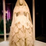
The Victoria and Albert Museum seems to ignore the rich history of powerful females in London though and, instead, caters to the idea that the aspiration of women is to look good on their wedding day. I think this is most clearly demonstrated in the wedding dress by Neymar that was worn by Angela Stamp on their wedding day in 1976. It was designed to resemble something Anne Boleyn would have worn.

Angela Stam's Neymar wedding dress
Anne Boleyn used marriage as a social stepladder more than possibly any other woman in history in my opinion. Taking any connection to the dress’s primary influence away though, the dress itself showcases exactly what the feminist movement was rebelling against in the 1970s. It is embroidered with beads and flowers and covered in frills and folds is such a way that it emphasizes the dress not the woman. In fact, the mannequin on display has absolutely no facial attributes at all. The woman is literally unnecessary. To me this implies that any woman can be placed into this dress, it wouldn’t matter at all who is in it. The dress is going to serve its purpose. The dress is going to find the desired husband (the husband who wants his wife in such a dress and will pay to make sure she looks like this to her public). Yes, it is crafted beautifully and is truly a sight to see. Other dresses were just as beautiful though, but it was this dress along with two other wedding dresses that were on display in single cases. It was this dress along with two other wedding dresses that attracted everyone’s attention. The museum is compiling a collection of wedding dresses for their wedding dress exhibit in 2013. It’s currently 2009. These wedding dresses aren’t a part of that exhibit. These wedding dresses are a part of the everyday collection and as such send the message (at least to me) that these are important enough to be set aside from all the other dresses because they are the most important clothes that women can ever put on. I would argue that’s just simply not the case.
I’m not even going to get started on the significant lack of male clothes present in the exhibit. There was a case of suits in the entire room. That was it. I recognize that that inequality is also a problem but the message of limitation through the wedding dresses was what struck me most in the room. Again, I was excited about seeing the museum. Victoria and Albert made incredible contributions to the art and science communities that shouldn’t be ignored. Unfortunately, the way in which the wedding dresses were displayed made all of their accomplishments completely invisible to me. All I could see was lace and embroidery.
Tags: Audrey · Museums
September 6th, 2009 · 1 Comment
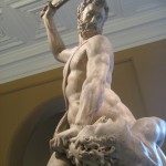
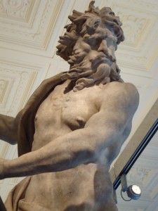
No museum has affected me as viscerally as The Victoria and Albert Museum in South Kensington. Immediately upon entering the museum I was struck by the sight of life-sized Rodin sculptures of the human body that were raised above eye level, which created, for me, a sense of the insignificance of the appreciator, and likewise, the importance of art over all things. These sculptures were grotesque; Rodin used a technique that rendered them black and raw-looking, as if they had once been alive and thrown into a fire, then the charred remains removed and put on display. Though they were shocking and somewhat disturbing, Rodin’s pieces elicited in me a very emotional response, one that cut to the core of my perceptions of the self and of humanity, and one that I can neither explain nor recreate for the reader.
I also really enjoyed seeing several sculptures by Alfred Stevens, including a copy of the original “Truth and Falsehood” which is a part of The Wellington Memorial which we saw at St. Paul’s Cathedral several days ago.
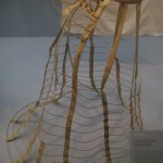
The fashion and jewelry exhibits at the Victoria Albert were equally as touching, but for different reasons. Coming from a background in feminism, I was disappointed in those women who conformed to societal ideals of beauty – women who cinched their waists and bustled their butts, weighing themselves down with heavy jewelry, changing and shifting and molding themselves to ‘fit,’ quite literally, into the beauty myth. One display featuring a bustle and the wooden innards of a hoopskirt were reminiscent of a cage. And would it really be so far from the truth if it were?
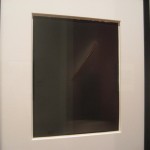
Another exhibit which really hit me was photography. A great little exhibit, though I do wish it were larger. I thought that all of the works were quite good, though I connected on a deeper level with just two prints. The first piece was strikingly different. The artist worked with the principles of light and photography and used the sun to burn a simple design into the photo paper. I didn’t quite understand the process by which the piece was created but that’s the beauty of art, isn’t it? You don’t always have to understand it, or at least understand it as the artist does.
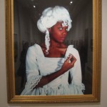
One piece that I definitely took a bit of “viewer’s license” to form my own interpretation was a photograph of a beautiful black model in a traditional Georgian dress and wig – both stark white. In her delicate hand she held a large diamond, perfectly cut and gleaming. Her head tilted towards the diamond in her hand, yet her eyes remained fixed intently on the camera. I thought that this piece, out of all the pieces of artwork I have seen at any exhibit thus far, had the most to say. It powerfully conveyed, by capturing just a single moment in time, hundreds of years of British imperialism and the pain it caused the imperialized. The Africans and West Indians were brought to perhaps not-so-‘Great’ Britain and taught that being ripped from their homelands like so many weeds was a privilege. They drowned the enslaved in western culture, which is represented by the model wearing the white (this was surely no mistake) Georgian garb, and meanwhile robbed their homelands of natural resources – such as diamonds and gold – for their own profit.
“Has imperialism, has slavery, really ended?” one must ask him or herself when one considers that there are still related issues in today’s society. The answer should become glaringly apparent when one considers Westerners’ continued thirst for diamonds. Though our presence in the diamond mines of Africa, in places like Sierra Leone, The Democratic Republic of Congo and Angola, may not be physical, our socially-sculpted ideologies surrounding the institution of marriage perpetuates these issues, and exacerbates the problems surrounding blood diamonds. So, for all you ladies out there: next time you stare doe-eyed into a Zales’ display window and exclaim in “I can’t wait to get married!” think twice about what societal forces and social constructions may be at work when you consider the “necessity” of an engagement ring. And the next time you look at a piece of art, everyone, look a little deeper and listen a little closer to what the piece may be trying to say.


Tags: Anya · Museums
I love museums. I like to put my ipod on and wander around alone, allowing myself to really get the full experience of the art. It feels like I’m connecting to not only the piece of art itself, but to the artist and his or her experiences and emotions.
On Saturday, Amy and I took the tube to Charing Cross to visit The National Gallery. There we proceeded to immediately get lost in the extensive building, but we weren’t complaining. We wandered through room after room that held amazing works by Rembrant, Van Gogh, Monet, Leonardo da Vinci, Cezanne, and Turner, just to name a few of my favorites. I compared this museum to the Met in NYC: both are enormous, well cared for, and very popular. However, I noticed a key difference. This difference is simply that most museums here are free, with a just a suggested donation, unlike the Met which charges 10$ per visitor. I love that England honors the historical and cultural value of artwork by making it accessible to the general public. Not only could I observe famous works of art, but I could also examine the evolution of religious practices, social castes, daily life, and even fashion free of cost.
This is a pretty good segway into discussing the museum I visited today: the Victoria and Albert Museum, commonly referred to as the V & A. As a small group, we left from Euston Station to take the central line directly to South Kensington where the tube conveniently led us straight into the museum.
At first, I really didn’t know what to expect of this experience…I mean, I know very little about fashion and I simply wasn’t sure how I was going to be able to relate to the displays.
Yet, as is often the case, I was pleasantly surprised.
I walked into a room filled with some of the most beautiful sculptures I have ever seen. Though I had never heard of most of the sculptors, I was able to get really close to each of the statues and really examine the detail and expression in each.

With my head phones in and the world tuned out, I strolled around. There was a huge exhibit on the evolution of clothing, another on shoes & accessories, another on fashionable metal-ware (pots, religious idols, masks, etc).
It was really cool to see how our everyday lives have been affected by the trends of the past. We often hear that things are “out of style” or “not in fashion anymore” but have we really stopped to contemplate what that means? Fashion is constantly fluctuating and changing and all of us, (whether you consider yourself fashion forward or not), are players in this game. We ourselves are walking works of art, displaying the genius of designers as they mold trend after trend, mixing past and future to create something entirely new. And that, at least to me, is fascinating. The thought that I am connected to the past through the evolution of fashion really intrigues me and I would never even have noticed this unless I’d visited the V& A museum!
Another exhibit that I thought was amazing, literally AMAZING, was located in the main lobby of the museum. It was called “Telling Tales; Fantasy and Fear in Contemporary Design” created by international designers Tord Boontje, Maarten Baas, Jurgen Bey and Studio Job who were all inspired by the classic fairy tales which they then translated into their construction offurniture. I know it sounds almost comical (like really, how can furniture be at all interesting) but I’d never seen anything like it. I posted a link a little further down that gives you a little tour.
Also in this exhibit was a frightening, but brilliant, room that entitled “Heaven and Hell”. I won’t give all of it away because I cannot adequately describe it, but the link below also can give you an idea of what to expect. However, I will say this, the lighting, color, back drops, music, and the positioning of the art are all major contributors to the overall effect of the art and are carefully constructed by the artists/museum staff. Basically, see it in person because you won’t regret it.
http://www.vam.ac.uk/microsites/telling-tales/exhibition.html
This exhibit only lasts until October 18th, and I suggest everyone see it while here. Truly, both the National Gallery and the V&A are exceptional and I really enjoyed having the opportunities to both observe and reflect on my experiences.
Tags: Maddie · Museums · Uncategorized
August 30th, 2009 · 1 Comment
Today Sarah, Chelsea and I made a journey to the Victoria and Albert Museum. Upon immediately entering the V&A, we noticed that it was going to be a hodgepodge of all sorts of items. The first room we entered featured various nudie sculptures that caught our attention. Then to our right we noticed the “Fashion” exhibit. The “Fashion” exhibit featured everything from a 1700s brocade ball gown to futuristic designs. Being in a girly mood, we decided to go to the jewelry section next, we can dream can’t we?
On the way, we stumbled upon an ironworks exhibit, gargantuan columns, and Asian textiles. One of the best exhibits, we thought, was the Theatre and Performance gallery. This exhibition housed anything from ballet costumes to miniature set designs and various recordings of performances. This kind of exhibit, we felt, was rare compared to the other museums we had visited.

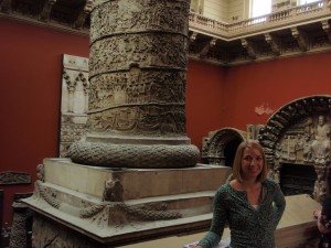
Alli morphed by a gargantuan columnNo caption needed.
As a whole, we felt that this museum showed more socio-cultural exhibits than the rigid British Museum and National Gallery. The 20th Century exhibit showed anything from an iMac to early cell phones. It included a section about technology as an astestic, featuring a pink vacuum cleaner from the 1970s. This museum tended to show more “everyday life” items rather than royal jewels and strictly upper class items that are less easy to relate to. Even the jewelry exhibit included less elaborate pieces, such as funerary rings, that did not necessarily belong to royalty or a famous name. These items weren’t just “dug up from the ground” and put on display, but they were placed in a better context.

No caption needed.
Additionally, the V&A seemed to be more “British,” containing the most number of galleries dedicated to English artifacts and history. They had 13 rooms entitled “British Galleries: 1760-1900” whereas the British Museum only had 2 rooms and the National Gallery had 4. It is interesting that these two museums are considered “national” museums and yet they have the least amount of national artifacts.

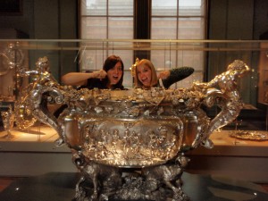
Sarah and Alli drinking from the giant punch bowl
Tags: Alli · Chelsea · Museums · Sarah
August 29th, 2009 · 1 Comment
Today we wandered, via the scenic route, over to the Victoria and Albert Museum in South Kensington. We knew that it would be an eclectic and eccentric collection, but we were in for a surprise…
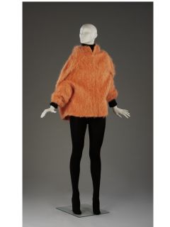
Upon exiting the convient tunnel linking the Tube to several well-visited museums and sites in the area, we found ourselves in a ground floor sculpture hall. Randomly picking a direction to walk in, we wandered into in the fashion section. (Aidan and Brandon were thrilled.) In this collection we found everything from hautecouture to Elizabethan-era ensembles. Some of these clothes were truly shocking! One such item reminded Kelley of a woolly mammoth, but alas, it was a apres ski jacket. While we were lingering by a shirt made from a parachute and some heavily-sequined items, we could see into an exhibit of Raphael’s cartoons.

The Woolly Mammoth, erm, Apres Ski Jacket (picture taken from the website of the Victoria and Albert Museum)
A cartoon is a preliminary drawing for either a tapestry or a painting. In this case, the drawings were for a series of tapestries commissioned for Pope Leo X and they depicted a number of scenes from the Bible. We were impressed with the sheer size and careful preservation of the drawings. As one of the completed tapestries was present, it was also interesting to see what the finished product looked like.
We decided simply to wander from exhibit to exhibit in order to understand the Victoria and Albert collection as a whole. We were met with limited success. While the museum contains an extensive array of artifacts from around the globe, we found that there was no logical flow pattern in the museum. For example, we went from Korea to the European Cast Court (essentially a large number of copies of well-known facades and memorials) and again from finely-painted late 19th century tables to the radios of the 20th century. Essentially, we were confused. Why were these objects here and what is the purpose of their order? What is the collection of the Victoria and Albert trying to say to the visitor? It reminded Grace of a really nice yard sale. To Kelley, it was like searching around her grandparent’s basement. We found the artifacts to be very interesting and laid out well within their exhibits,we just question the museum’s purpose as a whole. That said, it was a worthwhile way to spend an afternoon. (We highly recommend going out into the garden and watching the children playing in the paddling pool!)

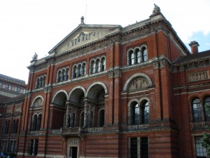
The architecture of the V&A from the garden
Tags: Grace · Kelley · Museums · Uncategorized
