September 3rd, 2010 · 1 Comment
Our trip to the National Portrait Museum was a fantastic experience, giving an eye opening look into famous icons in England dating back all the way to the 17th century. However, that was all it gave, was a look into the faces of rich families and celebrities in England. The museum itself began with elegant portraits of royal British families such as the Tudors and the Stuarts. Fancy galleries seperated by large arched doorways provided the backdrop for all these paintings of wealth. By the time one arrived at the section concerning 19th and 20th century portraits, the portraits of royal family members dropped slightly in numbers and the paintings became a bit more abstract. However, never did they shy away from only portraying the celebrity aspect of all these people. Needless to say, the common man did not receive a portrait. I would have liked to see at least one portrait that portrayed an everyday Londoner, but one can assume that just wouldn’t happen; either because the portrait costs a large amount of money to have done for you, or the artist did not find the common man interesting enough.
Amidst all the glory and wealth illustrated in the earlier portraits in the gallery, one practically leaped off the canvas at me for a different reason.
This portrait, amongst all the glorified, epic depictions of wealth and royalty, shows Paine in a very distorted and dark look, rather than the clean and pristine style of most royal portraits. It is inserted right smack in the middle of the 18th century portraits of Revolutionaries and Royalty. The portrait lacks definition in its lines and Paine’s body almost seems to seep into the background in an odd blend of himself and the darkness around him. In addition, the painting also seems to have a somewhat forboding feeling about it, which differed from nearly every painting surrounding it, where the environment was a large royal hall or a fancy room with the subject seated in a comfy chair. This portrait inserts Paine amongst the darkness, the unknown, something that makes you uncomfortable but fascinated at the same time. A great portrait amongst a great gallery. Cheers.
Tags: 2010 Benjamin
September 3rd, 2010 · 2 Comments
Before visiting the National Portrait Gallery today, I predicted that while much of the museum would feature only the white rich and famous, the contemporary collection at least would attempt to capture the multi-ethnic character of England. In that regard I was disappointed. In terms of subject matter, the museum evolved very little throughout.
As I finished the final gallery, I gradually realized that this particular museum does not portray (and does not intend to portray) the faces of England as a whole. In fact, The “About Us,” section of the National Portrait Gallery’s website explains that the museum’s goal is to, “promote through the medium of portraits the appreciation and understanding of the men and women who have made and are making British history and culture.” This does not mean the day to day making of history and culture, accomplished by the people who make up its population. Its purpose is first and foremost to portray the individuals who have made it into the history book, and unfortunately, that group remains fairly homogeneous.
However, the Portrait Gallery does show change through the years in the art of portraiture. Throughout most of the museum, any given time period has a corresponding style. Clues are in the crafting of every detail, down to the folds in the fabric of the sitters’ clothing: for example, in any painting in the Tudor section, the fabric tends to look particularly stiff. Many of these paintings can be easily assigned to a time period, but much less easily to a particular artist. Since the main goal of portraiture for many years was to portray the sitter in a flattering, distinguished, and fashionable light, creativity was low in priority.

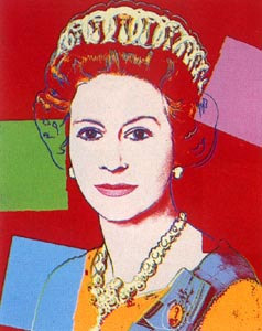
http://www.google.co.uk/imgres?imgurl=http://www.warholprints.com/images/artwork/full/FS-II.334.jpg&imgrefurl=http://www.warholprints.com/portfolio/Reigning.Queens.html&h=300&w=238&sz=26&tbnid=SmjYKTlKUTL7OM:&tbnh=116&tbnw=92&prev=/images%3Fq%3Dandy%2Bwarhol,%2Bqueen%2Belizabeth&zoom=1&q=andy+warhol,+queen+elizabeth&usg=__MGSvsIOwgTvT2lRepyT6Wz-eJDo=&sa=X&ei=ZnSBTOSfN8K84gb637XTCw&ved=0CB0Q9QEwAQ
The newest paintings depart from this long tradition of conformity. One room contains numerous paintings of nearly photographic quality, among a few actual photographs of members of the current royal family. These look in a sense tradition to an extreme, since they so closely achieve the old goal of capturing exact but flattering likenesses of the subjects. However, the room around the corner features three Andy Warhol prints of Queen Elizabeth II, in which features are simplified in bright colors. In these, the queen is a pop culture icon first and foremost. Some of the recent paintings were so thick with paint or otherwise distorted, that painting style itself was more prominent than the famous individual’s features.
Probably not coincidentally, the contemporary section contained many more self portraits by artists. With creativity as a main focus of portraiture today, the artists themselves are ready subjects for their own experimentation.

Tags: 2010 Emily · Uncategorized
September 3rd, 2010 · 5 Comments
As someone who wants to work at a museum, I enjoy different ones (even on a day where I visit four) and seeing how they formulate their exhibitions and present their collection. I also enjoy seeing how children interact with museums, as I want to combine museum education with my love of medieval art. The National Portrait Gallery, however, was not the best museum I have been to thus far. In fact, the quality of the art aside, I was largely disappointed.

Going in, I expected the portraits to be largely of the elite ruling class and others who had some power, whether political, artistic, or scientific. The collection was predominantly white elites (mainly males). This is understandable, as that was who was most likely to be in a position of power through the majority of England’s history. While portraits are not as readily available of the lower classes, they do exist. The NPG seemed to overlook this fact until very recent history. (Even then, the portraits chosen to be featured in the permanent collection tended to have an element of celebrity rather than being chosen for the lesson they can teach about daily life in a given period.) After finishing the Tudor section, my interest levels were in automatic decline and the museum had very little to reverse that. Its one redeemable feature was the interactive computer stations that went past the simple didactics in the collection. Yet, even that was lacking: it was written for an average adult.
There should have been a version of the interactive stations specifically designed (and easily accessible) for children. (Supposedly there was a map for children, but I did not see any families with one. Did anyone??) The NPG is a family destination: tourists (who make up a presumably large part of the museum’s audience) do take their children there (I witnessed several families) and there needs to be something more that acknowledges this more interwoven into the permanent collections. Instead of a dad timing his son to see how long he could walk from one end of a wall-long portrait to the other, I should have witnessed a dad engaging his son with a museum map for children. (This is something that I have seen in almost every other museum on this trip, which made the issue more obvious to me. If a family chose not to use the available map, then the museum still has the responsibility to help engage a wider audience.)
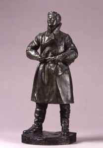
One of the few portraits that spoke (amidst the celebrity portraits) to me was a small model of a full-scale statue of Albert Ball by Henry Poole. Ball, a WWI pilot, shot down 43 enemy planes before being killed in action. At 21, he is one of the few people who appeals to a largely universal audience: English viewers for his patriotism, history buffs (WWI geeks specifically), art historians for his glimpse into war-era art, younger children of all backgrounds because of his heroic story (everyone loves a good hero, yeah?), 20-somethings who wonder if they can make a difference, and wanderers because of the persona that radiates from the work itself, capturing the power and passion of a young hero. Yet, even the portrait I liked the most stuck true to the NPG’s “requirements” for display: white and elite. (The portrait was given by Ball’s father, Sir Albert Ball). It did, however, lower the average age of the collection’s sitters by a few years… Picking a younger sitter for a comic book-esque family guide would have engaged the children. Who better than a WWI hero to be the leader? (This could easily be inserted in the visit with a small map and identifying pictures on didactic panels to let families know that a certain portrait would be more interesting for a younger audience.)

Albert Ball by Henry Poole, 1920s, http://www.npg.org.uk/collections/search/portrait.php?locid=50&page=1&rNo=6
After visiting the NPG’s education website (http://www.npg.org.uk/learning.php), I realize that there are educational activities available for families; I do want to give them some credit. However, I wish there were more in the gallery on a daily basis rather than on weekends or just for school groups.
To recap. The negatives: a lack of engaging material (even the interactive bits got boring after a short while, and specifically for the younger members of the audience) and a less than diverse “cast” of sitters. The positives: the collection itself (overall stellar artworks) and the opportunity to think up some (hopefully) creative activities that if I were the Curator of Education I would consider adopting. (Who knows? Maybe I will borrow these from myself in the future at an internship…) Oh, one other thing, what was up with the atrocious color scheme in the Regency wing? It detracted from the experience for me because there were times I noticed the wall color before the portraits, which should never happen, especially at a major national institution!
Tags: 2010 Stephenie
September 3rd, 2010 · 1 Comment
First, who’s not in the National Portrait Gallery? Minorities! Honestly, even without the prompt, it would have been a slow realization that as we walked through room after room of white faces, something was missing. There was one freed slave portrayed in the audience of an abolitionist convention, and that was about it as far as paintings of minorities at the Gallery go.
Second, and more broadly, working class people are not in there. This, to me, is less upsetting as it’s just a natural consequence of the fact that only the upper crust can afford to have portraits commissioned. Hours after visiting the Gallery, though, the lack of minorities still rankles, for one simple reason. If a black or Asian or Latino family came to visit the Gallery, and one of the children asked their parents “Why don’t any of these people look like us?” the parents would have no good answer.
____________________________________________________________________________________________
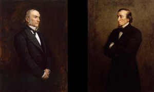
We were supposed to pick one portrait that we found particularly affecting. As a political science major who has taken British History 244, though, I could not resist going with the dueling portraits of William Ewart Gladstone and Benjamin Disraeli. Gladstone was the pillar of 19th century liberalism, while Disraeli was his counterpart on the right.

credit: youreader.com
This is exactly how the two portraits (by the same artist, Sir John Everett Millais) appear in the Gallery. In the Victorian era, the two were the titans of Parliament, serving as Prime Minister six times collectively. There is much, much more on their epic personal and political rivalry here:
http://www.bbc.co.uk/history/british/victorians/disraeli_gladstone_01.shtml
A favorite quote of mine on their lack of mutual respect, from Disraeli is “The difference between a misfortune and a calamity is this: If Gladstone fell into the Thames, it would be a misfortune. But if someone dragged him out again, that would be a calamity.”
Their respective portraits contain subtle and not so subtle bits of political imagery. First, Gladstone is facing to his left, while Disraeli is facing his right. The rest of what follows may be a bit of armchair psychology, but I believe it speaks volumes about both men.
– Gladstone has his hands folded, while Disraeli’s arms are folded in an aggressive posture. Disraeli was far more warlike as prime minister.
– Gladstone is looking towards the sky, while Disraeli’s gaze is a bit more earthward. This is in line with both men’s fundamental outlooks on life: Gladstone considered himself a great Christian moralist, while Disraeli preferred to concern himself with more earthly issues, considering Gladstone to be out of touch with the nitty-gritty of the world.
While the placing of these two portraits together obviously has an intended effect, that does not make the effect any less powerful. While standing in front of the two portraits, I felt like I could almost feel the hate flowing between these two great men, a great moment for a politics junkie like me.
Tags: 2010 Dennis · Museums
September 3rd, 2010 · 3 Comments
The works in the National Portrait Gallery are nothing more and nothing less than you’d expect from a collection of British heroes and icons. A pale Lady Diana laughs with her sons. Rows of Tudors sit in the same position, same facial expression, same symmetrical balance. I can’t believe how much one of them looks like Jeremy Irons. James Joyce looks as weaselly as I’ve ever seen him. British history was written by the British- either the intellectual elite or the monarchy. That’s who’s represented here. Over the span of the entire museum I counted two non-white Brits. Maybe I missed a few, but the fact still remains that Britain is visibly a nation overrun by cultural and class elitism. It’s no surprise, nor is it unique to the Isle. Still, including a few of the notable Black, Indian, or East Asian historical figures in the portrait gallery housed in one of the most culturally diverse cities in the world doesn’t seem like too much to ask. A city and a nation dedicated to fostering a people of many backgrounds should be dedicated to celebrating a heritage of many origins.
The portrait which most struck me is of a man who wouldn’t have agreed with this sentiment. Jan Christiaan Smuts was a British-South African who was a major proponent of segregation between African Blacks and European colonizers. Politics and morals aside, the military man Smuts (or his portrait, anyway) exemplifies what seems to be a perpetual process of one-upmanship in the British community.
Portraits are, if nothing else, a statement that you’ve made it; you have the experience, you’ve earned the recognition. Might as well show yourself off by hiring someone to paint your likeness. Smuts takes it further. A not-so-inconspicuous inclusion of a chest full of army pins and badges in the upper/left half of the canvas serves as a reminder that Smuts is the real deal. It’s the perfect visual representation of the superiority complex which Smuts clearly had. I’m beginning to think of it as a “look at me” incentive; as mentioned before, all of the British officers depicted in portraits are white and they all wear similar uniforms. Smuts puts his accomplishments on display to set himself apart from the pack. It’s almost more a portrait of an ideal- a machismo, militarist ideal- than of a man. Based on Britain’s imperialist tendencies, it seems like that mindset wasn’t unique to Smuts.
He just broadcast it best.

http://www.npg.org.uk/collections/search/largerimage.php?mkey=mw05872&search=ss&firstRun=true&sText=smuts&LinkID=mp04169&role=sit&rNo=0
Tags: 2010 Patrick
September 3rd, 2010 · 2 Comments
I think we can all agree that the National Portrait Gallery is filled with the white and wealthy. There were very few portraits of people of color, and even then they could only be found in the modern section. I found this was also true with portraits of women. Most of the the paintings seemed to feature men. As a woman, I found this both sad and frustrating. I was also disappointed by the fact that in the earliest collections of portraits almost every face looked the same. When I commented on this to Amy, she told me that at this time sitters would pose in order to look dignified, influential, and noble. This answers some of my question, but looking beyond the posing to the actual faces, I was still struck by the replication of features. It made me seriously question the legitimacy of each likeness. I wonder to what degree the artist might have altered the sitters actual appearance and if so, was it done for a reason?
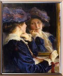
The portrait I chose, Mrs Philip de László has a bit more personality.  (Photo taken from the National Portrait Gallery, http://www.npg.org.uk/whatson/display/philip-de-laszlo.php)
I picked this portrait because I simply just fell in love with it. I hadn’t ever heard of Philip de Laszlo before today, but my eye was immediately drawn to his collection which featured more women than some of the other artists. This portrait is of Lucy, his wife. I think the idea of painting both her actual body and her reflection adds some originality. It is certainly mush different than the stiff dignified portraits of the Tudors and Elizabethans. The portrait reminds me more of a candid photo. Her chin rests on the palm of her hand in a very relaxed but graceful manner. But I think it is her eyes that really make the painting. Instead of looking upon her own reflection in the mirror, her gaze is focused on her husband. This changes the tone of the painting into something much more intimate and warm. It brings much more life to the sitter than the repetitive blank faces of the first portraits we saw.
Tags: 2010 Sarah
For the majority of human civilization history has been recorded by and about men. Today we learned that portraits are just another form of history telling. In the patriarchal society that has emerged in Europe in the past few centuries, powerful men have had their likenesses recorded by painters and photographers alike. The artists, who too were white men for the most part, helped to record a history in paintings that has sent the message that in any given era, white men were the only people worthy of remembrance.
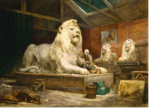
Not all of these men illustrated however, were men that were famous or powerful. One portrait that drew my attention, John Ballantyne’s The Artist’s Studio depicts a man, small and off center, carving the lions that would one day sit in London’s Trafalgar Square. It took a little researching but I finally found the picture to be painted of Sir Edwin Henry Landseer, someone whose name I was not familiar with but whose work I had seen dozens of times either on television or on the street. Even in the photo, this man is in the shadow of these monstrous lions, symbols of the aristocracy. It was interesting to finally get another perspective on the monuments all over London. All of these monuments honor great men, but behind all of them were unknown artists commissioned to sculpt or paint for little or no recognition or acclaim.

(photo from http://www.nnf10.org.uk/programme/detail/The_Artists_Studio)
Although the gallery was filled mostly with white rich men, it was refreshing to see this one painting of an almost normal guy who, like everyone else, was a subject and servant to an immutable class system.
Tags: 2010 MatthewG · Museums
September 3rd, 2010 · 2 Comments
Beginning my tour of the National Portrait Gallery in the room of Tudor paintings, I immediately noted the types of people included in the gallery’s selection of portraits: British royalty and aristocrats. As I wove my way in and out of the various rooms and hidden side rooms, I continued to notice a broader representation of the English classes. This included notable figures of military, political, and scientific importance, as well as remarkable social reformers, explorers, poets and writers, painters and sculptors, composers and musicians, and actors. Some scenes of war and exploration–or imperialism, if you prefer to describe it as such–were additionally included in the gallery. I therefore came to the conclusion that clearly, the National Portrait Gallery really wasn’t a proper representation of all English people. There were no people of lower classes–those without distinctive historical achievements.
It wasn’t until the last galleries I explored, the contemporary portraits and portrait finalists, that I noticed another distinctive exclusion: portraits of non-white English people. I unfortunately didn’t keep an exact count of the portraits depicting any English immigrants, but they most certainly were a minority. I found this ironic, as the National Portrait Gallery cannot accurately be called “national” when countless English people are excluded from the paintings–everyday people and immigrants of other ethnic backgrounds.

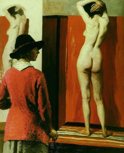
The National Portrait Gallery does not share this image on its website, so I found it here.
The portrait I chose in the National Portrait Gallery is “Self with Nude,” painted by Dame Laura Knight in 1913. This painting, illustrated above, is of a woman, the artist Laura Knight, painting a portrait of a nude female model. I found it striking as it was displayed in a large alcove, and its provocative nature most definitely caught my eye as it hung amongst other smaller, less distinctive portraits. Dame Laura Knight was an Official War Artist during the Great War (WWI) and recorded the famous Nuremberg Trials after WWII. In regards to this particular portrait though, it represents Knight’s prominence as a talented female painter defending the right for women to paint from a nude life model. The painting was placed in the gallery titled “We are making a New World Britain 1914-1918” where the gallery’s description stated that the Great War was an “end to an era, but it was also a catalyst for changes.”
Tags: 2010 Mary · Museums
September 3rd, 2010 · 1 Comment

Upon entering the National Portrait Gallery at its opening, I was struck by the immense size of the collection. For an art museum that had so narrow a focus, I was not expecting three full floors of work.
Beginning at the top floor, the museum took a chronological approach to the presentation of the portraits. One started going through rooms filled with portraits of the Tudors and ended observing portraits from the last decade on the bottom floor. The collection portrayed royalty, politicians, writers, musicians, artists, scientists, and other notable figures. Some of the artwork was surprisingly cynical in nature, while most were glorifications of their subjects. The term ‘national’ clearly was referring to the United Kingdom and not just England, given the presence of figures like James Joyce. Also, the collection seemed to feature figures that were mainly associated with the UK, as Handel was featured despite the fact he was born, and grew up, in Germany. A clear emphasis was placed on the rich and famous, while relatively none of the works portrayed the lower classes. Also, no one associated with the British Empire, such as Gandhi, was included.
The portrait I decided to focus on was that of Sir Francis Drake, located on the second floor. As we were not allowed to take pictures in the museum, I have provided a link here: http://www.npg.org.uk/collections/search/portrait/mw01932/Sir-Francis-Drake?search=ss&firstRun=true&sText=sir+francis+drake&LinkID=mp01357&role=sit&rNo=o
The painting of the famous navigator is not particularly flattering or, quite frankly, well painted. He stands before the observers at an odd angle, holding an oddly (aka poorly) shaped globe resting on a table for balance. Drake is dressed in a garish pink outfit, with a cape that looks too stiff too be real. His arms appear to be different sizes, and legs appear to be much larger than his torso. Looking at his face, his cheeks appear to be inflated, making him look more like a comical figure than the daring naval admiral and pirate that he was. He stands with a slight arrogant look, as if ready to take over the world (something his nation would effectively try to do in the coming decades). Looking at the portrait, it is hard to get over the poor quality of the painting. With the dismal proportions, poor color scheme, and lack of inspiration, you would almost wonder if the artist is unknown because he or she was ashamed of the work.
I picked this painting because I was so struck by its poor quality, particularly in relation to many of the other works in the National Portrait Gallery. One could almost see the work as an accidental representation of the British Empire’s colonial overreach. With the country moving so quickly to expand, one can understand the rush to make heroes out of these new explorers, evident in this portrait of Sir Francis Drake. Unfortunately, just as the Empire was built on a weak moral foundation, the picture falls victim to poor artistry. Therefore, one could read the portrait as a representation of the weaknesses of imperialism… or one can just see it as a really bad painting.
Tags: 2010 Andrew
September 15th, 2009 · No Comments
I went back to the National Gallery and was blown away by a painting: The Toilet of Venus by Diego Velázquez. The painting shows the the naked goddess Venus, looking at herself in the mirror, which is being held by her son, Cupid. Every time I went to the National Gallery, I passed it by. I do not why, but this time, I looked at it, and I just thought it was so powerful. I wondered why I had not seen it before. Why didn’t I noticed it the first time I visited London some years ago? I think sometimes, as we change, so is the way we observe things. Maybe, I was not ready to see it at the time.
Very similarly, I went to the National Portrait Gallery and realized I had a totally different experience than when I visited the place for the first time. I also went to the exhibit “Londoners Through a Lens” at the Getty Images Gallery near Oxford Circus. Comparing the two, I felt that portraits spoke to me much more than pictures. Not only should I mention that they are incredibly well done, but also, that they express so much more about the actual person, because you can just see how the painter views him or her. I specially enjoyed the portrait of Germaine Greer, a feminist advocate. I like how none of these portraits are condescending, but speak only the truth about those in the image. They also catch the subject in his or her natural habitat. There is nothing artificial about them, even if they are not pictures.
The main comparison I wanted to make in this post though, is between the Imperial War Museum and the Royal Air Force Museum. People usually think that the Imperial War describes English military history (there was even a big debate on whether to change its name or not). However, except for a few tanks displayed in the centre, most of the Museum deals with how the population suffered because of wars, particularly through the Holocaust gallery and the crimes against humanity gallery. Of course there could be a debate here over whether the a Holocaust gallery in an English museum is coherent or appropriate at all. Without getting into Holocaust Studies and how Holocaust museums have been created and grown almost exponentially in the past few years, I want to ask myself: Is the Museum trying to claim that England is in some way responsible for the Holocaust ever happening? After all, many would say that the Second World War was a direct consequence of the First World War which had its origins in imperialism, and England as the main empire. This is certainly very debatable, but it was just a thought…
Very differently, the Royal Air Force Museum displays a vast amount of military artifacts and describes English military history and technological advancement. The Museum does not include civilians at all. However, they are both free, and they both deal with war.
As we see, we can draw many conclusions by comparing museums which have a similar theme. I also enjoyed comparing the programs for children and family that these museums have since I work at the Education Outreach office of the Trout Gallery at Dickinson, and I always like getting new ideas.
Tags: Azul


