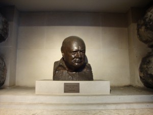
Churchill Bust
Today I visited both the Cabinet War Rooms/Churchill Museum and the Sir John Soane Museum and what struck me most about both of these very different museums was their presentation. The approach that these two museums took with presentation are very different from each other, and therefore striking in different ways. Having put on an exhibition myself during the past school year, I know the decisions involved in creating a show.
Although I visited both the Cabinet War Rooms and the Churchill Museum, I was much more impressed with the set up of the Churchill Museum, so that will be my focus here. Upon entering the Churchill Museum, the first thing I noticed was the color scheme: blue and grey/silver. This was continued throughout the exhibition which gave it cohesion and unity. This exhibit also mainly used interactive media like audio and video. My favorite section of the museum was the wall of black and white photos (keeping with the color scheme of the museum) that were back lit and place in deep silver frames. As you walked along the line of photos, motion sensors on the floor active clips from Churchill speeches that related to the photos. I found this combination of visual and audio stimulation to be very engaging.
Besides the color scheme, I also loved the various either lit up, scrolling, or painted Churchill quotes throughout the exhibition. Often when people picture art exhibitions they picture paintings and history exhibitions they picture photographs and artifacts. Adding text was just another way this exhibition engaged the audience successfully. As an English major and art minor, I found the quotes pleasing both because they were well chosen for their content, and also because they were presented in a very aesthetically pleasing way.

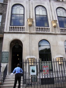
The Sir John Soane
The Soane Museum, on the other hand, had an equally engaging yet completely different layout. As opposed to the open, spacious, unified by color Churchill exhibit, the Sir John Soane Museum was in Soane’s home with tiny hallways, narrow stairwells, and rooms packed with busts and statues. Unfortunately no photographs were allowed in the museum, and only a photo could really convey the feeling of the museum—or home. That was the thing, this was the architect Sir John Soane’s home, more or less just the way he left it. The walls were covered in paintings and relief sculptures from various time periods. The banisters, tables, and other available wall space was covered in busts and other types of statues. Every windowsill and flat surface had something on it. The bookshelves were packed and the floors were all lined with various floral printed rugs. There was literally just enough room for a person to walk around the room or through the hallway. As I entered I had to place all my carried belongings in a plastic bag to be carried in front of me because there was not room enough for me to hold things at my sides as I walked. The stairwells winded around and as I walked, with my head always facing upward, I could not help but to think about the kind of man who would collect and appreciate these works of art, let alone live crammed in a house with them!
This exhibition overwhelmed me. I paced and paced around the house, and even saw a wall UNFOLD to reveal even more paintings! Most of the artwork was classical. Many of the paintings were landscapes. But it was not necessarily the artwork itself that made me love this museum, but the presentation. As I walked through the front door of the house and was instructed to turn off my mobile phone, I suddenly had this feeling that I was going through the wardrobe into Narnia. It was no longer busy modern London, it was 18th century England. The small spaces kept the museum goers quite, and I had a feeling of calm silence and awe as I entered room after room of wall to wall, floor to ceiling, art. Really, what could be better than that?
Ultimately I know that neither the content of the historical Churchill Museum or the classical busts and landscapes of the Sir John Soane Museum would have captivated me nearly as much had they not each been presented in such engaging ways. When it comes to being good at something practice, practice, practice. And when it comes to an exhibition its presentation, presentation, presentation!
Below is a slideshow of photos from the CHurchill Museum.
