September 21st, 2010 · No Comments
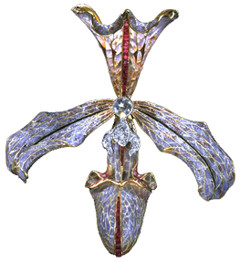
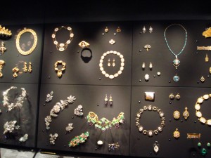
The way I feel about England’s museums (BM in particular) is the same way I feel about Tom Brady. They are both morally flawed, but too beautiful for me to honestly give a damn. So in that spirit lets forget about the mistreatment of Greece and Bridget Moynihan and just admire the physical beauty and inherent cultural value of the objects themselves. Sure, the jewelry collection in the Victoria and Albert represents the opulence, indulgence, and filthy wealth of the upper classes and royalty, but look how sparkly those diamonds are! The intricate cloisonne! The colorful enamel! The gemstones! Don’t hate the tiara because a spoiled rich woman owned it, admire it for its elegant design and exquisite craftsmanship.

Hair ornament in the form of an orchid, made by Philippe Wolfers, Belgium, 1905-7. Museum no. M.11-1962. Image from the Victoria and Albert Museum website
I also must say, setting aside moral issues and countrys’ bruised egos, what is truly in the best interest of the objects themselves is for them to be left alone. Art and artifacts should be handled and moved as little as possible to avoid damage and the acceleration of deterioration. Professor Earenfight, who curates the Trout Gallery and teaches the museum studies course at Dickinson, likes to say that art and artifacts are like the elderly. They are set in their ways, used to their specific atmosphere, and the best thing for them is to disrupt their comfort as little as possible. The bottom line is, virtually all of the objects in London’s museums are priceless and definitely irreplaceable. The transportation of any of these objects across countries and continents is absolutely horrifying from an art conservation/curatorial point of view.
In any case, how great is it that we can get into all of these places for free? Sure, government subsidization lends itself to government censorship, but the fact that I can just wander in off the street, as I am, and walk right up to Jan van Eyck’s The Arnolfini Portrait, or Joseph Wright’s An Experiment on a Bird in the Air Pump, or the ship burial treasure from Sutton Hoo, or the Rosetta Stone and countless other treasures more than outweighs any negative aspects for me. London’s collections are among the finest in the world, and they are open to everyone. Now that’s beautiful.
Tags: 2010 Rachel
September 20th, 2010 · 1 Comment
Rather than spend another post discussing curating practices or the pros and cons of government subsidies for museums, I wanted to write about the behavior I’ve observed in visitors to museums because, as a psychology major, this is what interests me. First, one can definitely tell the difference between English visitors to museums and tourists visiting museums. Tourists walk around looking up or looking sideways, gawking and paying no particular attention to where they are going. There was woman in the Map exhibit in the British Library yesterday who was wheeling around a suitcase behind her as she went through. Madam really, you are currently taking up enough space for three people. This doesn’t surprise me much, as I’m used to tourists in America being clueless and gawking as well. What I find more fascinating is the behavior of British visitors.
First, English visitors seem to come to museums with a specific purpose in mind. They seem to know exactly what they want to see and exactly what they want to learn or get out of their trip and proceed to the appropriate location efficiently. I’ll admit that it’s true that British visitors, especially Londoners, are at a bit more leisure to do this, since they live here and can return as often as they like while we tourists need to cram in as much as possible in a short period of time. In addition, some of these people are students with notebooks who must be on assignments concerning a certain painting or exhibit. An interesting mission that I’ve seen English museum visitors pursuing is educating a child. I’ve seen this several times, but I’ll share the example of a mother and son that I saw in the National Portrait Gallery. The mother had a notebook and was trying to convince the son (who seemed about 4 or 6 years old) to choose a picture he liked and try to draw it to “show Daddy later.” The son was reluctant and threw a few fits (as big of a fit as an English child would throw) but the mother was very persistent and kept telling her son, “We’ll look at just one more, one more picture.” When I saw them again later on, the son seemed a bit more engaged, but I just thought it was interesting that parents would bring their children to museums with such a structured purpose.
The second behavior that I’ve observed seems to relate to the English privacy rules and the social dis-ease mentioned by Kate Fox. I’ve noticed that if an English person is looking in a case or at a sign, and I walk up next to them to look at the same object, they will either apologize and leave, or give an embarrassed smile and leave. I still don’t really understand what they are apologizing for, but it’s almost like they think more than one person cannot occupy the same object (or 3 foot radius) as another person, like each person needs their time alone with whatever sign they are reading. I remember looking in the Museum of London at the Docklands at the hanging bird cage thing in which they would put pirates for birds to come eat them and a small child ran in front of me, pressing his nose on the glass, and asking his father to come look. The case was rather large, the print on the sign rather large, and the child rather short. He was not obstructing my view at all, but the father scolded him “Don’t stand there; the lady is trying to look.” I protested and said something like “Oh don’t worry he’s fine” to which the father gave an embarrassed laugh and quickly walked away. This behavior seems strange, awkward, and overly polite, but it makes some sense when we apply what we’ve read in Fox, and in light of other examples of social dis-ease that we’ve experienced in England. I suppose I prefer it to the behavior of American tourists, who will actually obstruct your view of something, and run you over with a suitcase while they’re at it.
Tags: 2010 Kaitlin
September 18th, 2010 · No Comments

The museums of London seem to all fall around one dominant theme: imperialism. Seeing that this defined the British Empire for a majority of the last three centuries, it is no wonder that one can see its influence in each place one visits in London. Every museum either boasts the riches and plunders of the imperial era or makes some sort of comment on imperialism by what the curators chose and didn’t choose to include. As imperialism is, in my mind, the central idea around which all these museums exist, I’m going to take a look at each of the museums I have visited as reflections on the topic:
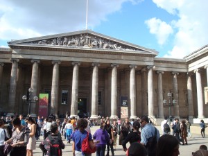
The British Museum: Many have already commented about the BM’s collection of artifacts and treasures from around the globe. It’s hard not to look at the mummies of ancient Egypt or the Elgin marbles without wondering just how exactly the BM got a hold of them. For its part, the museum seems to take delight in owning a collection that many would not consider rightfully theirs. On the “History of the World in 100 Objects,” I noted the quip the curator made about the “four languages” on the Rosetta Stone (as “Captured by the British Army” appears in English on the side of the artifact). While the BM could just ignore England’s imperial past, it seems to be content with making quips about where these objects came from. Essentially, the museum feels like a chance to show off the spoils of imperialism to rest of the world.

The Victoria and Albert Museum: This museum feels like a massive palace packed with valuables. In keeping with the British Museum, everything is thrown into areas based around vague “themes.” If you want to see jewelry, be prepared for a lot of rooms with a lot of randomly assorted riches. If you seek a certain historical artifact, you can probably find the right room based on the era and location of the piece, but after that you might have some problems as the rooms are randomly set up and gargantuan. Given the opulence of the collection, one cannot help but wonder how in the world the V&A wound up with all this stuff. The riches of imperialism are on full display at the V&A.
The Sir John Soane Museum: If the Victoria and Albert Museum feels like a massive palace packed with valuables obtained through imperialism, the Sir John Soane Museum IS a house packed with valuables obtained through imperialism. The place screams overkill, with walls of paintings that open up to more walls of paintings. I was particularly struck by the ivory chairs from India obtained during the eighteenth century: a very offsetting piece of the collection.
Natural History Museum: A few of us went through this museum after visiting the V&A, as the museum originated from the leftover collection at the V&A. While most of what one sees in the museum would not instantly recall British imperialism, some elements of the collection, like precious gems from South Africa, lead one to wonder just exactly how the museum got a hold of these pieces.
National Gallery: I really enjoyed this museum, but it is entirely Western European paintings. Given the Docklands Museum of London’s reference to the beauty of the arts in Africa before imperialism and slavery, why are none of these cultures, or those of the Middle East, represented?

National Portrait Gallery: I won’t go too much into this one, as several of my colleagues have already commented on the National Portrait Gallery’s imperialist nature. There is a stunning lack of racial or economic diversity in the collection, and I think a lot of that is a result of Britain’s imperialist past.
The Imperial War Museum: For a museum with the word “imperial” in the title, this museum actually had some of the least evidence of Britain’s imperial past of any of the places we visited. Only part of one wall was dedicated to all of the events surrounding the colonization of Africa, and I cannot recall any of the exhibits examining the struggles and fights for independence in any other former part of the British Empire. It is almost as if the curators wanted to sweep the entire history of British imperialism under the rug to focus on the glories of WWI and WWII. Based on the exhibits, one could easily come to conclusion that the Britain is embarrassed of its complete history. It was a cool museum, and I loved the section on British espionage (Who can’t love an exhibit that begins with James Bond clips?), but I found the museum incomplete because it ignored England’s imperial past.
The Cabinet War Rooms/Churchill Museum: My personal vote as the coolest museum in London, the Cabinet War Rooms show Britain near the end of the era of imperialism. Given the museum’s narrow focus, looking just at Churchill’s life and the struggle of the War Cabinet during the WWII Blitz, there was not much focus given to imperialism. One section of the Churchill Museum commented on the prime minister’s stance, early in his political career, in opposition to Indian independence. The part of the exhibit took a very apologetic tone, acknowledging Churchill’s mistake in taking such a position. Considering this museum is run in conjunction with the Imperial Museum, this part of the exhibit may provide an insight into the mind of the curators at that museum. Clearly, there is some sense of remorse on the part of the curators, evidenced by the Churchill Museum, for the British Empire’s actions, which could explain the lack of information about such events in the Imperial War Museum. Perhaps the curators are too ashamed to even broach the subject of British Imperialism.
Based on my observations, every museum I’ve seen in London is either indebted to imperialism due its bountiful collection of artifacts, or it tries to comment on the British Empire’s imperial past, typically by covering it up. Fifty years after the fall of imperialism, which is not that long ago, we still see its effects on the city of London.
Tags: 2010 Andrew
Yes- I guess we unanimously agree that the National Portrait Gallery was filled with portraits of the white and wealthy. There were no representations of middle or lower class, or any people of color, which didn’t come as a surprise to me. If you weren’t royalty or didn’t have a consistent money flow, you most definitely had no chance of getting your portrait done; hence no people of color. I was however pleasantly surprised with the amount of portraits of women- I expected it to be much less. There were a number of beautifully depicted portraits of women in intricately designed gowns that probably made every woman wonder what it would be like to have been in their shoes. As I began to take a closer look at each woman’s face, I noticed a similar characteristic; a majority of them were extremely pale and emotionless. After a while, I began to realize they all had to same face and the only things that differed were the color of the background, hairstyle, and attire.
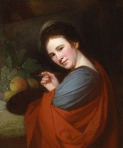
As I was just about getting fed up with seeing identical miserable portraits, I came across a portrait of Mary Moser by George Romney in 1770
.
(Taken from the National Portrait Gallery)
Mary was an English painter and one of the most celebrated women artists. Very popular in the 18h century, Mary was known for her depictions of flowers and had been recognized as an artist since the young age of 14. I was thrilled to see a woman who was an individual and tapped into her own talent to make a living, instead of sitting upon hereditary wealth. Romney did an excellent job in captivating Mary doing what she loved while expressing the happy look upon her face. So in the end, I didn’t walk out of the National Portrait Gallery completely disappointed as I envisioned.
Tags: 2010 Melissa · Uncategorized
When I visited the National Portrait Gallery the other day, I was pretty bored by the Tudor and Stuart portraits. If only we had portraiture of the ‘true lives’ of those figures rather than just stuffy, formulaic paintings. However, I was much happier when I finally got to the meat of the museum and started to see some literary and philosophical heavy hitters pictured. When we went on our Bloomsbury walk, I enjoyed hearing about the lives of the many interesting people who’ve lived here. It was neat to go one layer deeper at the Portrait gallery and see some portrayals of the society we’d heard about. In particular, I found a painting by Augustus John of Lady Ottoline Morrell. (Exhibit A):

#mce_temp_url#
The caption informed me that Lady Morrell was a socialite who entertained the likes of Aldous Huxley at her home in Bloomsbury. I was initially attracted to the photograph for its unattractiveness. Ms. Morrell seems to have some serious defect of the mouth in this portrait. A search of the NPG’s collections reveals two facts about Ms. Morrell’s likeness. First, the portrait I saw hanging in the gallery was accepted in lieu of taxes by Her Majesty’s government in 1990 and subsequently given to the gallery. Second, the Augustus John portrait is one of several hundred portraits of Lady Morrell which the museum holds (I got to page 6 of 60 of portraits before I stopped looking). None of the other portraits seemed to show the same deformed mouth as this one. And this, the one portrait with the markedly unattractive feature was the painting chosen for inclusion in the gallery. Curious.
I next came to a portrait of Aldous Huxley which showed him as a young man. Beneath the painting was a caption which informed me that Huxley had written the collection of essays, The Doors of Perception, while on mescaline. Fun fact there. Here’s the portrait of Huxley…. (Exhibit B):

#mce_temp_url#
All of this made me wish I could have been hanging around Bloomsbury during the days of Woolf, Huxley, and Morrell. Of course, they probably wouldn’t have let me in….
Tags: 2010 Daniel · Museums
September 6th, 2010 · 1 Comment
John Elliot Burns, whose portrait was painted by John Collier, was a labor leader in the late 19th and early 20th century. He was also the first member of the working class to be elected to a cabinet.

photo courtesy of NPG website
In the piece, Burns has his hands on his hips and a somewhat contemplative yet subtly stern expression. To me, the hands-on-hips symbolizes his discontentment with the conditions for the working class of London, those whom he led as a labor leader. This is a classic position of humans to show malaise. The angle of his head and raised eyebrows seem to suggest a bit of a “what of it” attitude. To some degree, these features balance his bodily position. If he were to have a furrowed brow and straightened head, he may appear too antagonistic to those he was trying to persuade (members of parliament, etc.). The profound facial features reinforce his strength of character, with defined cheek bones and dark eyes, beard, hair, and eyebrows. His beard also makes him look older and more experienced in life.
Lastly, the relatively simple suit, shirt, and tie combination shows that he is not a man of superfluous extravagance. This simple attire reflects the plain dark brown background. As opposed to many of the other portraits in the galleries, where many posed in front of extravagant rooms, by the lake, or the countryside. Burns was not one for such extravagance, or at least he was not portrayed in this portrait as such. This again helps reinforce the idea that he was a man working for increased rights for laborers, a man of the people.
Overall, I think this is a great portrait that casts Burns as a strong man working for workers’ and laborers’ rights.
As to who was and was not in the gallery, as everyone else has concluded: it is primarily rich white people. To me, this makes quite a bit of sense. For the vast majority of British history, older affluent white people have been in power, subjugating the rest of everyone else. I find it highly unlikely that any of these aforementioned people thought “wow, I should really get a portrait painted of my lowly dockworkers, that would be a great piece for that national portrait gallery one day.” In no way do I endorse the absence of a wider variety of people. Though getting later into British history, i.e. after the mid 19th century when there has been less rampant subjugation, yes, there should have been more portraits included of other races/economic classes.
However I’m not quite sure who to blame for this. I believe (I may be wrong) that the vast majority of the portraits were done privately and then donated to the museum. These portraits are probably quite expensive to have painted, and thus most could not afford them for quite some time. Perhaps certain groups of people simply choose not to have their portraits done, even if it has become lately feasible for them. I feel like portraiture has certainly become less popular over the past century, which may explain the absence of the groups of people who have lately gained rights/power/money/etc. recently. Though I find it unlikely, another possible explanation is that perhaps the curators have many portraits featuring minorities and simply choose not to display them. I certainly hope that is not the case.
Tags: 2010 ChristopherB
As a college student in this day and age, the 21st century, certain aspects or principles of life tend to be on my mind like every other student in America. Specifically I ponder whether my future career will have worldly riches at the forefront or intellect and the communities well being. As my young mind tries to figure this out I was caught off guard in the National Portrait Gallery, in the section of the museum that is labeled “The Tudor Dynasty”. As this title suggests the majority of these portraits were of Kings and Queens and nobility ranging from King Edward II to King Edward VIII. However, among all these nobles and riches sat a man by the name of Sir Thomas Chaloner.
Sir Thomas Chaloner, unlike any of the other Tudors in that room, was not born into greatness but instead earned it, through sheer determination and the use of an insightful mind. He was a statesman, one of the first England ever saw. He served under four different Tudors, was knighted after participating in the war against the Scots in 1547; he is best remembered as the first English translator of Praise of Folly. Besides having such an amazing and extensive resume, what caught my attention was what I saw within his portrait. Just as I ponder about what my life will say about me, so did Sir Thomas Chaloner ponder the same question five centuries ago. However, he was able to find an answer. His portrait depicts him in a frontal view with a very unwelcoming facial expression. In his hand he has a scale; on one side there is gold and the riches of the world on the other lies a stack of blazing books that outweigh the “transitory nature of earthly treasures.” Above him is a Latin inscription that refers to the Assyrian King Sardanapulus’ realization on material riches, “they fade black and begrimed with soot as though gold were nothing else but smoke…” ( You may find more information on the portrait at http://www.npg.org.uk/collections/search/portrait/mw01174/Sir-Thomas-Chaloner?search=ss&firstRun=true&sText=Sir+Thomas+Chaloner+&LinkID=mp00823&role=sit&rNo

Although I know Sir Thomas Chaloner, like the majority of humans, had many faults I commend him for devoting the intelligence he did gather for the improvement of society. I only wish to take the privileges I have received so far and will receive in the future to improve our 21st century society in one way or another; whether it be helping a child understand their homework , or having an active part in legislation. Only time will tell if I achieve this, in the meantime I will keep searching for my own answer.
Tags: 2010 Jamie
I tried to make a list of the different representation that I saw in the National Portrait Gallery, but it pretty quickly devolved into the terrifying-pasty-rich-people-with-deformed-hands section and then insane-facial-expression-with-no-explanation section. I assumed coming in that the paintings in the older section would all be rich white people, so I wasn’t actually as upset about the lack of diversity as I normally would have been. (I actually read on the plaque next to Elizabeth that while paleness was in fashion for some of the period, other pale skinned depictions could be attributed to the fact that the red paint used to color cheeks fades over time. This doesn’t really explain why there are no other races represented, but it does explain why everyone looked like they were characters in a Tim Burton film).
Most of the paintings I took an interest in were monarchs, artists’ self-portraits, or famous historical figures. The modern section was a lot more exciting to me because I could actually tell some of the faces apart. I especially liked Maggi Hambling’s self-portrait (the woman with three arms) and the sculpture of Richard Rogers by Paolozzi (the head with bolts going through it and a deformed eye) because I think weirdness naturally lends itself to art. I tried to spend more time in the old-rich-white-people section, though, because I don’t think I’ve ever really given them enough credit. They all have the same hair and creepy elongated claw fingers, but their facial expressions, gestures, and other objects that appeared in the picture were a lot more telling than the austere impressive gentleman paintings that I usually see in textbooks I gravitated toward the paintings of the women, and it seemed like behind their organ cruncher outfits, they had a sense of humor that went over the heads of other people in the paintings. The portrait of Selina Hastings depicts her holding her temple like she has a giant migraine and pursing her lips in such a way that she might be contemplative, or she might be about to roll her eyes.
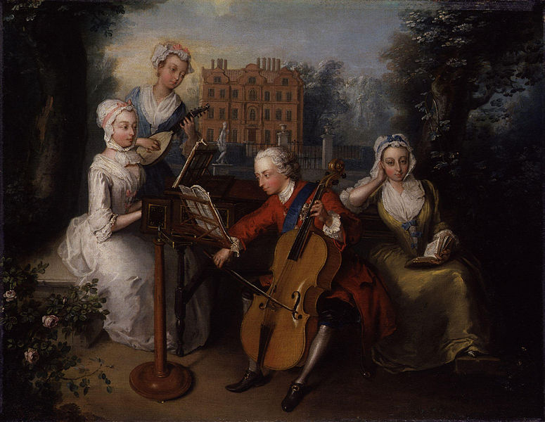
The painting I finally chose was another example of what I felt was an understated bond between exasperated women. Frederick Prince of Wales and his Sisters by Philip Mercier (1733) depicts Prince Frederick playing his cello accompanied by two sisters playing piano and mandora and the other reading Milton.
(from wikimedia.org)
Frederick is wearing red so the viewer’s eye goes to him immediately. He’s really engrossed in the music, leaning forward and wide-eyed. Anne and Caroline (the two sisters playing instruments) both look mellow enough, but upon closer inspection a little bored. Amelia (on the right) is my favorite. She’s the only one that looks right at the viewer, leaning her face in her hand like a 9th grader during a biology lecture and she looks completely exasperated. Frederick has no clue.
I know I’m romanticizing it a bit, but everyone either romanticizes art or deconstructs it until it’s ugly. So I’m going to romanticize it. The women in many of the paintings I saw, especially this one, are posed in such a way that no one can accuse them of anything, but they are mocking society. They look just serious enough that the eye rolling is overlooked by anyone that isn’t in on the joke. It’s a subtle art that seems to appear in groups with less power of being able to say something without ever saying anything. That’s why I wasn’t irritated that there was really no diversity represented in this time period. I think some of the subjects of the paintings know it (yes, I know I’m stretching it a lot, but these exasperated women really were all over gallery). Art enthusiast everywhere speculate about Mona Lisa’s secret chalking it up to a love affair or contemplation about the universe, but I think it’s the recognition that someone is full of it.
Tags: 2010 Jesse
The National Portrait Gallery. Who’s in it? Who’s not? Not to beat a dead horse about the “elitism” that other people have mentioned, but much of what has been said is factually true. Most of the portraits are of rich white men and women: royalty, statesmen, authors, artists etc. The cultures of the melting pot that London is today are conspicuously missing. However, I am not sure that “elitist” is the right word to describe the museum. I don’t think the museum itself is “elitist.”
First, the National Portrait Gallery is primarily an art museum, and secondarily a history museum. Much of the text on the signs focused on the artist, the painting techniques, and the treatment of the painting to preserve it. This type of text was accompanied by a short biography of the subject of the painting. The museum is not necessarily obligated to present a comprehensive picture of the history of immigration or the changing makeup of London neighborhoods and the other topics we have focused on so far. I think it falls into an entirely different category from other museums such as the Museum of London and the British Museum. Even so, I would argue that the NPG does teach us something about British culture and history precisely because of the lack of portraits of non-white lower class people. We need to remember that lower class British citizens could not afford to have portraits painted of themselves. Secondly, British citizen regarded their slaves as objects, not people, and regarded the people of the countries they imperialized as distinctly inferior to them. It would have occurred to no one to depict these people in a portrait, and the people with the money would not have paid for it. Historians and artists throughout history have only become interested in and recognized the importance these communities only in hindsight. It is the same story in the US concerning our own slaves and Native Americans. The National Portrait Gallery shows us this, and is a sort of indirectly and unfortunately accurate depiction of British history and the history of immigrant populations.
It is true that unlike the Docklands Museum and the Museum of London, the National Portrait Gallery is not apologetic about the absence of minorities. I say “absence” here and not “omission” or a synonym because the lack of diversity in the portraits is more due to a lack of resources than elitism – a word that I feel implies purposefulness. However, the Docklands Museum and the Museum of London are more diverse museums in general, with pieces like pottery, tools, furniture, clothing, human remains etc… to tell their story, while the NPG’s goal is to portray history and culture specifically through portraiture.
All this being said now, I was most interested in how the NPG demonstrates how painting techniques have changed and developed throughout history and I feel like I learned a lot about this topic I previously knew little about. As I looked through the Tudor portraits, I began to feel like the faces were rather interchangeable. The women’s faces were not particularly feminine and the men’s faces were not particularly masculine. There was little variation in face shape and feature shape, and it seems as though what distinguished one portrait from another was the clothing or the hair. It was as if there was a generic face template that every Tudor artist knew. When I got to the set of portraits of Elizabeth I, I found that I was right. There were certain portrait “formulas” that allowed artists to copy portraits and to create portraits without the live model. As I moved through the galleries to the Victorian Age and beyond, I began to notice more individuality in the faces, and if there were two portraits and a bust of a certain subject, all three indeed looked like the same person. I found I was able to recognize certain figures I knew without looking at the signage, including Jonathan Swift, Alexander Pope, Virginia Woolf and Vanessa Bell. (Ok so I mixed up Virginia Woolf and Vanessa Bell, but to be fair, they are sisters, and look rather alike.)
I think a particularly interesting painting in the NPG was a portrait of Elizabeth I. An X-ray of this painting showed that it had been painted on a reused canvas; painted over an unfinished portrait of an unknown woman. The unknown woman is facing in the opposite direction from Elizabeth and is painted on a completely different position on the canvas. I think what drew me to this painting was the mysterious aspect of it – almost a second painting that was hidden until revealed by modern technology.
Although I was sort of weirded out by some of the more modern portraits (particularly the silicone and glass skull filled with the artists own blood) I enjoyed my visit today, and feel as though it was both useful and informative.
Tags: 2010 Kaitlin
September 3rd, 2010 · 2 Comments
Since so many people have already written about the elitist tendencies of the National Portrait Gallery’s collection, I won’t spend any more time on that aspect. What I found interesting was the change in what types of figures were included throughout the years covered in the collection. In the Tudor rooms, only members of the royal family or other important government/magisterial figures were displayed (several of whom seemed to be Elizabeth’s “favorites…”). By the time of the Restoration, more portraits of social or artistic figures were included, and by the time of the Romantics, there were more portraits of philosophers, artists, writers, poets, social activists, etc… than there were of strictly governmental figures. The best explanation that I can come up with for this is the (late) arrival of the Renaissance in Britain during the Tudor reign, which gave rise to popularity for artists, playwrights (cough, Shakespeare, cough), and the like. This movement into non-political realms then continued with the Enlightenment and the growth of both the middle class and leisure time, so people were able to focus more on literature, philosophy, and science.
I really enjoyed the Gallery (except for maybe the twentieth-century room, and the self-portrait done in blood. Weird.), but I feel as though the collection was a very safe one. Almost every portrait seemed to be of someone who has had a positive effect on Britain’s image. There were no portraits (or very few) of political dissidents or very radical thinkers, nor were there any images of people who weren’t perfectly coifed and dressed. This may be due in part to the availability of portraits; I have no idea what sort of resources the museum has been able to draw on. I do think, however, that the collection could acknowledge that Britain’s history involves some ugliness (beyond some of the fashions in the paintings).
I focused on the portrait of Jane Austen, done by her sister, Cassandra because a) she’s my favorite author and b) it’s a very awkward portrait. I mean, it’s the only known image of Austen that was done from life, and she looks seriously pissed off.  (Image from National Portrait Gallery, http://www.npg.org.uk/collections/search/largerimage.php?sText=Austen&search=ss&OConly=true&firstRun=true&LinkID=mp00179&role=sit&rNo=1)
Austen is turned away from her sister and her arms are crossed, which makes her seem very closed, as if she did not want to sit for her portrait. Since Cassandra never finished the sketch, this may have been the case. Her lips are pursed and her nose seems slightly wrinkled, giving her a definite look of annoyance. Friends and family remarked that hte portrait captured a little bit of Jane, but that Cassandra had more or less missed the boat as far as a real likeness goes. I think that this was probably because drawing was considered a proper and genteel activity for women during the Regency Period, and Cassandra may have just been practicing on her sister.
This portait is especially interesting to me after the time that I spent at the Jane Austen Centre yesterday. In the museum, there was another portrait of Austen, done by a modern artist, Melissa Dring.  Dring took Cassandra’s portrait and descriptions of Austen from the written accounts of people who knew her in order to come up with this new image. I think that her eyes are twinkling a bit too much here, but at least she doesn’t look so ticked off.
Tags: 2010 Holly · Museums
