I tried to make a list of the different representation that I saw in the National Portrait Gallery, but it pretty quickly devolved into the terrifying-pasty-rich-people-with-deformed-hands section and then insane-facial-expression-with-no-explanation section. I assumed coming in that the paintings in the older section would all be rich white people, so I wasn’t actually as upset about the lack of diversity as I normally would have been. (I actually read on the plaque next to Elizabeth that while paleness was in fashion for some of the period, other pale skinned depictions could be attributed to the fact that the red paint used to color cheeks fades over time. This doesn’t really explain why there are no other races represented, but it does explain why everyone looked like they were characters in a Tim Burton film).
Most of the paintings I took an interest in were monarchs, artists’ self-portraits, or famous historical figures. The modern section was a lot more exciting to me because I could actually tell some of the faces apart. I especially liked Maggi Hambling’s self-portrait (the woman with three arms) and the sculpture of Richard Rogers by Paolozzi (the head with bolts going through it and a deformed eye) because I think weirdness naturally lends itself to art. I tried to spend more time in the old-rich-white-people section, though, because I don’t think I’ve ever really given them enough credit. They all have the same hair and creepy elongated claw fingers, but their facial expressions, gestures, and other objects that appeared in the picture were a lot more telling than the austere impressive gentleman paintings that I usually see in textbooks I gravitated toward the paintings of the women, and it seemed like behind their organ cruncher outfits, they had a sense of humor that went over the heads of other people in the paintings. The portrait of Selina Hastings depicts her holding her temple like she has a giant migraine and pursing her lips in such a way that she might be contemplative, or she might be about to roll her eyes.
The painting I finally chose was another example of what I felt was an understated bond between exasperated women. Frederick Prince of Wales and his Sisters by Philip Mercier (1733) depicts Prince Frederick playing his cello accompanied by two sisters playing piano and mandora and the other reading Milton.
(from wikimedia.org)
Frederick is wearing red so the viewer’s eye goes to him immediately. He’s really engrossed in the music, leaning forward and wide-eyed. Anne and Caroline (the two sisters playing instruments) both look mellow enough, but upon closer inspection a little bored. Amelia (on the right) is my favorite. She’s the only one that looks right at the viewer, leaning her face in her hand like a 9th grader during a biology lecture and she looks completely exasperated. Frederick has no clue.
I know I’m romanticizing it a bit, but everyone either romanticizes art or deconstructs it until it’s ugly. So I’m going to romanticize it. The women in many of the paintings I saw, especially this one, are posed in such a way that no one can accuse them of anything, but they are mocking society. They look just serious enough that the eye rolling is overlooked by anyone that isn’t in on the joke. It’s a subtle art that seems to appear in groups with less power of being able to say something without ever saying anything. That’s why I wasn’t irritated that there was really no diversity represented in this time period. I think some of the subjects of the paintings know it (yes, I know I’m stretching it a lot, but these exasperated women really were all over gallery). Art enthusiast everywhere speculate about Mona Lisa’s secret chalking it up to a love affair or contemplation about the universe, but I think it’s the recognition that someone is full of it.
Tags: 2010 Jesse
September 3rd, 2010 · 1 Comment
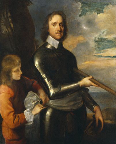
Today, we visited the National Portrait Gallery, which should be called the Rich White Male Portrait Gallery. Generally all of the paintings were of white guys well into the Gallery’s 20th Century portions, with the exception of any female monarch. Starting in the 1950’s or so, there were a few more token minorities and/or females throughout the remaining small portion of the museum. In my opinion, this lack of diversity is completely unacceptable for a vastly multicultural city like London. While wandering around the illogically designed museum (during which I frequently was forced to cross over my own path just to see the paintings in chronological order), I came across several paintings that caught my eye. The most notable of these is a portrait of Oliver Cromwell that was painted by Robert Walker circa 1649. As a political science major, I was drawn to this painting not so much for its artistic value (though it is a nice-looking painting) as for its sitter’s political accomplishments.

http://www.npg.org.uk/collections/search/portrait/mw01594/Oliver-Cromwell?search=ss&firstRun=true&sText=cromwell&LinkID=mp01116&role=sit&rNo=0
Cromwell is best known for serving as Lord Protector after the dissolution of the Monarchy at the end of the English Civil War. Fighting for the Parliamentary forces, he played a large part in Britain becoming a republic as opposed to the monarchic structure it had used for hundreds of years. This period of British history motivated several of the greatest philosophers of all time to venture into the world of politics, meanwhile formulating the basic ideas that have influenced every democratic government since. The likes of Thomas Hobbes and John Locke (both featured with Cromwell in the National Portrait Gallery), released these ideas in Leviathan and The Treatises of Government, respectively. Though they are often thought of as very similar, Hobbes and Locke were on opposite sides of the Monarchy (Hobbes) v. Parliament (Locke) war. Their ideas on the legitimacy of government (mostly related to the idea of social contract theory) serve as the cornerstone to the American system of government, which has in turn served as a template for governments all over the world. It’s clear that the victory by Parliamentary forces, led by Mr. Cromwell, in the English Civil War set the stage for one of the largest global political changes in the world’s history, which is why both the period and the man are so interesting to me.
Tags: 2010 MatthewM
The National Portrait Gallery. Who’s in it? Who’s not? Not to beat a dead horse about the “elitism” that other people have mentioned, but much of what has been said is factually true. Most of the portraits are of rich white men and women: royalty, statesmen, authors, artists etc. The cultures of the melting pot that London is today are conspicuously missing. However, I am not sure that “elitist” is the right word to describe the museum. I don’t think the museum itself is “elitist.”
First, the National Portrait Gallery is primarily an art museum, and secondarily a history museum. Much of the text on the signs focused on the artist, the painting techniques, and the treatment of the painting to preserve it. This type of text was accompanied by a short biography of the subject of the painting. The museum is not necessarily obligated to present a comprehensive picture of the history of immigration or the changing makeup of London neighborhoods and the other topics we have focused on so far. I think it falls into an entirely different category from other museums such as the Museum of London and the British Museum. Even so, I would argue that the NPG does teach us something about British culture and history precisely because of the lack of portraits of non-white lower class people. We need to remember that lower class British citizens could not afford to have portraits painted of themselves. Secondly, British citizen regarded their slaves as objects, not people, and regarded the people of the countries they imperialized as distinctly inferior to them. It would have occurred to no one to depict these people in a portrait, and the people with the money would not have paid for it. Historians and artists throughout history have only become interested in and recognized the importance these communities only in hindsight. It is the same story in the US concerning our own slaves and Native Americans. The National Portrait Gallery shows us this, and is a sort of indirectly and unfortunately accurate depiction of British history and the history of immigrant populations.
It is true that unlike the Docklands Museum and the Museum of London, the National Portrait Gallery is not apologetic about the absence of minorities. I say “absence” here and not “omission” or a synonym because the lack of diversity in the portraits is more due to a lack of resources than elitism – a word that I feel implies purposefulness. However, the Docklands Museum and the Museum of London are more diverse museums in general, with pieces like pottery, tools, furniture, clothing, human remains etc… to tell their story, while the NPG’s goal is to portray history and culture specifically through portraiture.
All this being said now, I was most interested in how the NPG demonstrates how painting techniques have changed and developed throughout history and I feel like I learned a lot about this topic I previously knew little about. As I looked through the Tudor portraits, I began to feel like the faces were rather interchangeable. The women’s faces were not particularly feminine and the men’s faces were not particularly masculine. There was little variation in face shape and feature shape, and it seems as though what distinguished one portrait from another was the clothing or the hair. It was as if there was a generic face template that every Tudor artist knew. When I got to the set of portraits of Elizabeth I, I found that I was right. There were certain portrait “formulas” that allowed artists to copy portraits and to create portraits without the live model. As I moved through the galleries to the Victorian Age and beyond, I began to notice more individuality in the faces, and if there were two portraits and a bust of a certain subject, all three indeed looked like the same person. I found I was able to recognize certain figures I knew without looking at the signage, including Jonathan Swift, Alexander Pope, Virginia Woolf and Vanessa Bell. (Ok so I mixed up Virginia Woolf and Vanessa Bell, but to be fair, they are sisters, and look rather alike.)
I think a particularly interesting painting in the NPG was a portrait of Elizabeth I. An X-ray of this painting showed that it had been painted on a reused canvas; painted over an unfinished portrait of an unknown woman. The unknown woman is facing in the opposite direction from Elizabeth and is painted on a completely different position on the canvas. I think what drew me to this painting was the mysterious aspect of it – almost a second painting that was hidden until revealed by modern technology.
Although I was sort of weirded out by some of the more modern portraits (particularly the silicone and glass skull filled with the artists own blood) I enjoyed my visit today, and feel as though it was both useful and informative.
Tags: 2010 Kaitlin
September 3rd, 2010 · 2 Comments
Reading Fox before I came to England has definitely helped me a lot, not only because it prepared me for the behaviors and quirks of the English, and probably diffused some of the culture shock, but also because it has helped me to notice things that I might not otherwise have noticed and to think about these things critically when otherwise I might not have know what to do or to think. During our first week in London, I have made a few observations about English culture and habits that were not specifically covered in Fox, but I have used Fox to help me think about these observations. Here are a few:
Bathrooms/toilets/loos: In America, bathroom stall doors and walls are constructed with the least amount of material possible, with a lock that might be a hook through a loop, or a latch in a slot. People check underneath the doors to see if the stall is occupied or gently poke the door, not without the danger of disengaging the flimsy lock. In England, there are floor to ceiling doors with legitimate deadbolts. In addition, the part of the lock on the outside of the door will show red when occupied, just so no one even tries to test the door of your occupied stall. Not that you could look under the doors if you tried. I probably would not have taken this much notice of the difference between the two countries I have now “lived in” had I not been thoroughly aware of the English obsession with and need for privacy through Fox. However, I like this aspect of the English obsession with privacy. Unlike some of the other privacy related quirks, such as not asking someone’s name upon meeting them, this one actually seems adaptive.
On the tube: Although the English are obsessed with privacy, they do not share American qualms about sitting next to strangers. If we were on a train in America, and the only seat open was next to a stranger, we would rather stand. In England, people go for any available tube seat. Do they acknowledge that they have a neighbor or make any attempt to talk to them? No, but I have caught our group standing for a whole train ride unless there are seats where we can all sit next to each other. We Americans have apparently not perfected Fox’s “denial rule” of pretending that we are alone, even in public.
Do not rush eating in England unless you are getting take-away: During our lunch break during class at the UEA London Centre, some of the group (perhaps foolishly, in denial about how much time we actually had) decided to go to a pub. We all ordered sandwiches. They were good, but we did not get our food until we only had like 10 minutes to eat before getting back to class. We scarfed it as fast as we could (this felt rude), some of the group took their sandwiches in napkins back to the classroom (this also felt rude), and some of us left the remainder of our lunches on our plates (this also felt rude). When people do get take away for lunch, they are always in a hurry. You can see people power walking through the tube stations with briefcases and sandwiches from Pret a Manger. Clearly the English have specific rules for the settings and circumstances in which you can hurry and not hurry your eating, and we are learning the rules as we go. At most take away places, it even costs less to take away then to eat in. I wasn’t quite sure how to interact with the English pub staff – to apologize for rushing. They didn’t say much other than “Oh well you seem to be in a hurry” but we know from Fox that they never would have told us if we were being rude. I suspect they may have tut-tutted among themselves after we had left.
Well I’ll keep this relatively short for now. I’m sure there will be more observations such as these as our time in London goes on, and as we get used to the customs and habits and begin to become part of them ourselves, I wonder if we’ll start to read Fox in a different way.
Tags: 2010 Kaitlin
September 3rd, 2010 · 2 Comments
Since so many people have already written about the elitist tendencies of the National Portrait Gallery’s collection, I won’t spend any more time on that aspect. What I found interesting was the change in what types of figures were included throughout the years covered in the collection. In the Tudor rooms, only members of the royal family or other important government/magisterial figures were displayed (several of whom seemed to be Elizabeth’s “favorites…”). By the time of the Restoration, more portraits of social or artistic figures were included, and by the time of the Romantics, there were more portraits of philosophers, artists, writers, poets, social activists, etc… than there were of strictly governmental figures. The best explanation that I can come up with for this is the (late) arrival of the Renaissance in Britain during the Tudor reign, which gave rise to popularity for artists, playwrights (cough, Shakespeare, cough), and the like. This movement into non-political realms then continued with the Enlightenment and the growth of both the middle class and leisure time, so people were able to focus more on literature, philosophy, and science.
I really enjoyed the Gallery (except for maybe the twentieth-century room, and the self-portrait done in blood. Weird.), but I feel as though the collection was a very safe one. Almost every portrait seemed to be of someone who has had a positive effect on Britain’s image. There were no portraits (or very few) of political dissidents or very radical thinkers, nor were there any images of people who weren’t perfectly coifed and dressed. This may be due in part to the availability of portraits; I have no idea what sort of resources the museum has been able to draw on. I do think, however, that the collection could acknowledge that Britain’s history involves some ugliness (beyond some of the fashions in the paintings).
I focused on the portrait of Jane Austen, done by her sister, Cassandra because a) she’s my favorite author and b) it’s a very awkward portrait. I mean, it’s the only known image of Austen that was done from life, and she looks seriously pissed off.  (Image from National Portrait Gallery, http://www.npg.org.uk/collections/search/largerimage.php?sText=Austen&search=ss&OConly=true&firstRun=true&LinkID=mp00179&role=sit&rNo=1)
Austen is turned away from her sister and her arms are crossed, which makes her seem very closed, as if she did not want to sit for her portrait. Since Cassandra never finished the sketch, this may have been the case. Her lips are pursed and her nose seems slightly wrinkled, giving her a definite look of annoyance. Friends and family remarked that hte portrait captured a little bit of Jane, but that Cassandra had more or less missed the boat as far as a real likeness goes. I think that this was probably because drawing was considered a proper and genteel activity for women during the Regency Period, and Cassandra may have just been practicing on her sister.
This portait is especially interesting to me after the time that I spent at the Jane Austen Centre yesterday. In the museum, there was another portrait of Austen, done by a modern artist, Melissa Dring.  Dring took Cassandra’s portrait and descriptions of Austen from the written accounts of people who knew her in order to come up with this new image. I think that her eyes are twinkling a bit too much here, but at least she doesn’t look so ticked off.
Tags: 2010 Holly · Museums
September 3rd, 2010 · 1 Comment
Our trip to the National Portrait Museum was a fantastic experience, giving an eye opening look into famous icons in England dating back all the way to the 17th century. However, that was all it gave, was a look into the faces of rich families and celebrities in England. The museum itself began with elegant portraits of royal British families such as the Tudors and the Stuarts. Fancy galleries seperated by large arched doorways provided the backdrop for all these paintings of wealth. By the time one arrived at the section concerning 19th and 20th century portraits, the portraits of royal family members dropped slightly in numbers and the paintings became a bit more abstract. However, never did they shy away from only portraying the celebrity aspect of all these people. Needless to say, the common man did not receive a portrait. I would have liked to see at least one portrait that portrayed an everyday Londoner, but one can assume that just wouldn’t happen; either because the portrait costs a large amount of money to have done for you, or the artist did not find the common man interesting enough.
Amidst all the glory and wealth illustrated in the earlier portraits in the gallery, one practically leaped off the canvas at me for a different reason.
This portrait, amongst all the glorified, epic depictions of wealth and royalty, shows Paine in a very distorted and dark look, rather than the clean and pristine style of most royal portraits. It is inserted right smack in the middle of the 18th century portraits of Revolutionaries and Royalty. The portrait lacks definition in its lines and Paine’s body almost seems to seep into the background in an odd blend of himself and the darkness around him. In addition, the painting also seems to have a somewhat forboding feeling about it, which differed from nearly every painting surrounding it, where the environment was a large royal hall or a fancy room with the subject seated in a comfy chair. This portrait inserts Paine amongst the darkness, the unknown, something that makes you uncomfortable but fascinated at the same time. A great portrait amongst a great gallery. Cheers.
Tags: 2010 Benjamin
September 3rd, 2010 · 2 Comments
Before visiting the National Portrait Gallery today, I predicted that while much of the museum would feature only the white rich and famous, the contemporary collection at least would attempt to capture the multi-ethnic character of England. In that regard I was disappointed. In terms of subject matter, the museum evolved very little throughout.
As I finished the final gallery, I gradually realized that this particular museum does not portray (and does not intend to portray) the faces of England as a whole. In fact, The “About Us,” section of the National Portrait Gallery’s website explains that the museum’s goal is to, “promote through the medium of portraits the appreciation and understanding of the men and women who have made and are making British history and culture.” This does not mean the day to day making of history and culture, accomplished by the people who make up its population. Its purpose is first and foremost to portray the individuals who have made it into the history book, and unfortunately, that group remains fairly homogeneous.
However, the Portrait Gallery does show change through the years in the art of portraiture. Throughout most of the museum, any given time period has a corresponding style. Clues are in the crafting of every detail, down to the folds in the fabric of the sitters’ clothing: for example, in any painting in the Tudor section, the fabric tends to look particularly stiff. Many of these paintings can be easily assigned to a time period, but much less easily to a particular artist. Since the main goal of portraiture for many years was to portray the sitter in a flattering, distinguished, and fashionable light, creativity was low in priority.
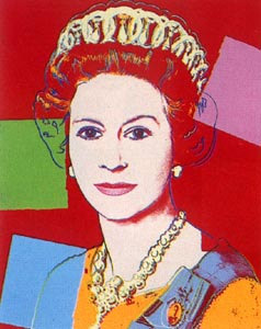
http://www.google.co.uk/imgres?imgurl=http://www.warholprints.com/images/artwork/full/FS-II.334.jpg&imgrefurl=http://www.warholprints.com/portfolio/Reigning.Queens.html&h=300&w=238&sz=26&tbnid=SmjYKTlKUTL7OM:&tbnh=116&tbnw=92&prev=/images%3Fq%3Dandy%2Bwarhol,%2Bqueen%2Belizabeth&zoom=1&q=andy+warhol,+queen+elizabeth&usg=__MGSvsIOwgTvT2lRepyT6Wz-eJDo=&sa=X&ei=ZnSBTOSfN8K84gb637XTCw&ved=0CB0Q9QEwAQ
The newest paintings depart from this long tradition of conformity. One room contains numerous paintings of nearly photographic quality, among a few actual photographs of members of the current royal family. These look in a sense tradition to an extreme, since they so closely achieve the old goal of capturing exact but flattering likenesses of the subjects. However, the room around the corner features three Andy Warhol prints of Queen Elizabeth II, in which features are simplified in bright colors. In these, the queen is a pop culture icon first and foremost. Some of the recent paintings were so thick with paint or otherwise distorted, that painting style itself was more prominent than the famous individual’s features.
Probably not coincidentally, the contemporary section contained many more self portraits by artists. With creativity as a main focus of portraiture today, the artists themselves are ready subjects for their own experimentation.

Tags: 2010 Emily · Uncategorized
September 3rd, 2010 · 5 Comments
As someone who wants to work at a museum, I enjoy different ones (even on a day where I visit four) and seeing how they formulate their exhibitions and present their collection. I also enjoy seeing how children interact with museums, as I want to combine museum education with my love of medieval art. The National Portrait Gallery, however, was not the best museum I have been to thus far. In fact, the quality of the art aside, I was largely disappointed.
Going in, I expected the portraits to be largely of the elite ruling class and others who had some power, whether political, artistic, or scientific. The collection was predominantly white elites (mainly males). This is understandable, as that was who was most likely to be in a position of power through the majority of England’s history. While portraits are not as readily available of the lower classes, they do exist. The NPG seemed to overlook this fact until very recent history. (Even then, the portraits chosen to be featured in the permanent collection tended to have an element of celebrity rather than being chosen for the lesson they can teach about daily life in a given period.) After finishing the Tudor section, my interest levels were in automatic decline and the museum had very little to reverse that. Its one redeemable feature was the interactive computer stations that went past the simple didactics in the collection. Yet, even that was lacking: it was written for an average adult.
There should have been a version of the interactive stations specifically designed (and easily accessible) for children. (Supposedly there was a map for children, but I did not see any families with one. Did anyone??) The NPG is a family destination: tourists (who make up a presumably large part of the museum’s audience) do take their children there (I witnessed several families) and there needs to be something more that acknowledges this more interwoven into the permanent collections. Instead of a dad timing his son to see how long he could walk from one end of a wall-long portrait to the other, I should have witnessed a dad engaging his son with a museum map for children. (This is something that I have seen in almost every other museum on this trip, which made the issue more obvious to me. If a family chose not to use the available map, then the museum still has the responsibility to help engage a wider audience.)
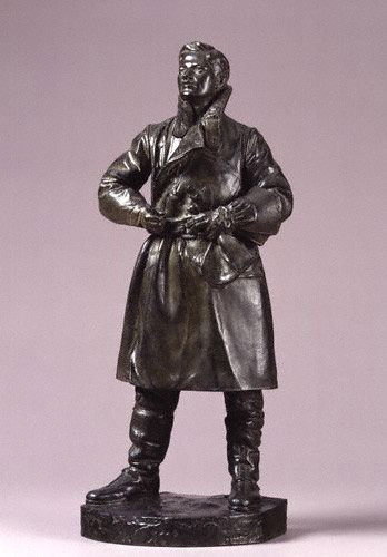
One of the few portraits that spoke (amidst the celebrity portraits) to me was a small model of a full-scale statue of Albert Ball by Henry Poole. Ball, a WWI pilot, shot down 43 enemy planes before being killed in action. At 21, he is one of the few people who appeals to a largely universal audience: English viewers for his patriotism, history buffs (WWI geeks specifically), art historians for his glimpse into war-era art, younger children of all backgrounds because of his heroic story (everyone loves a good hero, yeah?), 20-somethings who wonder if they can make a difference, and wanderers because of the persona that radiates from the work itself, capturing the power and passion of a young hero. Yet, even the portrait I liked the most stuck true to the NPG’s “requirements” for display: white and elite. (The portrait was given by Ball’s father, Sir Albert Ball). It did, however, lower the average age of the collection’s sitters by a few years… Picking a younger sitter for a comic book-esque family guide would have engaged the children. Who better than a WWI hero to be the leader? (This could easily be inserted in the visit with a small map and identifying pictures on didactic panels to let families know that a certain portrait would be more interesting for a younger audience.)
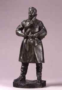
Albert Ball by Henry Poole, 1920s, http://www.npg.org.uk/collections/search/portrait.php?locid=50&page=1&rNo=6
After visiting the NPG’s education website (http://www.npg.org.uk/learning.php), I realize that there are educational activities available for families; I do want to give them some credit. However, I wish there were more in the gallery on a daily basis rather than on weekends or just for school groups.
To recap. The negatives: a lack of engaging material (even the interactive bits got boring after a short while, and specifically for the younger members of the audience) and a less than diverse “cast” of sitters. The positives: the collection itself (overall stellar artworks) and the opportunity to think up some (hopefully) creative activities that if I were the Curator of Education I would consider adopting. (Who knows? Maybe I will borrow these from myself in the future at an internship…) Oh, one other thing, what was up with the atrocious color scheme in the Regency wing? It detracted from the experience for me because there were times I noticed the wall color before the portraits, which should never happen, especially at a major national institution!
Tags: 2010 Stephenie
September 3rd, 2010 · 1 Comment
First, who’s not in the National Portrait Gallery? Minorities! Honestly, even without the prompt, it would have been a slow realization that as we walked through room after room of white faces, something was missing. There was one freed slave portrayed in the audience of an abolitionist convention, and that was about it as far as paintings of minorities at the Gallery go.
Second, and more broadly, working class people are not in there. This, to me, is less upsetting as it’s just a natural consequence of the fact that only the upper crust can afford to have portraits commissioned. Hours after visiting the Gallery, though, the lack of minorities still rankles, for one simple reason. If a black or Asian or Latino family came to visit the Gallery, and one of the children asked their parents “Why don’t any of these people look like us?” the parents would have no good answer.
____________________________________________________________________________________________
We were supposed to pick one portrait that we found particularly affecting. As a political science major who has taken British History 244, though, I could not resist going with the dueling portraits of William Ewart Gladstone and Benjamin Disraeli. Gladstone was the pillar of 19th century liberalism, while Disraeli was his counterpart on the right.
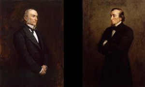
credit: youreader.com
This is exactly how the two portraits (by the same artist, Sir John Everett Millais) appear in the Gallery. In the Victorian era, the two were the titans of Parliament, serving as Prime Minister six times collectively. There is much, much more on their epic personal and political rivalry here:
http://www.bbc.co.uk/history/british/victorians/disraeli_gladstone_01.shtml
A favorite quote of mine on their lack of mutual respect, from Disraeli is “The difference between a misfortune and a calamity is this: If Gladstone fell into the Thames, it would be a misfortune. But if someone dragged him out again, that would be a calamity.”
Their respective portraits contain subtle and not so subtle bits of political imagery. First, Gladstone is facing to his left, while Disraeli is facing his right. The rest of what follows may be a bit of armchair psychology, but I believe it speaks volumes about both men.
– Gladstone has his hands folded, while Disraeli’s arms are folded in an aggressive posture. Disraeli was far more warlike as prime minister.
– Gladstone is looking towards the sky, while Disraeli’s gaze is a bit more earthward. This is in line with both men’s fundamental outlooks on life: Gladstone considered himself a great Christian moralist, while Disraeli preferred to concern himself with more earthly issues, considering Gladstone to be out of touch with the nitty-gritty of the world.
While the placing of these two portraits together obviously has an intended effect, that does not make the effect any less powerful. While standing in front of the two portraits, I felt like I could almost feel the hate flowing between these two great men, a great moment for a politics junkie like me.
Tags: 2010 Dennis · Museums
September 3rd, 2010 · 2 Comments
Personally, I had been looking forward to going to the NPG ever since we got here- some of my favourite images, absolutely iconic to my field of study are housed here. And I was not disappointed.
People have been going on and on about how the Gallery only had portraits of white, rich men but, strictly speaking, that’s not true. The number of female portraits rivalled, if not exceeded the portraits of the men, certainly not during every era, but overall. As for the other considerations, think about the cost, time and hassle it would have been to get your portrait painted- from the Tudor era to Victorian times (at least) portraits could only be afforded by the wealthy or the important, generally meaning royalty or aristocracy. As we got further on in time, there were more portraits of professionals: important scientists, artists, poets, even some Shakespearean actors! However, these people all had powerful (read: rich) friends or connections and I think a more accurate characteristic of the majority of sitters was celebrity rather than wealth. As has been previously mentioned, there was more diversity in the contemporary (1960s-present) sections of the Gallery but this may not satisfy everyone as many of these were not wholly portraits per se but photographs, sculpture, etc. The sad fact is, now that more people could actually afford painted portraits, the medium is a dying breed. Photography has taken over.
I was having an incredibly difficult time choosing one portrait, as so many of my favourites live in the NPG (indeed, my all time favourite artist Franz Xavier Winterhalter had a few for me to drool over). However, I finally settled on “The Brontë Sisters” painted by Patrick Branwell Brontë (their brother) around 1834. Here is the image’s page from the National Portrait Gallery website:
http://www.npg.org.uk/collections/search/portrait/mw00797/The-Bront-Sisters?LinkID=mp00572&role=sit&rNo=0
and the image itself:
 This is an image that I- as an English major specialising in 19th Century British Literature and a devoted admirer of Jane Eyre, my all-time favourite book- have seen countless times, but there was something completely magical about seeing it in the flesh, as it were. There are many reasons that I love this portrait: it includes Charlotte (who I practically worship), the oft-neglected Anne (whose books I really enjoy and think should be read more), and the bane of my existence Emily (I think Wuthering Heights is probably the worst love story of all time) and shows them in what was really their natural setting: their home. The siblings were very close (several other children had died before their teen years) and I think it’s very significant that the portrait was painted by the only brother, Branwell. Branwell was a very tragic figure: he drank himself to death in 1848, squabbled away his money and talent (both as an artist and a poet) and left his sisters alone to care for their ageing father. I had not really noticed the details of the portrait before: that “pillar” in the middle, which my eyes had frequently just glossed over, appears to actually be a painted-over self-portrait of Branwell. Whether he had just changed his mind about including himself in with his sisters or was simply unhappy with the result is unknown, but there is an eerie symbolism to the ghostly silhouette that remains amidst the figures of the sisters.
Two months after Branwell’s death, Emily sickened (likely with a fever resulting from a neglected cold) and died very quickly. Anne developed consumption not long after and died within six months of her sister. This left Charlotte the only surviving Bronte sibling until her own death about six years later. It is hard to view the siblings together, apparently happy- approximately 14 years before their tragedies began-and forget this sad fact.
Tags: 2010 Elizabeth