September 3rd, 2010 · 1 Comment
I can agree with Jessica that most paintings in the National Portrait Gallery are of men. I didn’t expect anything else – for most of history, or at least the history that’s been recorded, men have called the shots. But I was most drawn to the portraits of Stuart queens and princesses. For one thing, they looked more real than the Tudor portraits – I can’t imagine a real person looking anything like the portraits of Elizabeth I, for example. But I can imagine Queen Anne. She looks like I could reach out and touch her. The painting of her that I found the most compelling looks like this:
http://www.npg.org.uk/collections/search/portrait/mw08095/Queen-Anne?search=ss&firstRun=true&sText=queen+anne&LinkID=mp00111&role=sit&rNo=6

Queen Anne
I know a lot of this might have to do with fashion, but the Snow-White complexion, the sensual folds and materials of her gown, the emphasis on her… curves… even the placement of her hand all suggested to me a kind of softness, maternity, fertility. I can’t believe a monarch would allow herself to be presented in such vulnerability. She doesn’t look intimidating or powerful. She looks nurturing.
The caption below the portrait tells us that she was the younger sister of Mary, Princess of Orange, and that she experienced eighteen pregnancies without ever raising a child to adulthood. So this means that by the time this portrait was taken, in 1705, Anne had seen her father deposed and replaced by her sister. Her sister and brother-in-law had died. She had buried eighteen children. And then she had become one of the most powerful people in the world. I have to think you can see some of the grief she’s suffered on her face.
The portrait spoke to me because, I think, it made Anne someone real, someone for whom my heart can break. I generally don’t like the Tudor and Stuart era of British history because it seems like so many names and dates and Roman numerals and unnecessary bloodshed over highfalutin theological issues. But the women in this section of the museum brought it alive for me. Look at the resemblance between Mary of Modena, the queen of James II, and Mary of Orange, her daughter:
http://www.npg.org.uk/collections/search/portrait/mw04280/Mary-of-Modena?search=ss&firstRun=true&sText=mary+of+modena&LinkID=mp02997&role=sit&rNo=0

Mary of Modena

Queen Mary II
http://www.npg.org.uk/collections/search/portrait/mw08755/Queen-Mary-II?search=ss&firstRun=true&sText=queen+mary&LinkID=mp02998&role=sit&rNo=0
Different painters, different decades, and they could be twins. I wonder how Mom felt about Mary and her husband replacing James. If it weren’t for the obvious likeness in the portraits, I might never even have asked myself that question. I mean, most moms would be upset if their daughters forgot a birthday. The paintings of men in the gallery, were, for some reason, less evocative for me. I didn’t wonder how James felt about Mary’s role in the Glorious Revolution. Call me sexist, but this was my favorite part of the museum.
Tags: 2010 MaryKate · Museums
September 3rd, 2010 · 2 Comments
Beginning my tour of the National Portrait Gallery in the room of Tudor paintings, I immediately noted the types of people included in the gallery’s selection of portraits: British royalty and aristocrats. As I wove my way in and out of the various rooms and hidden side rooms, I continued to notice a broader representation of the English classes. This included notable figures of military, political, and scientific importance, as well as remarkable social reformers, explorers, poets and writers, painters and sculptors, composers and musicians, and actors. Some scenes of war and exploration–or imperialism, if you prefer to describe it as such–were additionally included in the gallery. I therefore came to the conclusion that clearly, the National Portrait Gallery really wasn’t a proper representation of all English people. There were no people of lower classes–those without distinctive historical achievements.
It wasn’t until the last galleries I explored, the contemporary portraits and portrait finalists, that I noticed another distinctive exclusion: portraits of non-white English people. I unfortunately didn’t keep an exact count of the portraits depicting any English immigrants, but they most certainly were a minority. I found this ironic, as the National Portrait Gallery cannot accurately be called “national” when countless English people are excluded from the paintings–everyday people and immigrants of other ethnic backgrounds.

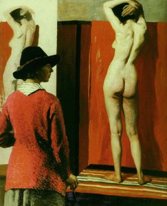
The National Portrait Gallery does not share this image on its website, so I found it here.
The portrait I chose in the National Portrait Gallery is “Self with Nude,” painted by Dame Laura Knight in 1913. This painting, illustrated above, is of a woman, the artist Laura Knight, painting a portrait of a nude female model. I found it striking as it was displayed in a large alcove, and its provocative nature most definitely caught my eye as it hung amongst other smaller, less distinctive portraits. Dame Laura Knight was an Official War Artist during the Great War (WWI) and recorded the famous Nuremberg Trials after WWII. In regards to this particular portrait though, it represents Knight’s prominence as a talented female painter defending the right for women to paint from a nude life model. The painting was placed in the gallery titled “We are making a New World Britain 1914-1918” where the gallery’s description stated that the Great War was an “end to an era, but it was also a catalyst for changes.”
Tags: 2010 Mary · Museums
September 3rd, 2010 · 1 Comment

Upon entering the National Portrait Gallery at its opening, I was struck by the immense size of the collection. For an art museum that had so narrow a focus, I was not expecting three full floors of work.
Beginning at the top floor, the museum took a chronological approach to the presentation of the portraits. One started going through rooms filled with portraits of the Tudors and ended observing portraits from the last decade on the bottom floor. The collection portrayed royalty, politicians, writers, musicians, artists, scientists, and other notable figures. Some of the artwork was surprisingly cynical in nature, while most were glorifications of their subjects. The term ‘national’ clearly was referring to the United Kingdom and not just England, given the presence of figures like James Joyce. Also, the collection seemed to feature figures that were mainly associated with the UK, as Handel was featured despite the fact he was born, and grew up, in Germany. A clear emphasis was placed on the rich and famous, while relatively none of the works portrayed the lower classes. Also, no one associated with the British Empire, such as Gandhi, was included.
The portrait I decided to focus on was that of Sir Francis Drake, located on the second floor. As we were not allowed to take pictures in the museum, I have provided a link here: http://www.npg.org.uk/collections/search/portrait/mw01932/Sir-Francis-Drake?search=ss&firstRun=true&sText=sir+francis+drake&LinkID=mp01357&role=sit&rNo=o
The painting of the famous navigator is not particularly flattering or, quite frankly, well painted. He stands before the observers at an odd angle, holding an oddly (aka poorly) shaped globe resting on a table for balance. Drake is dressed in a garish pink outfit, with a cape that looks too stiff too be real. His arms appear to be different sizes, and legs appear to be much larger than his torso. Looking at his face, his cheeks appear to be inflated, making him look more like a comical figure than the daring naval admiral and pirate that he was. He stands with a slight arrogant look, as if ready to take over the world (something his nation would effectively try to do in the coming decades). Looking at the portrait, it is hard to get over the poor quality of the painting. With the dismal proportions, poor color scheme, and lack of inspiration, you would almost wonder if the artist is unknown because he or she was ashamed of the work.
I picked this painting because I was so struck by its poor quality, particularly in relation to many of the other works in the National Portrait Gallery. One could almost see the work as an accidental representation of the British Empire’s colonial overreach. With the country moving so quickly to expand, one can understand the rush to make heroes out of these new explorers, evident in this portrait of Sir Francis Drake. Unfortunately, just as the Empire was built on a weak moral foundation, the picture falls victim to poor artistry. Therefore, one could read the portrait as a representation of the weaknesses of imperialism… or one can just see it as a really bad painting.
Tags: 2010 Andrew
September 3rd, 2010 · 1 Comment
The National Portrait Gallery: full of important, rich, white men (and a few others). Like most large art galleries, in my experience, those prominently featured are mainly white males. There are a few portraits of Tudor women, but they are also all white. In the exhibits featuring portraits from more recent centuries, there are increasingly more women, but I can count on both hands the number of portraits of non-whites. I feel that this is partly a reflection of what was considered acceptable subject matter for paintings in earlier centuries. It was common to paint royalty and wives or daughters of important men, but it seems that women had to be extremely important to be prominently featured in a portrait.
One of my favorite portraits was one from the Tudor era. It was, like many others, the portrait of a white male. It is, however, a self-portrait. Michael Dahl, a prominent portrait painter who moved from Sweden to England in 1682, painted his self-portrait in 1691.

I loved this portrait, mainly because I am fascinated by the mere concept of self-portraits. It is amazing to me to think about different peoples’ unique perspectives. The man that Dahl saw in his mirror when painting his self-portrait is probably not the same man that others saw when looking at him. Something else I found interesting about the portrait is the choices that Dahl made when painting it. For example, he decided not to wear a wig, the opposite of how nearly all the other men of the time were depicted. He chose to stand in his portrait and to gesture at a table which held a bust and his painting implements. He chose to paint himself from the knees up, holding an artist’s smock over his arm which covers much of his lower body. This self-portrait shows us the way Dahl wanted to be remembered. He wanted to be seen in ordinary clothes, without a wig and without makeup, with the tools of his profession nearby.
Even setting aside all of the interesting choices Dahl made, I was immediately drawn to the portrait. I thought it was absolutely beautiful. Dahl’s attention to light and shadow and his depiction of different textures astounded me. I love the way the light shines on the fabric of his right shoulder and his smock. Even the shadows and detailing on his face were more remarkable to me than in many other paintings from the same era. But then, I have to wonder just how accurate the self-portrait really is. Did Dahl omit less favorable features because of personal vanity or did he paint himself exactly as others see him? Was he more or less critical of himself than others were of him? I wish I could answer these questions, but I can only make assumptions based on my limited knowledge of psychology.
Tags: 2010 Jessica


