I have been juggling with what to say in this post. I have been sifting through my likes and dislikes concerning the National Portrait Gallery and have come to a couple conclusions: Their collection is awesome, but it is incomplete and the lay out of the rooms was misleading and without enough direction.
Just as everyone has recognized, the collection consisted primarily of portraits of white people. Looking back, I really don’t remember seeing any portraits that focused on any other person of a different race. Because of this, the collection failed to do what I had expected it to do. If I had no knowledge of British history, than I would not have been able to draw an accurate account form this collection. I expected to walk through the rooms and see, as the portraits became more and more recent, examples of the diversification of England, of its people, and of its actions. Colonialism and imperialism representation was so underwhelming. But then I start to question what the point of the gallery is… What is the point? Without recognizing the importance of an array of different people, from all races, on England and its history as an empire, or even contemporary, there really is no point. Like I said before, I expected to get a glance at British history from walking through this collection, but it was so incomplete that it lost much of its meaning.
My second point, which is not about the collection itself, but how it was laid out, is also related to how I feel the gallery did a poor job representing the history of the nation. I would have like arrows. Seriously. I would have like to have been told where to start and which rooms to go into next. I understand that by the end the rooms became thematic, but I still believe they should have been placed one after another. Only dabbling in chronological order is confusing.

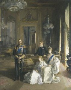
(Lavery, John. The Royal Family at Buckingham Palace. 1913. The National Portrait Gallery, London.)
I chose the portrait above in particular to look at because it was unusual and stood out from all the others. It was the portrait of the royal family in 1913 by Sir John Lavery. Its immensity was the first thing that caught my eye. It was of Prince Edward, King George V, Queen Mary and Princess Mary. The two women were sitting and the men were standing behind them. However, they did not take up the whole canvas. Most of the portrait was actually of the room. There were mirrors, chandeliers, couches, and tables. I began to focus more on the surroundings than the people in the painting. There was a window with light shinning through, casting shadows of the royal family. The corners of the room were dark. There was an open door behind the family, leading into another room. The dimensions of this portrait were fascinating and I spent a lot of time creeping through all its levels with my eyes. Another thing I noticed was the the whole family was looking forward except for Prince Edward, who was looking at his father. Again, Lavery is playing with dimensions, but this example is dealing with time. This glance that Edward is giving King George V takes the portrait out of static. Its not just right here, right now, but it is also about what is to come. I thought that was awesome.

3 responses so far ↓
Mary Kate // Sep 5th 2010 at 13:41
I went back to the National Portrait Gallery today, and I have to agree that the layout is spectacularly confusing. This probably seems like a sort of juvenile criticism, but it’s hard to let the portraits tell the story of British (or English) history when the layout of the exhibit is so fragmented. This whole half-floor thing doesn’t help either – I was pretty confused on the escalator, watching the twentieth century collection pass me by. So close, yet so far away.
BUT that brings me to my disagreement with your other comment, that there is no point to the NPG. I completely disagree! I think this unique focus on portraits allows us to simultaneously watch the development of art, history and identity in England. We see how aesthetics evolve over time, we meet the most influential figures in British history in moments both vulnerable and powerful, and we learn how those figures view themselves, or how they want others to view them. I just think this would have been much stronger if the museum had been laid out as a comprehensive and continuous tour of English history, so we could watch the layers unfold. I love the NPG, but I’m definitely missing the continuity.
hatzopod // Sep 5th 2010 at 15:14
I agree with you. That it has no purpose is an overstatement. It just really missed the mark for me. I could feel something missing the whole time, that it was so incomplete. It’s impossible to achieve what the gallery is attempting by only including white men. We are definitely not the first visitors to bring this up, so I really wonder why the collection has not been changed or expanded to include other important figures who were/are not white.
bowmanc // Sep 6th 2010 at 17:20
I really like your analysis of the painting, and though I understand your frustration with the omission of most other ethnic groups, but I think it’s also interesting to look at it from a class perspective. Not only are most portraits centered on whites – it’s really rich whites. At least I didn’t notice any farmers, docksworkers, etc. in the galleries. I think these two types of omissions reflect the socio-economic requirements to hire a painter for your portrait.
You must log in to post a comment.